AVVENN by Time to Gather in Shanghai, China
Project: AVVENN Architects: Time to Gather Location: Xinle Street, Shanghai, China Area: 1356 sq ft Year: 2023 Photography: Wu Jianquan
AVVENN by Time to Gather
Within the grand urban history, individual expression often conceals gentle emotions. Shanghai, beyond its renowned buildings and bustling districts, possesses a constantly evolving fashion and energy that continuously enriches the cultural depth and internal structure of the city.
AVVENN, a diverse brand of designer clothing, was founded in Shanghai in 2021. With skills blending artistic aesthetics with forward-thinking design thinking, it conveys a sense of self-consistency and comfort through a simplified approach. The brand's new physical store returns to Shanghai, where the space serves as a medium for storytelling about the brand. TIME TO GATHER, centered around the prototype of clothing – paper with a pattern – interprets the brand's spirit of "Pioneer Harmony" from multiple perspectives, including appearance, interior design and details.
1. Form
Pioneer Harmony
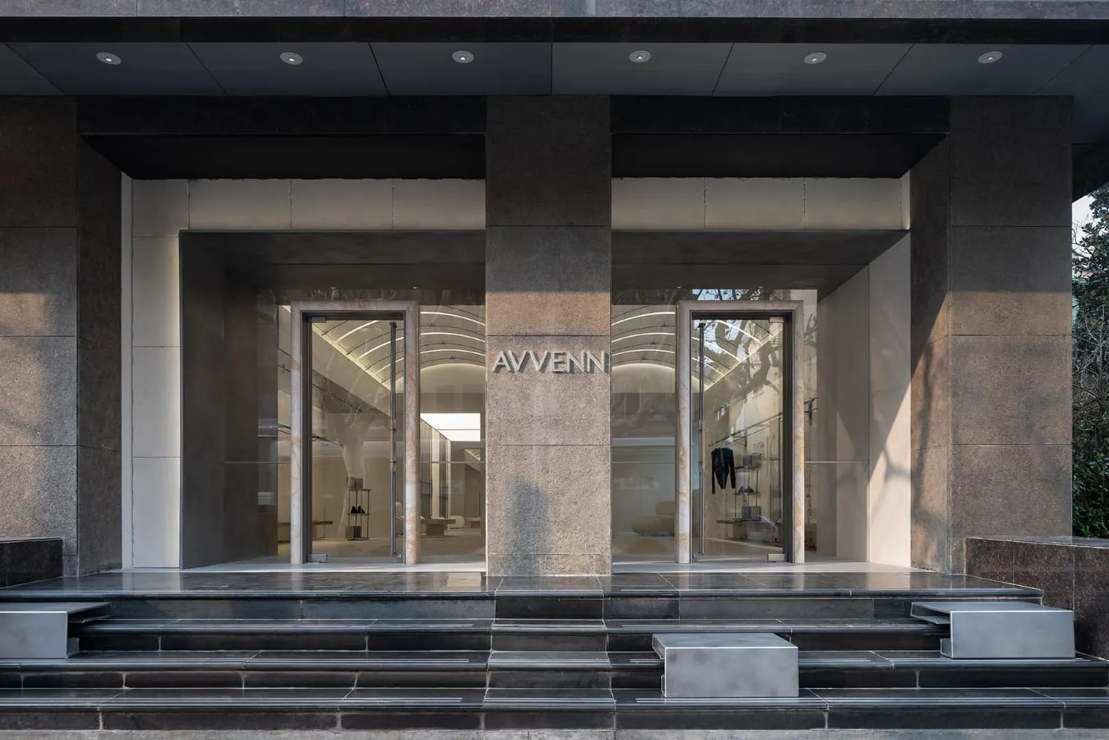
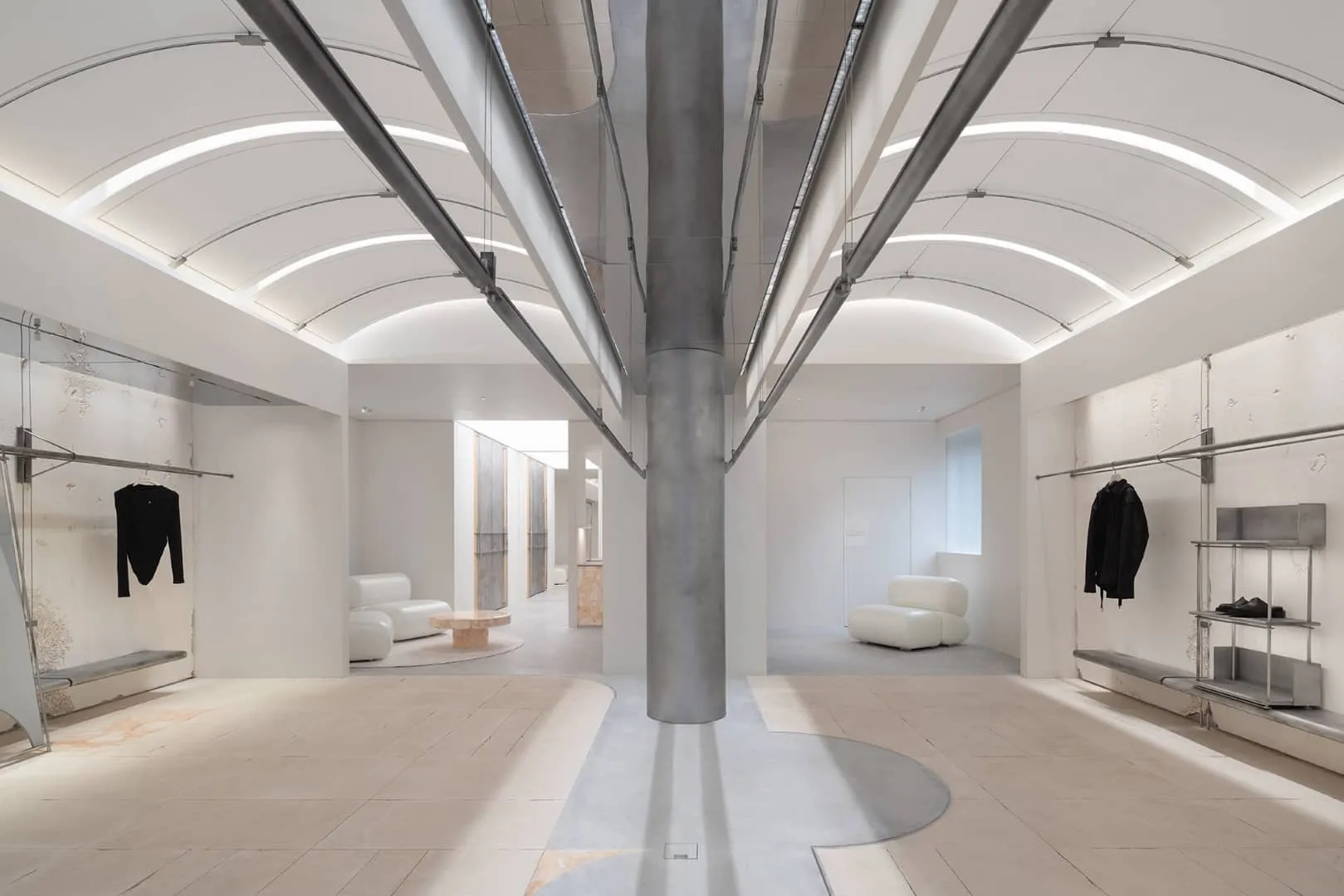
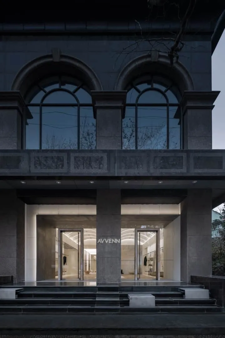
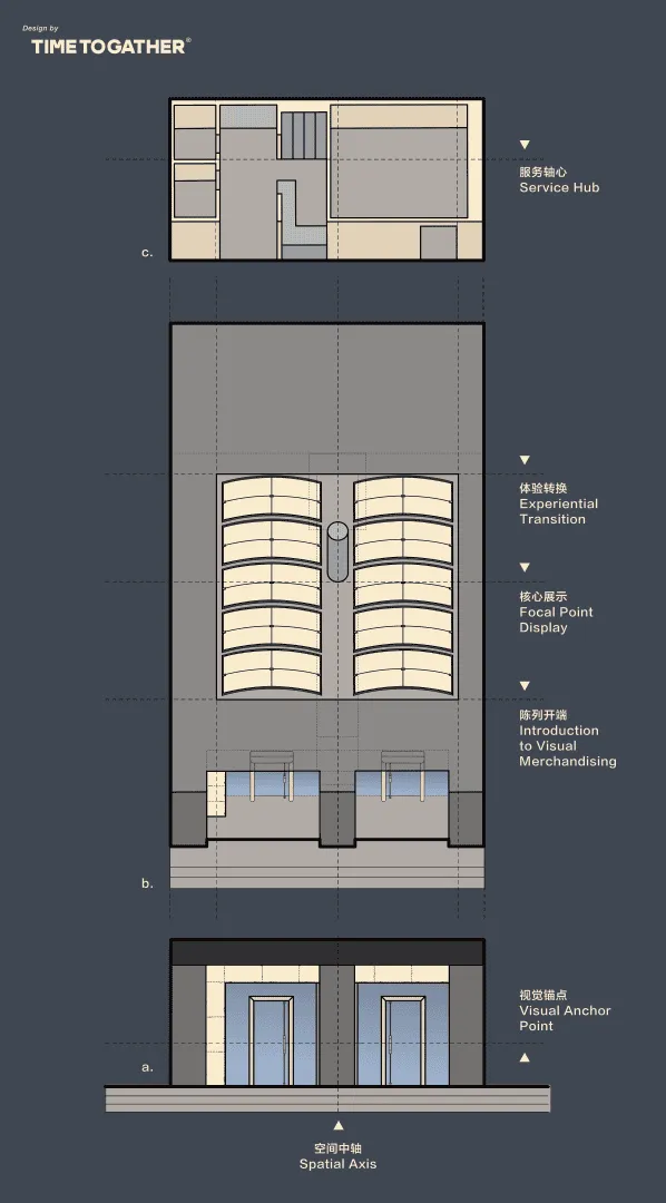
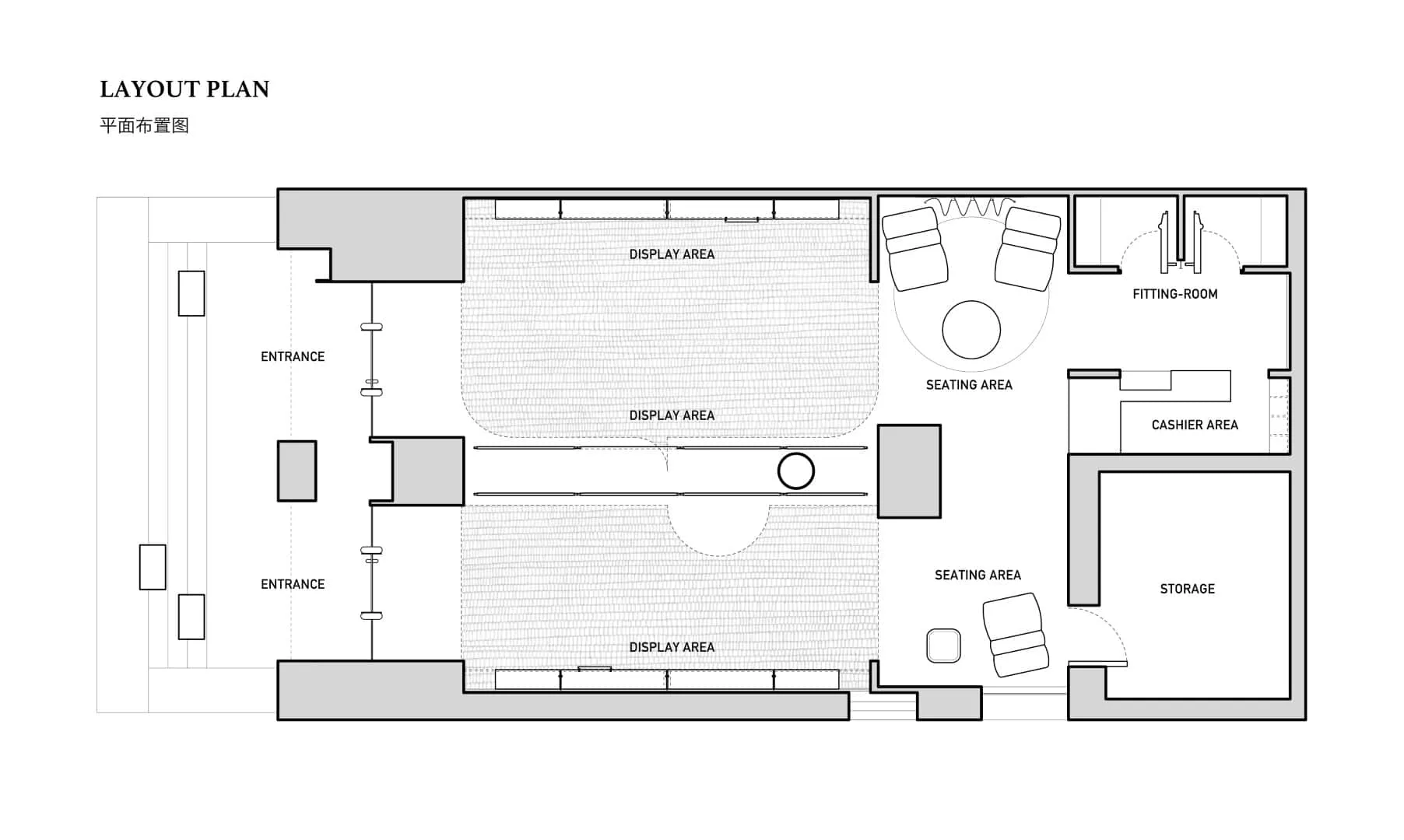
From the perspective of appearance, architecture departs from traditional forms, redefining itself into an L-shape. Visually symmetrical entrances on both sides boldly declare the brand's position in contradictions and harmony, as well as sharpness and relaxation inherent in "Pioneer Harmony".
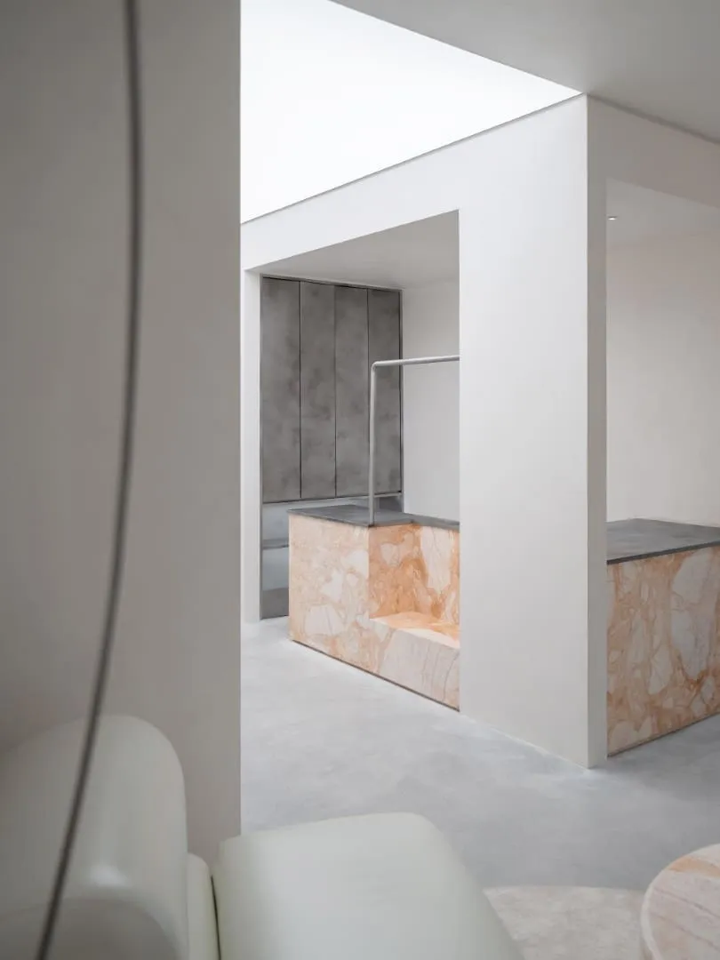
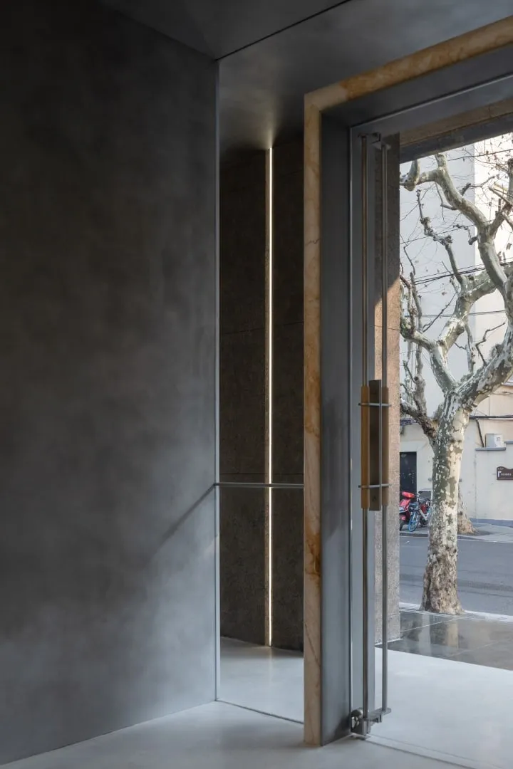
The pioneer means distinction and uniqueness. Natural stone, serving as the primary material for built-in structures, establishes the unique facade of the space. Metal blocks interweave from the exterior to the interior, visually enhancing the volume of passage, guiding human flows and simultaneously creating a sense of ceremony upon entering the space. Stone and metal plates, weathered by hand, soften surface rigidity, awakening natural warmth and spatial feelings that allow tracing the "harmony" expressed by the brand.
Traditional commercial design suggests occupying every part of a space. However, what makes the pioneer a "pioneer" is the courage to lead and deviate from norms. By dedicating certain physical space at the entrance, an emotional buffer and transition are created. Light gray terrazzo continuing from outside to inside guides visitors into different conditions.
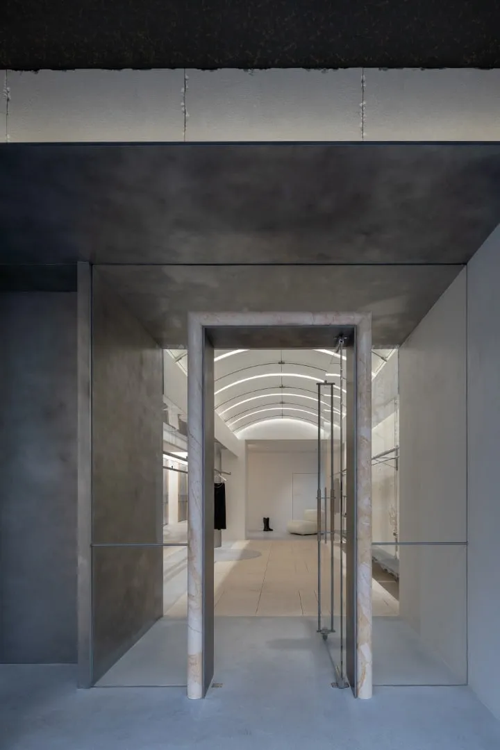
As movement progresses, the curved edges of metal chairs on the staircase convey a light texture of "paper with pattern"; the arched stone door frame at the entrance extracts the trajectory of "cutting"; and the complex interwoven door handle structure expresses the action of "threading" through a sewing machine. These subtle details reveal specific explorations into the brand's spirit.
2. Concept
Creative Scale
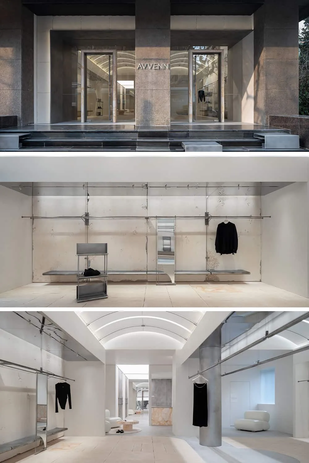
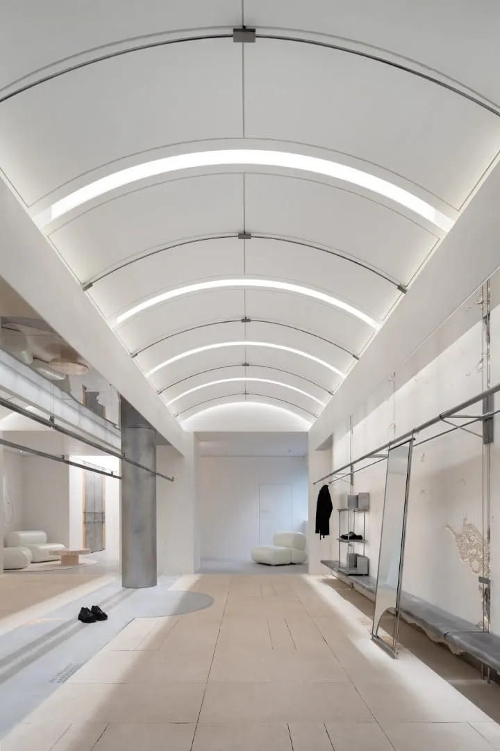
The concept of "paper with pattern" originates from the prototype design of clothing, symbolizing endless creativity and precise measurements. Entering inside feels like being in an unfinished garment sketch. Lines, forms, textures and colors express the creative ideas of design.
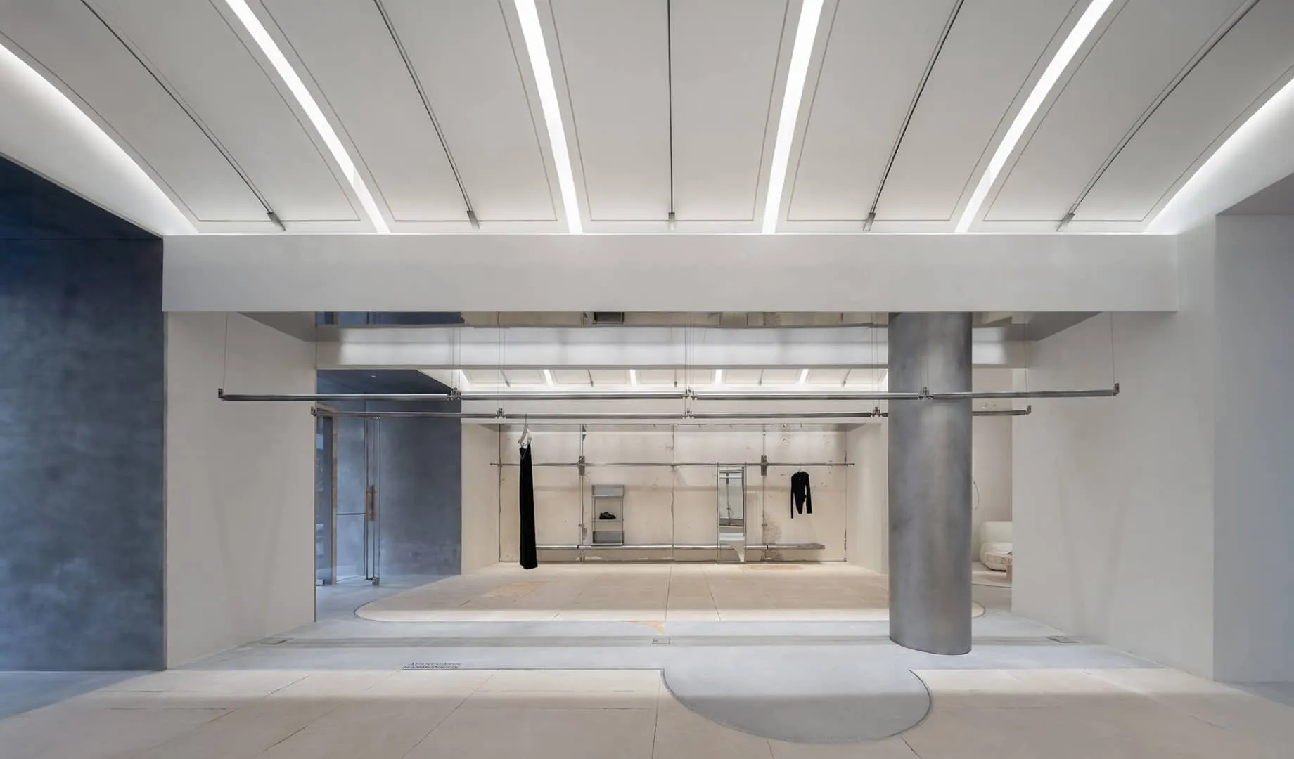
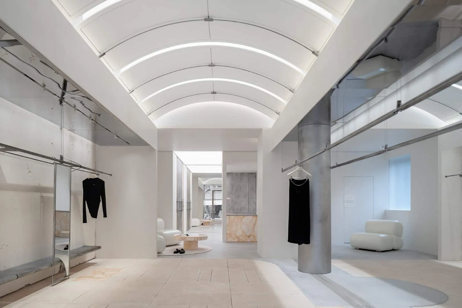
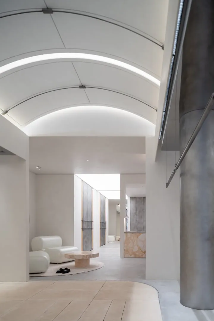
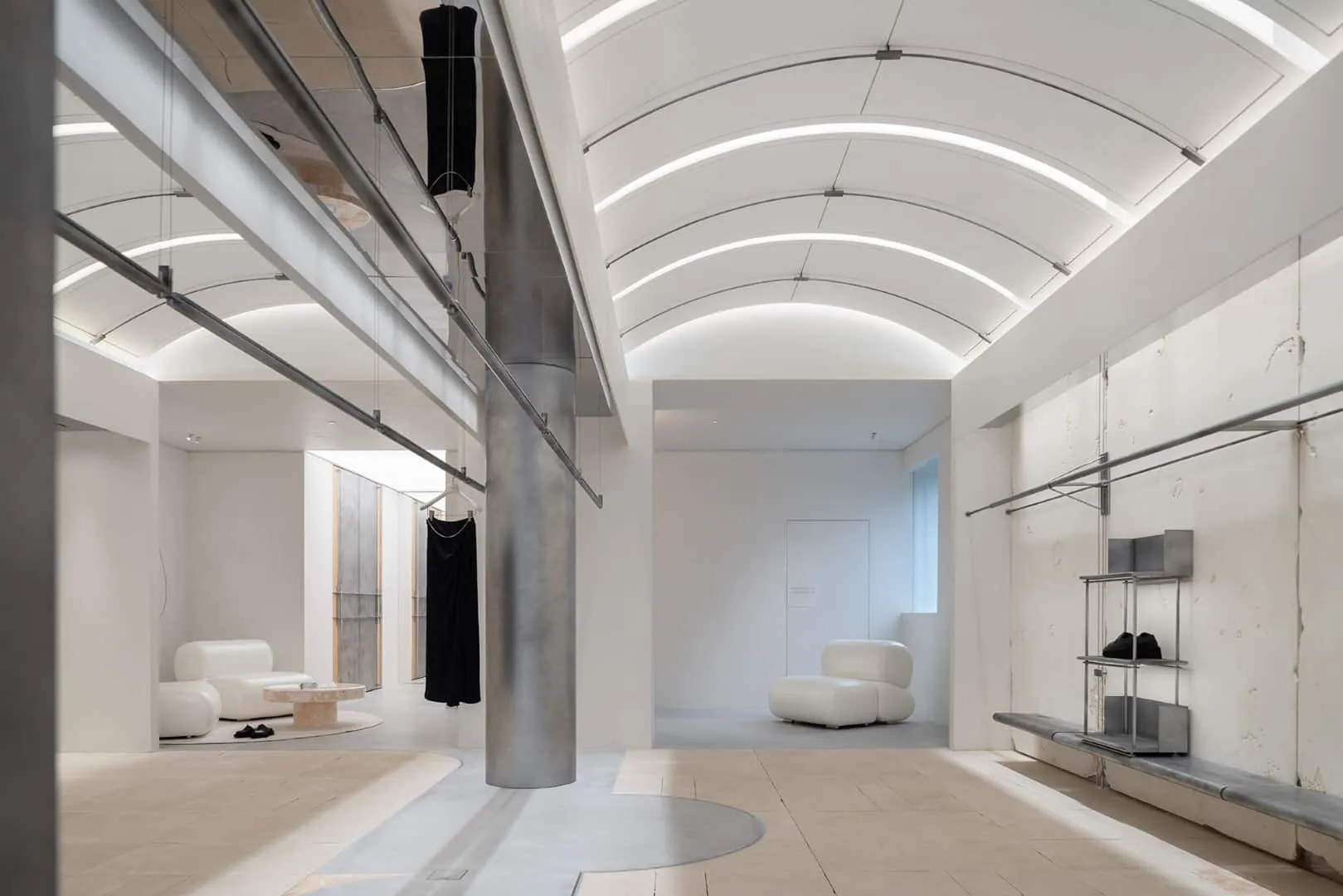
Continuing the structural facade design, the interior is arranged symmetrically. The arched roof with orderly placement of slab structures evokes freedom from cutting and the lightness of paper with a pattern. 10 mm wide grooves around metal structures imitate fixed connections and fasteners found in clothing construction, with smooth lines reminiscent of precise control by a master while sketching. Light penetrating through gaps emphasizes form and highlights the concept of "paper with pattern".
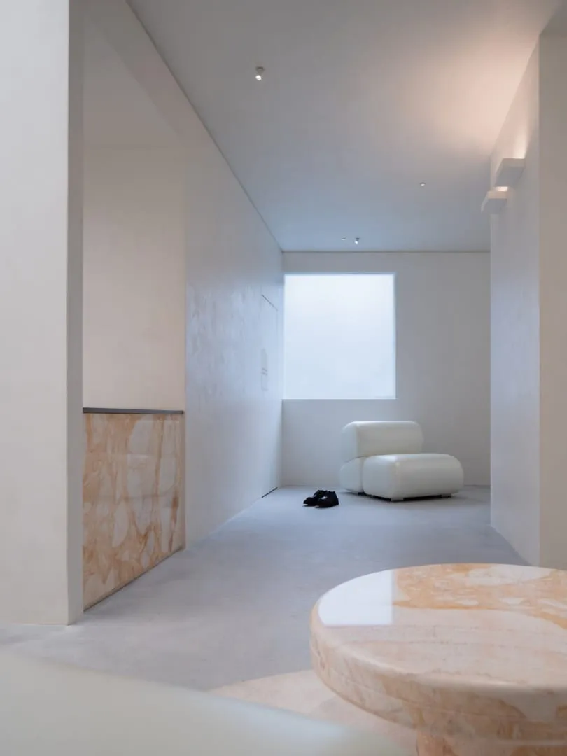
Texture is an emotion of space. The extensive white field frees from regular constraints, offering more freedom for imagination. Hand-cut brick walls resemble natural brushstrokes and appear random but easily evoke gentle emotions upon closer inspection. Each item, like an independent artwork, provides visitors with sufficient space for admiration.
Silver steel, naturally spotted artistic paint and beige stone sections bring poetic details through contrasts of various materials; roughness and elegance coexist, delivering nuanced perception. Metallic texture and lines embedded in the floor again respond to the brand's textural attributes.
3. Interpretation
Freedom of Self-Expression
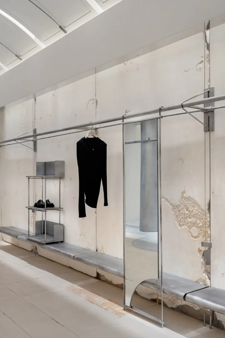
From "paper with pattern" to clothing display, the design narrative also metaphorically represents diversity and potential of space. The central area, inspired by sewing machine interweaving, presents a hanging system organized in pairs and adjustable from 1200 to 2400 mm height, meeting seasonal collection needs.
Since its founding, AVVENN has aimed to create an eternal, boundless community that blends different cultures in lifestyle. When the hanging system is adjusted to maximum height, it completely disappears, transforming the space into a multifunctional social arena. Here creative brand ideas are realized, facilitating meetings with like-minded individuals and interesting people.
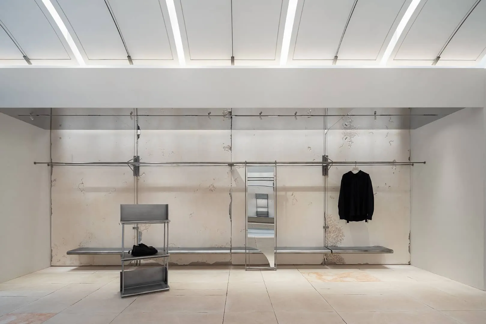
The design interpretation goes beyond its visual representation and lies in all the small, beautiful details. The wall clothing system with interweaving, connection and overlay artistically recreates the moment of threading a needle in garment construction, as if observing the transformation of fabric into clothing.
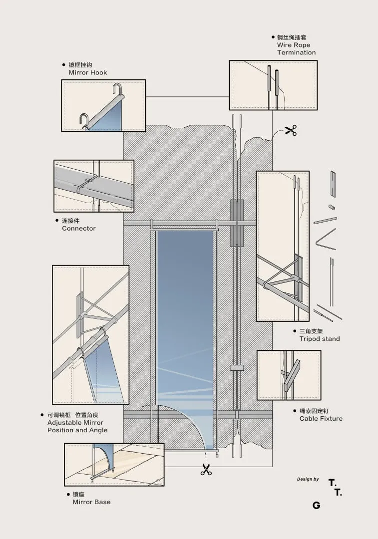
Changing room mirrors skillfully connected to clothing shelves via hooks easily move to different positions and adjust under various angles around the mounting point, ensuring complete display of clothing beauty from all sides. The tall curved stand for display at 350 mm height perfectly reserves space for footwear, hats and other brand accessories. Individual display stands are placed flexibly according to daily brand needs, enriching display requirements in various scenarios.
AVVENN is a women's brand. Original square columns wrapped in metal sheets form cylinders, softening the space. The beauty of femininity lies not only in softness but also in inner strength beneath the surface. Triangular shaped connecting fasteners with clean and sharp lines symbolize a solid core of modern pioneer women, representing the balance between strength and softness throughout.
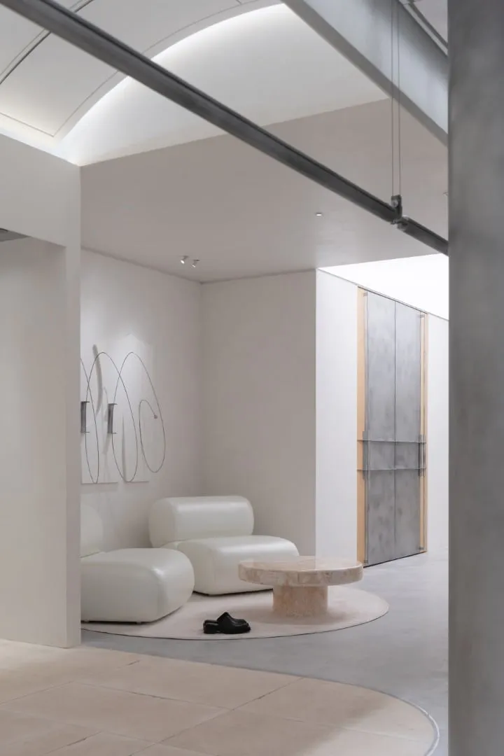
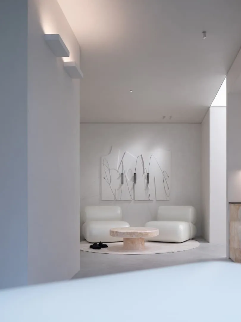
4. Relaxation
State of Lightness
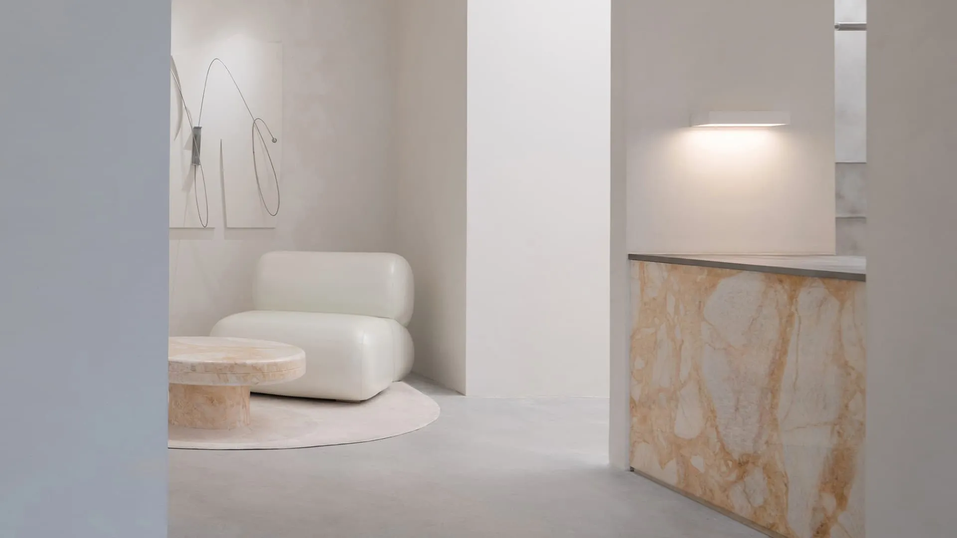
Proceeding along the path, whether exploring or acquiring – the back part loses its armor and embraces a relaxed and comfortable present. Misplaced canvases on walls again reflect the concept of "paper with pattern", adorned with live metallic lines reminiscent of the brand's unique and interesting perspective on combining clothing. Original sofas and sideboards with soft and rounded combinations provide a more comfortable and relaxed atmosphere in the relaxation zone.
The cash register counter, continuing the color scheme of the facade frame and surrounded by natural stone, faces the front display area for easy identification and sales assistance to visitors. The side part allocates space for a hanger, maximizing the use of space.
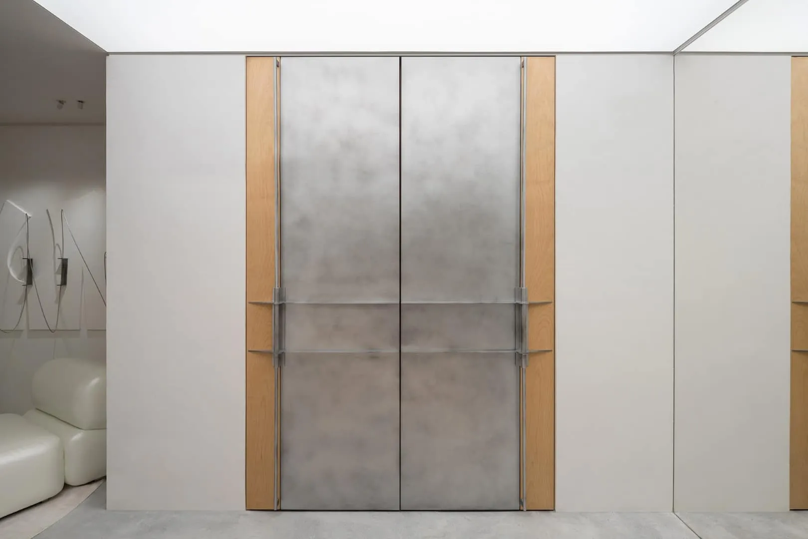
The fitting room, as the most personal area in the store, is where the most detailed design comes to life. Clothing hangers are based on "fastening pegs" used in garment construction; the stone serving as a spatial surface demonstrates natural textures and warm tones, creating a more relaxed atmosphere. Considering the potential tendency of rough stone texture to scratch visitors or clothing, its surface was carefully polished. This not only preserves the natural beauty of the material but also highlights the brand's ultimate goal – to provide an exceptional consumer experience.
When the fitting room door closes, it takes on a flat appearance resembling an uncut part of paper with pattern. Defined by a central axis, the door seems skillfully cut along this middle line, transitioning from two-dimensional facade to three-dimensional reality. This play of opening and closing not only physically transforms the space but also metaphorically represents the evolution of consumer experience.
The "Pioneer Harmony" advocated by AVVENN is rooted in the brand's core. Just as clothing serves individuals not only as a保暖 means but also as direct expression of inner emotions and aspirations, the physical representation of brand space, achieving modern aesthetics, must transcend boundaries of one space. It should create a spiritual world filled with creativity and imagination, providing consumers greater opportunity to connect with the warmth and essence of the brand.
Lighting color schemes provide various atmospheric conditions for brand operations, fully satisfying needs of different events such as non-standard exhibitions, art salons, exchanges and streaming. Careful expression, diverse culture and concise presentation all embody a sense of ceremony in design and life, further demonstrating the deep heritage of the brand and the refined craftsmanship of its masters.
-Project description and images provided by ZZ Media PR
Drawings
Need a renovation specialist?
Find verified professionals for any repair or construction job. Post your request and get offers from local experts.
You may also like
More articles:
 Modern Minimalist Transformation of an Apartment in the NEVATOWERS Residential Complex
 Apartment a+e by El Fil Verd in Barcelona, Spain
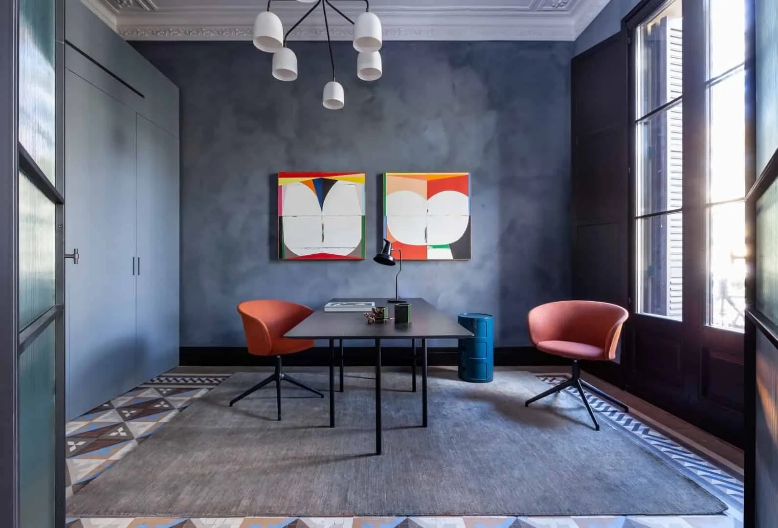 Apartment on Paseo San Juan / YLAB Architects / Spain
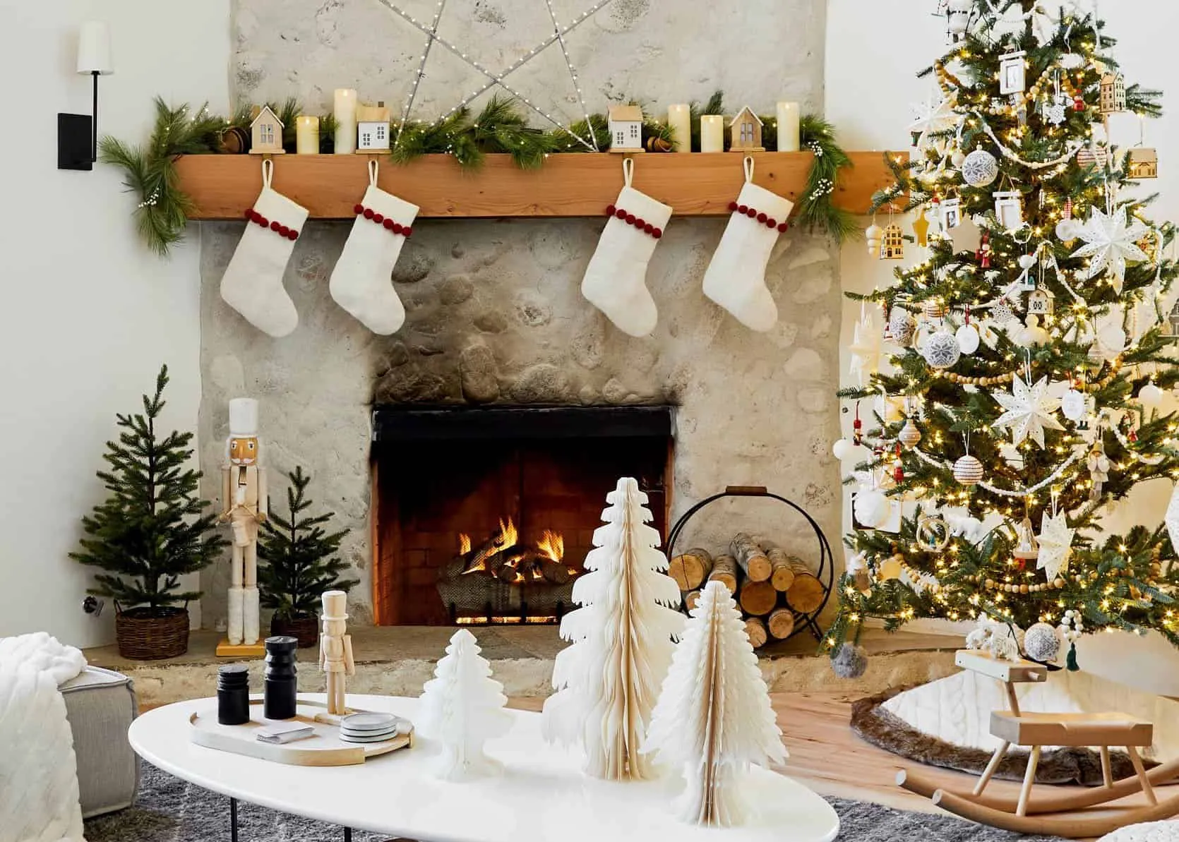 Tips for Christmas Decorating Your Apartment
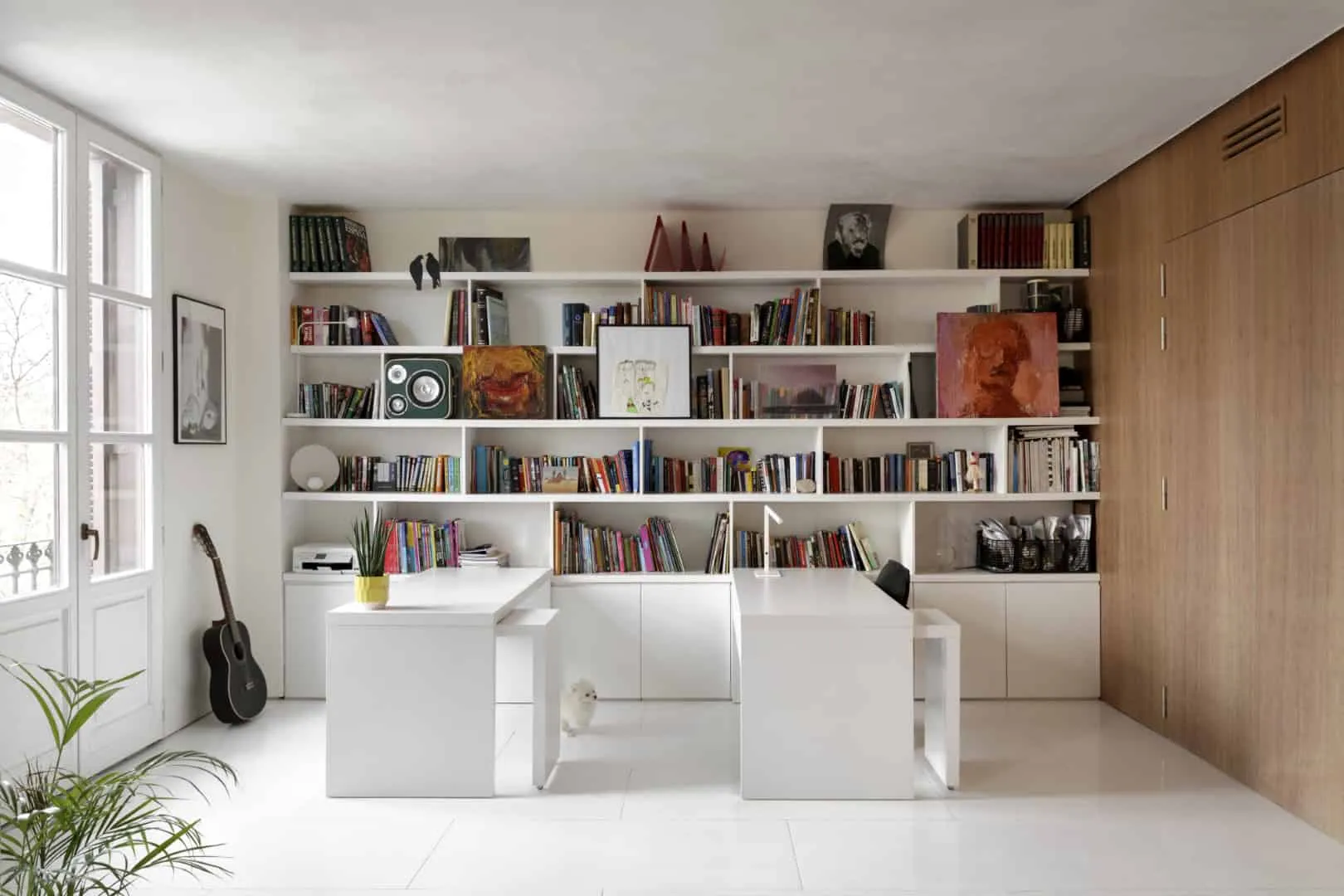 K+T Apartment by El Fil Verd + Element Architecture Urbanism in Barcelona, Spain
 Apartment with meticulous decoration that gives an ideal home
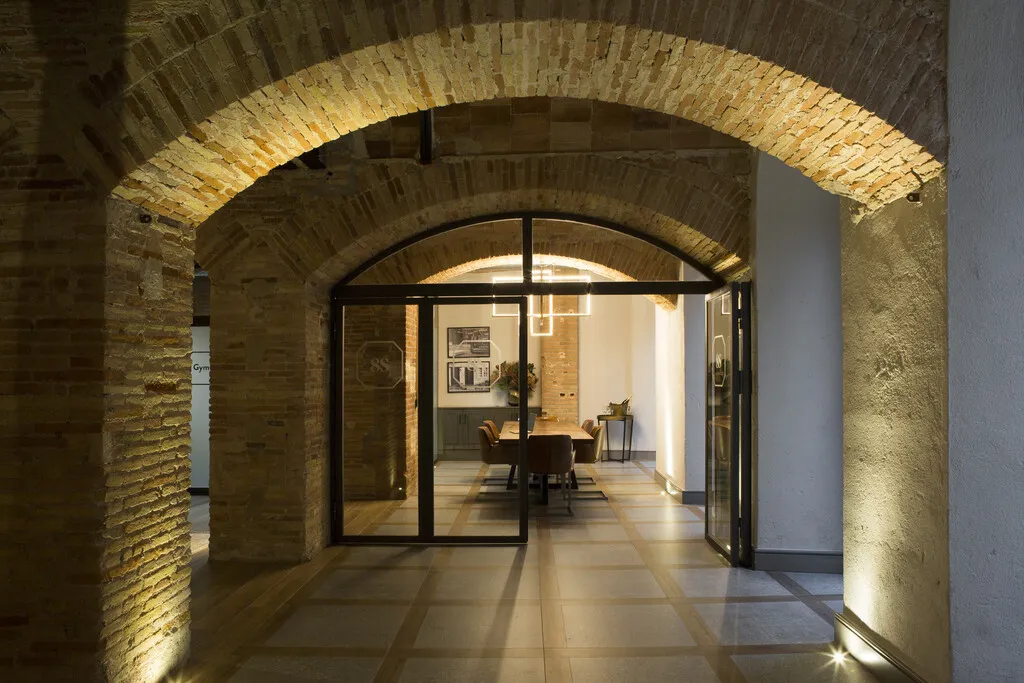 Apartments Designed with the Spirit of Home Will Make You Think About Interior Renovation
 Apartment in Astana with Light Asian Style by Kvadrat Architects