Color in Interior Design: How Tones Affect Mood
Which color to choose for each room
What color to paint the walls to relax or, on the contrary, feel more energetic? We tell you.
White and Grey
Basic colors that are perceived differently by everyone: some find white light and refreshing, others consider it sad – so rely on your own feelings. However, white and light grey are now widely used as a base in most interiors, and there's good reason for that: they expand space, don't overload it and look stylish. A monochromatic interior with minimal color accents also looks great – for example, as in Inna Azorskaia's project.
Best for: any room. A lifesaver for small rooms. These colors also pair well with any other hues.
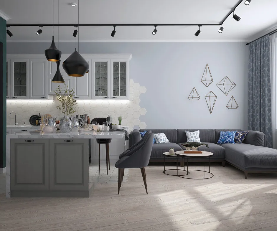 Design: Inna Azorskaia. Black
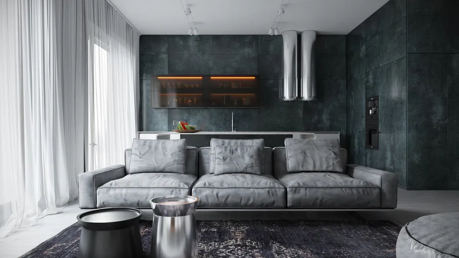
Black is often associated with negative emotions – sorrow and melancholy. But at the same time, it's a color of elegance and often a sign of good taste. A bold choice: using black on several walls, as in this project in Skolkovo.
 Design: Kameleono.
Best for: as small accents, suitable in any room. Makes the interior more contrasted and vibrant. Works well in overly spacious rooms that need to be made cozier and more intimate.
Not recommended: in large quantities. Exception – if you personally feel comfortable in a dark monochromatic space and it doesn't psychologically oppress you. Remember that black strongly 'eats up' space – not suitable for most small apartments.
 Design: Buro5. Beige and Brown
These warm, natural shades soothe and give a sense of safety, balance, and 'grounding'. Usually associated with nature (trees, mountains, sand, stones) or something appetizing – baked goods, coffee or chocolate.
 Design: GP Project.
Best for: any room, provided you dilute them with contrasting accents. Light beige tones are an excellent base for any interior.
Not recommended: brown – not the best choice for small, dark rooms. Can create a feeling of clutter.
 Design: Elena Markina. Red and Orange
They energize even on a physical level – can raise adrenaline levels in the blood, affect heart rate and increase blood pressure. Warm shades of these colors make a room more cozy.
Best for: living room and dining room – red and orange promote communication and stimulate appetite.
Not recommended: in the bedroom, especially in large quantities – it will be hard to relax. Red is great for accents – for example, in Irina Travkina and Natalia Tarasевич's project, textiles in this color were used.
Yellow
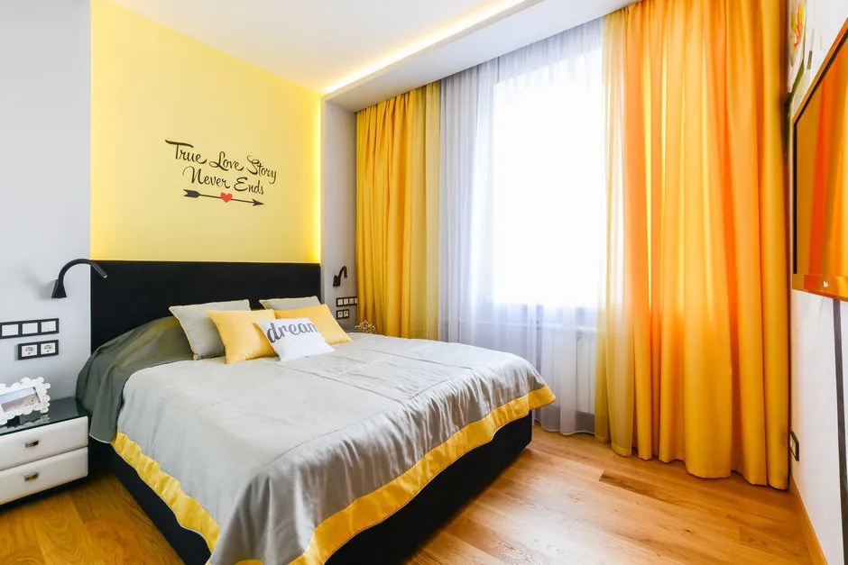
The color of joy and optimism. It's important to choose the shade correctly: while light shades make an interior sunnier and lighter, darker ones may start to depress over time.
Best for: kitchen, dining room, bathroom, hallway. Looks great in small spaces. Especially good for accents – interesting details and accessories.
 Design: Olga Shapovalova.
Not recommended: in children's rooms – very small children usually don't feel comfortable in yellow interiors. With caution – in bedrooms. No matter what room you use this color in, it must be diluted with neutral tones (e.g., light grey, as done by Svetlana Yurkova) – otherwise it starts to irritate.
 Design: Svetlana Yurkova. Green
Considered the most natural and pleasant color for the eyes, it's associated with living nature and relieves stress. Combines stimulating properties of yellow and relaxing properties of blue.
Best for: any room, especially looks great when combined with other colors: for example, white.
 Design: Natalia Yanson. Blue and Navy
They set the mood for tranquility and relaxation, lower blood pressure, and reduce appetite.
Best for: small rooms – light blue shades visually expand the space. For rooms that are always warm and have windows facing the sunny side – cool tones make them feel 'cooler'.
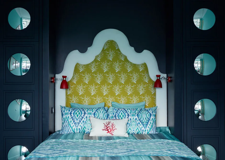 Apartment of designer Anna Muravina in Gelendzhik. For bedrooms and bathrooms – these colors are excellent for relaxation. Some shades work well in home offices, helping with concentration. If you want to reduce appetite and lose weight, blue is an excellent choice for the kitchen or dining room. See how delicately blue looks on the kitchen of designer Marina Zhukova.Not recommended: in large quantities in any room – such an interior will evoke melancholy. For the same reason, it's better to avoid dark shades of these colors. To prevent such an effect, dilute blue with white or another light neutral tone. Choose warm (e.g., periwinkle) or bright tones – azure or turquoise.
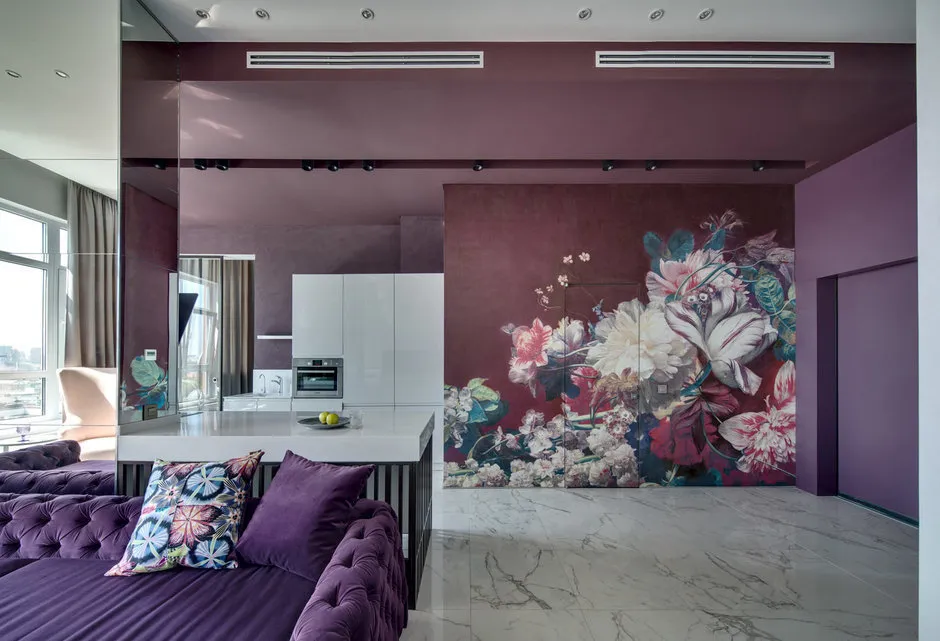
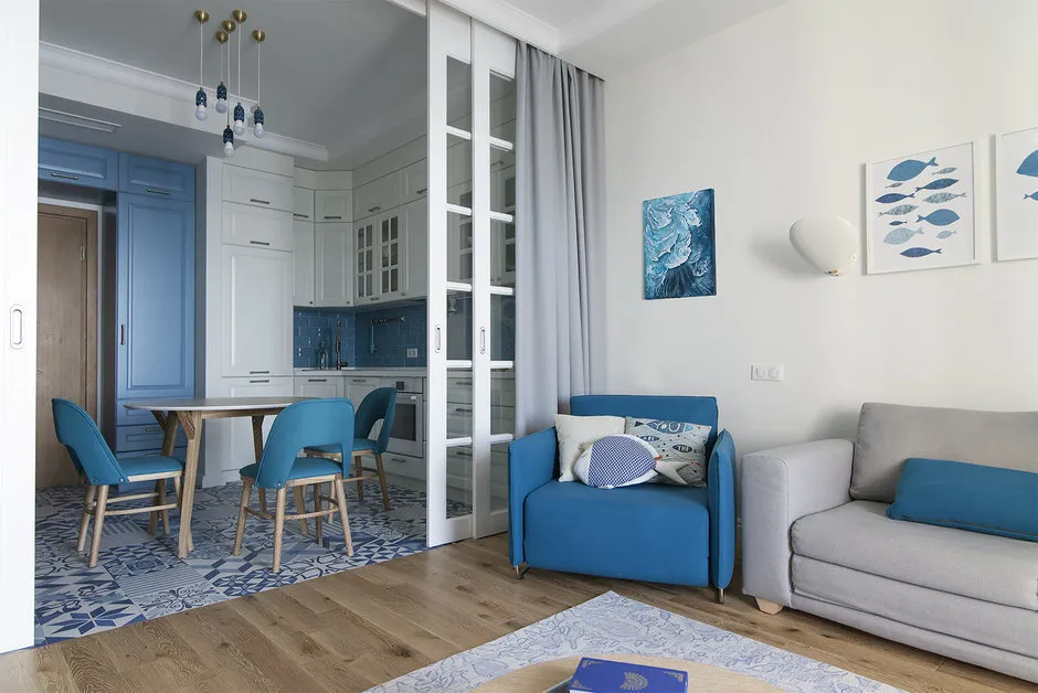 Design: Tatiana Kazantseva. Violet and Pink
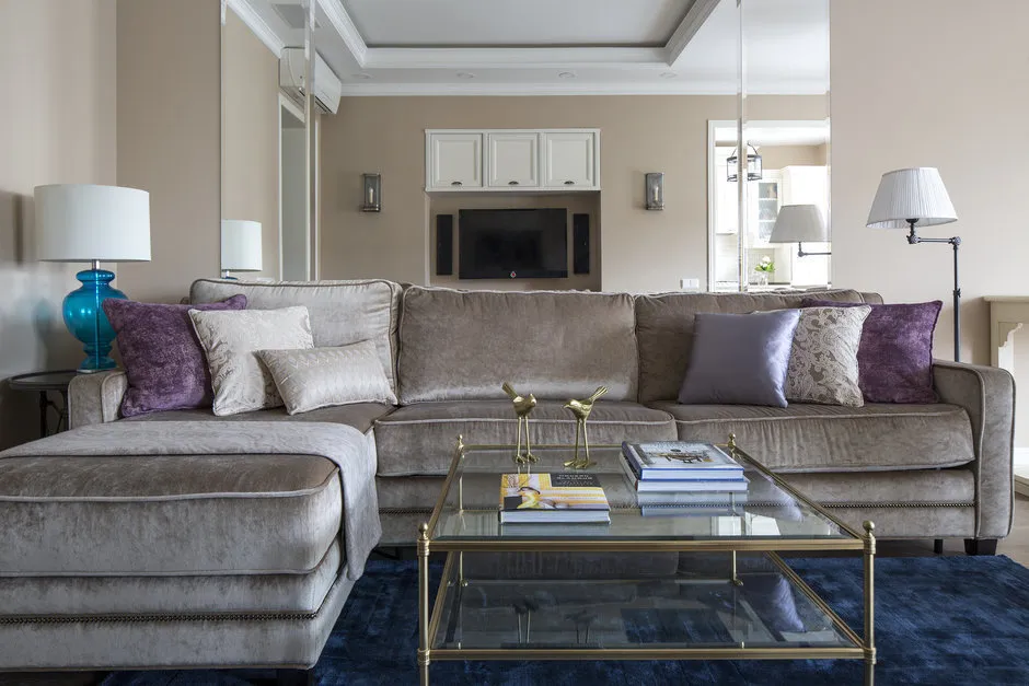
Soft shades of violet and pink soothe and relax, while darker ones create a festive, strict, and mysterious atmosphere.
 Design: Nika Vorotynceva.Best for: any room, especially bedroom.
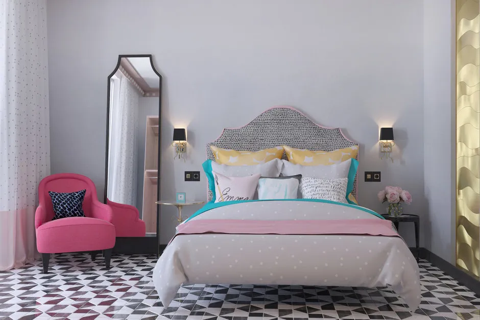 Also read:
- What white color hides: psychology and decor
- Shades of sky and water: color psychology and decorators' tips
- Perfect pairs: 8 winning color combinations
Need a renovation specialist?
Find verified professionals for any repair or construction job. Post your request and get offers from local experts.
You may also like
More articles:
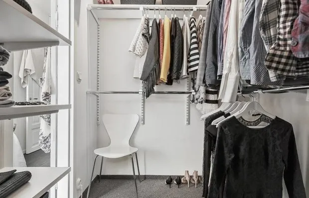 Pros and Cons: Wardrobe in a Small Apartment
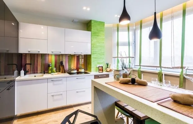 Kitchen-living Room Design for 20 Square Meters: Zoning Tips and Best Projects
 7 Ways to Combine Living Room and Bedroom
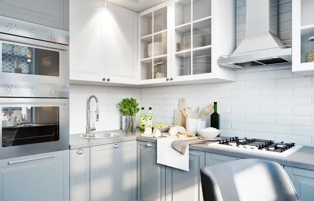 Kitchen Design 11 Square Meters: Interior Features
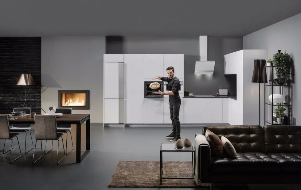 Kitchen of the Future: 7 Trends
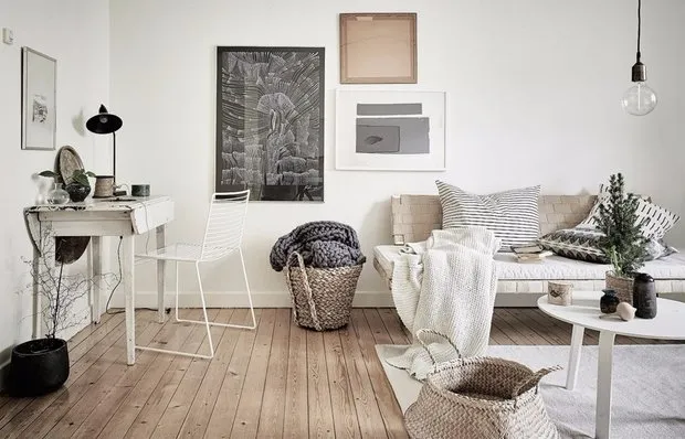 5 Simple Ways to Increase Home Security
 Flowers and Color: Artist's Cottage in Australia
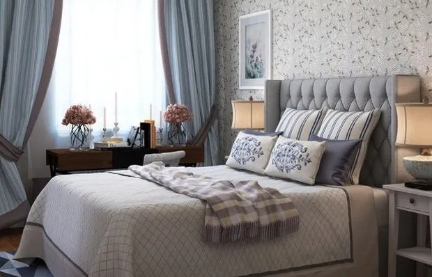 How to Create a Cozy Bedroom: 10 Design Ideas