Choose Light Colors for Lighting Dark Rooms
LIGHT BUT DISPLAY
 Pinterest
If your bedroom is already very bright due to its orientation and a large window, paint it in an off-white tone rather than pure white to avoid unpleasant glare. That's exactly what interior designers did here to create a bedroom with light but in moderation.
STIMULATING WHITE
 Pinterest
White conveys purity, neatness and calm; it never goes out of style and stimulates creative imagination. Moreover, it is the brightest color since it reflects up to 80% of light and highlights decorative elements best. It's ideal for small spaces because it lifts the ceiling and pushes walls away, visually expanding them. When combined with wood tones to make it warmer, it can also be used in larger rooms. Clean, broken white, in an oak tone, pairs with all other colors; for example, with greys or sandy tones it gives an elegant feel.
WATCH THE WHITE SOFA
 Pinterest
Painting the walls, ceiling and floor white creates a bouncing effect that enhances clarity. If you also choose light fabrics and white furniture painted or varnished in white, the brightness will be complete.
SAND COLOR, TIMELESS
 Pinterest
Subtlety, versatility, universality and elegance—sand color or what I call grey-brown is 'universal,' says an interior designer. Perfect for any space where harmony, visual relaxation and highlighting other decorative elements are desired. It's neither classic nor modern; it is timeless. It is full of nuances.
IN SOFT CREME
 Pinterest
If you don't like the taste of milk on its own, add a drop of coffee and it becomes something else! That's exactly what happened in this room. Designer Martha Tobella painted it in a soft cream tone that softens the environment and makes it more inviting. Put it on, because it will provide many conversation starters! Fibers and wood give it warmth, while green accents bring freshness.
GRAY, SUPER-BRIGHT
 Pinterest
Gray is ideal for large open spaces, but also small rooms because it expands them. Our color palette includes two shades of light gray: grisaille, a warm gray composed with ochre, reds and earth pigments and patina gray, slightly cooler, created with blues, greens and blacks. Both are perfect for areas with direct sunlight and light patches and harmonize almost with all colors. For example, white and light stones create a balanced and calm atmosphere. With roses—romantic; with reds, yellows or saturated blues—modern.
TAN TRANSFORMS WITH LIGHTING
 Pinterest
Sand color maintains balance between greys and ochres at the right point, giving it necessary neutrality to combine with brighter colors such as red, green or blue. It is particularly sensitive to clarity and radically transforms depending on the strength and type of light falling on its surface, taking greenish, bluish and purplish tones depending on the surroundings. That's why it looks great anywhere.
TEAL GREEN, SO NICE!
 Pinterest
Using green color to renovate the living room and give it a cheerful look that evokes nature and helps us recharge our batteries is a great idea. The designer used Provence green in this kitchen, which conveys freshness and informal accents—so summertime!
NAVY BLUE VERY INVITING!
 Pinterest
Want to give a child's bedroom light and that very dark blue air they love so much? Paint the walls white and navy blue, as interior designer and home decor expert Dara Dias did here. The lower strip, like a panel ceiling, also acts as a headboard, while the upper band gives blue the needed clarity.
Need a renovation specialist?
Find verified professionals for any repair or construction job. Post your request and get offers from local experts.
You may also like
More articles:
 House by the Lagoon from A4estudio: Sculptural Retreat Above the Blanca Lagoon
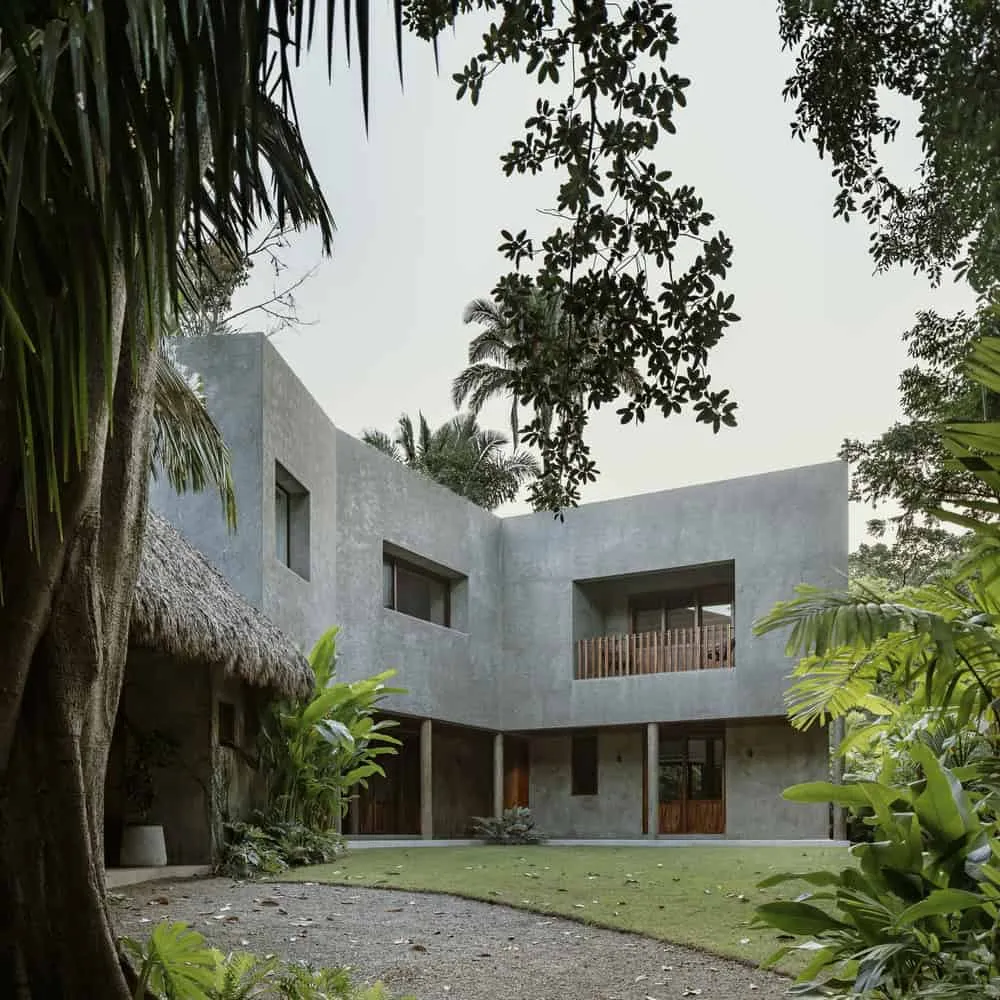 House in the Jungle Created by CoA Arquitectura Architects
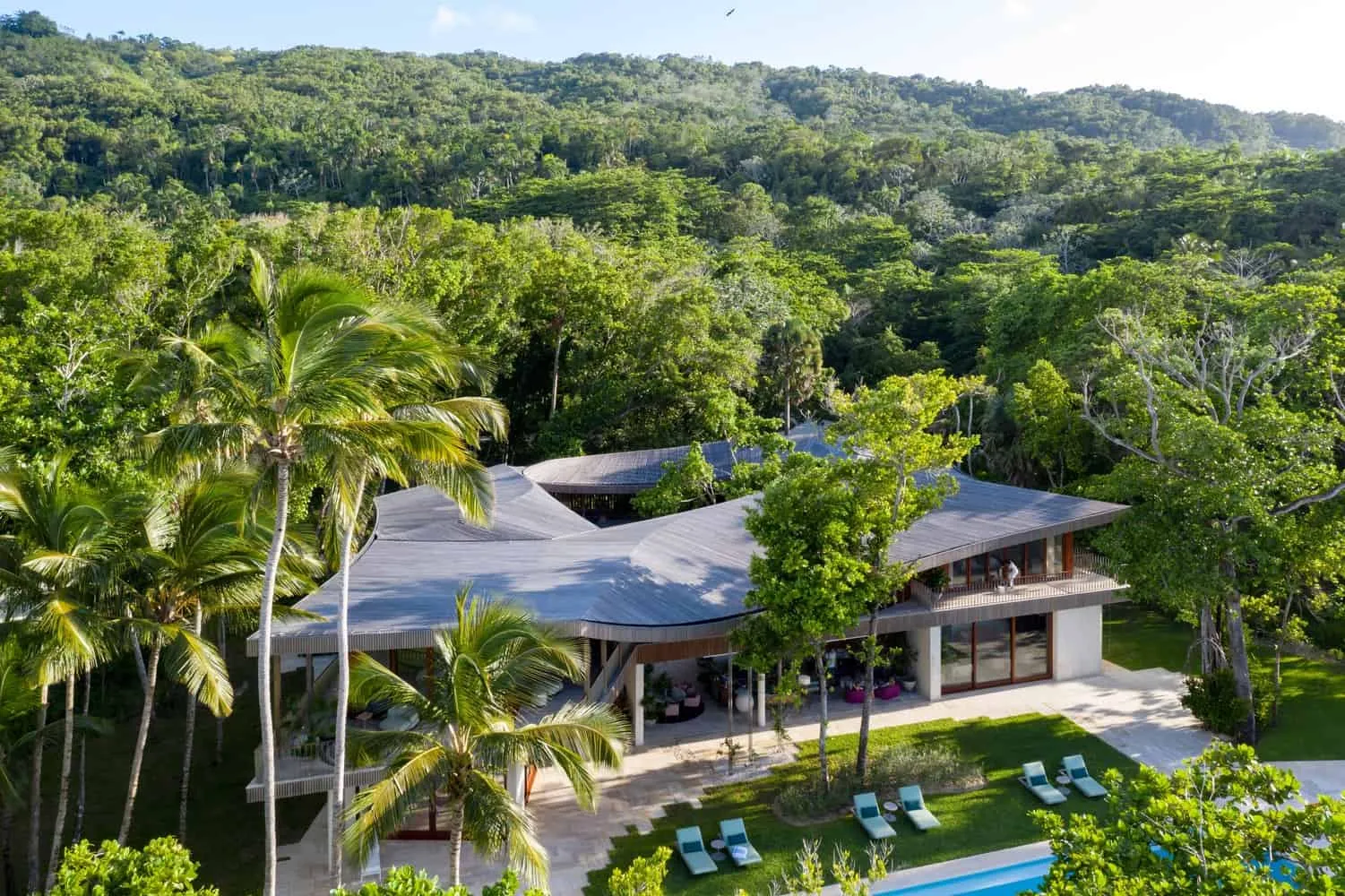 Las Olas House by Young Projects in the Dominican Republic
 Modern Casa Lomas II House by Paola Calzada Arquitectos in Mexico
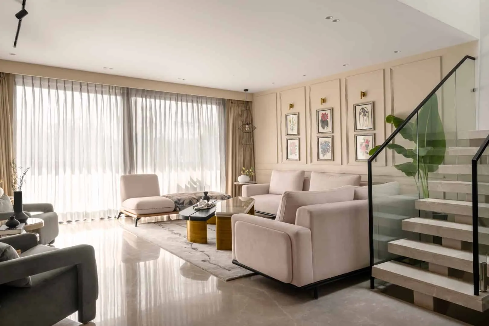 Casa Loto | Unorthodox Designs | Kailash Hills, Delhi, India
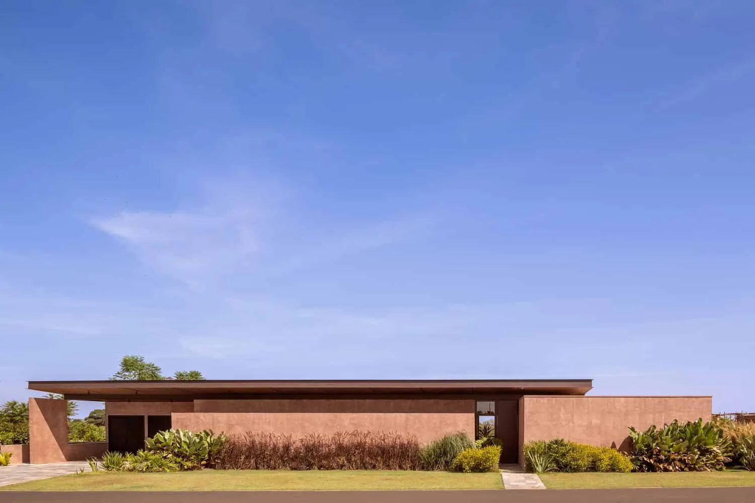 Manaka House | VAGA Architecture | Cesário Lange, Brazil
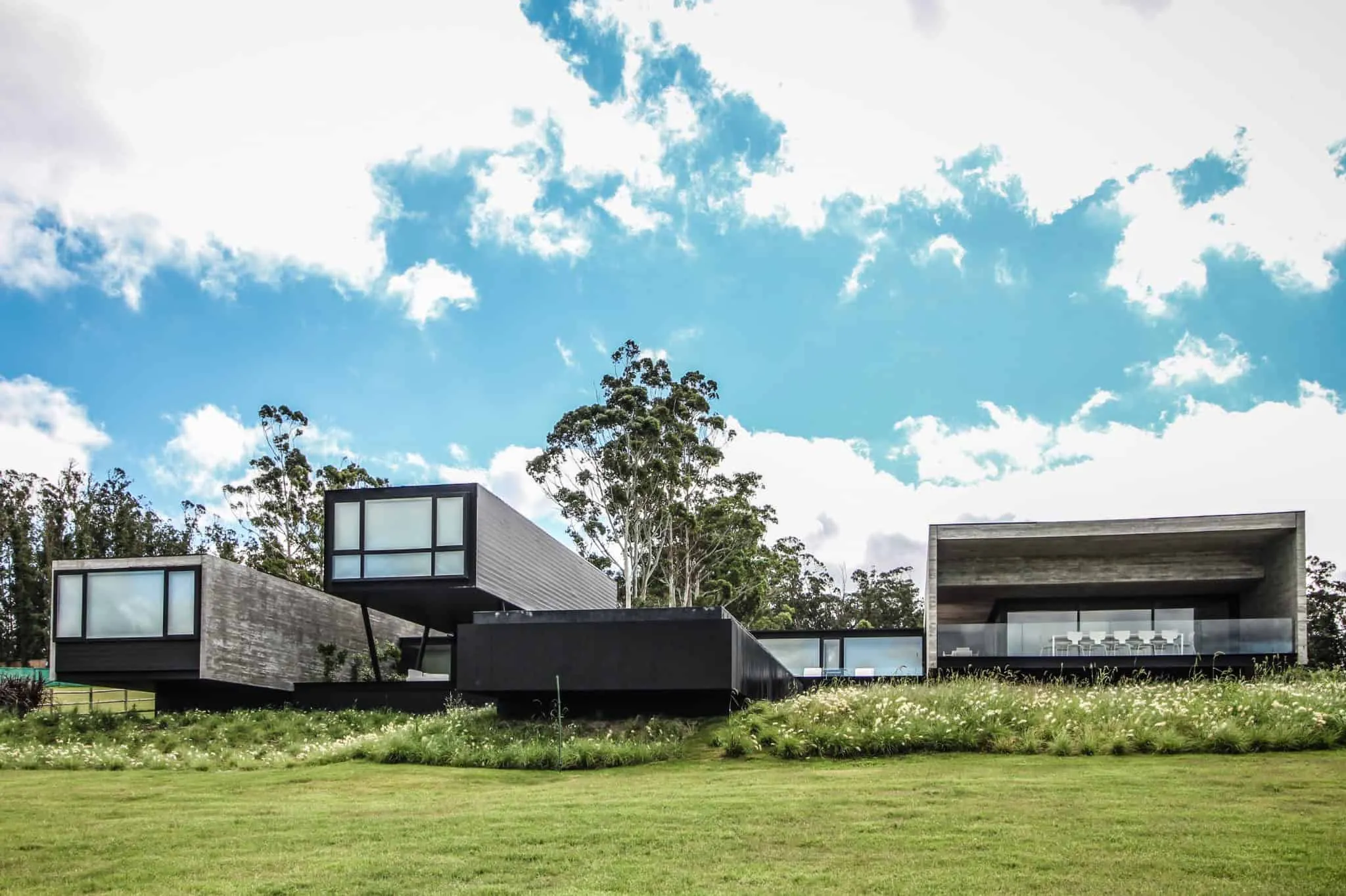
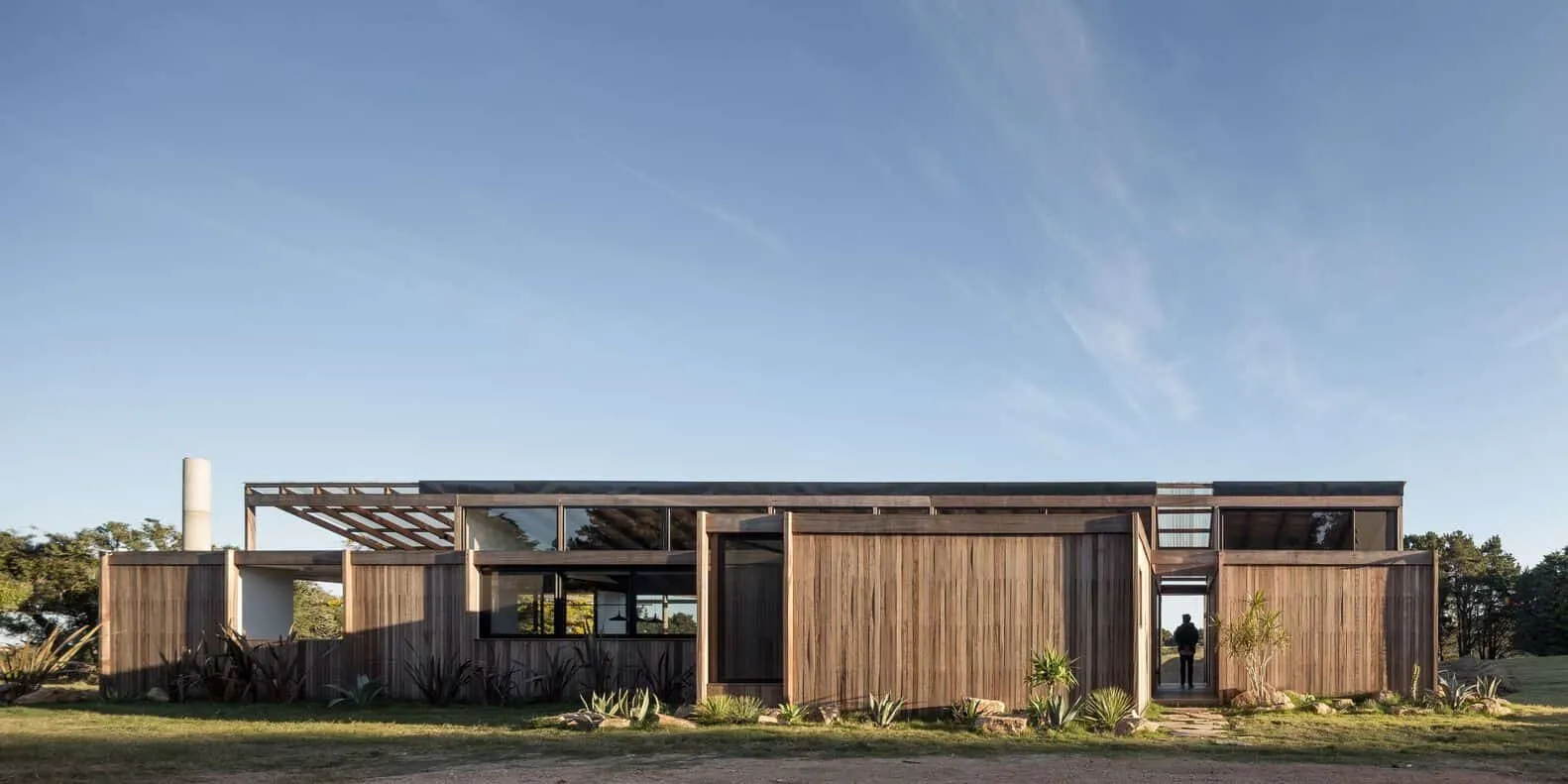 House Mat by Mutar in Garzón, Uruguay
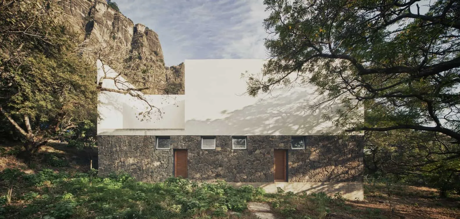 House of Mesitla by EDAA in Tepoztlán, Mexico