When Interior Starts with Color: How to Choose a Palette You Won't Get Tired Of
Spoiler: calm tones make the interior not bland but thoughtfully designed, especially if based on a well-assembled color scheme
Color is not just a background. It shapes mood, helps zone space, and can be a detail that sets the character of an interior. But how do you choose a palette that will delight for years to come, not bore you, and remain flexible for possible changes?
We explain how to make an interior expressive, even if you don't love bright accents.
Eternal colors — not boring
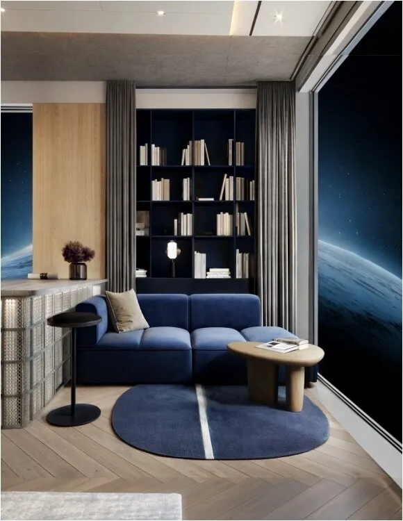
Basic tones are often underestimated: they seem to add no character. In reality, it's precisely complex, dusty, muted tones that make an interior deeper and more refined. Tones function not as a background but as a flexible and aesthetic foundation. Moreover, they adapt more easily to changes in furniture, textiles, or stylistic accents: the interior doesn't 'fall apart' if you remove a colorful throw blanket.
The key here is not to pick tones randomly, but to find those created with an understanding of spatial perception.
When Color Is Thoughtfully Chosen: Capsule Approach
Picking a palette is not about choosing 'like or dislike'. The focus shifts to balance, compatibility with textures, and longevity, especially if you're designing a whole project rather than just one room.
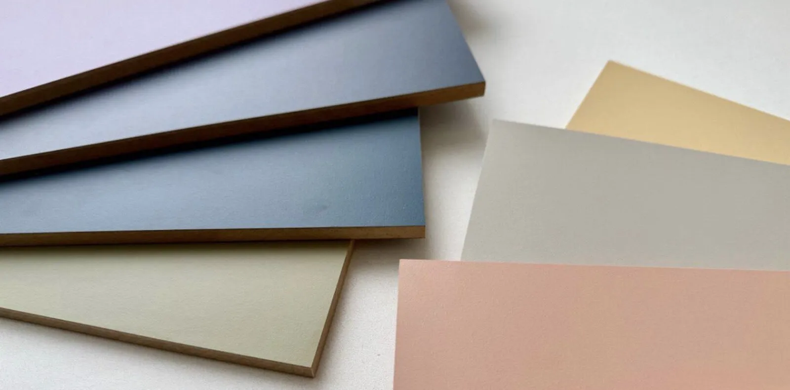
To avoid chaos and not get lost in hundreds of shades, designers rely on capsule palettes — carefully planned color systems where each tone relates to others and is easily combinable. One of the most accurate examples of this approach is the new PerfectSense® Top facade panel collection from EGGER.
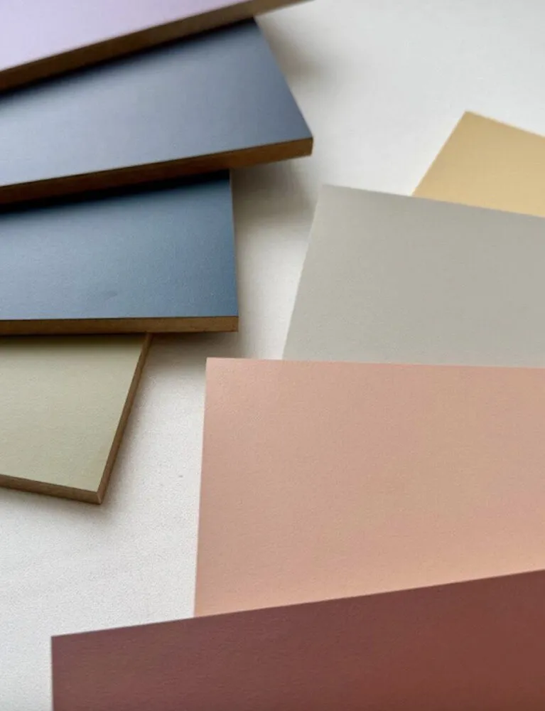
The collection was created with consideration of color trends and real-life usage scenarios in interiors. It includes 20 solid-color finishes — from noble dark tones to light muted shades that easily blend into various stylistic directions.
The colors are not flashy but refined: they don’t tire or bore, yet create character. What's especially important is that these tones do not exist in isolation: the palette is integrated into the global 24+ decor collection, making it easy to combine with wood textures and other finishing materials.
Strength in Details: How Technology Affects Color Perception
To make color in an interior look expressive, it's not enough to simply choose a beautiful shade: how it appears on the surface matters. That’s why more designers opt for matte materials: they eliminate glare, soften color, and visually enhance the look.
In PerfectSense® Top panels, this effect is achieved through a finish coating that creates a super-matte, velvety texture. But behind this visual effect lies a complex engineering structure — the proprietary PUFF-pie technology that primarily ensures durability.
The name PUFF-pie (from the English term 'layered pie') reflects its essence: each panel consists of several functional layers, each enhancing performance characteristics. In the center is an MDF base that ensures stability and resistance to deformation.
Next come several layers impregnated with resins, acting as an internal frame that increases resistance to scratches, chipping, and moisture. On the outside are impregnated decorative paper and a protective coating that forms that visually clean, fingerprint-free matte finish.
As a result, these panels are suitable not only for vertical applications but also for complex horizontal surfaces — from countertops to sliding doors. This is more than just a decorative solution; it's a multi-functional facade material where aesthetics, tactile qualities, and durability are balanced at an engineering level.
Color as Accent: Less Is More
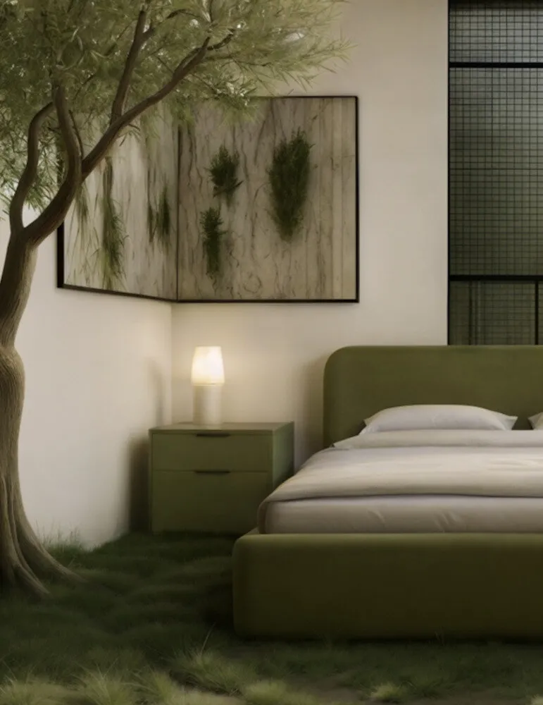
You don’t have to use a lot of color in an interior to make it interesting. One rich but calm tone can define the style of a space: for example, an olive cabinet, deep blue kitchen facade, or gray-lavender panel in the hallway. This approach works well for those who are afraid of overdoing it with colors.
The PerfectSense® Top range includes shades designed precisely for such 'point work': expressive yet not tiring, thoughtfully crafted so that the interior looks like the work of top design studios.
Color = Emotion, Not a Trend
Trends come and go, but your feeling of home stays with you for a long time. Therefore, it's better to focus not on 'color of the year', but on shades that create the desired mood: relaxation, lightness, energy, or focus. The same color can be cozy or sterile — all depends on its depth, undertones, and surroundings.
When choosing a palette, imagine how you feel in that color. If calm, confident, and warm — then it's yours.
Start with the Floor or Facades, Not Pillows
The most common mistake is starting with small details (throws, curtains, accessories). Actually, it's large surfaces that define the main palette: floor, walls, large furniture. It’s better to start from these, and then small elements will naturally complement the overall look.
If you're unsure about wall color, you can 'catch' harmony through furniture or finishes, and then build the rest around them. This method reduces the risk of visual clutter and simplifies choosing decorative elements.
An interior should not adapt to trends, but rather adapt to you. That’s why thoughtfully developed palettes become more than just a background — they are tools that help you create a personal space.
Advertisement. egger-russia.ru. LLC 'Egger Drevprodukt Shuya'.
Need a renovation specialist?
Find verified professionals for any repair or construction job. Post your request and get offers from local experts.
You may also like
More articles:
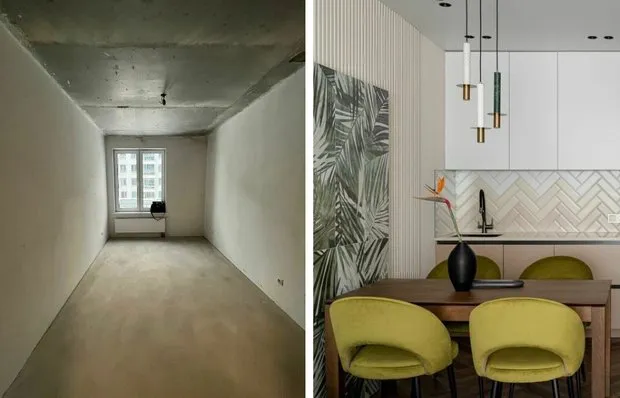 How We Designed a Kitchen with Natural Accents and Graphic Details
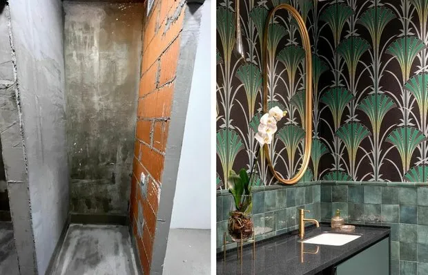 Stunning Green-Toned Bathroom with Art Deco Touches
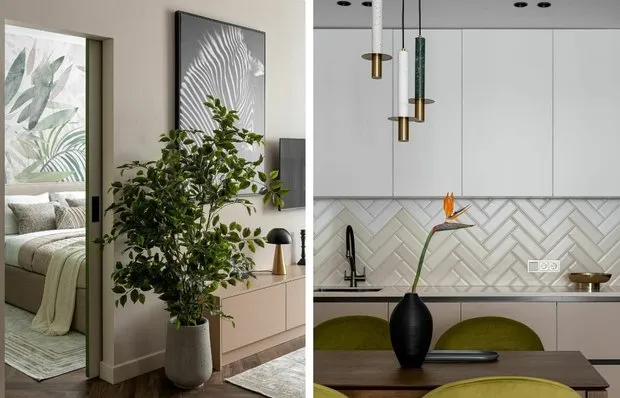 7 Ideas We Spotted in the Transformed 54 m² Eurodouble
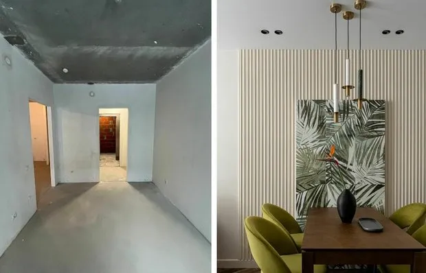 How to Create a Stunning Interior from a Faceless Apartment in Kazan
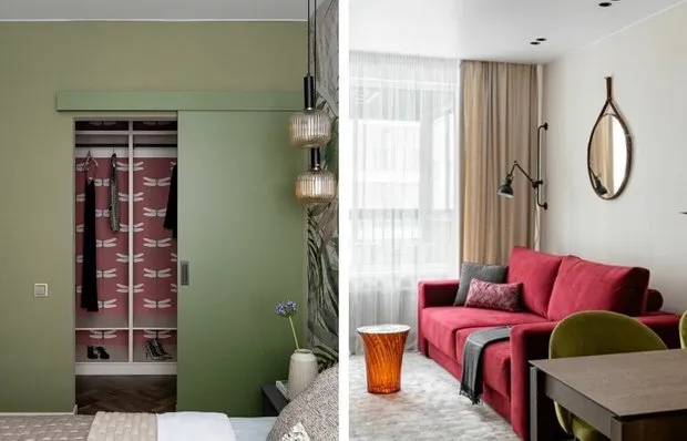 How to Organize Storage in a Eurostudio: 5 Ideas Inspired by Our Heroes
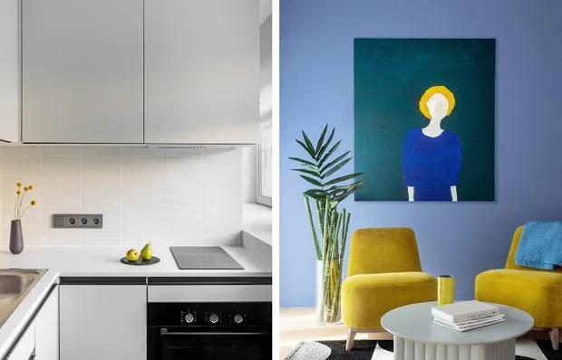 Why Millennials Love Minimalism, and Zoomers Prefer Bright Interiors? It's Not That Simple
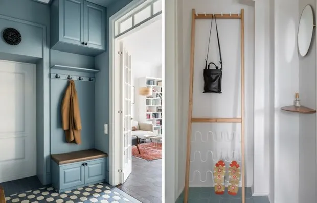 How to Organize Storage in the Foyer: 7 Great Ideas
 Summer Accents: 10 Green Finds for a Stylish Interior