Pantone Announces the Color of the Year 2022: How It's Chosen and Why It Matters
We explain where the shade comes from that is used as a reference point all over the world
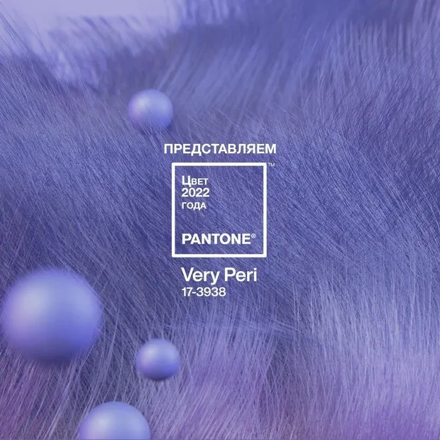
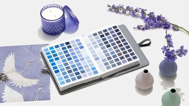
Every year in December, the long-awaited news is published — the Pantone Color Institute determines the main color of the coming year. The shade always provokes lively discussions, not only among those whose work is directly related to color. In 2022, the main color will be Very Peri — a blue shade with a red-violet undertone.
However, few people think about why Pantone conducts such research and where the specific shade comes from. We explore why choosing the color of the year is truly a major event.
A little about Very Peri — the main color of 2022
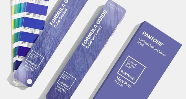
The shade 17-3938 Very Peri, becoming the main color of 2022, can be called truly unique. Pantone created this color for the first time independently rather than choosing from an existing palette. The Institute describes the new color as "a dynamic blue with a vital violet-red undertone, combining loyalty and constancy of blue, as well as energy and excitement of red."">
On the Pantone website, the color is called "a symbol of global zeitgeist and transitional period." During the development of Very Peri, specialists relied on a new reality where the popularity of the metaverse and the presence of art communities in digital space are rapidly growing.
"Society continues to realize that color is an important form of communication and a way to express emotions. The complexity of this new blue with red-violet undertone underscores the tremendous opportunities opening up for us," added Lori Pressman, Vice President of the Pantone Color Institute.
 Pantone.ru
Who are Pantone?
When we learned about the color of the year, it was time to tell about the organization itself. Pantone is an American company with a remarkable reputation, founded in the 1950s. Many experts claim that Pantone is the most authoritative source of information on color and tints. Pantone deals with developing color palettes, brands can consult with them, and the company also analyzes market trends.
Pantone gained fame in the 1960s when specialists created a standardized color selection system — the Pantone Matching System. Each color and shade now has its own number and name, and a convenient fan-shaped catalog significantly simplified designers' work.
Now, the client simply names the number of the preferred shade: it can’t be mistaken for another tone, and there’s no doubt about the color of the final product. By the way, palettes are used not only by interior designers but also by fashion houses, and some countries even selected flag colors based on the table.
 Pantone.ru
What is the Pantone Color Institute?
The Pantone Color Institute is part of Pantone, dedicated to studying the impact of color on various spheres of our lives. The research center analyzes how tints affect fashion, interior design, advertising, cinema, printing and other industries. The Pantone Color Institute not only observes the present but also predicts future color trends.
The organization has been determining the color of the year since 2000. From the Pantone registry, experts select a color that will peak in popularity in all areas in the coming year. For example, in 2021, the Color Institute chose two shades — deep gray and bright yellow. According to researchers, these are "two independent colors whose union creates an inspiring color pair that combines the sense of depth and thoughtfulness with an optimistic promise of a sunny day."">
 Pantone.ru
How is the color of the year determined?
If you think that determining the main shade depends on the taste preferences of members of a secret committee, we’re here to surprise you. The process is much more tedious, lengthy and serious than it might seem at first glance.
Every spring, a large-scale study begins, during which experts must discover recurring color patterns. It takes nearly nine months. Before announcing the main color of the year, specialists immerse themselves in various fields: they study art, films, designers’ creations, popular clothing colors, concerts, sports events, interior design trends, industrial design and tech innovations. Pantone also follows new materials, textures, popular websites and social media.
In the end, committee members must agree on one variant, but this doesn’t always happen. In such cases, the color of the year becomes two shades — exactly what happened just before 2021.
 Design: ANDdesign
How do they come up with names?
Many people have wondered why a vibrant violet shade is called "Royal Purple," and why the color of 2021 was indeed "Pure Gray."">
When choosing a name, Pantone uses associations: of course, every shade has a digital code, but it’s unlikely that anyone can identify the color just by the set of numbers. The main task of specialists is to give a shade such a name that the word or phrase allows one to instantly visualize the color.
For example, for yellow and red shades, associations with food are used: agree that it’s easy to imagine "Strawberry Pink" or "Ripe Pumpkin." And the "Royal Purple" is explained quite simply — in our consciousness, violet has long been associated with luxury.
 Pinterest
What impact does the color of the year have?
It might seem that the color of the year becomes popular precisely due to Pantone. This statement is not entirely true. Although choosing the main shade indeed influences product development in completely different industries, it should be remembered that Pantone selects a color that already enjoys popularity. The company just emphasizes this point and gives it publicity.
Undoubtedly, after the study results are published, the color becomes even more in demand, and this is also supported by Pantone itself — every year the company produces souvenirs and gadgets in the main color.
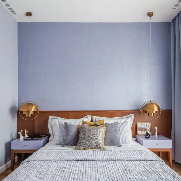
Also, Pantone releases exclusive collaborations with fashion and cosmetics brands — the shade’s recognition increases once again. And the companies themselves always pay attention to the color of the year: Adobe released an instruction on working with the color of the year in Photoshop, shops re-evaluate their store displays, interior and fashion designers add the trendy color to their projects, and even confectioneries make special toppings in the popular shade.
Need a renovation specialist?
Find verified professionals for any repair or construction job. Post your request and get offers from local experts.
You may also like
More articles:
 Storage in a Studio Apartment: 6 Functional Ideas
 Budget-friendly but very beautiful 6 sqm bathroom DIY
 Beautiful Kitchen for 63 Thousand Rubles with IKEA Furniture
 How to Choose a Color Palette for Interior Design: 10 Tips
 Where Did We Save Money? Renovating a Stalin-era 53 m² Apartment for 700 Thousand Rubles
 How to Choose a Bathtub to Avoid Regret: 5 Tips
 7 bloggers' bedrooms in Scandinavian style: without a designer, but with taste
 Kitchen for 29 Thousand? How They Designed a 10 m² Kitchen in a Stalin-era Apartment