How to Choose a Color Palette for Interior Design: 10 Tips
How not to get lost in a huge color palette when choosing interior finishes and decor? We share ten tips that will help you make the right choice
Color is the main aspect that sets the mood for the entire interior, so you should approach its selection with special attention. This task often puts people in a dilemma, but our ten tips will help you make the right choice.
1. Pay Attention to Your Wardrobe
Your wardrobe is a great source of inspiration for choosing colors. When we prefer a certain color in clothing, we try to highlight our strengths and show our character. We unconsciously choose colors that improve our mood. Therefore, your favorite colors can be safely transferred to the interior.
2. Use the Rule of Three Colors
Feeling lost in a vast variety of colors? Remember the golden rule of three colors: choose three shades and repeat them in different elements of decoration.
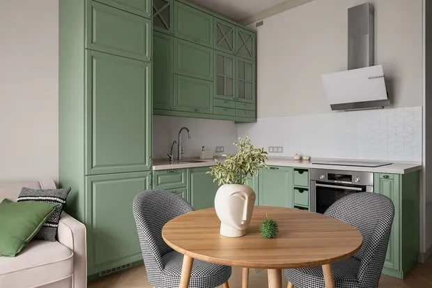 Design: Alla Senichyeva
3. Remember the 60/30/10 Ratio
The color ratio in space should correspond to the 60/30/10 formula, where 60% should be taken up by the main, dominant color, 30% — secondary color, and 10% remains for color accents. Usually, the dominant color is the walls, secondary — furniture upholstery, and accent — accessories and decorative items.
4. Add Variety with Similar Tones
An interior using only three colors can be too bland. To avoid this, yet not create color chaos, add lighter or darker shades of the colors already used.
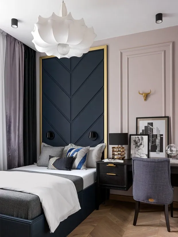 Design: Anastasia Kovalchuk
5. Maintain Balance Between Warm and Cool Tones
A harmonious interior always combines warm and cool colors. A saturated warm color should be complemented by two cool, light tones, and vice versa: a bold and vibrant cool color should be softened with sunny warm tones.
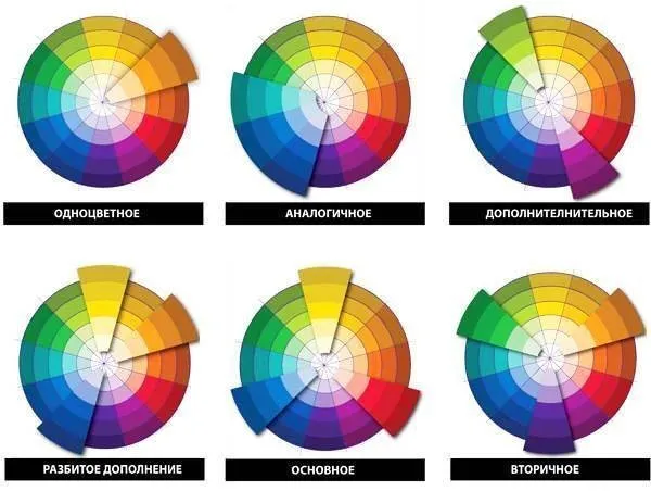
6. Use Proven Color Combinations
If you're afraid of making a mistake in color combinations, refer to the color wheel. You can be absolutely confident in several options: complementary, equidistant, analogous, and monochromatic schemes.
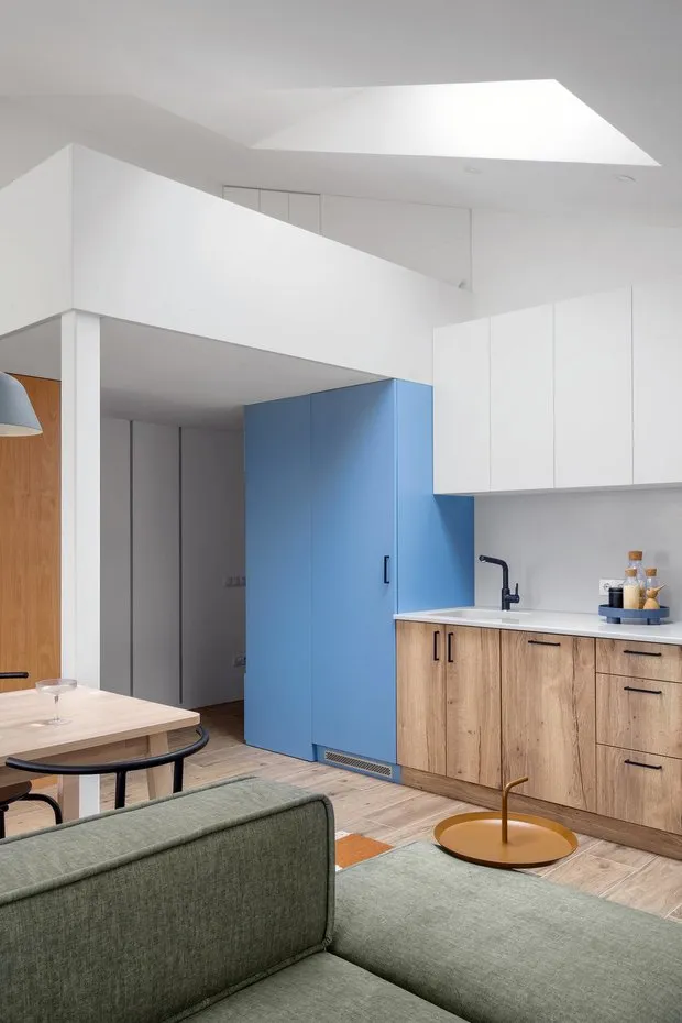
 Pinterest
7. Remember the Weight of Different Colors
The choice of color depends on the size and layout of the room. Soft, muted tones and simple patterns make space appear more spacious and open because they have less visual weight. Therefore, they are ideal for small rooms. Conversely, bolder, brighter, and more saturated colors, as well as large patterns, suit spacious rooms because they add visual weight.
8. Don't Forget That Any Material and Texture Has Its Own Color
Wooden floors, brick walls, chrome hardware, and gilded mirror frames — any detail in the space has its own shade that should be taken into account.
Too much variety in colors can turn an interior into a true chaos, and the final drop might be such a seemingly insignificant detail as the color of cabinet handles that don't match other metal elements.
 Design: Olga Bondar
9. Remember Harmony
An interior becomes harmonious when darker tones are placed lower, and lighter ones higher. Even in light Scandinavian interiors, the floor is darker than the walls, following nature where the earth is always darker than the sky.
10. Create a Color Swatch Catalog
Collect your own catalog of color swatches when selecting paints, materials, furniture upholstery, and decorative items. It’s quite hard to remember the right shade, but with swatches you’ll always be able to easily navigate in stores.
Text: Lana Zolotar
Photo: Cover design by Olga Moiseeva
Need a renovation specialist?
Find verified professionals for any repair or construction job. Post your request and get offers from local experts.
You may also like
More articles:
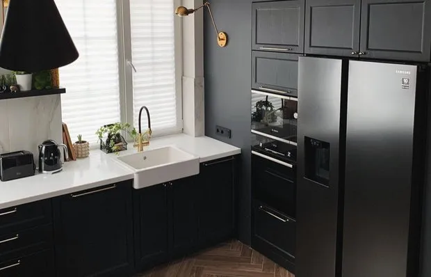 Black Kitchen 10 m² Done by Yourself: Bold and Very Stylish
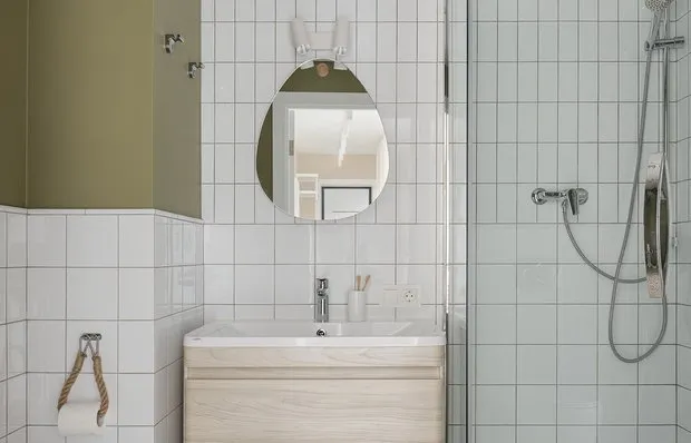 7 Cool Interior Ideas for a Small Bathroom
 6 very beautiful interiors where the main accent is floor covering
 High-Speed Internet in a Private House, Like in a City Apartment: Connection Guide
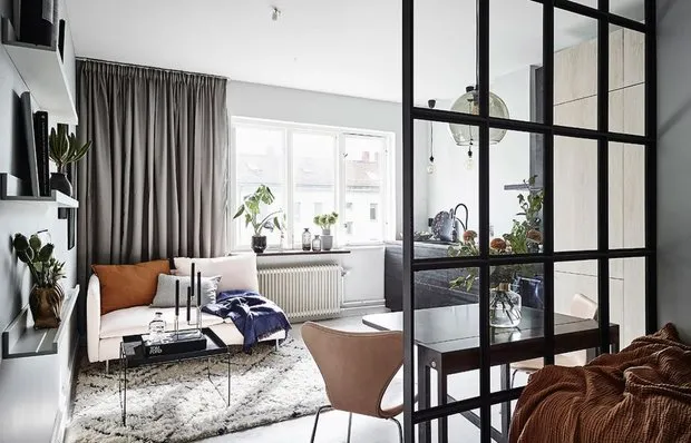 Beautiful cozy studio apartment 25 m² in Sweden
 6 Budget Ideas for the Hallway That Everyone Can Replicate
 How to Decorate Your Home for Halloween + BONUS: Top 7 Scary Movies to Watch This Evening
 8 Very Useful Bathroom Items You Probably Don't Have