How to Make a Monochrome Interior Uninteresting
Monochromatic projects often seem unexpressive and poor. Decorator Olga Legoshina explains how to give them hypnotic depth.
In monochromatic interiors, there is no ironic multicolor pop art or faceted contrasts of art deco, nor the charm of vintage hues. But what you can't refuse monochrome projects is hypnotic depth, polyphony of various textures, and, of course, color that envelops space with the softness of velvet, silk-like shimmer, or glossy shine. Decorator Olga Legoshina talks about those who know how to make monochrome uninteresting.
Olga Legoshina, Decorator
"We orient ourselves on the properties of the client's personality and create spaces that correspond to their individuality, but we also strive to make the interior multi-layered and unconventional."
Some decorators work with intense tones, allowing them to resonate at full strength, but only within one zone. Others base their work on muted colors and "dress" each room in them, bringing adjacent shades to maximum uniformity. In every case, the choice of style and materials is crucial, which shape and mold the space.
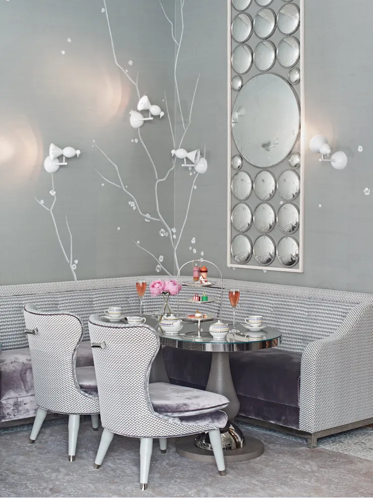
Robert Engell filled the interior with a shimmering glow, delicate shades of pearl, lavender, and blue, visible in the velvet upholstery of chairs, silk carpets, and marble finishes.For example, look at the Collins Room restaurant located in the glass pavilion of The Berkeley hotel in London, dedicated to the work of David Collins. Its designer, Robert Engell, filled the interior with a shimmering glow, delicate shades of pearl, lavender, and blue, visible in the velvet upholstery of chairs, silk carpets, and marble finishes.
Opalescent glints multiply in numerous mirror surfaces, slightly muted by translucent porcelain lamps, and create a special silence in which you can hear whispers, rustles, or melodious chimes.
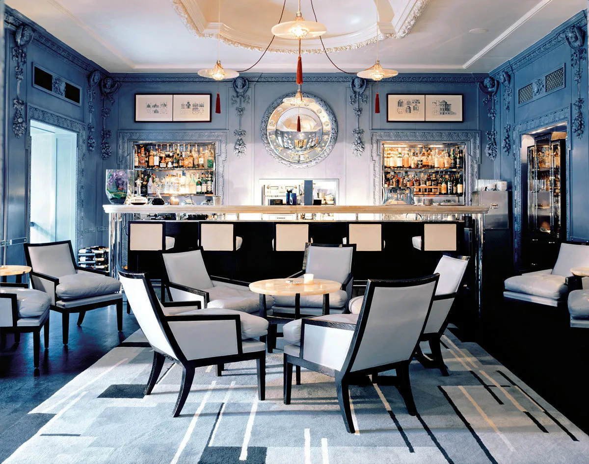
Here is a typical work by David Collins himself, created twelve years ago for the same hotel The Berkeley – the legendary Blue Bar. The blue color seeps through the walls with luxurious carving, sometimes fading and nearly disappearing, at other times enhanced by bold red details.
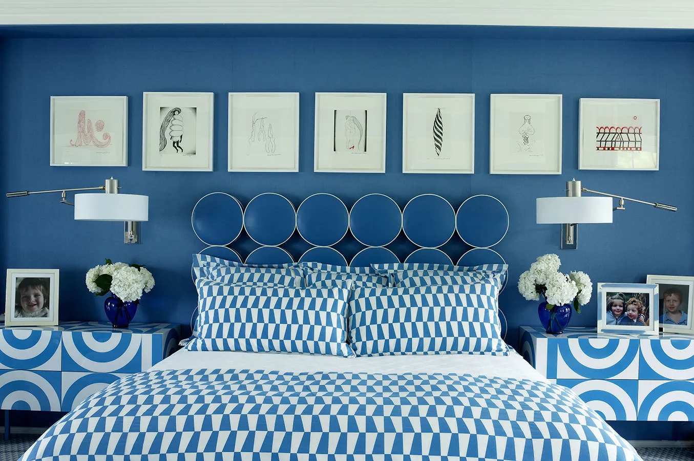
Large lovers of blue tones were also partners William Diamond and Tony Baratta (William Diamond passed away a few years ago). Every second project of theirs meticulously and thoroughly conveys the decorators' love for this noble color. But even more, designers respected expression and diversity, so even the most monochromatic interiors in their portfolios radiate brightness, liveliness, and playfulness.
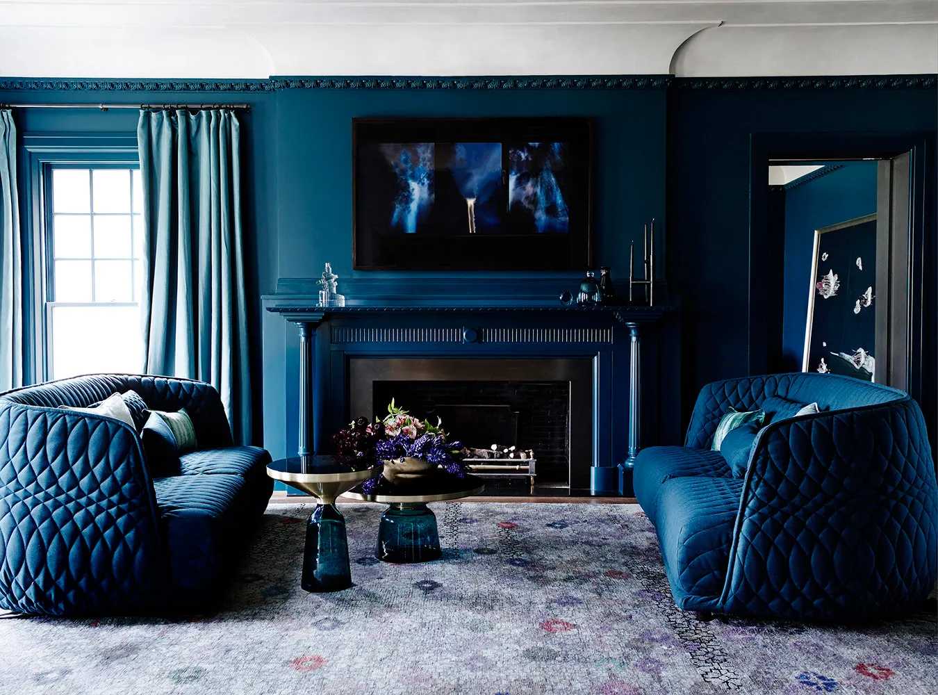
It should be said that blue interiors are not rare. Designers love this color for its lightness, freshness, and reminder of the welcoming southern sky. Most decorators approach deep blue with respect, but few dare to clothe even one room entirely in ultramarine.
Walls, furniture, curtains, and even paintings are painted in saturated blue, while the muted palette of the carpet, pristine white ceiling, and bright light from windows dilute the magnetic monochrome.However, architect Robert Mills dared to designate the most eye-catching room in a house located in Melbourne as the one for this provocative color – the living room. Walls, furniture, curtains, and even paintings are painted in saturated blue, and only the muted palette of the carpet, pristine white ceiling, and bright light from windows dilute the magnetic monochrome.
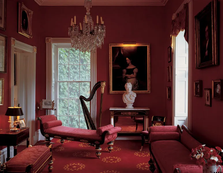
Let's not dwell in detail on red interiors, just remind that this is one of the most challenging colors for monochromatic mastery, and designers who can "tame" it deserve the deepest respect.
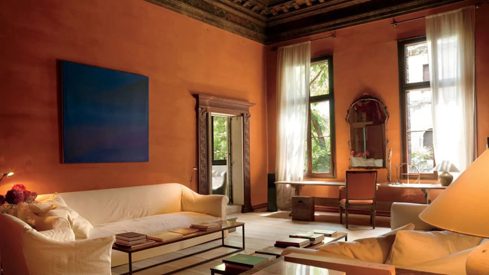
Where there is red, there is orange – rich and expressive, like the walls of the living room in Axel Vervoodt's Venice apartment. The overall style is traditional Belgian, with restrained colors, covered furniture, intricate combinations of rustic textures, carved details, and a lot of antiques.
Walls of the living room, which was originally a bedroom, were painted in saturated orange by the decorator, and the furniture was covered in vanilla-colored covers, tables in walnut tones – and the room was charged with special energy.The walls of the living room, which were originally a bedroom, were painted in saturated orange by the decorator, and the furniture was covered in vanilla-colored covers, tables in walnut tones – and the room was charged with special energy, which is further emphasized by a single contrasting painting – a blue abstraction by Jeff Verheyen.
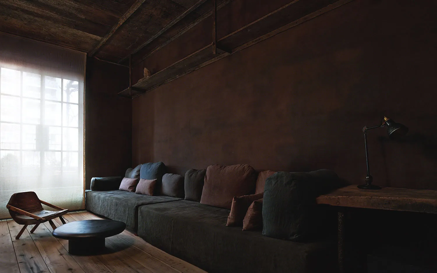
Fans of Axel Vervoodt know that for his work, more typical are complex meditative shades of nature: soil, trees, sand, and wavering light through windows. The Greenwich Hotel is located in New York, but by the appearance of its penthouse decorated by Vervoodt, you wouldn't think so.
The interior of The Greenwich Hotel is based on Japanese wabi-sabi aesthetics, which is embraced by Belgian designer Axel Vervoodt.The interior is based on Japanese wabi-sabi aesthetics, which is embraced by Belgian designer Axel Vervoodt. Visually minimalist but rich in content, the plasticity of lines, tactile textures, and objects with a rich history written on their surfaces – this is the simple formula for these monochromatic spaces filled with deep meaning.
If speaking about sensual textures, one cannot fail to mention the Scandinavians who know how to reproduce in their homes the atmosphere of eternal winter – that same one that fascinates with its attractive melancholy and shimmering delicate shades within a clean white palette.
In the ScandinavianNeed a renovation specialist?
Find verified professionals for any repair or construction job. Post your request and get offers from local experts.
You may also like
More articles:
 Arranging a Small Apartment: 5 Useful Tips
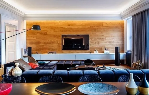 How to Transform a Bachelor's Den into a Masculine Interior
 Wall as Organizer: 4 Interesting Finishing Options
 Test: How Well Do You Know Soviet Design
 If You Missed It: 10 Best Articles of February
 How to Buy Real Estate Without Leaving Home
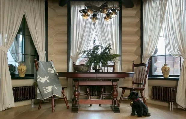 10 Ideas for Decorating a Wooden House
 How to Raise Low Ceilings: 7 Pro Tips