Before and After: Budget Renovation of a 60 m² Studio in a Brick House
The renovation was done very economically: they refused to reconfigure the layout, kept most of the furniture, and painted the walls with a gradient.
Designer Petr Grigorash decorated the studio for rent in a brick house built in the 1990s. The client approached with the task of doing a renovation on a minimal budget — meaning maximum preservation of everything that is in good condition. It was also desired to use interesting decorative techniques to make the apartment stand out from other listings. We show what was achieved.
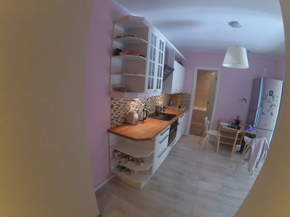
Kitchen Before Renovation
About 10 years ago, a renovation was done in this apartment: the kitchen was moved to the hall to create two separate rooms, and the balcony was attached to the bedroom. The kitchen had a linear cabinet and dining area with a table near the door to the bathroom.
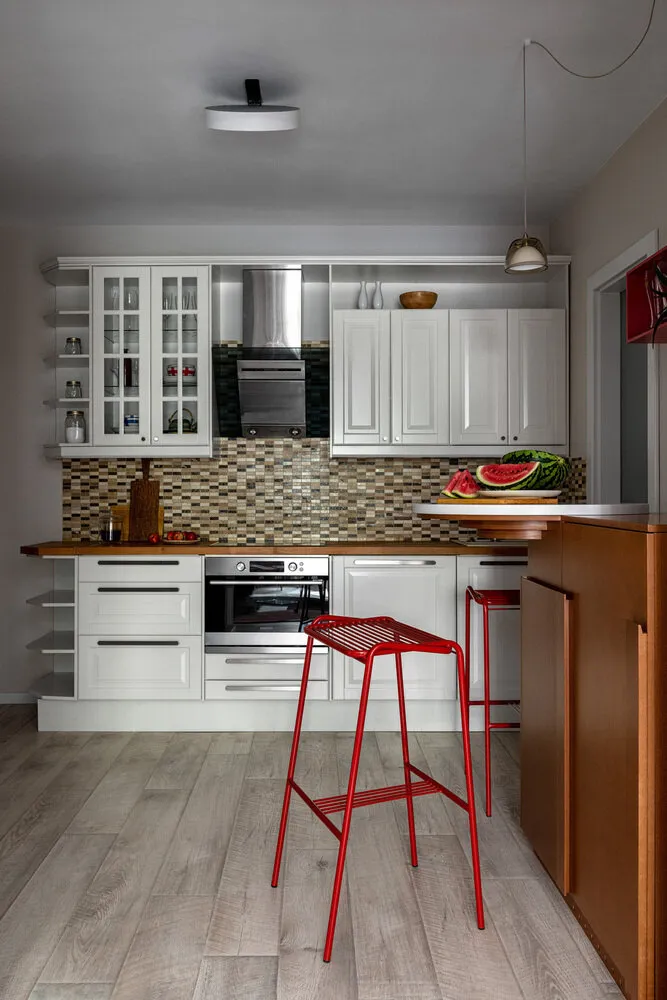
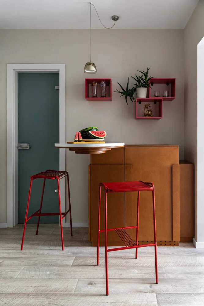
Kitchen After Renovation
The kitchen furniture had to be kept completely as replacing it would have led to significant costs. It was decided to place a small breakfast table in the spot of the tall refrigerator and install the refrigerator and other storage systems under its countertop. This way, it was possible to solve not only the functional task but also create an interesting element visible from different parts of the apartment.
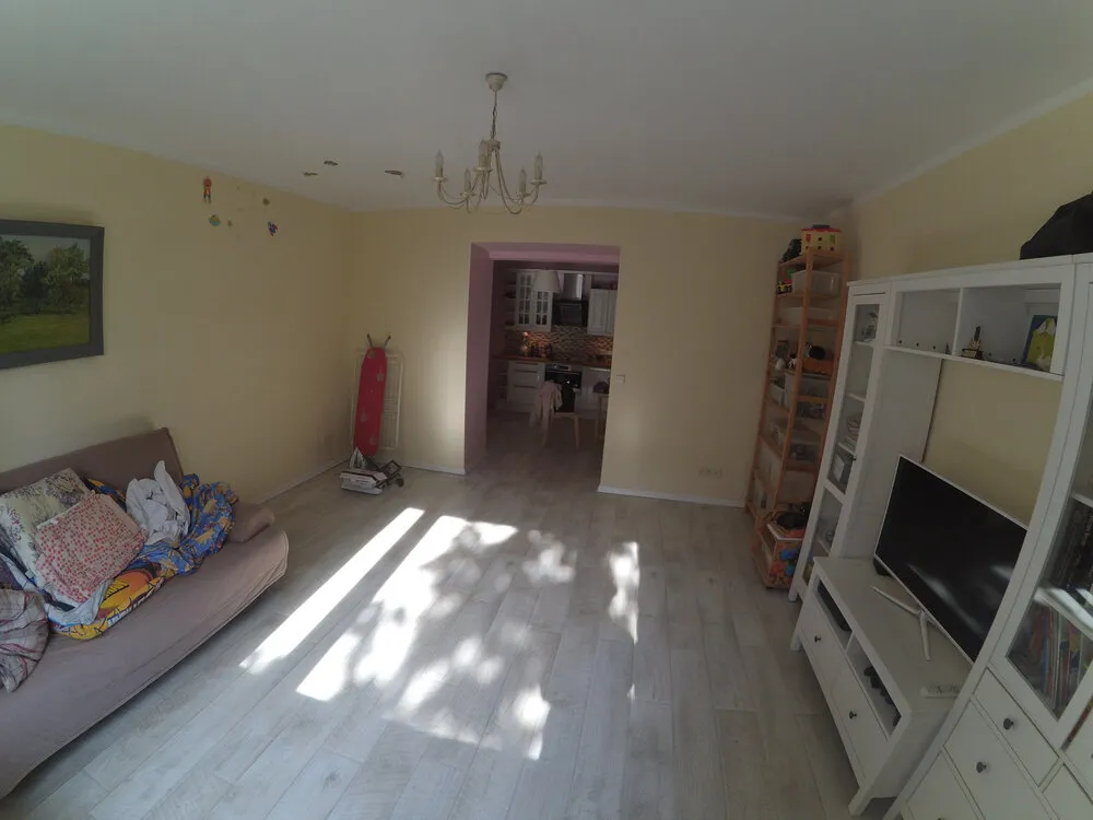
Living Room Before Renovation
The living room had a rather simple layout: the TV area and shelves on one wall, and the sofa on another, which created a certain imbalance. The wall color also simplified the overall look.
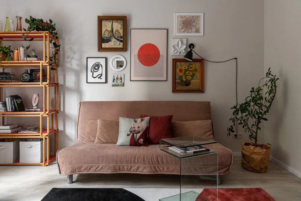
Living Room After Renovation
The main accent was the active gradient terracotta paint in the living room. This significantly influenced the perception of the object as bright, unusual, and even artistic.
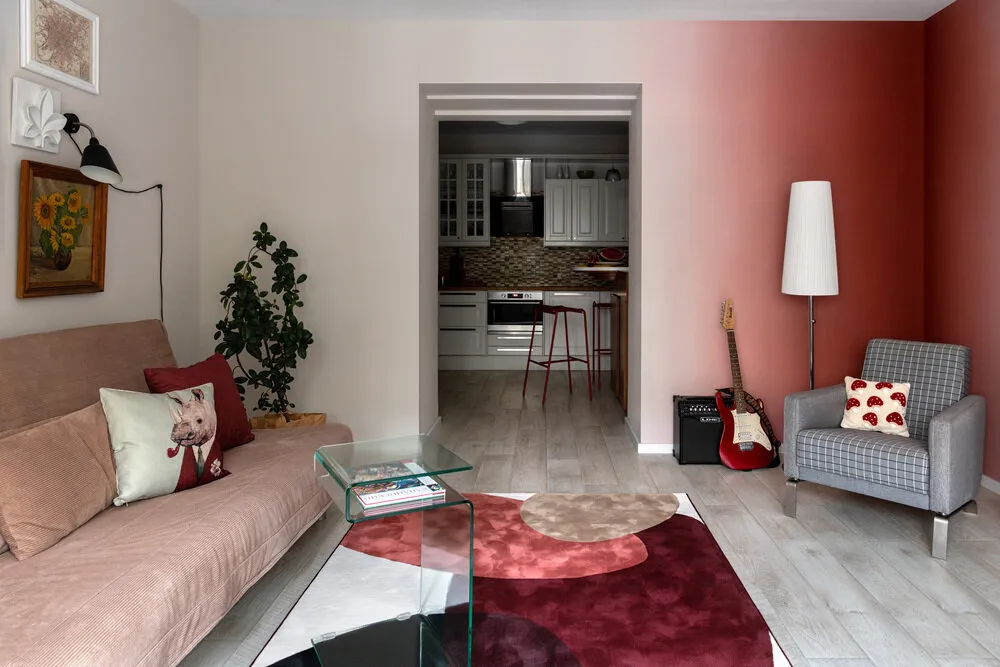
It was not possible to abandon furniture that is functional but does not fit stylistically into the interior. Therefore, the main focus was placed on decoration. For example, a wallpapered picture hanging was organized above the sofa — now the space looks stylish.
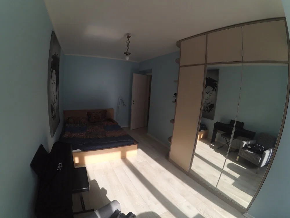
Bedroom Before Renovation
The bed was located in the darkest part of the room. The bulky wardrobe made the space feel heavier. Overall, more warmth was desired.
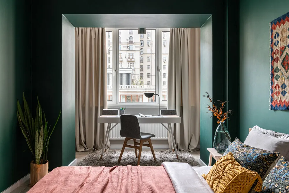
Bedroom After Renovation
A rearrangement was made in the room: a workspace was set up by the window, the bed was placed in the center with its headboard facing the wall, and the wardrobe was moved further from the window. The quality of the renovation work done 10 years ago was not that high, so during the rearrangement of the wardrobe in the bedroom, it was discovered that the ceiling in the room was so uneven that the wardrobe could not fit in its new location by height, and it was necessary to urgently negotiate with a carpentry company for its trimming
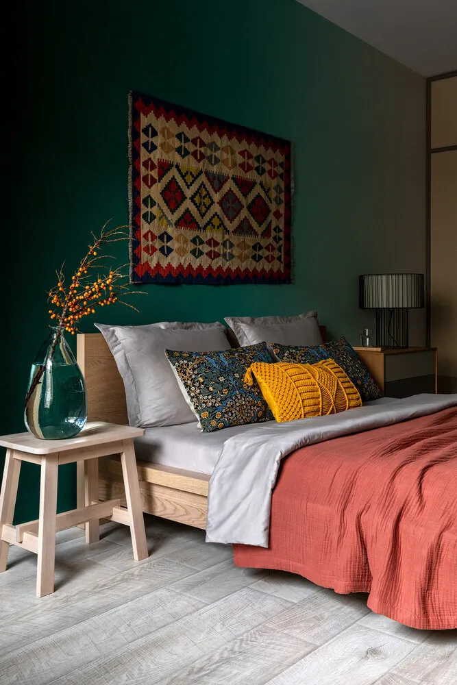
Green gradient paint was chosen for the walls — the workspace now looks brighter, and the bedroom itself became more intimate and cozy. An interesting detail is the bright rug in the headboard area of the bed.
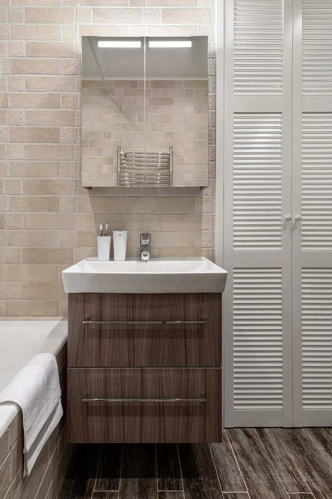
Bathroom Before Renovation
The bathroom had two zones: the bathtub and the sink with a mirror, and a somewhat unattractive laundry area.
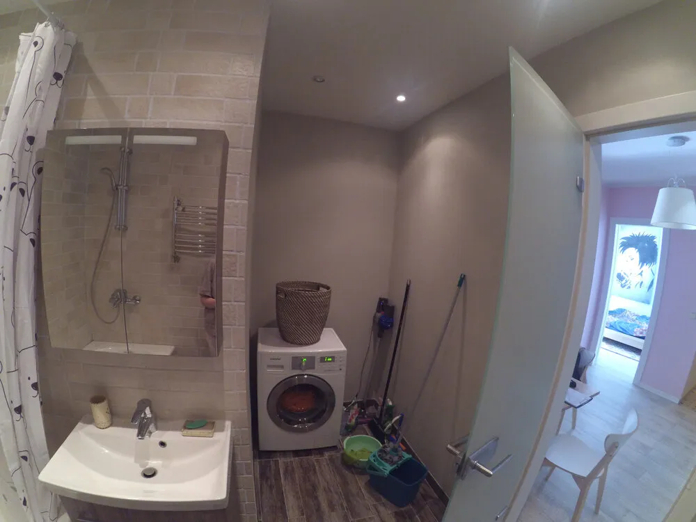
Bathroom After Renovation
Blinds were installed in the bathroom, which allowed separating the laundry area into its own zone.
Want more details? Watch the full project
Need a renovation specialist?
Find verified professionals for any repair or construction job. Post your request and get offers from local experts.
You may also like
More articles:
 10 Cool IKEA Products for Your Bedroom
 Two Excellent Options for Kitchen-Dining Room Design
 10 IKEA Products for a Cozy Living Room
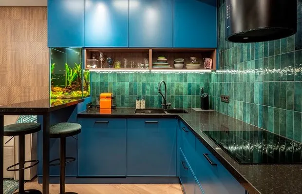 Wow! Bright Kitchen with Thoughtful Storage and Built-in Aquarium
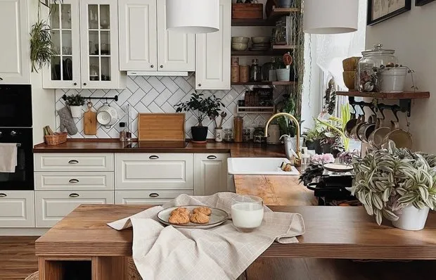 Kitchen Storage: 6 Great Ideas from Our Heroes' Projects
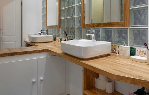 Storage in a Small Bathroom: 6 Ideas from Real Projects
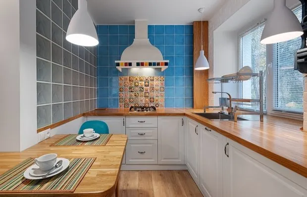 How They Redesigned a Standard Kitchen in a Tiny Khrushchyovka
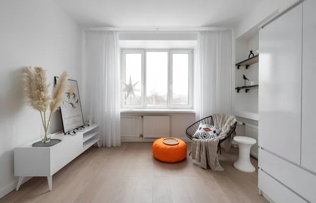 Before and After: How They Refreshed Old Apartment Renovation in a Brezhnev-Era Flat for 850 Thousand Rubles