7 Interior Design Tips That Designers Will Never Recommend
Alexander Osipov shares what to avoid in interior design
There are several mistakes that can ruin even the newest, modern, and creative design. Before starting a renovation, check if any of these have crept into your project. What tips should you avoid? Designer Alexander Osipov explains.
Alexander Osipov Expert Conceptmaker, space designer, architect
Style Mixing
Mixing styles often leads to chaos. It's nearly impossible to successfully pick individual elements from different styles and combine them, especially when beginners take over. It's also important to remember that some styles are completely incompatible. If you don’t want your apartment to look like a salad, choose just one style.
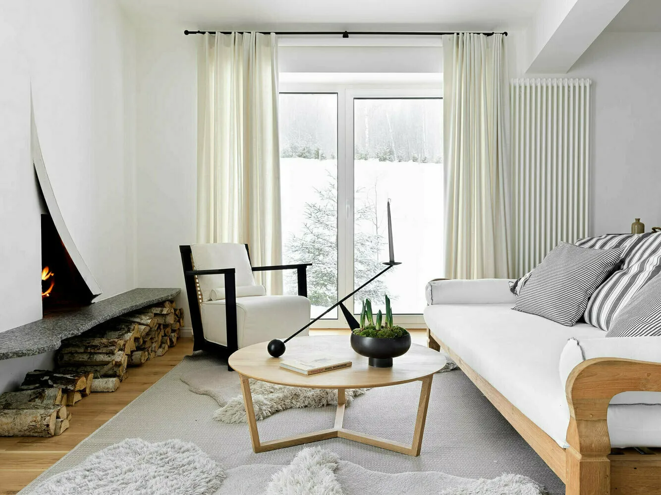 A successful example from S-style studio: This interior is designed in Scandinavian style with all its elements — wood usage, light tones, attention to decor. It looks very stylish and harmonious.
Colored Ceilings
Stepping away from the traditional white ceiling is an unconventional choice. In reality, it's a very complex design technique, the consequences of which are hard to predict. Not every colored ceiling lowers or raises the perceived height of a room — it depends on many factors.
One thing is clear: colored ceilings change the perception of space and other color choices in the room. It’s certainly possible to take a risk, but is it worth it?
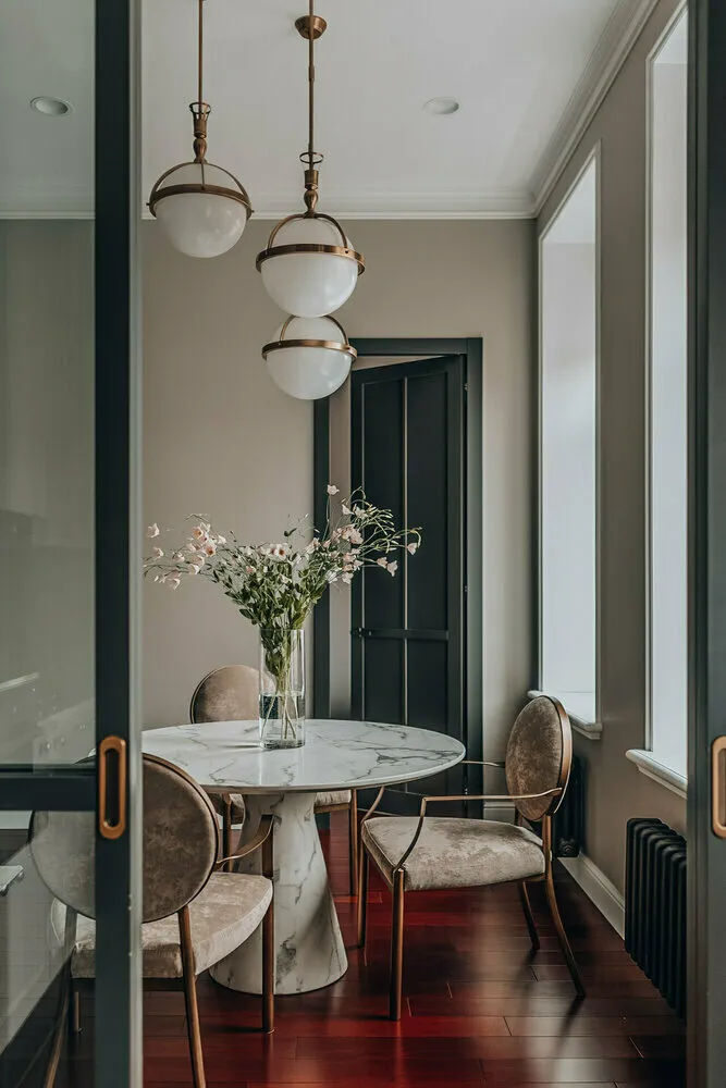 A successful example from designer Natalia Komova: A white ceiling works well with colored walls. To avoid mistakes, the transition can be styled using an elegant ceiling cornice.
Improper Ceiling Proportions
A lowered ceiling in a large room or overly high ceiling in a small one both look unharmonious and spoil the impression of even a very trendy interior design.
Owners of large rooms should also be cautious with multi-level ceilings. They divide the ceiling into levels, visually making the space disproportionate. Moreover, such constructions can create a suffocating feeling and look like a throwback to the 00s when European renovations were in vogue.
 A successful example from designer Margarita Kalinina. Afraid of overcomplicating things? Choose proven solutions, and an accent in the room can help create a unique lamp.
Improper Decor Proportions
Another common mistake in proportions is using large details in a small room or too many small elements in a large space. If you don’t maintain proper proportions, the interior won't feel cohesive.
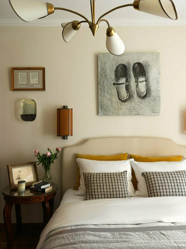 A successful example from designer Olga Komarova: If the painting above the headboard were smaller, the proportions would be off. But here all elements are chosen correctly (even the books on the nightstand aren’t too big).
Breaking Up the Room
Dividing a room by splitting the floor or ceiling is a bad idea. To make an interior look voluminous and harmonious, it's important to preserve its integrity. If you want to separate a room functionally, use zoning techniques with color, textiles, furniture, decorative structures, or screens.
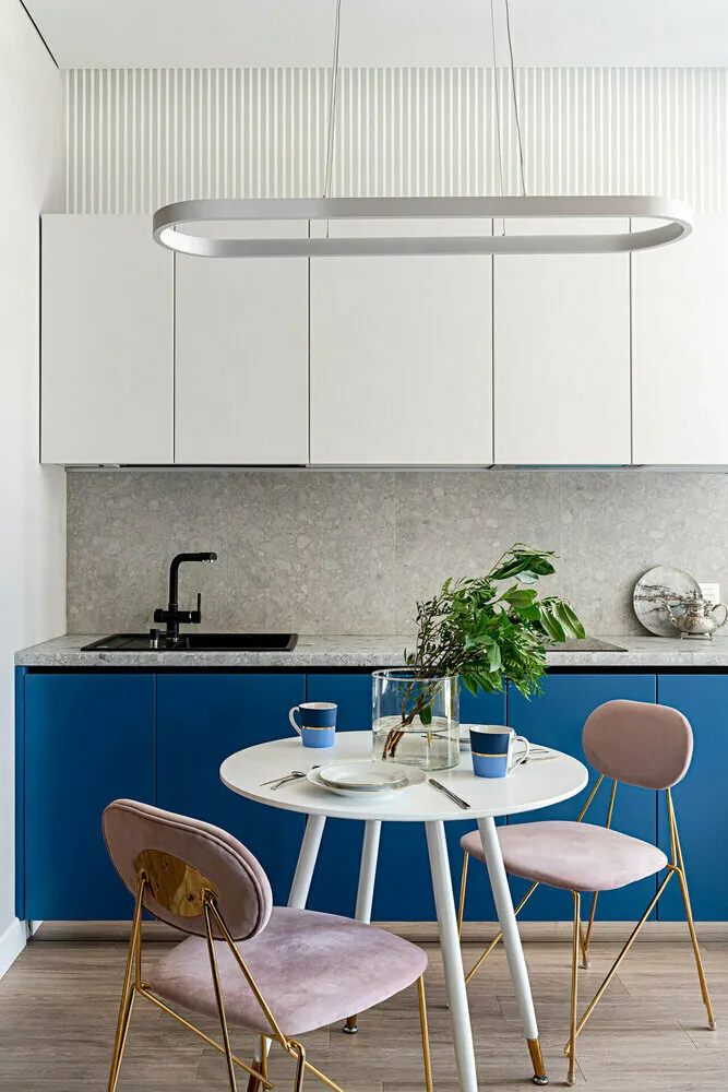
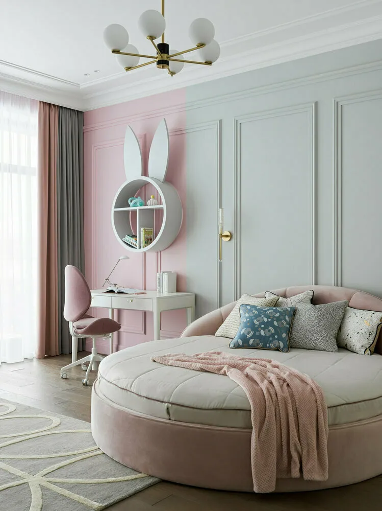 A successful example from designer Maria RUBLEVA: In this children's room, the workspace is highlighted with color — it’s a great accent and clear functional division.
Busy Color Schemes
People choose busy color schemes in interiors to make an impression or inspire admiration, but in practice, the results don’t always achieve that effect. This is a very complex design technique that even experienced specialists don't always apply successfully.
If the tones are dissonant or there’s too much color, the interior loses its simplicity and style can evoke discomfort.
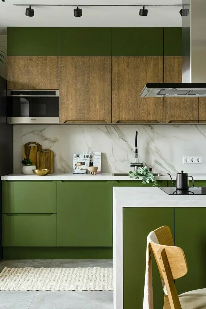 A successful example from designer Lubov Utkina: To avoid mistakes, base your design on three to four calm tones (in this case — wood, green, gray, white).
Trim in Floor Color
This outdated solution should be avoided. Today, it’s trendy and practical to match the trim with the wall color. Visually it lifts the ceiling and expands the space. Another good option is hidden installation trim, which is mounted in the same plane as the wall and doesn’t take up extra space.
 A successful example from designer Elena Rydikova: In this project, the trim matches the wall tone, and it looks much more favorable than a trim in wood tone.
Photo on cover: Project by Ksenia Skorogod
Need a renovation specialist?
Find verified professionals for any repair or construction job. Post your request and get offers from local experts.
You may also like
More articles:
 8 Tips for Decorating a Mini-Kitchen in a Khrushchyovka That You Won't Regret
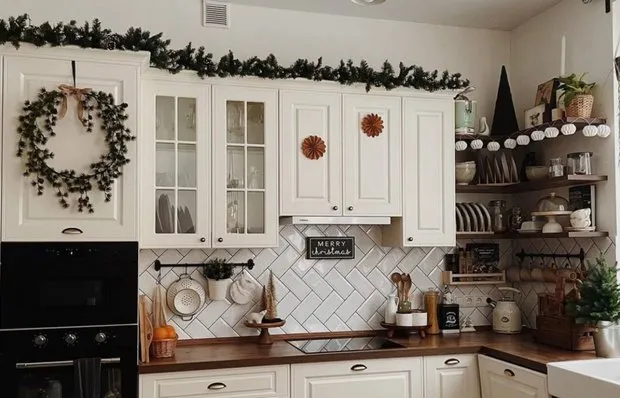 Full Upgrade of a Standard 12 m² Kitchen by Yourself
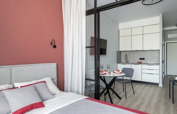 Transformed a Concrete Box into a 31 m² Studio for a Young Woman
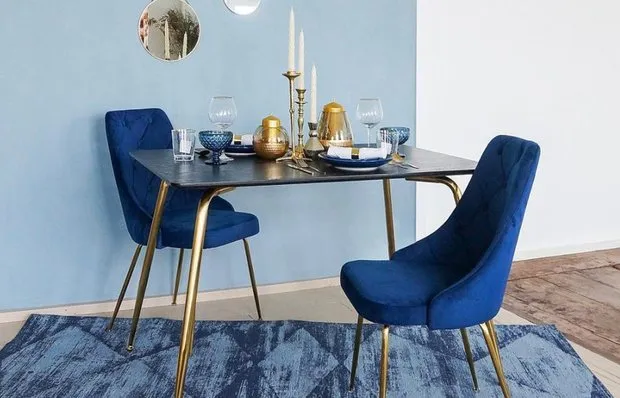 Top 10 Most Popular Chairs Under 12,000 Rubles
 74 m² Trash with Loft Storage Instead of Standard Cabinets in Ufa
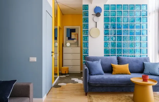 Top 10 Most Relevant Lighting Fixtures at Affordable Prices
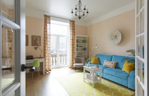 How to Stylishly and Affordable Update an Outdated Interior: 8 Ideas
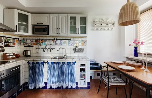 How to Style a Country House Interior: 12 Examples from Designers' Projects