Posters in Interior Design: Useful Tips from a Designer
How to choose the right image and where to place it
Decoration serves different purposes, but most often: it unifies interior items, blends colors, brings the space into a harmonious state, and creates a sense of completion. Here are several simple tips that will help you select perfect posters for your interior.
Lena Kharkova, Interior Designer, Ergonomist
Choosing an Image
Color Palette
The colors in the image should be the same as or related to the interior items. You can use contrast, but you need to be more careful in your selection. To avoid color mistakes — you can use a color wheel.
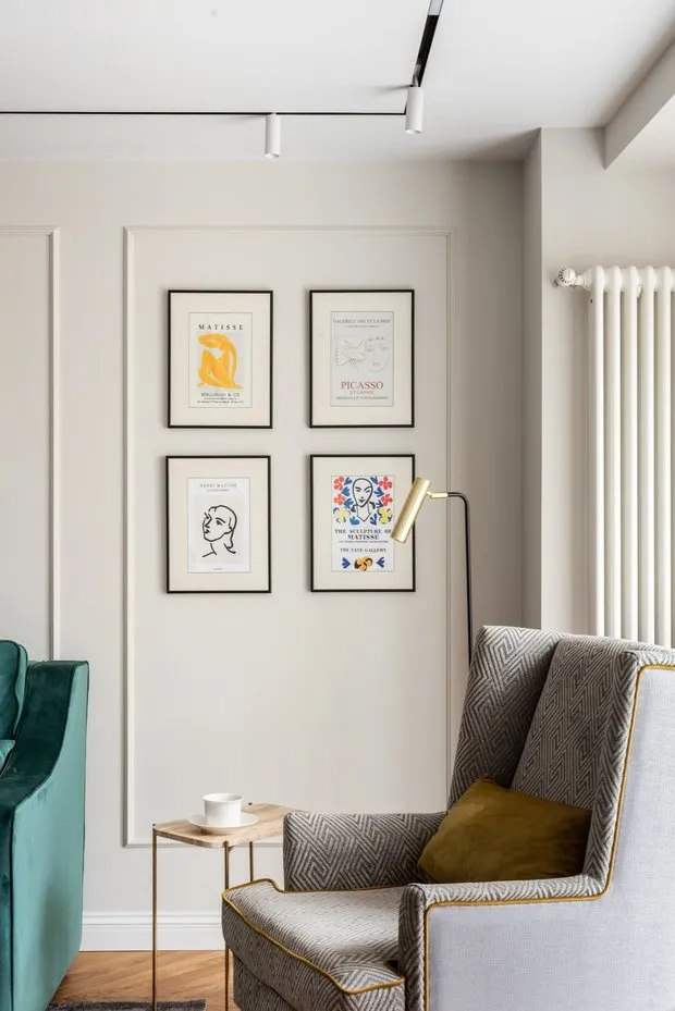
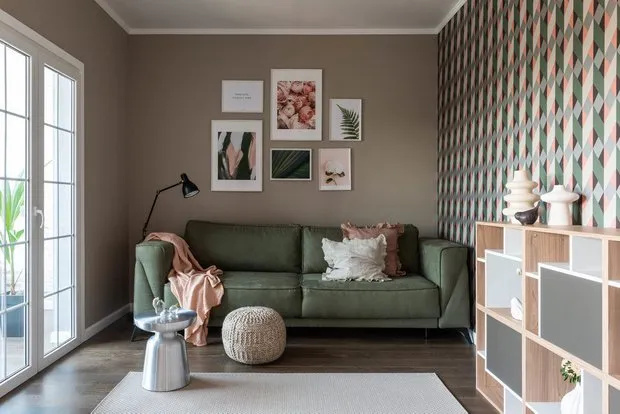 Design: Julia Filippova
Theme
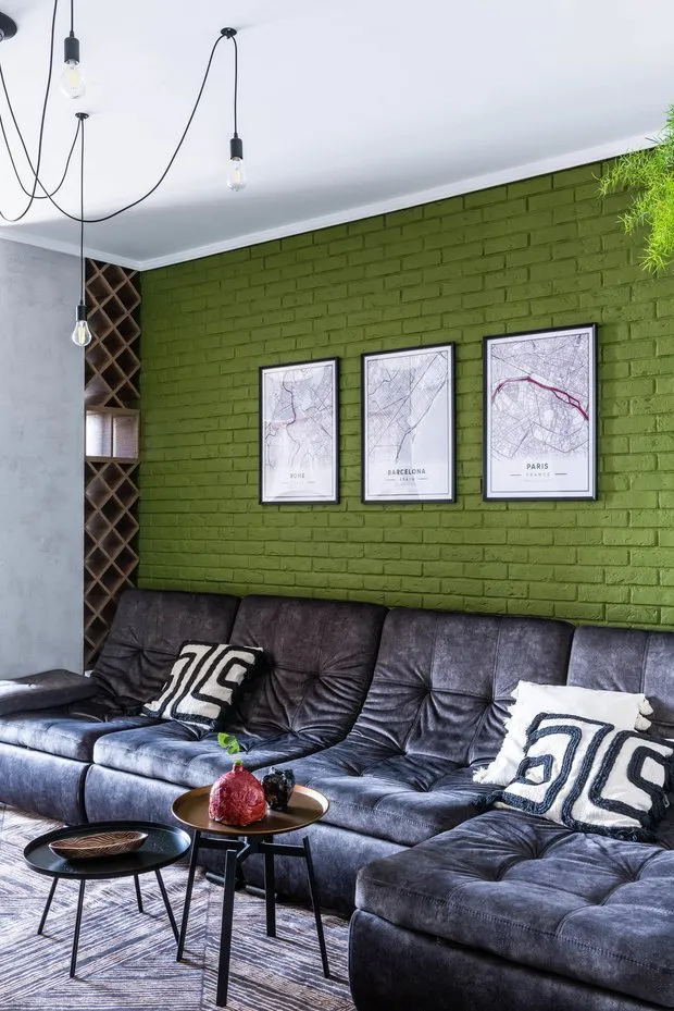
The theme should reflect the mood of the interior. For example, nature works best for Scandinavian style precisely because the style itself conveys the idea of using eco-friendly materials, simplicity, and closeness to nature. In modern interiors, "experiments" work well, such as "Mona Lisa" with chewing gum. To add character to the interior, use ethnic motifs.
 Design: Julia Filippova
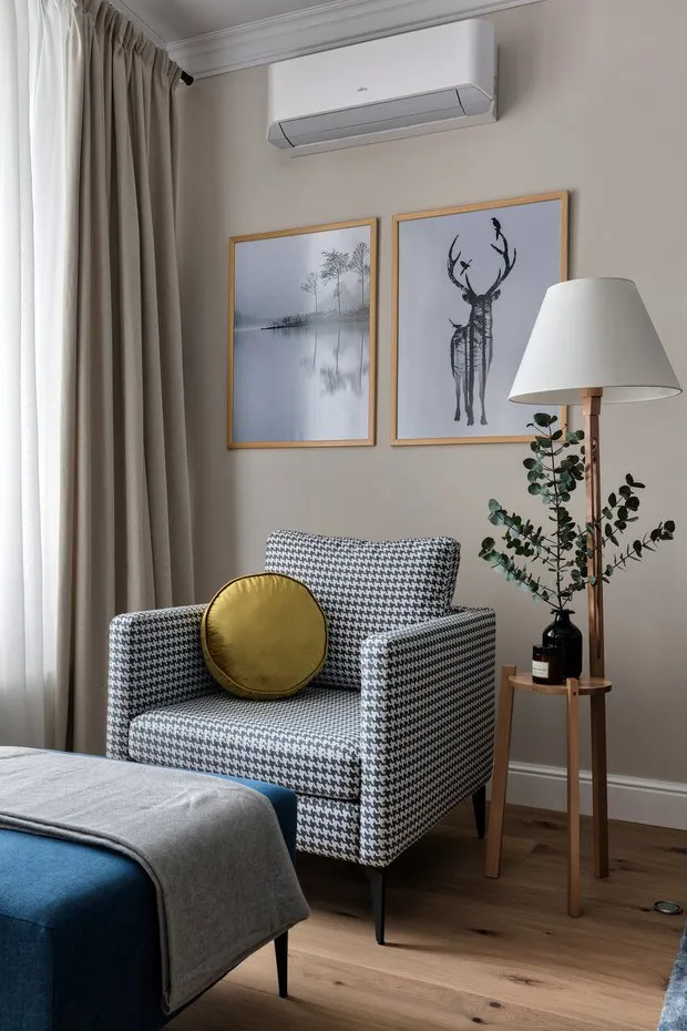
Imagine that every time you enter the room, you see these posters. If there is a positive internal reaction — it means they suit you. If it's rental property, it’s better to choose neutral images — graphics, nature, patterns.
Size and Placement
Scale is one of the pillars of spatial harmony. Wall decor is always in the center of attention, and correctly chosen scale will bring the desired feeling of warmth and harmony to your home.
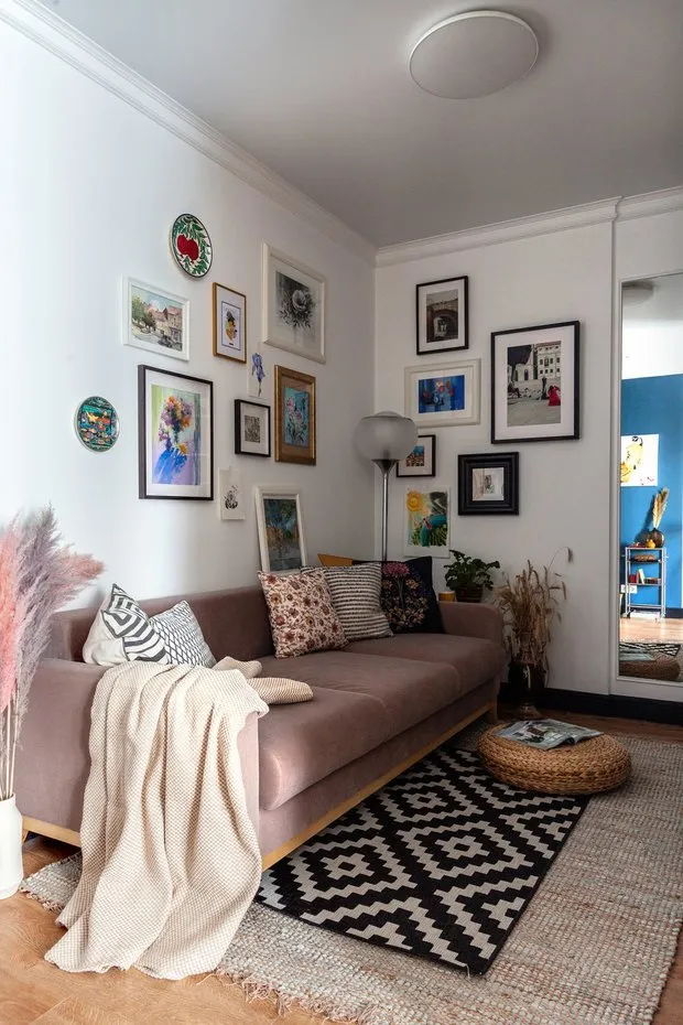
Generally, posters occupy 2/3 of the decorated space and are centered. But all rules have exceptions, especially regarding harmony. Therefore, you can pre-apply thin white tape to the planned frame contours on the wall to ensure that the composition suits you.
 Design: Yana Gurova
Choosing a Frame
There are services for printing on canvas that immediately apply the image to a wooden base (matting), there is printing on plastic and wood, and much more.
If you want to pay special attention to framing, it’s best to visit a picture framing workshop. Sometimes a frame created by a designer is already high art in itself.
Vintage frames can be found on "Avito," often they need to be refreshed — painted, coated with oil — and you will get an exclusive interior item.
 Design: Svetlana Melnikova
Frames with glass have several nuances:
- They are heavy (you should pay more attention to their mounting to the wall because they can shatter if dropped), so choose frames with a plastic protective sheet, for example, at IKEA;
- When placing posters on walls: if sunlight hits them, the probability of constant glass reflections is very high. Pre-test the frame and check how the image looks from another angle in the room.
- If you choose a frame without glass, the poster should fit snugly to the base to prevent waviness. But this type of execution is better suited for paintings, not posters.
- It should be noted that although posters aren’t high art, they also look great with passepartouts. Choose frames with pre-made passepartouts.
 Design: Natalia Sorokina
Don’t underestimate the impact of posters and paintings on home atmosphere, because a well-chosen poster can set a positive tone for every day. Decorating your home often requires great involvement in the process, but all your efforts will surely return as daily joy in living there.
Need a renovation specialist?
Find verified professionals for any repair or construction job. Post your request and get offers from local experts.
You may also like
More articles:
 Beautiful renovation in a studio for 500 thousand rubles
 Storing Things in a Studio Apartment: 5 Cool Life Hacks
 From a 'killed' two-room apartment in an old house to a stylish and spacious flat
 Elegant Loft in a Compact One-Room Apartment of 32 Square Meters
 How We Did a Cheap Renovation in a Khrushchyovka in 2 Months
 How to Renovate a Khrushchyovka: Stylish and Modern Interior Design
 How They Arranged the Living Room, Dining Room, Bedroom, and Office in a Single Room of a Khrushchyovka
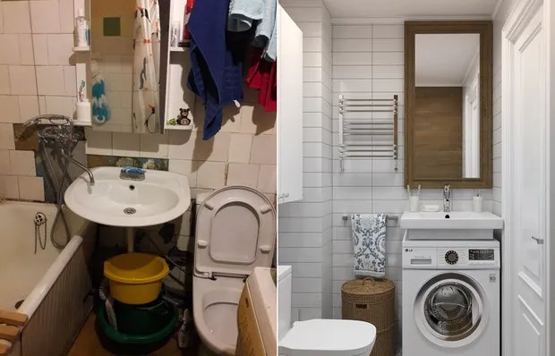 Before vs After: How Remodeled Bathrooms Transformed Old Apartments