Wall Art That Expands Space
- Tweet
- In blog
- By email
Are you unhappy with the size of your room, or just want to play with the visual perception of your interior? You can change both, even if it’s just an illusion, by choosing the right wall art that expands or narrows space.
One key principle to remember when selecting a wall image: dark tones visually reduce space, while light tones expand it. Also, cool tones truly 'cool' a room, while warm tones have the opposite effect. Of course, this is not a physical phenomenon, but a psychological one.
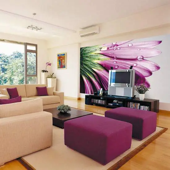
Photo 1 — A minimalist color combination — when wall art harmonizes with the interior, forming a unified conceptual context
Principles of Using Color
1. You can bring a wall closer using warm tones — yellow, orange, or red.
2. You can visually push a plane back using cool colors in the image — purple, blue, or turquoise.
IMPORTANT! The most effective of the two principles above are blue and yellow — they are best at, respectively, reducing and increasing space.

Photo 2 — A clever way to integrate wall art into the interior. First, a vertical stripe 'stretches' the room; second, straw-like detailing completes the design
3. Avoid color confusion — choose one dominant color for both the wall art and furniture, and do not combine it with a conflicting color.
4. You can expand a room by using light-toned wall or ceiling wall art, and dark flooring.
IMPORTANT! This color play principle is commonly used in compact spaces such as hallways, kitchens, or bathrooms.
5. You can visually expand a room by using dark-toned materials on the ceiling and matching them on the floor, while choosing light-toned wall art or finishes — though this may reduce the perceived height of the ceiling.
6. You can 'stretch' a room by applying dark wall art on the wall farthest from the entrance, and light tones on the other three walls. After such a finish, the room gains what’s known as 'depth'. In this case, large patterns on dark wall art work particularly well.
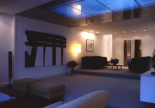
7. In almost any room, you can create what’s known as a 'basement effect': light-colored ceiling, and dark-colored walls and floor.
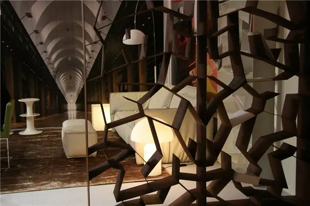
Photo 3 — The 'basement effect' in interior design enhanced with perspective-based wall art in a matching color scheme
8. The 'tunnel effect' can be achieved by covering the far wall and floor with light-colored materials, and the ceiling and three other walls with dark ones.
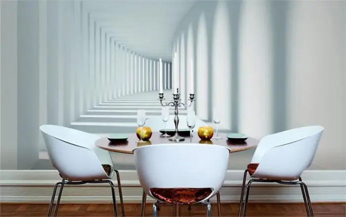
Photo 4 — The 'tunnel effect' can be replaced with a simple image of a tunnel in perspective. However, these two images will produce entirely different impacts on the room.
9. Large patterns always narrow space; glossy surfaces always expand it.
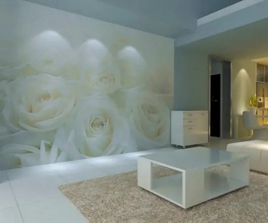
Photo 5 — A large pattern on wall art narrows the room’s space, even when white is the dominant color
10. Thanks to the right choice of wall art, you can visually raise the ceiling: make the floor light, the ceiling white, and place images with clear vertical stripes on the walls (e.g., macro shots of reeds, bamboo, or wheat stalks).
11. You can apply wall art that expands space due to the camera angle used in the photo. Most often, these are images of objects in perspective.
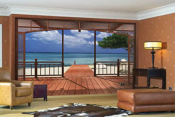
Photo 6 — A widely used image on wall art that expands space — a view from a terrace
To make a terrace image look realistic, the floor finish in the room should match the floor in the photo. Ideally. In practice, you can unite the image and room symbolically using a threshold that matches the image style. Also, a perspective image may be complemented by a wall arch (especially if it’s a seaside landscape or a view of an Italian alley).

Photo 7 — Another example of 'perspective' wall art — a terrace on the Maldives
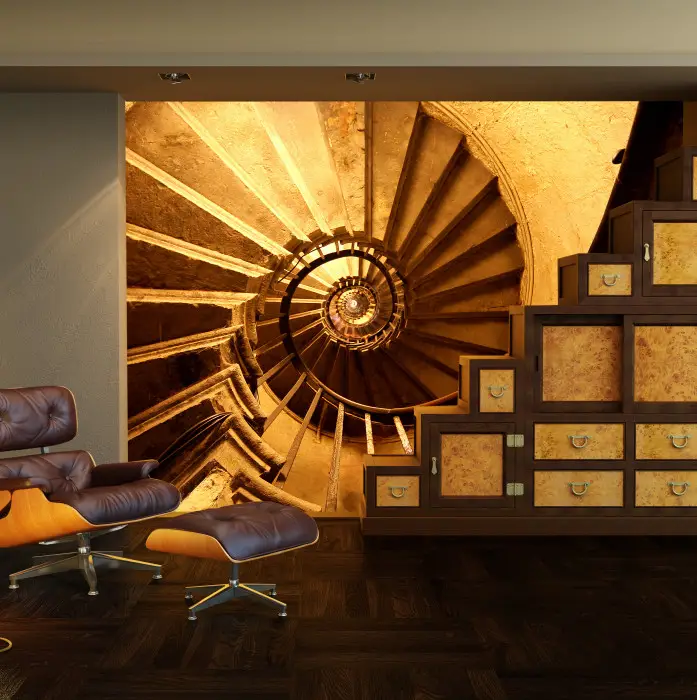
Photo 8 — Wall art that expands space — a spiral staircase. However, it would be better if this design were applied to the ceiling or floor (it would make more sense when viewed from a horizontal position, not vertical)
IMPORTANT! The final and one of the most crucial secrets: when planning any changes to your interior, you must be in a good mood and full of energy!