Large Format: What Is the Pantone Color Institute and What Does It Do
Everyone has heard of Pantone, but few know how it works and for what purpose research is conducted. We asked architect Julia Malysheva.
The Pantone Color Institute is a globally renowned organization and expert in color. Each year, specialists conduct research and select the Color of the Year. In 2019, it was a vibrant coral color. We asked architect Julia Malysheva to tell us more about Pantone's activities and its significance in the world of design.
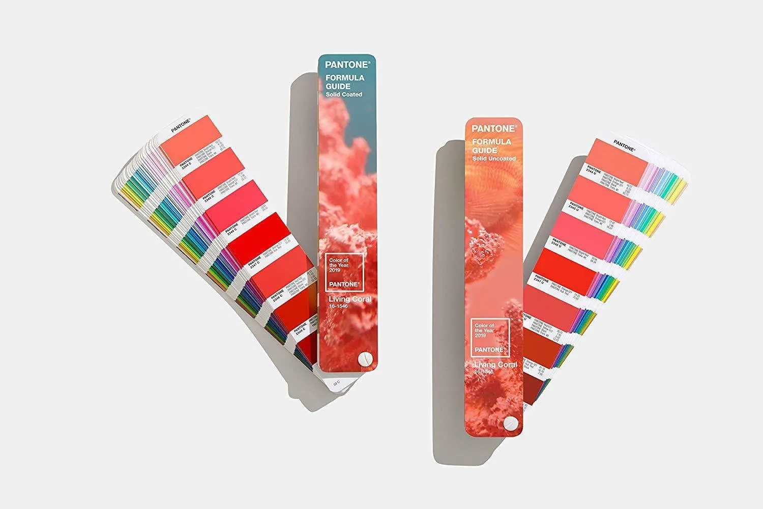
Julia Malysheva — Expert, Chief Architect of the Capital Repair Service for Apartments "Made". What do we know about the Pantone Color Institute?Foundedin 1986 Since 2000, the results of research have been used to select the Color of the Year and the relevant color palette for the next 12 months — Pantone View.DevelopedPANTONE COLOR MATCHING SYSTEMA reference of numbered shades shows their compatibility and display on paper or fabric.CreatesCOLOR PALETTE for the upcoming season twice a year. It is based on presentations of leading fashion houses.
 About How the Color of the Year Is Chosen
Of course, it's not a matter of personal preferences of Pantone Color Institute staff, but the result of long-term work with psychologists and sociologists. Experts study which shades are most popular in contemporary art, conduct perception tests, and analyze consumer preferences worldwide.
THIS IS INTERESTING!
The Color of the Year reflects global cultural events and societal moods in relation to technological and political changes.
For example, in 2018, the shade "ultraviolet" was chosen, reflecting our need for creativity and inspiration. According to Lettrice Eiseman, head of the Pantone Color Institute, it is a color of intuition and space. In 2019, the vibrant and life-affirming "Living Coral" replaced the deep shade. A reminder that people need to reconnect with nature.
 Why Are Researches Needed?Research helps everyone working with visual imagery: designers, florists, and fashion designers. They receive an answer to the key question: what color is most interesting to society, and therefore doomed to success?Brands in all sectors always release limited collections in popular shades. There even exists a Pantone hotel, where each room has its own color scheme.The Institute provides ready-made color schemes for interiors, which can be used by everyone. Just remember that Pantone's ideas are merely recommendations, not directives.
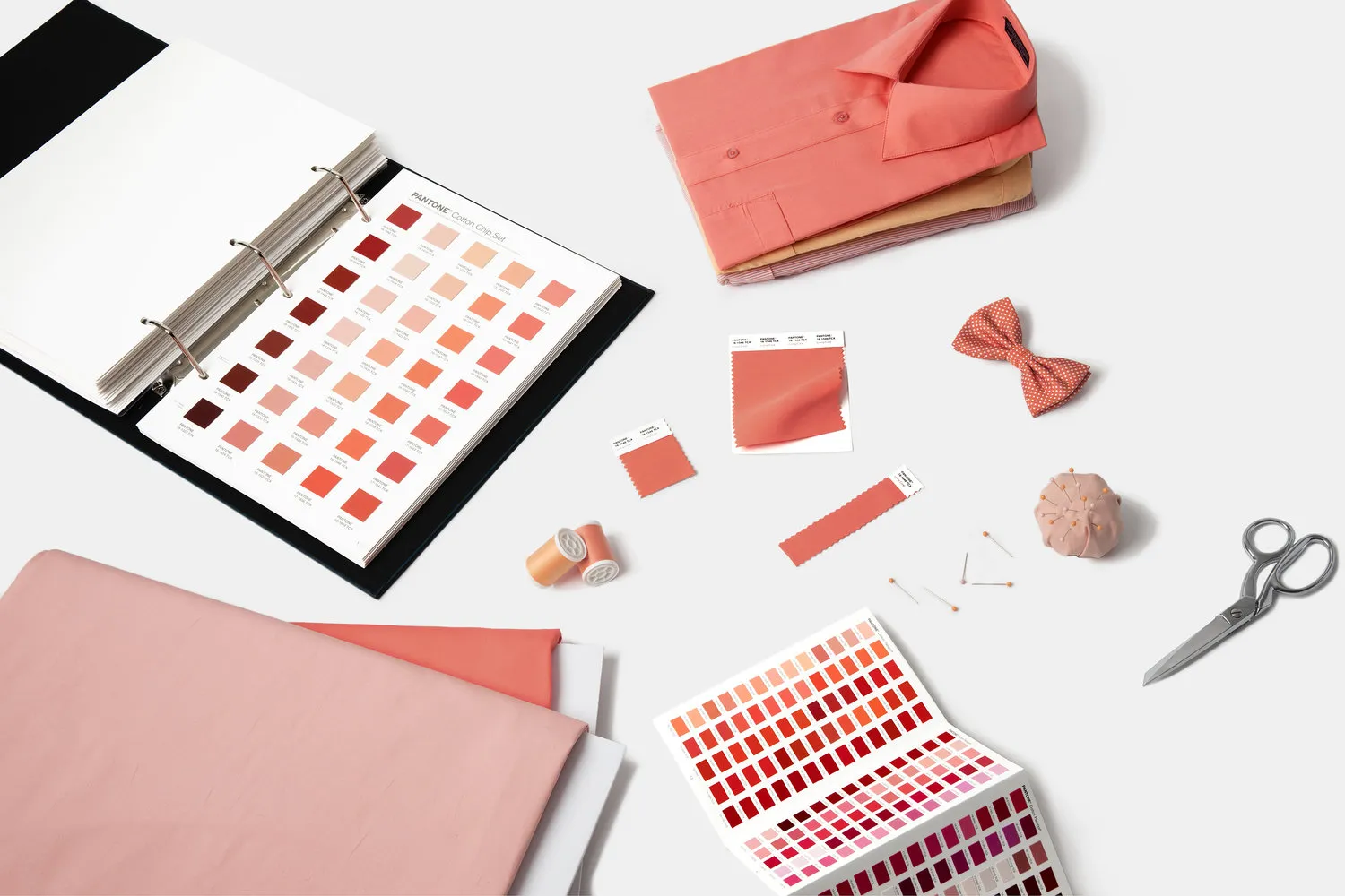 How Does Pantone Help Designers in Their Work?
Pantone color guides help in choosing colors.
Choosing colors that won't clash with each other in one room is a complex task even for an experienced designer. This is where Pantone guides come in handy.
Numbered colors are grouped into gammas, and in the guidebooks, you can find out which base colors Pantone mixed to create a specific shade. By the way, the color wheel shows all existing shades, and seasonal palettes help select successful combinations in line with trends.
For working with textures on walls and fabrics, a portable spectrophotometer Capsure comes in handy.By scanning any surface — wall, floor, furniture — this device compares the existing color with the entire Pantone library and identifies the closest match. This greatly simplifies communication between specialists and clients, ensuring they speak about the same color.
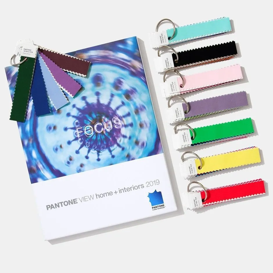
The PantoneView Home + Interiors Guide is indispensable for interior designers.The guide contains eight palettes of 72 current shades suitable for interior design and decoration. As a bonus, it includes photographs with examples of how these shades are used in interiors and color samples.
Some guide values are specified in RGB, which is convenient for selecting interior paint of a similar shade.There are paints that answer the question of how specific Pantone colors would look on your wall. For example, Valspar's Pastels collection — 16 shades named after specific Pantone colors and as close to them as possible.
 + 9 Interiors in the Main Color of 2019 According to Pantone
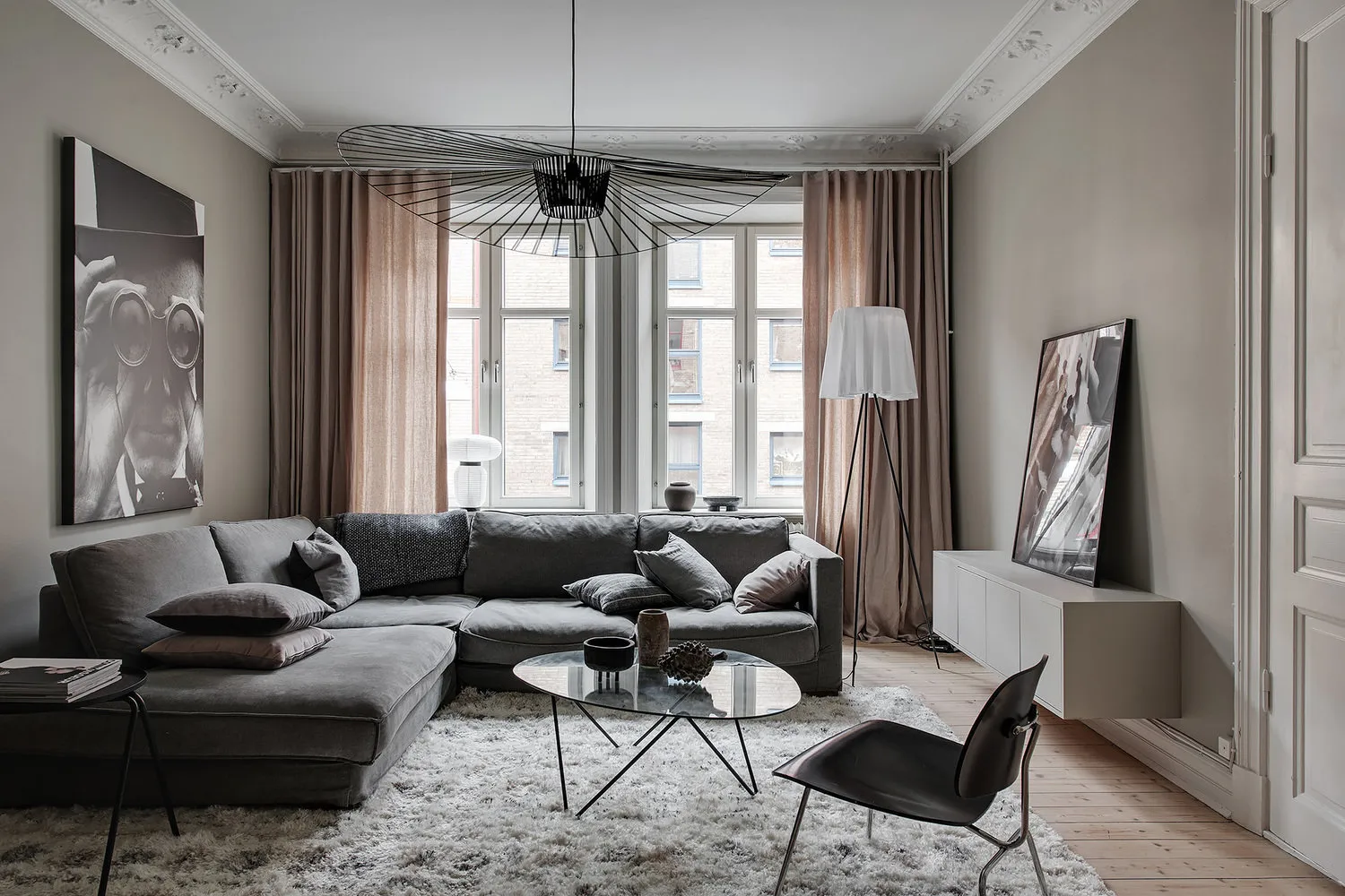
Nadia Zотовa combines coral shades with dark blue walls and decor featuring silver and brass elements. Designers from JoinForces Studio chose coral for the hallway and paired it with a mint shade. Another example of an unbeatable blue and coral combination was found in the OM Design Studio project. Varvara Shabelnikova chose a soft and gentle shade for furniture upholstery. The print on the wallpaper harmonizes well with it. Bright elements against emerald walls provide an effective design solution by Studio "Tor Ard". Refreshing a monochrome interior is easy: designers from OM Design Studio painted the partition frame in a matte pink shade. Marina Sarkisyan decorated a light dining room with colorful accents: soft coral and magenta. Painting the wall in coral is a bold decision by Irina Uzhintseva. Doors can also be bright! Nikolai Nikitin decided to make them blue and pink.
Need a renovation specialist?
Find verified professionals for any repair or construction job. Post your request and get offers from local experts.
You may also like
More articles:
 Cozy Studio Apartment in Sweden with Fireplace in Bedroom
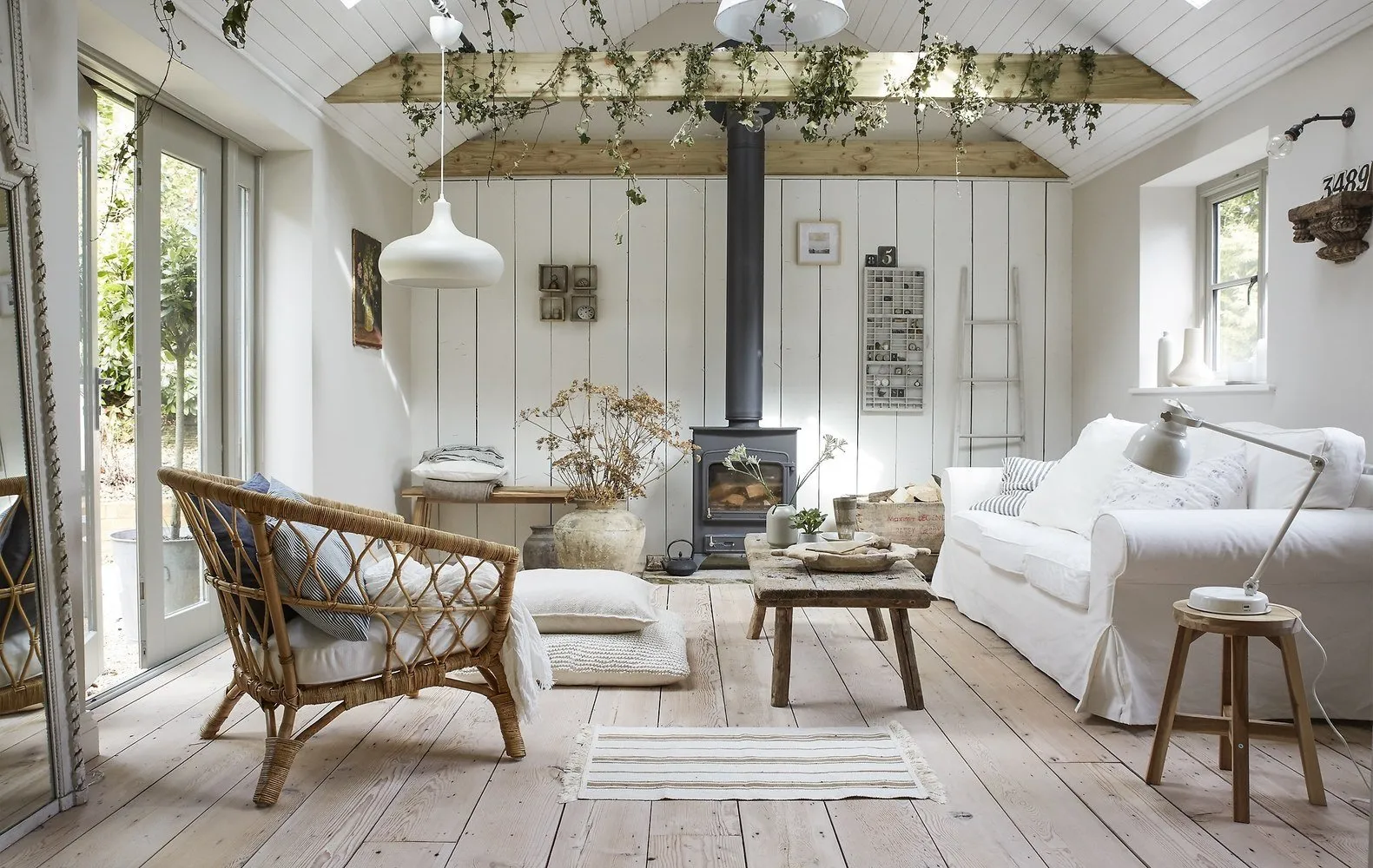 Vintage House in England with IKEA Furniture and Decor
 Winter Sales: Discounts on Furniture and Decor + Warehouse Clearance
 What Tones Look Great in Interior Design During Winter?
 How to Attach a Balcony to a Room: Tips from the Pros
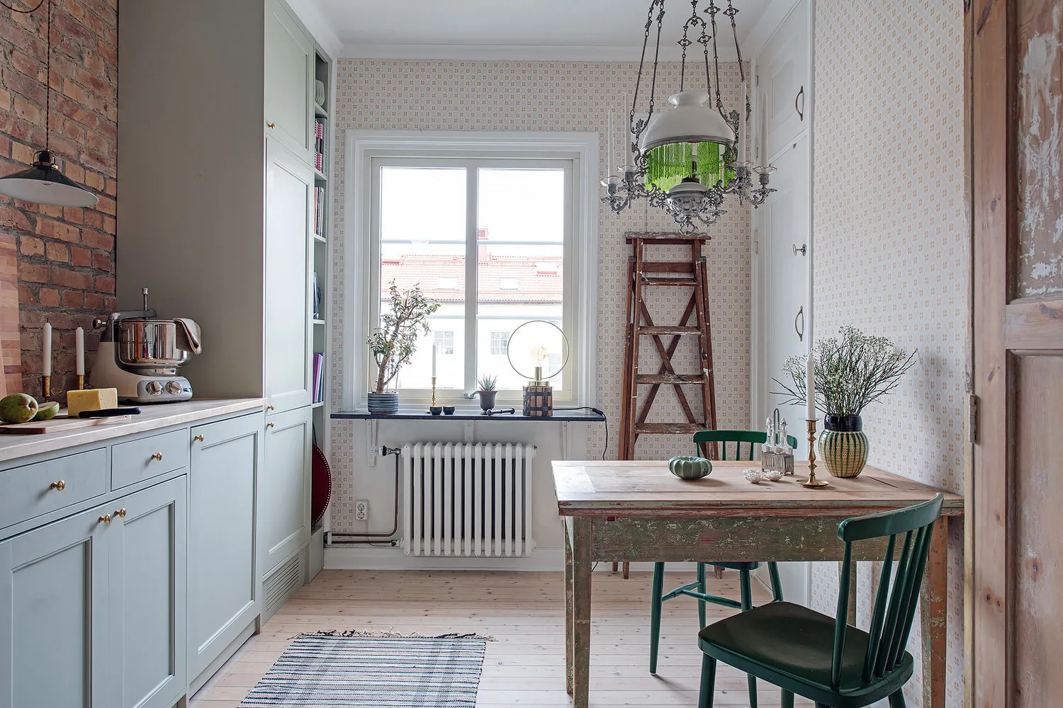 Apartment in the Style of a Scandinavian Country House
 Decorating the Home for New Year with Professionals
 How a Swedish Decorator Decorated Her Home for New Year