What Tones Look Great in Interior Design During Winter?
To prevent walls in an apartment from looking as dull as the view outside the window, it's important to select the right paint shade. Our architect Julia Malysheva shared her insights on this.
Julia Malysheva is an expert and lead architect at the repair service 'Made'
A bit of theory: Why do colors appear differently in winter?
Due to cloudy weather and diffused natural lighting, bright colors seem dull, while muted ones appear darker and deeper. Moreover, most of the day we spend under artificial lighting, which also affects color perception.
- Incandescent light adds a yellowish tone to all colors. Warm colors become more saturated, while cool ones fade.
- Fluorescent lighting works in the opposite way: cool colors become vivid, sometimes dazzling, while warm tones fade.
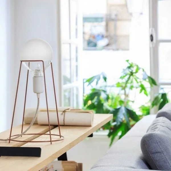
- Halogen bulbs distort color perception the least, as their light is closest to natural sunlight.
Which colors look great in winter?
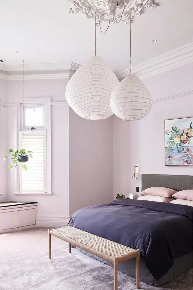
Lavender
This tone is elegant in both 1950s minimalism and American glamour, as well as in the Provence style. Perfect for a bedroom: lavender walls create a relaxing atmosphere and set the mood for rest. Especially effective when paired with green, violet, or brown tones.
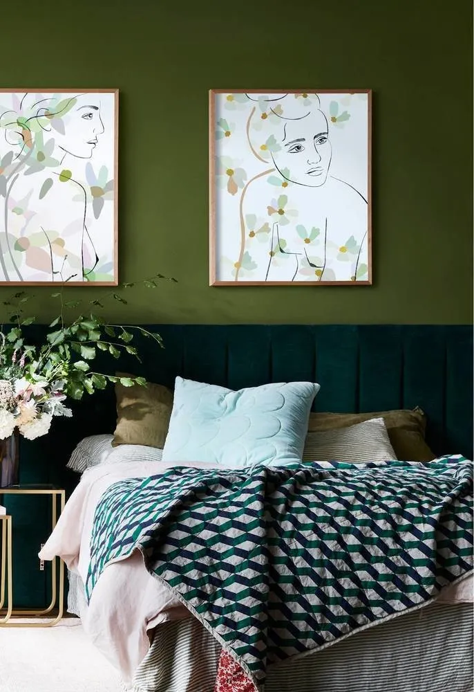
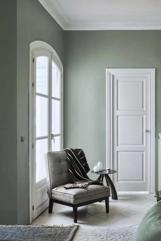
Swamp Green
Works well as a main accent. A soft green shade is suitable for both the living room and bedroom.
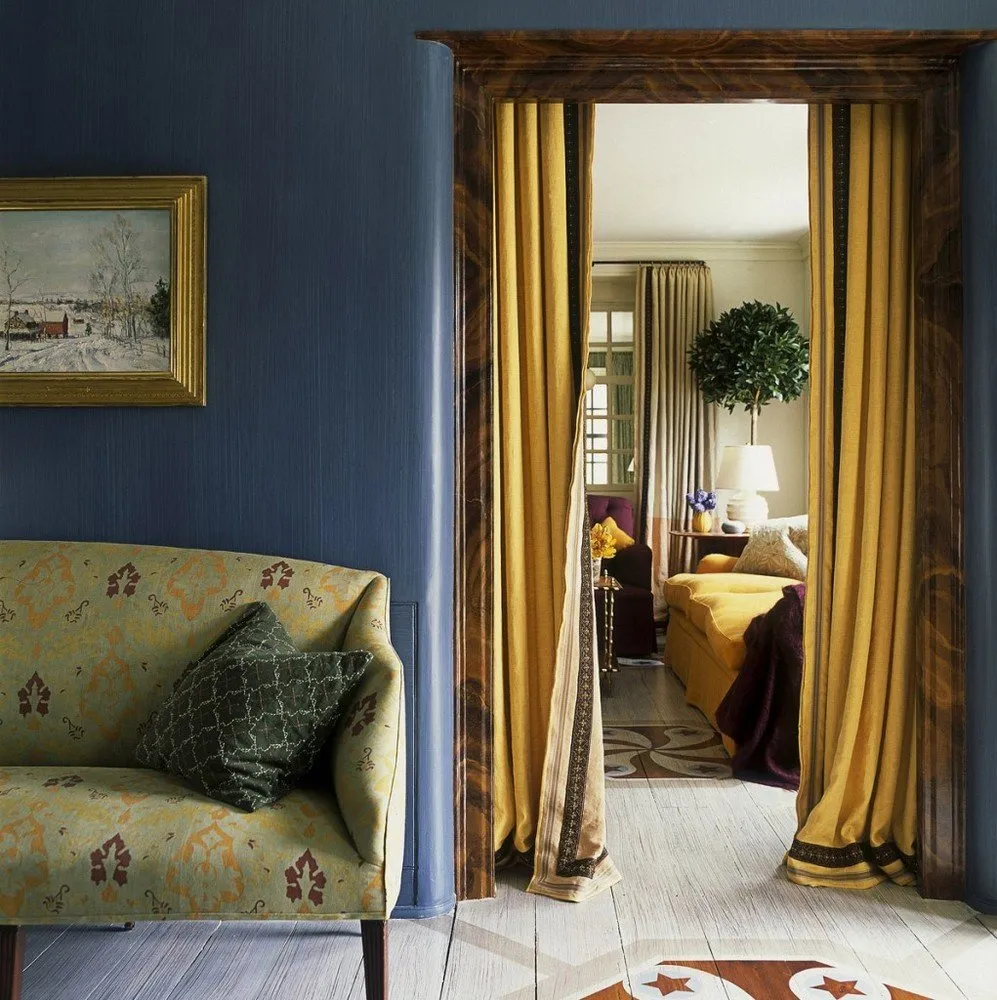
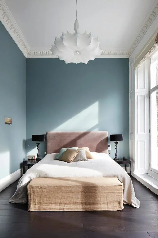
Dark Blue
Ideal for decorating small rooms like bedrooms or living rooms. When combined with white, it's a great alternative to classic black-and-white combinations.
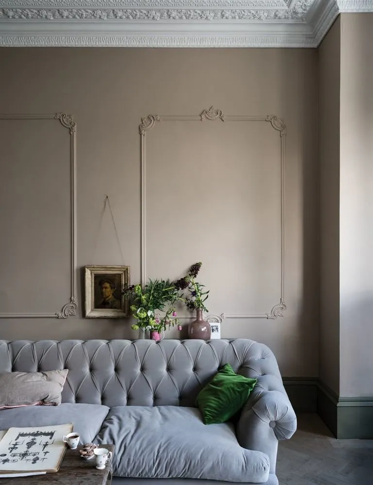
Lincoln
A neutral tone, one of the lightest browns, blends naturally into any room. Unobtrusive and pairs well with both cool and warm tones. An ideal base for classical-style interiors.
Olive
A warm and calm color that can be mixed with other natural tones. This neutral tone also suits classical-style interiors.
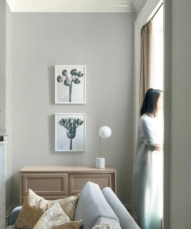
Gray
The shade named Metropolitan by Benjamin Moore, a leading manufacturer of interior paints, has been dubbed the color of the future year. Neutral gray calms and works well as a base for classical and minimalist interiors. A fine substitute for traditional beige and white.
How to Avoid Mistakes in Choosing Colors?
Complex shades reveal themselves differently depending on time of day and type of lighting.
The darker the paint color, the less light it reflects. There's a special indicator called the Light Reflectance Value (LRV), which is listed on interior paint cans. It's measured in percentages from zero (black) to one hundred (white). The higher the value, the lighter the paint appears in interior spaces.
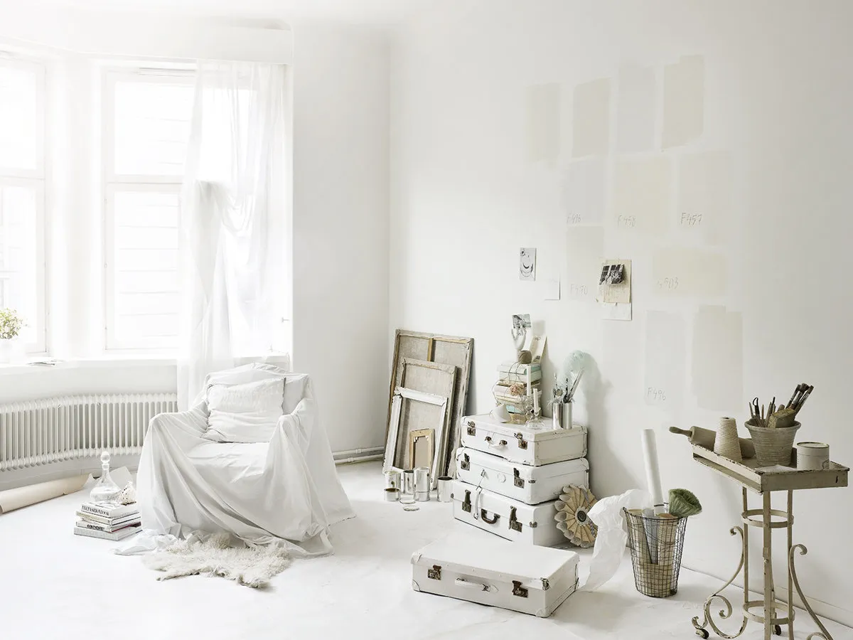
It’s not easy to select the perfect shade for walls right away – you’ll have to test samples. You don’t need to buy a whole can of paint – often manufacturers provide sample pots. Apply the paint onto a section of wallpaper or gypsum board and label the color number on the back.
Hang these samples on the wall in the room for which you're selecting the color. It’s helpful if the floor is already finished so you can see how colors blend together.
Need a renovation specialist?
Find verified professionals for any repair or construction job. Post your request and get offers from local experts.
You may also like
More articles:
 How to Fix a Poor Apartment Layout: 6 Examples
 Preparing a Country House for Winter: 8 Tips
 7 Design Solutions That Are Outdated
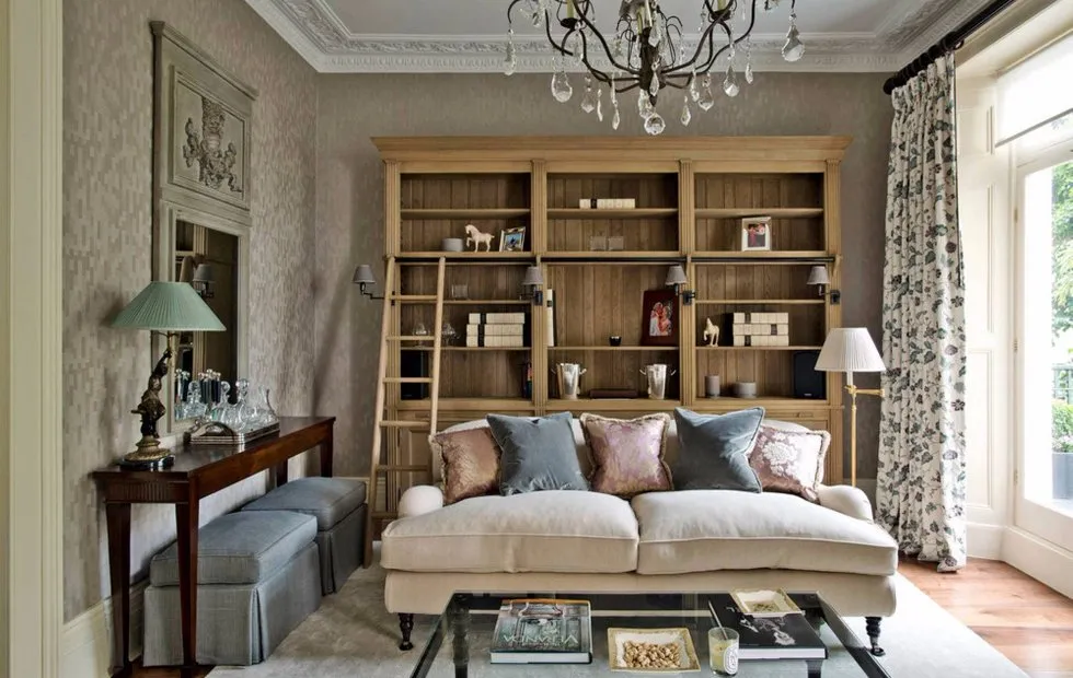 How to Extend Summer: Idea for a Small Living Room
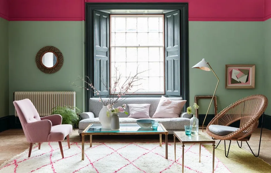 David Mottershead: Beige Tones in Interior? Time to Give Way to Green Hues!
 Interior Design Trends 2019
 How to Organize Storage in a Studio Apartment: 7 Examples
 How to Properly Work with Clients: Tips from Professionals