Color — the Key to Impression: 5 Small Entrances That Captivate at First Glance
Vibrant walls, unconventional shades, and bold details: this is how color transforms the perception of even the tiniest entrance
A small entrance is definitely not a reason to give up on expressive design. On the contrary, it's precisely in compact spaces that color can play a leading role: set the mood, visually expand the entrance area, or add an unexpected accent. We've collected 5 examples where designers used color and achieved an instant 'wow' effect.
Green Walls and Lightness from the Threshold
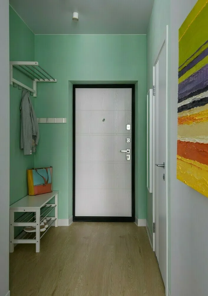
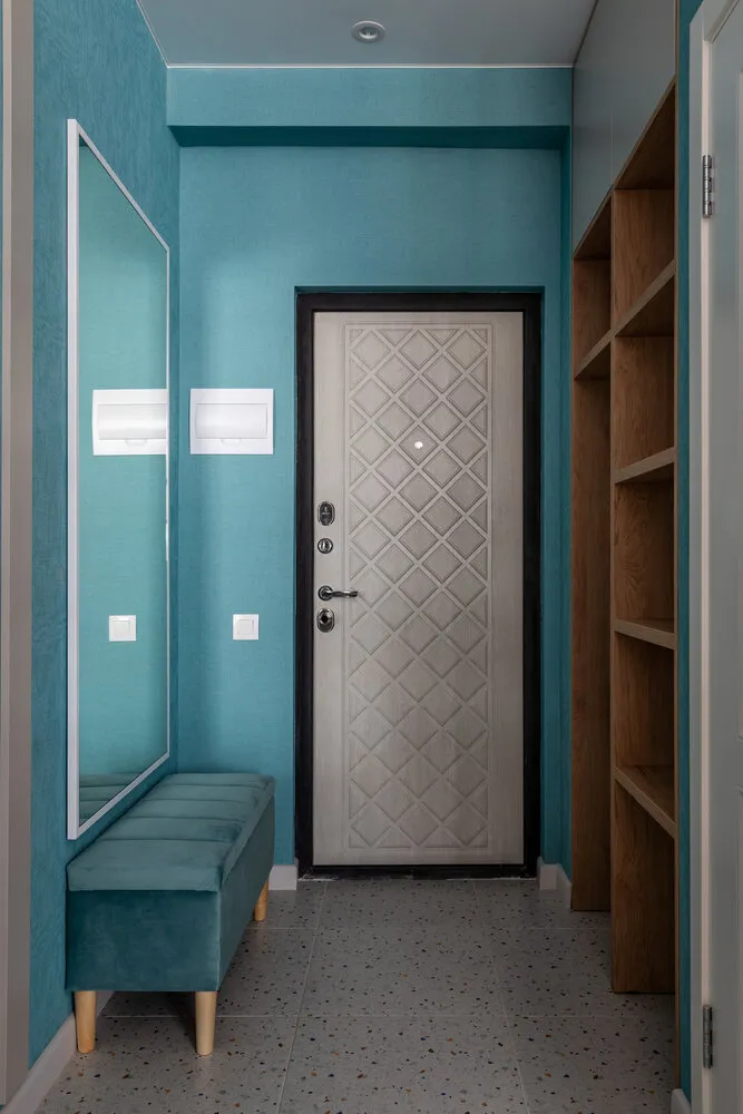
In the studio in Novosibirsk, designer Natalia Kadochkina made her bet on a muted mint shade that visually cools the space and makes the entrance airy. The walls from floor to ceiling are painted in one tone, making the room look cohesive.
 Design: Natalia Kadochkina
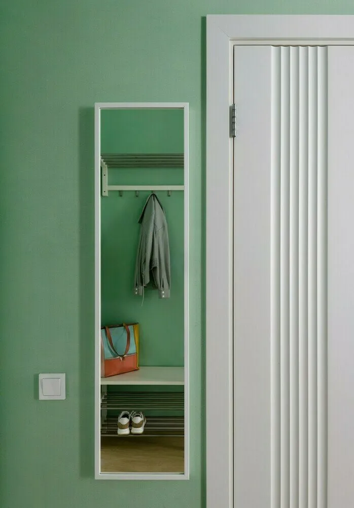
Against a green palette, the white door with relief and minimalist furniture elements stand out. The pastel green sets the right mood from the first step — not too bright but unconventional. This shade is perfect for those who want to move away from classic styles but aren't ready for radical color experiments.
 Design: Natalia Kadochkina
Brown with Character
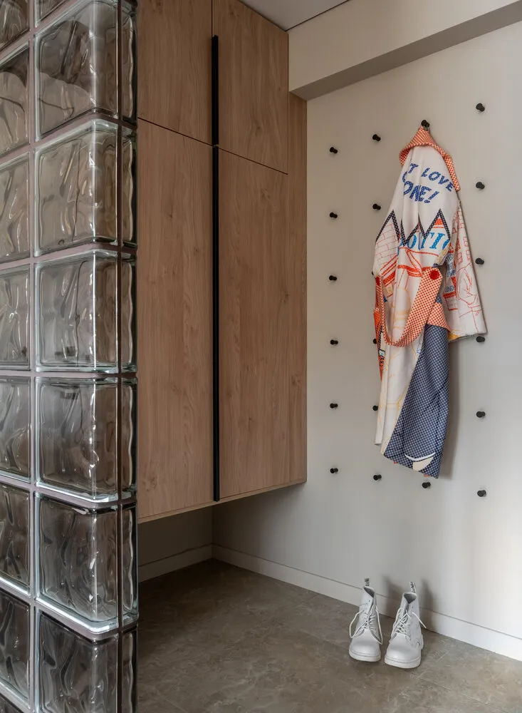
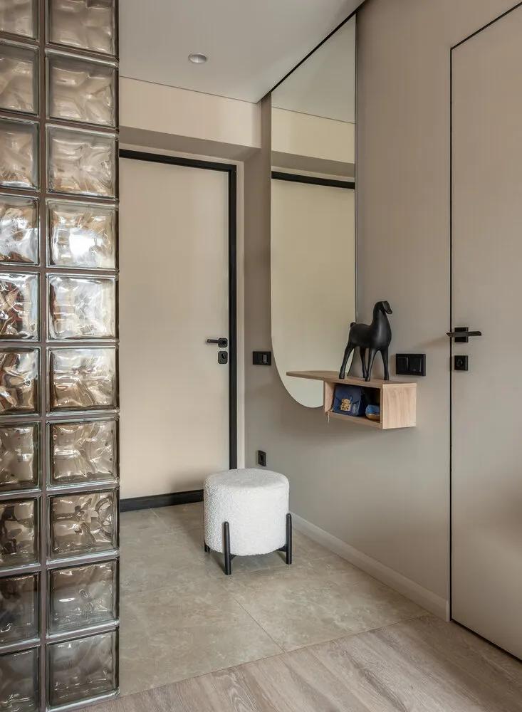
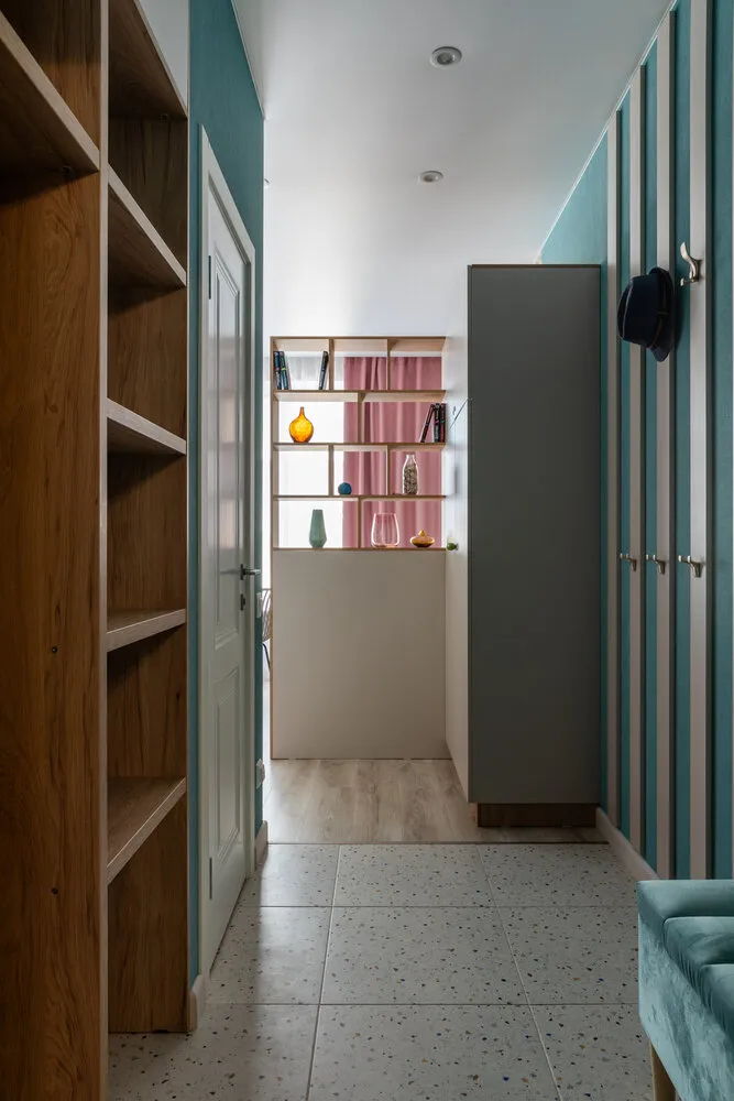
In a Moscow apartment, designer Olga Filippova decorated the entrance in a light beige tone but made the space memorable through an interesting combination of textures. The accent was a partition made of glass blocks, which allows light to pass through and adds architectural rhythm.
 Design: Olga Filippova
The color is complemented by textured finishing: smooth walls, large-format ceramic tile on the floor, and matte cabinet doors. A vibrant jacket on unusual black hooks makes the wall lively even without decoration. The entrance turned out to be minimalist but with a character.
 Design: Olga Filippova
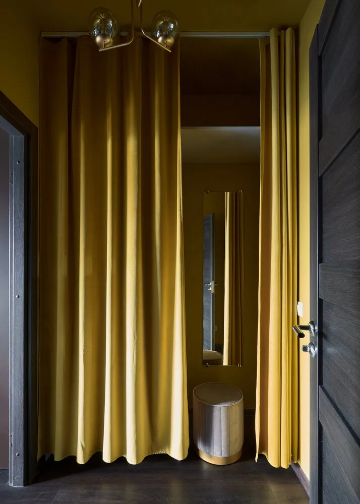
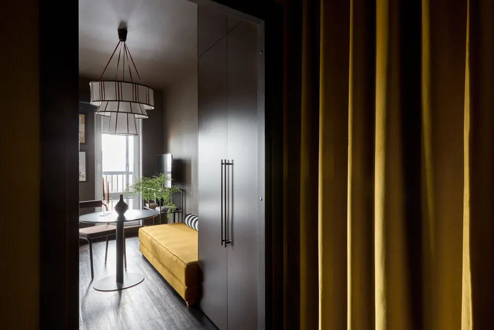
Yellow Curtain as the Centerpiece
In compact apartments in St. Petersburg, designer Nina Simonova made an accent on bright colors and soft textures. The entrance is decorated in a rich yellow shade: walls, ceiling, and textiles match in tone, turning the entry zone into a cohesive color capsule.
 Design: Nina Simonova
 The main character is the closet hidden behind a velvet curtain. It not only visually expands the space but also adds a feeling of comfort and even some theatricality, while contrast with the dark floor enhances the effect. A cheap but effective solution!
 Design: Nina Simonova
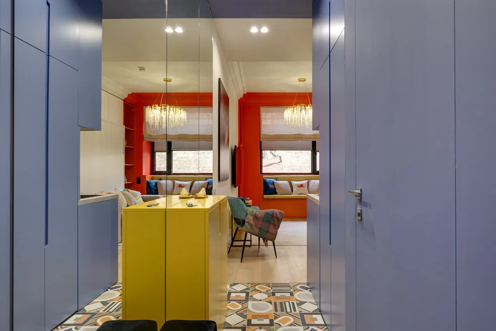
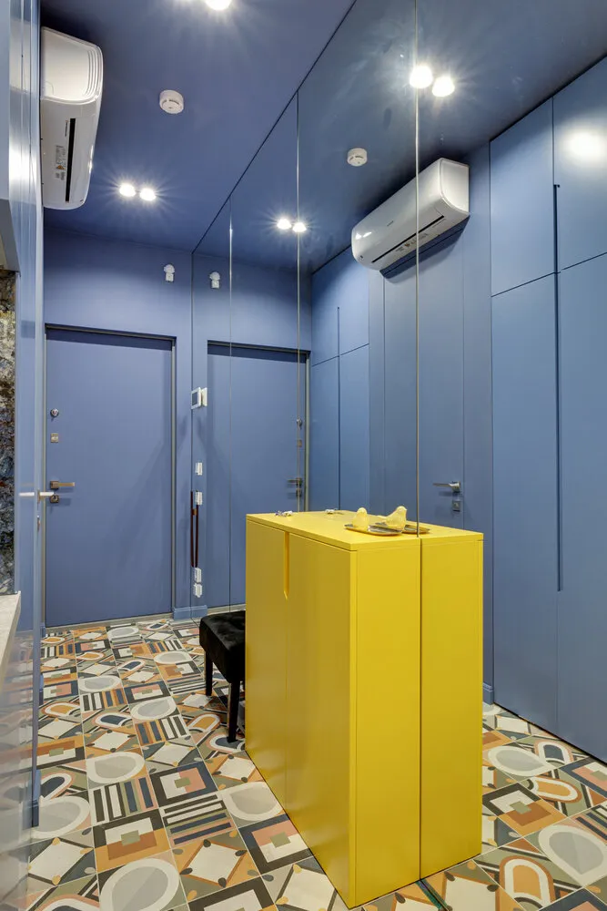
Blue Walls and Lemon Island
In a vibrant Moscow studio from Kogan Design Studio, even a tiny entrance looks like an art piece. The walls, ceiling, and built-in cabinets are painted in a rich blue-violet color that creates a sense of depth and visually unifies the space. In the center is a lemon-yellow island with a glossy surface that reflects light and brings life to the interior.
 Design: Kogan Design Studio
A contrast approach makes the entrance truly memorable, and a bright floor tile pattern completes the composition. A great example of how color can replace decoration and create a wow effect even in just two square meters.
 Design: Kogan Design Studio
All Shades of Blue
In a studio in Sochi, designer Svetlana Pletnyeva made her bet on blue and didn't miss. The walls, textiles, and even part of the furniture in the entrance are done in a unified cool palette, creating a sense of cleanliness and visual order.
 Design: Svetlana Pletnyeva
Against the light door and wood, the blue shade works beautifully. Tile with terrazzo inlays complements the composition and adds a bit of playfulness. The approach helps visually refresh a small space without overloading it with complex decor.
 Design: Svetlana Pletnyeva
Even the smallest entrance can make an impression if it has color. Bright accents, unusual combinations, and bold choices set the mood from the very first second. The key is not to be afraid of moving away from neutral tones.
Need a renovation specialist?
Find verified professionals for any repair or construction job. Post your request and get offers from local experts.
You may also like
More articles:
 How to Create an Effortless 3 m² Bathroom with Green Ceiling and Marble Tile
 6 Tips We Spotted in a Stylish 69 m² Apartment
 How They Organized Storage in a 69 m² Trash Space: 5 Ideas You Can Replicate Too
 Rainy Weekend at the Cottage: 15 Activities That Will Save You from Boredom
 Family of 4 lives in a 36 sq. m house: how to accommodate everyone without losing your mind
 Before/After: From a Gloomy Stalin-era Apartment to a Cozy, Bright Interior
 Cheremushki: Where Did This Cute Name Come From and What Does It Have to Do with Khrushchev Experiments?
 Flying Muzzles: What Happens to Dogs When They Catch a Treat