How Colors in the Apartment Affect Mood: Analyzing Each Shade
The psychology of color and its application in different rooms
Why in some spaces we feel energetic, while in others we want to sleep? It's not only about lighting — colors directly affect our mood, productivity, and even appetite. We explore how to use the power of color in interior design.
Main points from the article:
- Each color evokes specific emotions;
- Different rooms require different colors;
- Shades are more important than pure colors;
- White is not always the best choice for a workspace;
- Color combinations have a stronger impact on the psyche than a single color;
- Personal associations may be stronger than general rules.
Why colors have such a strong effect on us
Our brain reacts to colors on a subconscious level — this is built into evolution. Red meant danger or ripe fruits, blue — water and safety, green — vegetation and shelter. Today we live in cities, but ancient mechanisms still function.
Color affects not only mood but also physiology: it can change heart rate, influence blood pressure, and even temperature perception. In a blue room, we feel colder than in an orange one, even if the thermometer shows the same temperature.
How Different Colors Affect the Psyche
Warm tones stimulate the nervous system:
- In a red room, pulse increases, productivity rises but only temporarily — then fatigue sets in.
- Orange stimulates appetite and communication.
- Yellow improves mood and helps concentration, but in large amounts may cause anxiety.
Cold colors, on the other hand, calm down:
- Blue lowers blood pressure and pulse, helps focus on mental work.
- Green creates a sense of stability and calm.
- Violet promotes creative thinking but can be depressing in large amounts.
 Design: Inna Velichko
Which Colors Suit Different Rooms
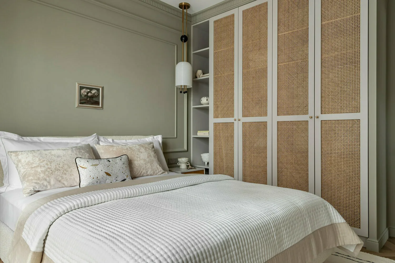
In the bedroom, calm and muted shades work best. Lavender, soft blue, dusty pink help relax and sleep better. Avoid bright and dark colors — they may interfere with falling asleep.
For the kitchen, warm tones that stimulate appetite are suitable. Coral, peach, and warm yellow create a cozy atmosphere. But do not use overly bright colors — they may trigger overeating.
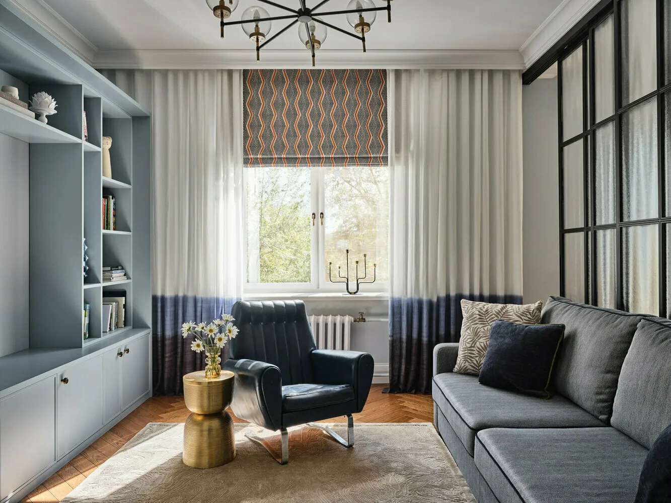
In the living room, you can experiment with complex color combinations. This is a room for communication and relaxation, so it's important to find a balance between stimulating and calming shades.
 Design: Natalia Sedova
Workspace: Colors for Productivity
A common misconception is that white color is ideal for a workspace. In fact, pure white walls can reduce productivity. There's nothing for the eyes to focus on, and the brain starts to get tired.
The best combination is a neutral background with color accents. Light gray or beige with elements of blue or green help focus. Yellow accents stimulate creativity.
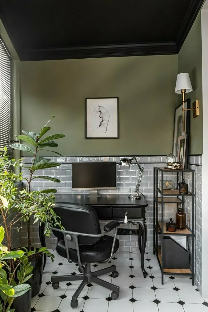 Design: Anastasia Korol
Children's Room: A Special Approach to Color
In a child's room, it's important to consider the child’s age. Soft pastel tones are suitable for babies — they don't overstimulate the nervous system. For older children, brighter colors can be used but in small amounts.
Avoid black and dark gray in children's rooms — these colors may cause anxiety in kids. It's better to use natural shades: sky blue, grass green, sunny yellow.
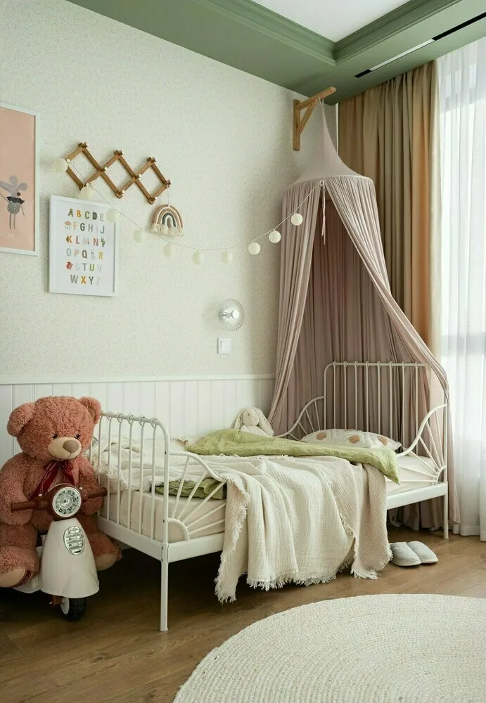 Design: Julia Komissarova
How Color Affects the Perception of Space
Dark colors visually bring walls closer and make a room appear smaller. But this isn't always bad — sometimes such an effect helps create a cozy atmosphere.
Light tones expand space. Cool shades seem farther away, warm ones appear closer to the observer. This can be used to adjust room proportions.
How to Choose Your Color Palette
Start by analyzing your feelings:
- Which colors calm you?
- In what color environments do you feel comfortable?
- What associations do different shades evoke?
Personal preferences may not align with general rules, and that's normal. The key is how color affects you personally.
How to Avoid Color Mistakes
The most common mistakes in working with color:
- Using overly bright colors in large amounts;
- Ignoring lighting when choosing shades;
- Following trends without considering personal feelings;
- Creating overly contrasting combinations.
Color in interior design is not just a decorative element but a powerful tool for influencing our well-being. Thoughtful color choice can improve sleep, increase productivity, and make your home truly comfortable for living. The key is to listen to yourself and not fear experimenting with shades.
Cover: Design project by Elvira Shayken
Need a renovation specialist?
Find verified professionals for any repair or construction job. Post your request and get offers from local experts.
You may also like
More articles:
 Interior Trends 2025 That Will Never Go Out of Style: Classics for All Times
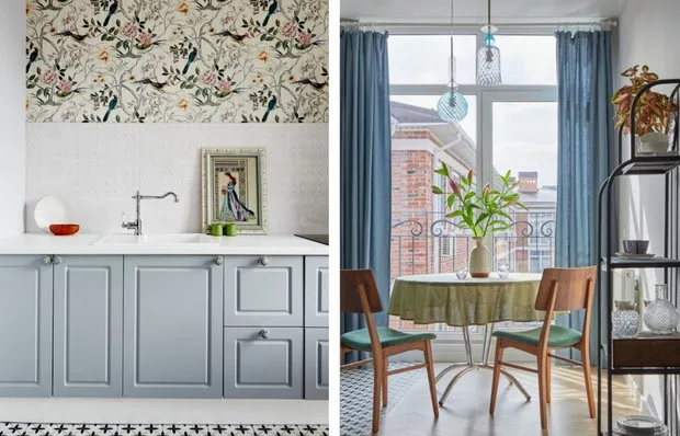 Kitchen in a Block House: Minimal Cabinets and Retro Design Accents
 How to Decorate a Small Hallway in a Studio Apartment
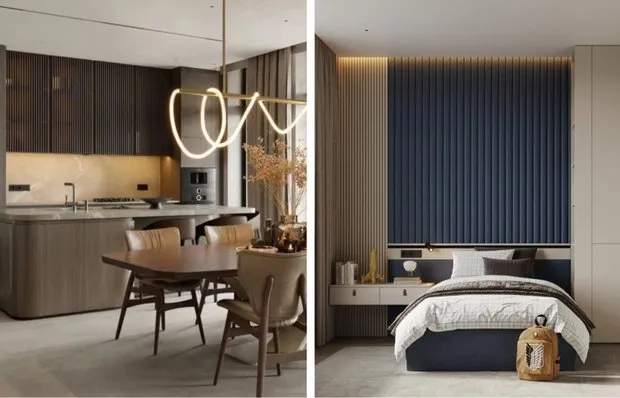 Country House, Into Which You Want to Move: 6 Trendy Ideas Relevant Today and in the Future
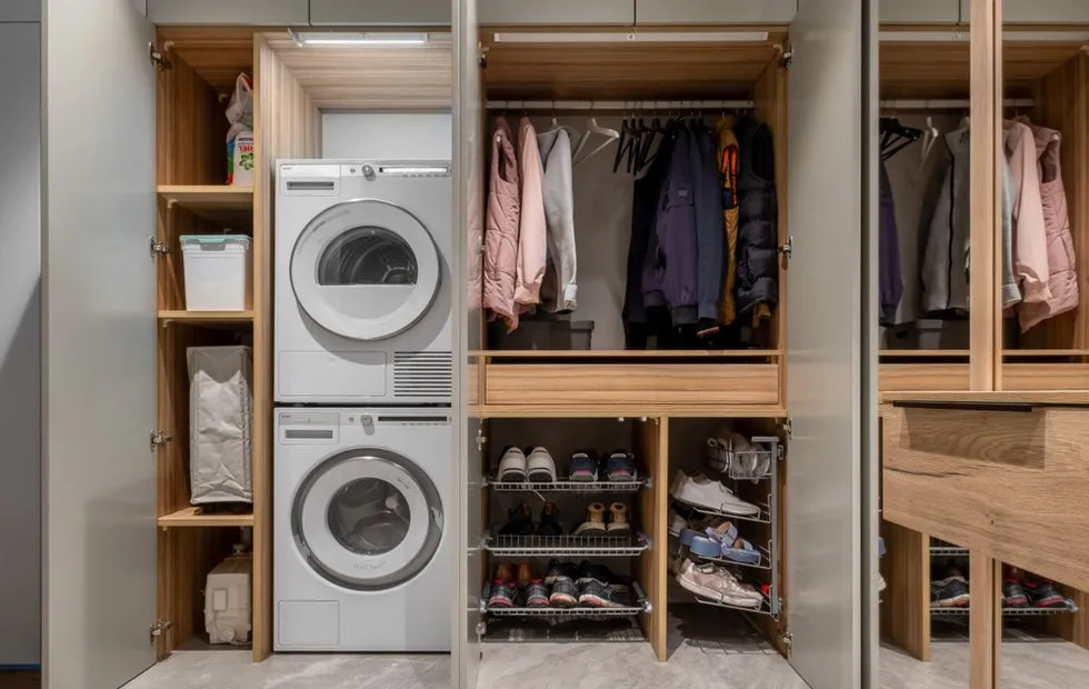 Smart Storage Organization: Systems That Actually Work
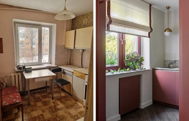 Before and After: Bold Kitchen Interior in a Khrushchyovka
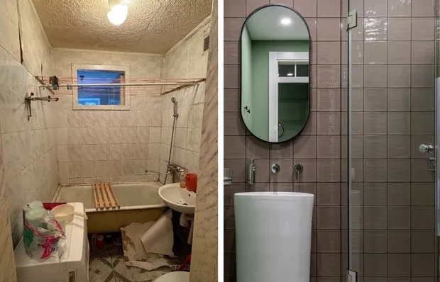 How a Micro Bathroom in a 44 m² Housing Unit Was Transformed: Before and After Photos
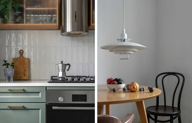 How an Architect Transformed a Kitchen in a Stalin-era 50 m² Apartment for Herself