9 Elements in Kitchen Interior That Signal Poor Taste of the Host
Designer Named Things and Solutions to Avoid
Andrey Bubnov, designer and founder of DECART DESIGN Studio, notes that with each passing year, interior designs are becoming more complex, and what visually appears simple can actually be a technically demanding task. For example, there's a widespread belief that classic design is difficult to execute, while minimalism is simple. In modern interiors, technologies are used that look stylish and visually lighten the space, but in reality, they are technically complex. These include floors with hidden baseboards, channel air conditioners with built-in single-slot grilles, built-in track lighting, smart home systems, and more.
Kitchens are complex, multi-functional spaces. We increasingly use on our kitchens what was once used only by professionals. This includes not just appliances, but also other elements. Therefore, it's crucial to approach this issue meticulously and responsibly. Plan the workflow on the kitchen, account for everything: furniture, lighting, finishing — and always consult with professionals.
Checklist of outdated elements and solutions in kitchen interiors that indicate poor taste.
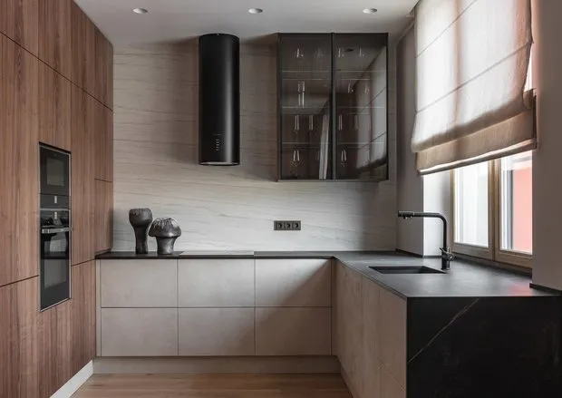
1. Asymmetrical Kitchen
When designing a kitchen, always keep this in mind. When drawers and cabinets follow some logic, it always looks better. Even if you need to place a drawer for tableware on the left side and don't need one on the right, create a hidden drawer that opens simultaneously with the lower drawer. This is much better than having a split front panel on the left and none on the right.
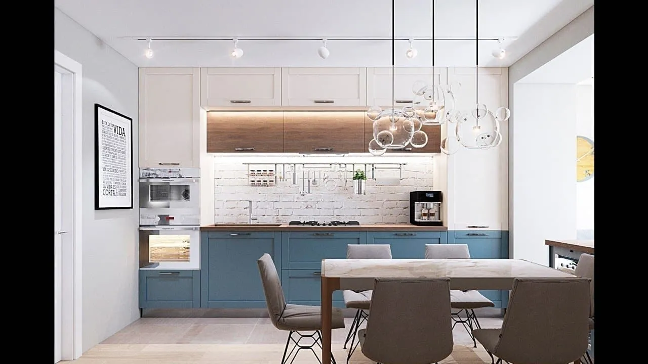 Example of a well-thought-out kitchen in Andrey Bubnov's project
2. Intersecting and Non-Opening Cabinets, Boxes That Press Against Each Other
Despite the fact that a manager in the showroom is involved in kitchen design to protect the client from obvious mistakes and eliminate signs of poor taste, most kitchens are designed without considering ergonomics or the workflow on the kitchen. Therefore, it's important to plan how drawers and cabinets will open so they don't intersect when opened. Consider many details, such as a 3–5 cm insertion for the refrigerator to open comfortably.
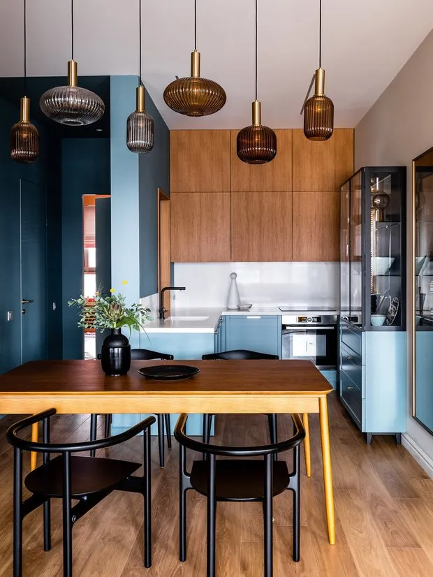
3. Loud, Eye-Catching Colors
Using bright, eye-catching colors in the kitchen interior as a background or painting the backsplash or cabinet fronts in vibrant hues often looks overly flashy. If you want to add vibrant colors, try using color accents through lighting and chairs, as designer Anastasia Struve did in the example below.
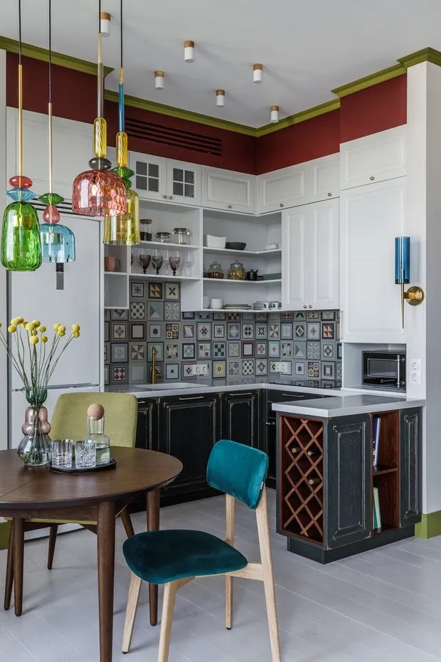 View Anastasia Struve's project in full
4. Not Using Facade End Panels
It is a mistake to not use facade end panels at the beginning and end of kitchen furniture. Often, people don't order these panels to save money, which significantly reduces the cost of the kitchen. However, since there's no logical finishing to the furniture, the protruding, hanging base of lower kitchen cabinets looks like a cabinet with doors hanging off.
 Example of a multifunctional Kitchen and Use of Facade End Panels in Andrey Bubnov's Project
5. Cheap Materials Imitating Expensive Ones
Countertops made of MDF that imitate natural stone, wallpapers that mimic brickwork or laminates that look like natural wood often appear unattractive. If the budget doesn't allow using natural marble, it's better to avoid materials that imitate it and instead choose neutral textures and colors.
 Use of Neutral Colors and Textures in Limited Budget Projects by Andrey Bubnov
6. Economy on Hardware
Frequently, kitchens last for many years and are purchased not just for a few decades, so it's important to approach not only the appearance of the furniture and how ergonomically it fits into the interior but also its internal components. Therefore, cutting costs on hardware, drawer systems, dampers, etc., leads to poorly functioning drawers, clattering doors without dampers, and misaligned fronts.
7. Large, Uncomfortable Handles
Another sign of poor taste is improperly chosen handles that are often disproportionate to the kitchen's proportions, don't match the style, or simply aren't comfortable to use. The latest trend in kitchen design has been complete elimination of handles on cabinet fronts.
8. Baseboard and Corner Piece Where the Backsplash Meets the Countertop
A few years ago, this was used in many kitchens, but now it's considered a sign of budget kitchens. It cheapens the look and hints that the walls were uneven, so defects were hidden with a baseboard.
9. Using Only One Light Source
What was once common on all kitchens is now considered outdated. A single chandelier on the ceiling, not using different lighting scenarios, will look tasteless and cheapen any interior. Kitchens are multi-functional spaces, so different tasks can use various light sources: chandeliers and diffused lights for general lighting. Pointed or directed light for highlighting specific zones and items, and various lighting using LED strips to accentuate the outline of furniture.
 View Designer Vlada Peterson's Project in Full
Need a renovation specialist?
Find verified professionals for any repair or construction job. Post your request and get offers from local experts.
You may also like
More articles:
 How to Properly Choose Curtain Material, Color, and Size for Interior
 IKEA vs Designer: How They Decorated a 58 m² Two-Room Apartment in a Panel Building
 Top 10 Men's Gifts from AliExpress You'll Definitely Want to Buy!
 Where to Place a Washing Machine: 9 Ideas from Designers
 5 Things in Your Home Where You Absolutely Cannot Cut Costs
 Cool IKEA Gifts from 299 Rubles: 10 Ideas for Him and Her
 What to Make Floors From in a Small Studio? 7 Successful Examples
 Unusual Solution: 9 Bathrooms with Black Accent Color