17 Design Rules You Should Not Follow
Rules are made to be broken, agree? We asked designers which common design solutions they consider useless. The list turned out to be interesting.
We asked designers which rules they often break themselves and recommend to others. It turns out that to create a good interior, you need to experiment more.
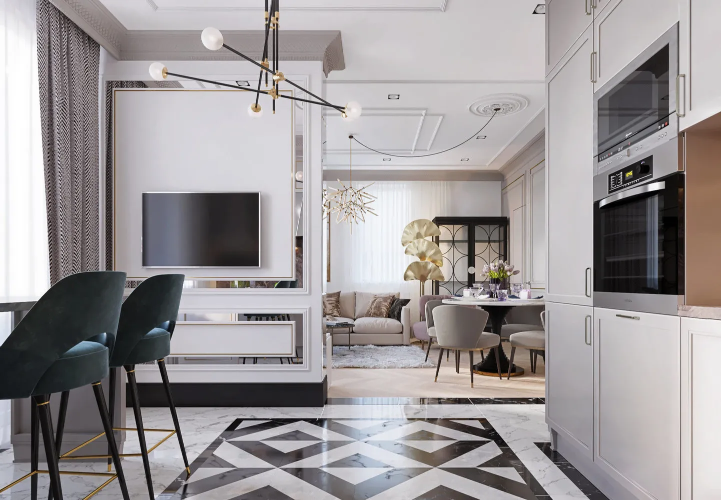
Julia Atamanenko, Designer. Founder of the Design Studio "Architecture and Interiors"
The floor in the entire apartment should be of one shade
This is boring! Each room can create an atmosphere, and it's best done through finishing.
It's better to zone spaces by height differences in the ceiling
If you don't miss the 90s, it's better not to do this. Besides, height differences will consume ceiling height. Zone the space using thoughtful furniture arrangement, floor coverings, and lighting.
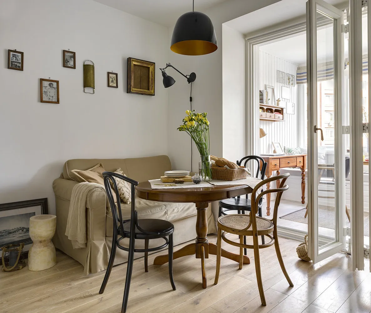
Design: Julia Atamanenko
Tile should go from floor to ceiling in the bathroom
Use decorative plaster, moisture-resistant wallpaper or paint — it's cheaper and easier. There’s no need to find a tiler or worry about layout and corner joints. If you do decide to use tiles, try not to go all the way to the ceiling.
Wooden floors should not be used in humid zones and in combination with underfloor heating
There are always workarounds: for example, in the bathroom, you can lay a tile. The space is minimal, so buying materials won’t hit the budget. On underfloor heating, you can lay a solid Junckers board, but not with glue and plywood — use brackets when laying on screed. Of course, with frequent temperature changes, wood may crack, but in my opinion, it only adds individuality to the room.
Design: Julia Atamanenko
A baseboard is required at the junction of wall and floor
There are many other solutions: for example, a cork compensator, an 'L'-shaped profile, or a hidden baseboard. And I’ll tell you a secret: you can make the floor-wall junction without a seam. After laying tiles on the wall, apply a layer of plaster and completely hide the seam. But first, you need to lay a sealing tape for painless deformation. In the bathroom where we conducted such an experiment a few years ago, everything worked out well.
Chandeliers should be hung in the center of the room
There’s nothing wrong with chandeliers themselves, but they look outdated. Also, centering the lighting seems too forced. Lighting can be different and interesting: try to do without ceiling lights or place a lamp in the center of a specific zone.
Design: Julia Atamanenko
Inna Azorsкая, Expert. Designer-Architect, Creative Director of Her Own Design Studio
Colored and multi-level ceilings look interesting
Multi-colored stretch ceilings and ceilings with backlighting are already a thing of the past. You can only use colored options in the bathroom. But I prefer a simple one-level ceiling with a cornice around the perimeter or even without it.
If tiles are on the splashback, they must be small-format
I recommend ordering large-format ceramic granite or full artificial stone on the splashback.
A wardrobe should be placed in the hallway
Replace them with sliding models. The interior walls can be covered with wallpapers featuring bold prints.
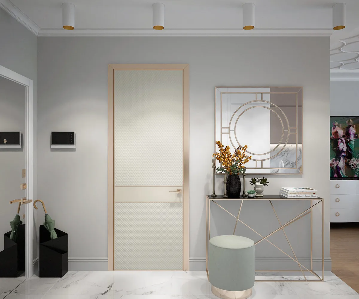
Design: Inna Azorsкая
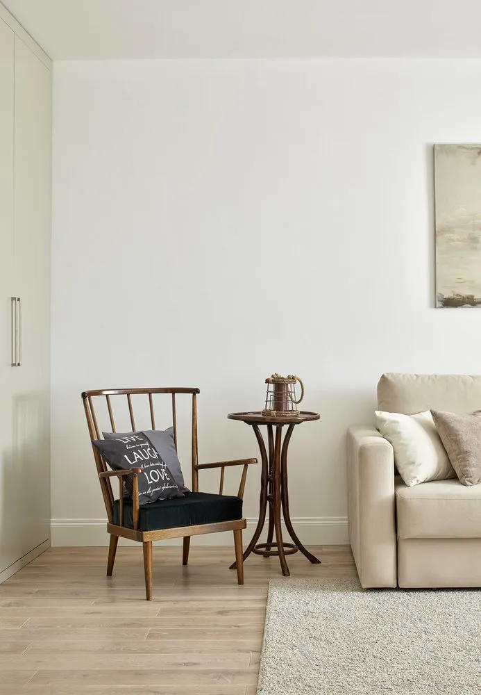
Valeriya Dan'kovskaya, Designer. Works in interior design for over 7 years and opened her own design studio
Items in the interior should be arranged symmetrically
Asymmetry looks much more interesting. Place a nightstand or table on one side of the bed in the bedroom, and a floor lamp on the other side.
Small-format tiles visually expand the bathroom space
This is not true! Large-format ceramic granite works much better for this.
A ceiling painted in the color of the walls visually decreases the height of the room
Another myth: such a ceiling will actually look higher.
Design: Valeriya Dan'kovskaya
Vlad Sedov, Designer. Head of the Design Studio Lines
Each room should use furniture from one collection
This is more of a myth than a design rule now. Of course, there are exceptions, and much depends on the collection, but don’t get too carried away. You don’t want to live like in a furniture store where the bed, wardrobe, and nightstand are all identical but don’t go well together.
Design: Lines
Elena Ivanova, Expert. Interior Designer from St. Petersburg with over 7 years of experience. Holds a higher architectural education (NGAHA)
The interior should be decorated in a unified style
Classic walls with moldings and cornices, modern soft furniture, an antique chest of drawers, and an abstract painting — all of this can be combined. If you like eclecticism, experiment boldly.
Using several types of metal in the interior is excessive
On the contrary: mixing gold, chrome, and colored metals looks much more interesting.
Design: Elena Ivanova
Vika Zolina, Expert. Designer, Graduate of the British Higher School of Design, Founder of the Zi-Design Studio
No more than three main colors should be used in the interior
I never follow this rule unless the interior itself demands monochrome. Using color plays can create different moods: the more saturated colors, the more harmonious the interior looks. The key is to skillfully combine prints and graphics and avoid monochromatic textures.
There should be only one accent in the room
With proper composition, there can be many. The key is to logically group them and avoid visual chaos.
I always plan the scenario for each room with color and accent zones. For example, in the living room, a soft zone is highlighted using armchairs, a rug, or a composition of pictures above the sofa. In the dining room — with a large chandelier, a rug, or accent furniture. And in the workspace zone, it’s perfect to hang a bright painting or an art poster.
Design: Zi-Design
Cover design: Julia Atamanenko's project
Need a renovation specialist?
Find verified professionals for any repair or construction job. Post your request and get offers from local experts.
You may also like
More articles:
 What Tones Look Great in Interior Design During Winter?
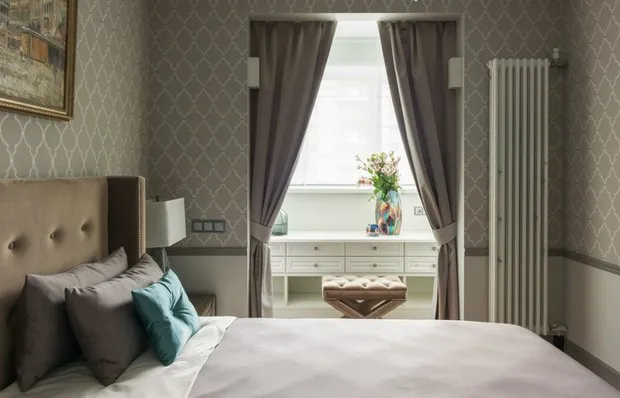 How to Attach a Balcony to a Room: Tips from the Pros
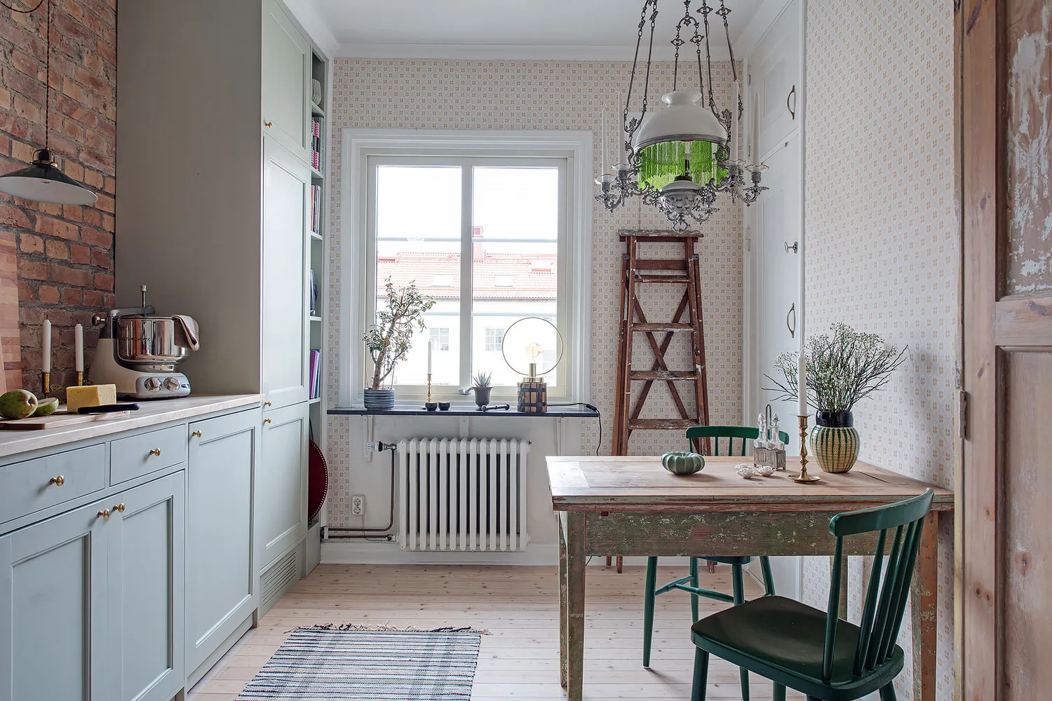 Apartment in the Style of a Scandinavian Country House
 Decorating the Home for New Year with Professionals
 How a Swedish Decorator Decorated Her Home for New Year
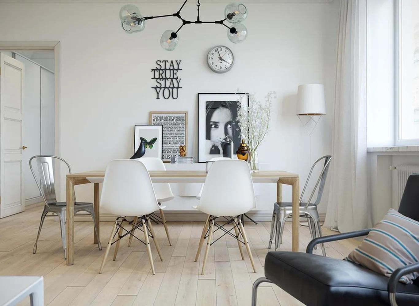 A New Perspective: What Should a Modern Home Be Like?
 New Year's Wishlist of Designer Oxana Butman
 Three-Level Apartment with Attic and Fireplace