Light or Dark Interior – Which Is Better?
Analysis of the advantages and disadvantages of dark and light interiors – for those who are unsure between a familiar light palette and trendy rich tones
Dark or light interior? This question has been asked for more than a decade. Both options have their pros and cons, which we decided to explore.
1. Expanding Space
The most common reason why flat owners choose light colors for decoration is their ability to visually expand the space. However, it should be noted that a monochromatic interior, free of accents, textures, and tone play, looks flat and visually narrows the boundaries of a room.
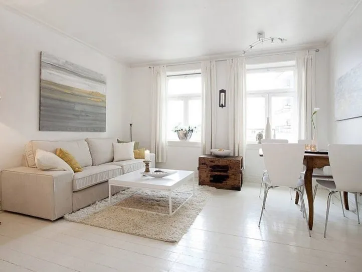
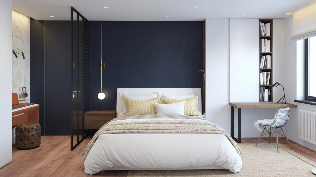
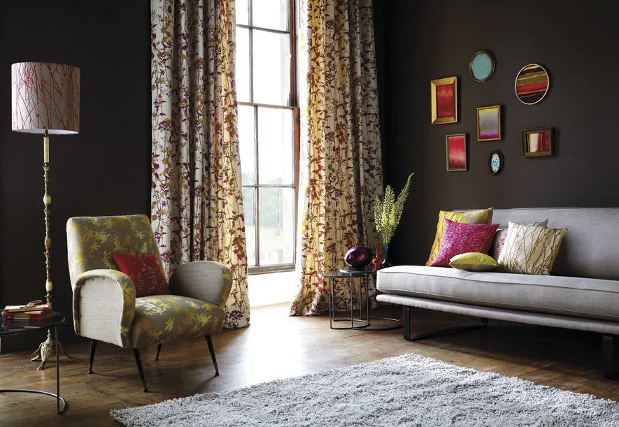
Not everyone knows this: dark colors can also visually expand the boundaries of a room. Of course, only when used skillfully. For example, painting one wall in a dark shade can visually move it further away.
 Design: Int2 architecture
2. Temperature
An important factor to consider when choosing between a light and dark interior is the ability of colors to absorb sunlight. If a significant part of the day sun shines through the windows, a dark interior will literally heat up more.
3. Lighting
White, beige, light gray, and pastel tones make an interior visually brighter and additionally reflect sunlight. Apartments where natural light is clearly insufficient may not suit a dark setting. However, if there's more than enough light in the room, richer tones may be a good fit.
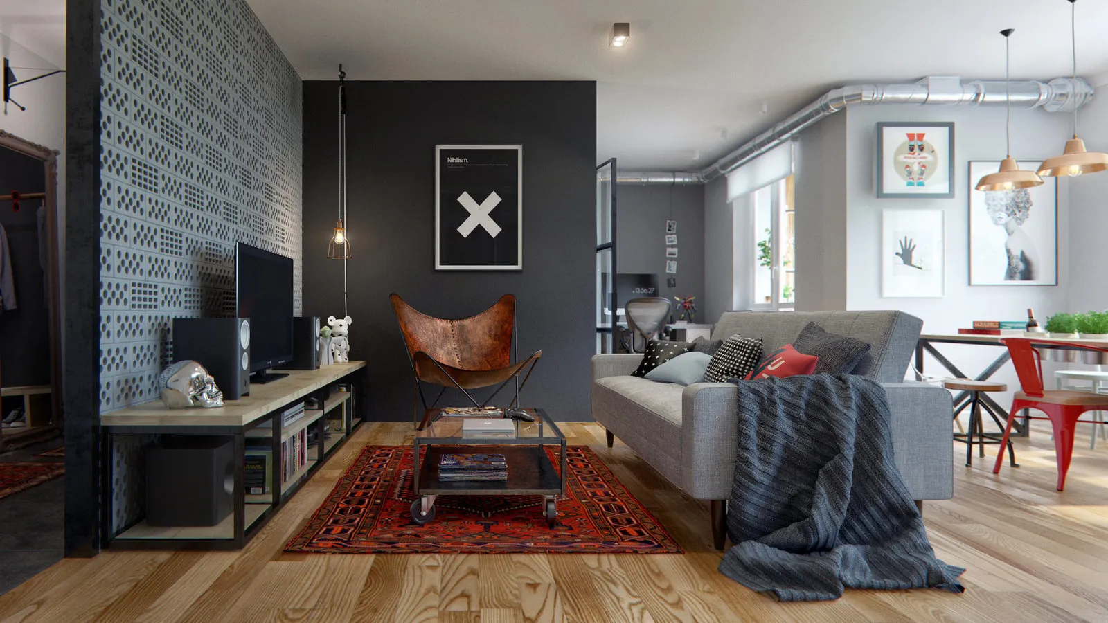
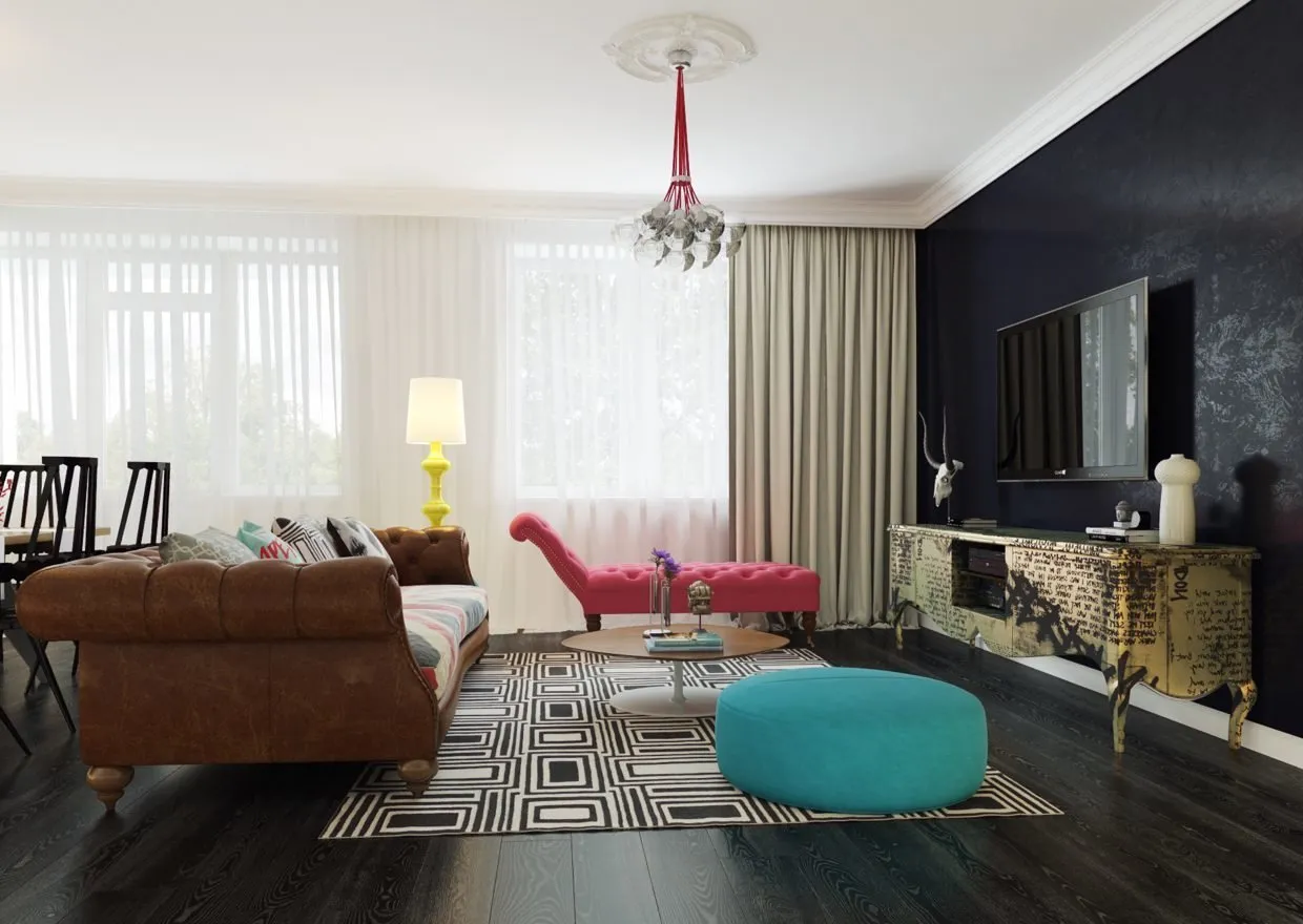
 Design: Co:Interior
4. Comfort
Naturally, a cozy interior is a rather vague concept. However, for rooms intended for a more intimate setting, dark colors are better suited than light ones (appropriate for bedroom, smoking room; possibly also for living room and bathroom).
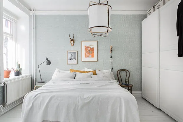
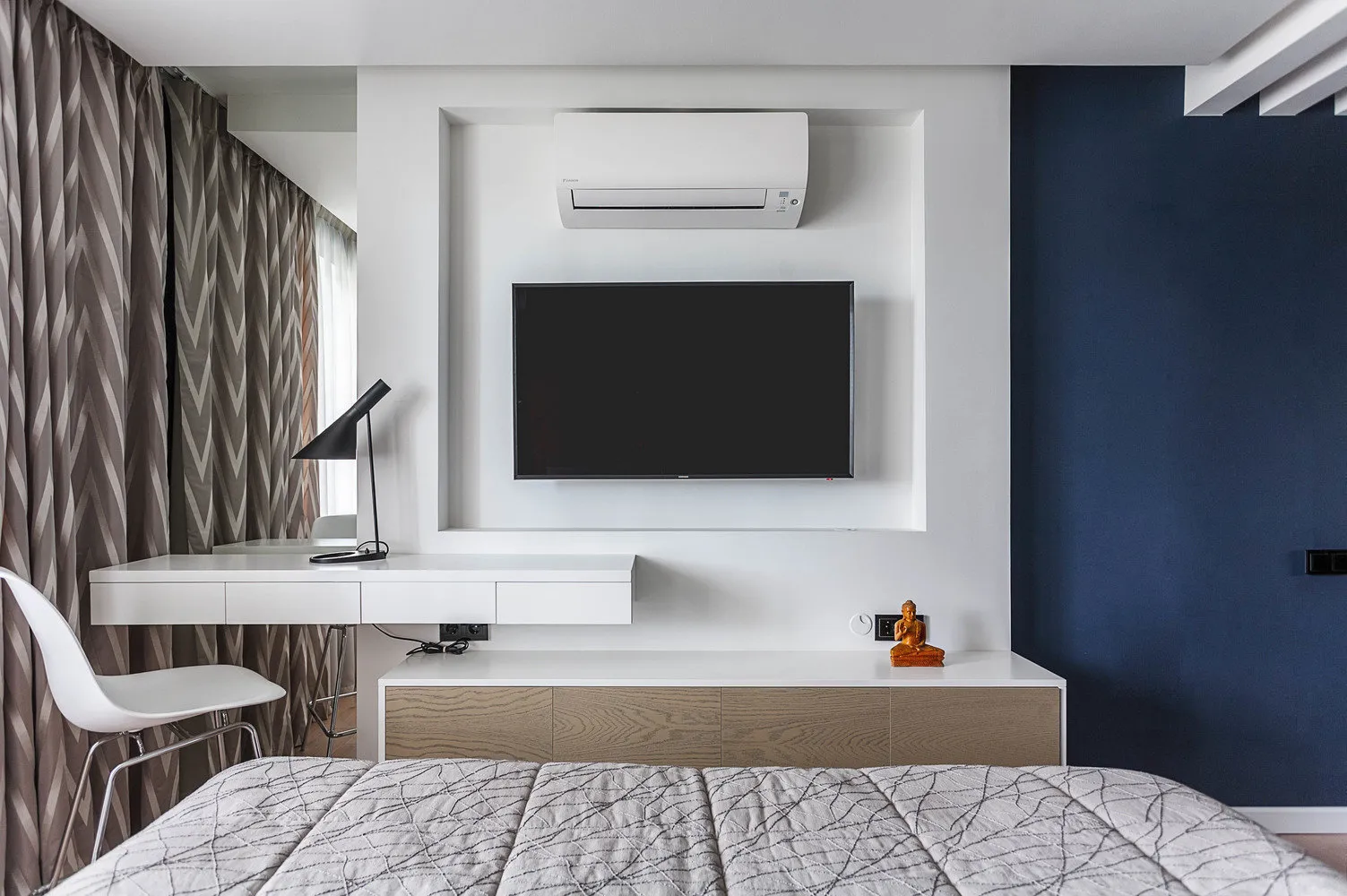 Design: Mila Titova
Still, light colors can also do a great job creating a cozy atmosphere. The secret is the same: more shades and textures. And, of course, it's better to stop not on cold white but on warmer pastel or beige-gray tones.
5. Matching Equipment
Many people, dreaming of a light interior, give it up out of fear that it will be much harder to buy equipment. Indeed, traditionally home cinema equipment is mainly produced in black. But things are changing: new products appear on the market, released in two variants: dark and light.
For example, Sony recently introduced a sleek, minimalist, and incredibly tech-savvy 2.1-channel soundbar HT-MT300 with Bluetooth® technology. The new model is available in both dark and light versions, allowing easy integration into an interior without breaking the overall concept.
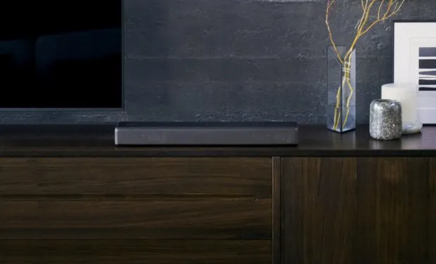 2.1-channel Sony HT-MT300 soundbar with Bluetooth®
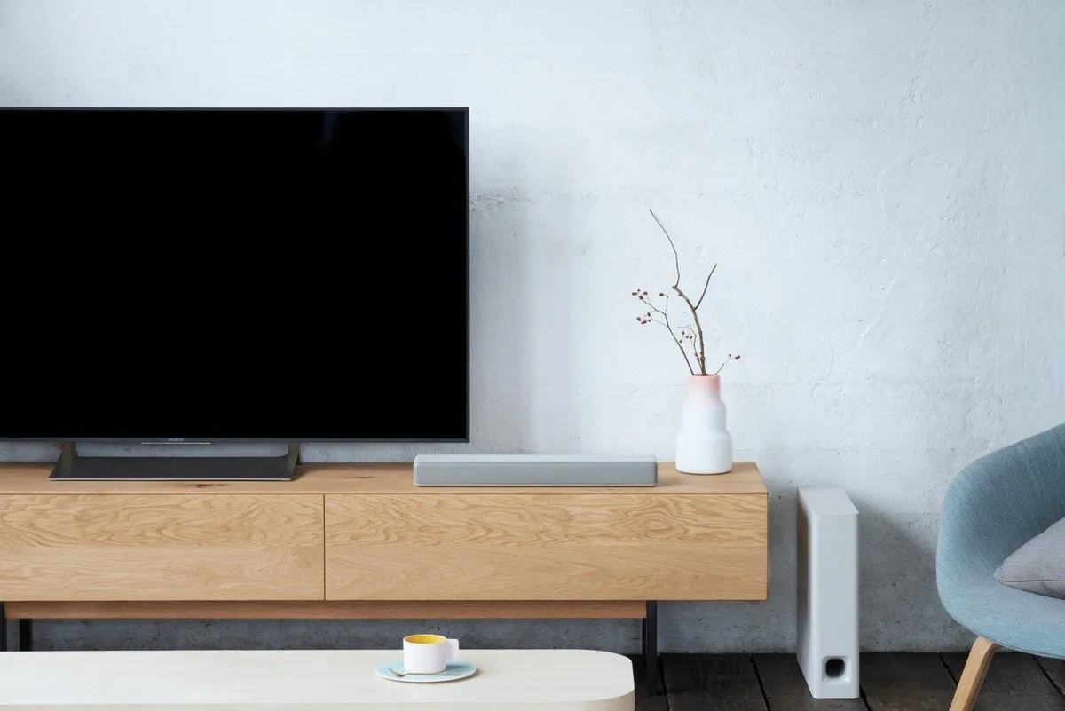 The HT-MT300 is also suitable if you want to minimize visible equipment. The wireless subwoofer can be mounted not only vertically but also horizontally, allowing it to be hidden under a sofa or armchair. Interestingly, the manufacturer has provided a special Sofa Mode that optimizes low-frequency sound and prevents sound muffle from furniture.
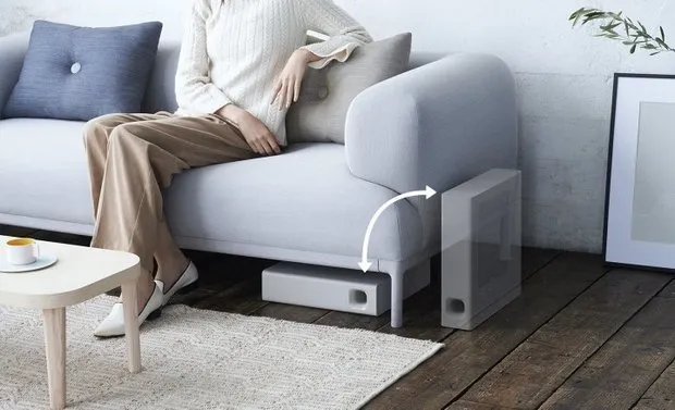
6. Sophistication
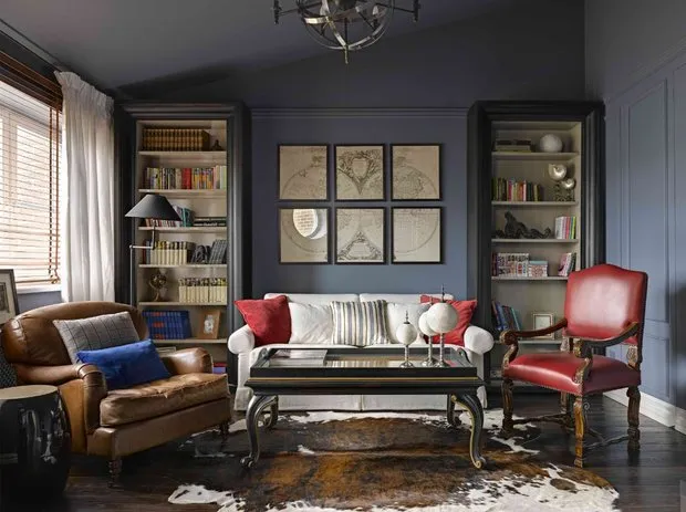
Light interiors are more familiar and common, thus slightly more associated with "simplicity." Dark tones in a setting, when skillfully paired with complementary shades and materials, look much more refined, elegant, and prestigious.
 Design: Evgenia Lykasova
7. Richness of Tones
At first glance, it seems that a light palette offers a wider range of colors and shades than dark. However, in reality, the dark palette is just as diverse and also provides radical black as well as softer options: graphite, dark green, dark brown, wine, saturated blue, and many others.
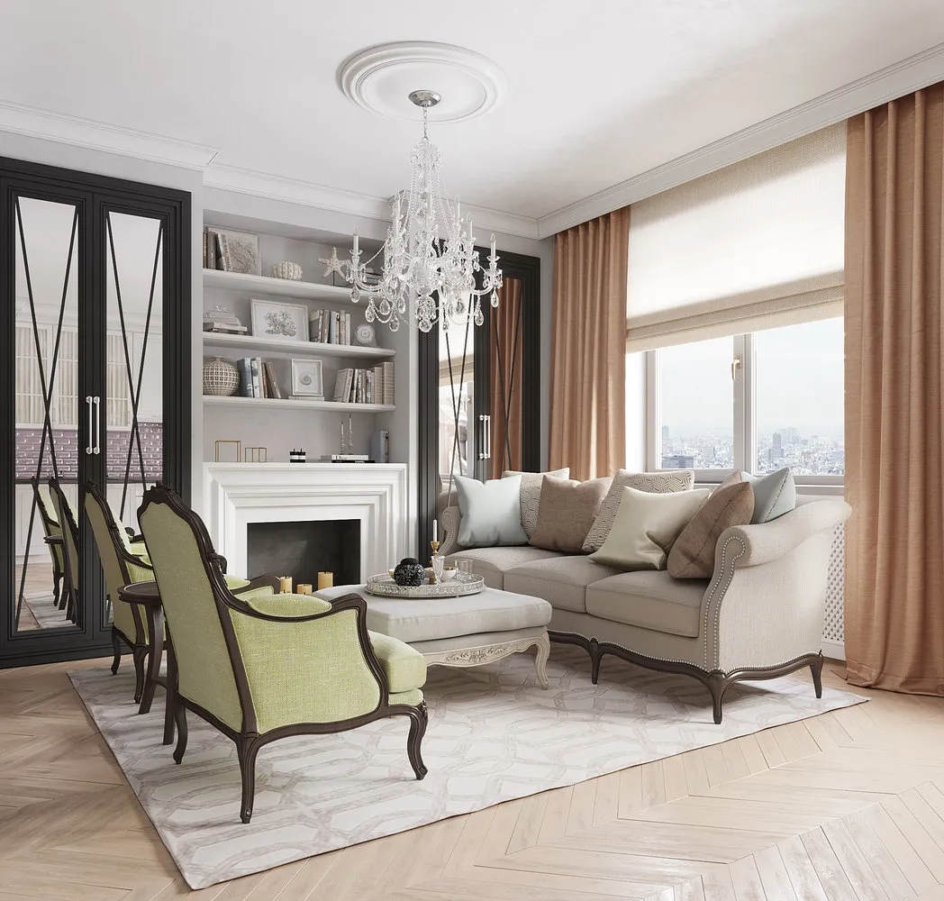
 Design: ChDecoration
8. Decoration
Light interiors are slightly simpler and more convenient for decoration and combining semi-transparent tones with bright accents. A significant role in this is played by the ability of light shades to visually unite colors, making them appear as one cohesive image.
 Design: Dzerassa Kachmazova
However, more effort is required for decorating dark interiors: wrong choices of complementary patterns and shades can make the setting overly sharp, too graphic, or overloaded. Moreover, design mistakes on a dark background will literally jump into the eye.
9. Compatibility
As mentioned above, light background colors can 'connect' complementary shades with each other, making the interior harmonious.
Dark interiors provide another advantage in terms of compatibility: a rich wall color unifies elements of an interior in various styles into one whole. This is especially relevant given the current trend toward eclecticism and all sorts of mixing.
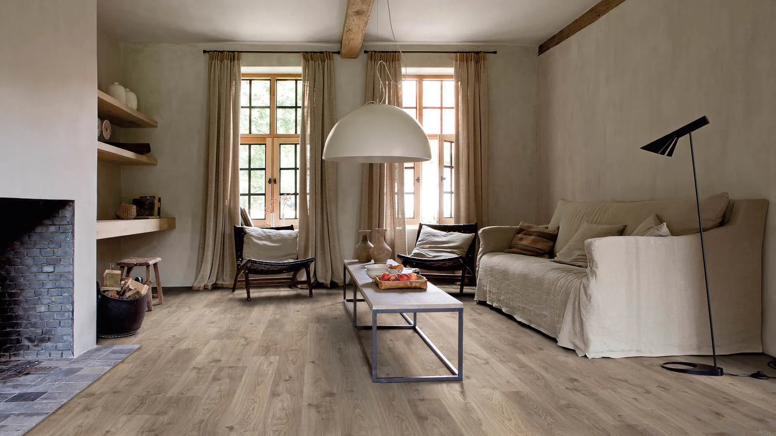
On the cover: design project by Int2 architecture.
The material was prepared with support from AO "Sony Electronics".
Need a renovation specialist?
Find verified professionals for any repair or construction job. Post your request and get offers from local experts.
You may also like
More articles:
 8 Mistakes Made by Designers and Contractors That Cost Owners Too Much
 Creating a Living Room Like in the TV Series 'Mad Men'
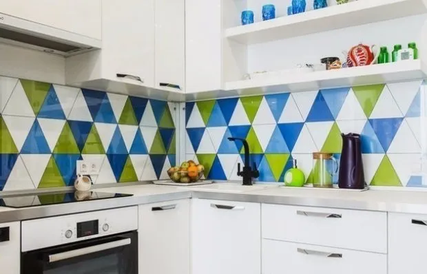 13 Ideas for a Small Kitchen: Projects by Our Designers
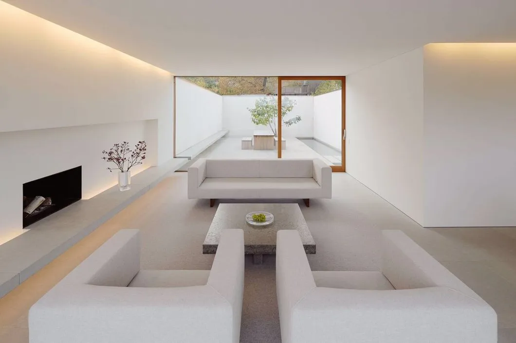 How to Decorate an Interior in Minimalist Style
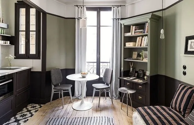 10 Golden Rules of Designing a Small Apartment
 What You Might Have Missed in the Design of Eataly's Gastronomy Store
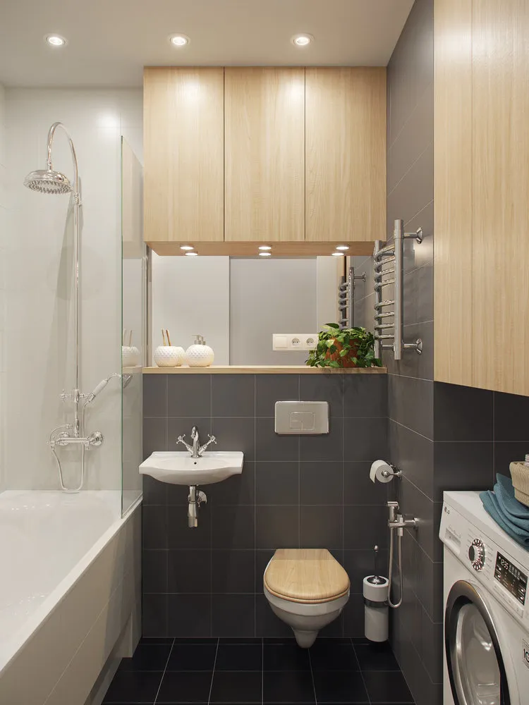 5 Rules for Choosing a Sink for a Small Bathroom
 How to Set Up a Home Theater in the Living Room: 9 Tips