How to Choose a Color Palette for the Bedroom: 10 Expert Tips
The bedroom is one of the most private rooms in the apartment. Here, a person immerses themselves in an atmosphere of relaxation and peace. Nothing should distract, irritate, or cause discomfort.
Creating the perfect relaxing effect relies on a carefully chosen color palette. Experts share insights on how to select it and what to pay special attention to.
It's no secret that bedrooms are best decorated in soft, calm tones. This creates a cozy and relaxed atmosphere. While this is true, it's also important to remember that in bedrooms we should not only fall asleep peacefully but also wake up refreshed. We’ll explore unique approaches to bedroom design with these expert tips.
Tip #1: Bold Accents
There’s no need to fear bold elements. These can include large wall surfaces such as photo wallpapers, frescoes, or murals, or subtle accents like textiles or decor. The choice depends on the bedroom’s size.
In smaller spaces (up to 12 square meters), use accent elements sparingly—overdoing large bright features may turn your peaceful retreat into a social hangout. One or two vivid paintings against a simple, pastel-patterned wallpaper are enough to maintain the right mood.


Tip #2: Don’t Fear Dark Tones
Don’t hesitate to use deep, dark colors like dark brown or even charcoal black. Avoid glossy finishes; instead, opt for dense, textured materials. Later, you can enhance this dark side of your design with targeted lighting to create an intimate, subdued atmosphere—just not so dark that you lose your partner in the passion.

Tip #3: Personal Preferences
Ultimately, it depends on the room’s occupant, their lifestyle, and personality. A carefree bachelor may love using authentic materials like leather walls or dark brick to give the bedroom a mysterious allure.
An older woman around 70 might not mind silk light-colored wallpapers and soft, light green textiles to make the room feel more elegant and graceful—though this is purely a matter of personal taste.
To find the best color combinations for you, start by reflecting on your current and future style preferences over the next 7 years. Consider your design preferences, room size, and orientation to the cardinal directions (a crucial factor often overlooked).

Tip #4: Direction of Windows
Grab a pencil and paper and list your preferred styles and colors. Print a few color combinations you like and immediately rule out greenish-yellow, burgundy, and gray tones if your windows face north or west. Avoid blue, pink, and brown hues if your windows face east or south.
These shades often look unflattering under sunrise or sunset light, creating an unpleasant, cluttered atmosphere. They may even cause mental fatigue, making you delay bedtime until sunset—or wake up to an unappealing room. This stems from natural light interacting with chosen wall colors, leading to stress, tiredness, and chronic sleep deprivation.
These tones are best avoided on large wall areas. Small accents, however, can work and even highlight interior details effectively.

Tip #5: Quick Fixes for Design Flaws
If your bedroom already features color combinations that make you uncomfortable, you can fix them with minimal investment by adding decorative lighting. Direct it toward areas that look dull in natural light to counteract the effect with artificial illumination.
You can also distract the eye from unflattering light using bold accents like textiles, cushions, decor, or even a beautiful woman (or a fit man, if you're a woman) with a champagne glass on the bed, surrounded by white rose petals—this will draw attention away from mismatched tones, unnatural wallpaper patterns, and directional light issues.

Now, another expert shares their view on bedroom design.
Tip #1: Calm Palette
The ideal solution for a bedroom is using soft pastel tones and neutral color palettes as the main background. However, these neutral tones should be warm. They’ll create a sense of warmth and comfort in winter, and by emphasizing light, airy fabrics and white or pale textiles, you can achieve a breezy, summery feel.

Tip #2: Focus on Details
Stay away from pure or near-white colors, or use them only as bold accents in the form of small accessories. These can be easily hidden or swapped depending on season, time of year, mood, or personal preference.

Tip #3: Textures and Materials
Don’t overlook the texture of materials and furniture. For example, bright plastic in a bedroom looks jarring and out of place. But a bold velvet upholstery on a chair or cushions can transform the space, adding grandeur and luxury.

Tip #4: Patterns and Motifs
Use patterns and ornaments mainly in textiles and upholstery.

Tip #5: Color and Light Harmony
Pay special attention to how colors behave under both natural and artificial light. Well-chosen pastel and neutral palettes can energize you in the morning by enhancing their brightness, and create a soothing atmosphere at night when lights are dimmed.
This balance makes the palette highly versatile and effective at promoting rest and relaxation.


Need a renovation specialist?
Find verified professionals for any repair or construction job. Post your request and get offers from local experts.
You may also like
Більше статей:
 30 вдохновлюючих видів з вікна
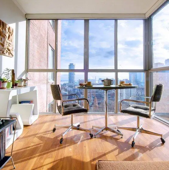
 How to Decorate a House if Windows Are Floor-to-Ceiling: Interior Behind Glass
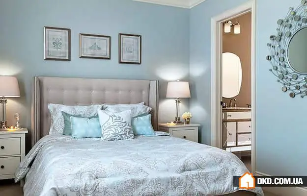 20 Elegant Bedrooms in the New Classic Style
 Дерево і бетон: екологічний і мінімалістичний будинок
 7 Ways to Use Wallpaper Coloring Not as Intended
 5 famous designer chairs
 How to Design an Interior in Scandinavian Style: Tips and Examples
 8 планувань кухонь площею менше 10 квадратних метрів