Small Kitchen Is Not a Problem: 10 Visual Expansion Techniques
A small kitchen is an opportunity to show creativity
Cooking in a kitchen the size of a postage stamp is a real quest. There's nowhere to turn around, no space for storage, and the island is only a dream in sweet dreams. But designers have learned to transform small kitchens into spacious and functional spaces. The secret is not in demolishing walls, but in skillful visual techniques that deceive perception and make the brain see more square meters than actually exist.
Main points from the article:
- Light-colored fronts reflect up to 90% of light and visually double the size of the kitchen;
- Kitchens up to the ceiling seem 20-30% more spacious than those with cornices;
- Open shelves create a sense of air, closed ones — monolithicity;
- Proper lighting can visually expand the kitchen by a third;
- Glossy surfaces work like mirrors and double the space;
- A single countertop without seams creates an illusion of unity.
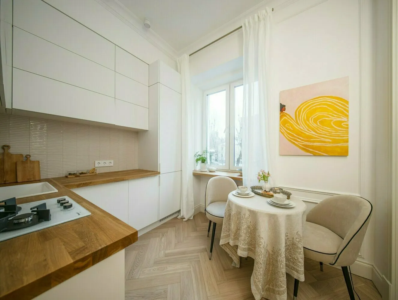
Light-colored fronts are your magic wand
A white kitchen in a small space is not boring, but genius. Light-colored fronts reflect maximum light and create a sense of airiness. Dark ones, on the contrary, absorb light and visually compress the space.
It's not necessary to make a kitchen sterile-white. You can play with shades: milk, ivory, light gray, soft beige. The main thing is to avoid contrasting combinations that fragment the space into parts.
Professional trick: make upper cabinets slightly lighter than lower ones. This visually raises the ceiling and adds height to the kitchen. White top + light gray bottom = a proven success formula.
Design: Darya Shatilova
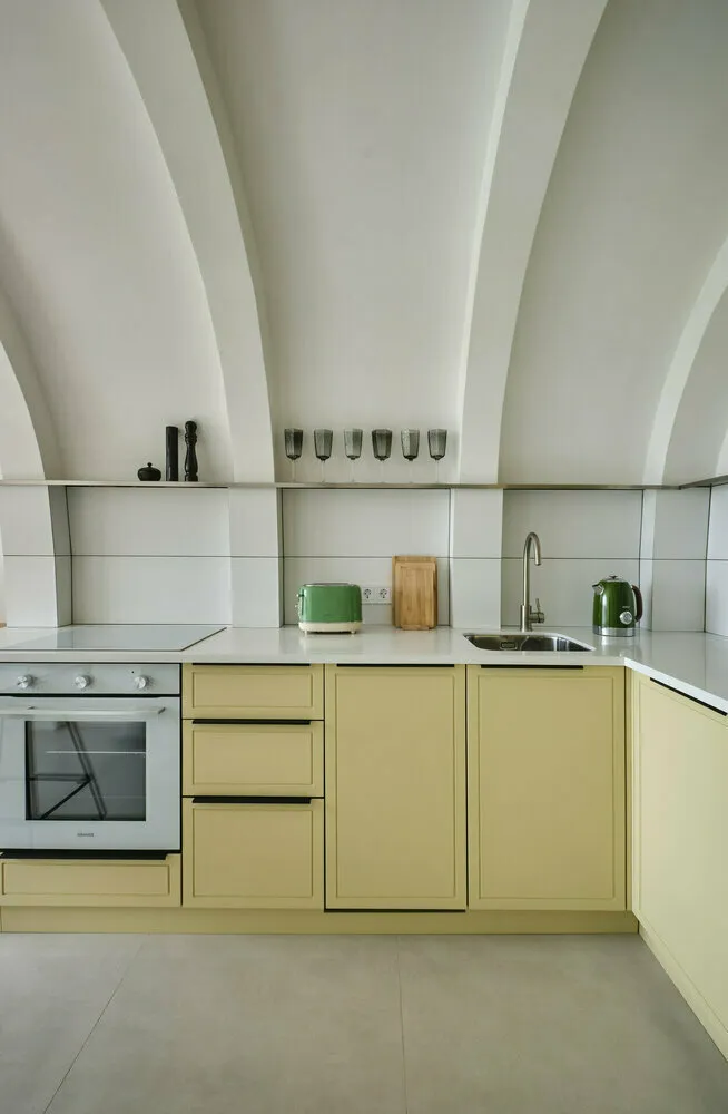
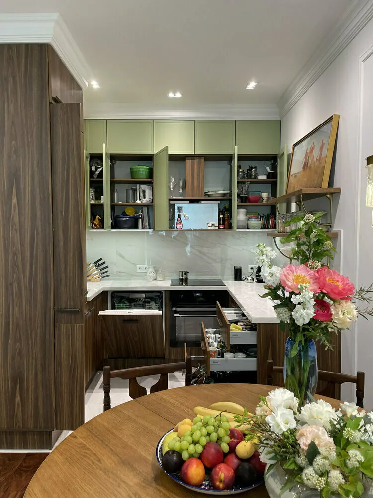
Kitchen up to the ceiling instead of cornices
Cabinets up to the ceiling are one of the most effective techniques for a small kitchen. They create a monolithic vertical line that visually raises the ceiling. Cornices with gaps, on the contrary, cut the height and make the kitchen appear low.
Upper shelves can be used for seasonal items or beautiful dishes. Even if it's hard to reach them, the visual effect is worth it.
If the ceiling is very high (more than 3 meters), you can make two-level cabinets: the lower tier for daily use, and the upper one for storage. This adds architectural character to the kitchen.
Design: Olga and Anna Izotovs
Open shelves create air
A few open shelves instead of upper cabinets is a bold but effective solution. They do not clutter the space and create a feeling of lightness. Especially well-suited for shelves by the window or in a corner.
Only beautiful dishes or decor should be placed on open shelves. Chaos of jars and packets will ruin the entire effect. Better less, but neat.
Compromise option: keep some cabinets closed for storage and replace others with open shelves for beautiful items.
Design: Elena Zufarova
Glossy fronts work like mirrors
Glossy surfaces reflect light and the surrounding space, creating a depth effect. A glossy kitchen seems one and a half to two times bigger than matte.
Especially effective are light glossy fronts opposite a window — they reflect daylight and literally double its amount. At night, they work with artificial lighting.
The only drawback of gloss is that fingerprints are visible on it. But for a small kitchen, this disadvantage is outweighed by the visual effect of space expansion.
Single countertop without gaps
A countertop that runs around the entire perimeter of the kitchen without seams or gaps creates a feeling of unity. The eye perceives the kitchen as a single space, not a set of separate elements.
This works particularly well with corner kitchens. A countertop that smoothly wraps around the corner visually unites two walls into one functional zone.
If the budget doesn't allow for a continuous countertop, the joints should be as inconspicuous as possible. It's better to pay extra for quality finishing than to save and end up with visible seams.
Proper lighting expands the boundaries
More light — more space. In a small kitchen, several sources of lighting are needed: general ceiling light, under-cabinet lighting for work zones, and accent lighting.
LED strips under upper cabinets are a must-have for small kitchens. They illuminate the countertop and create an effect of cabinets floating above the work surface.
Spotlights should be distributed evenly across the ceiling rather than concentrated in one spot. Even lighting makes the space look visually larger.
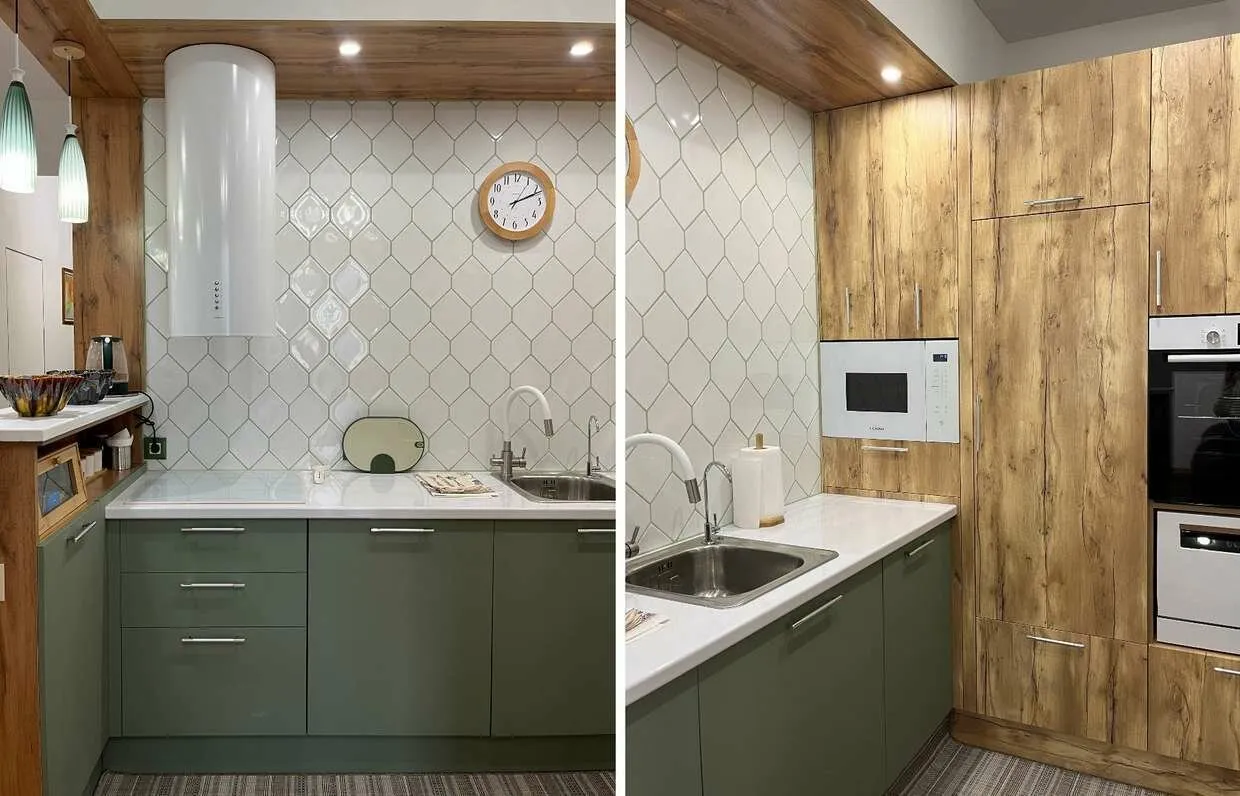
Vertical lines lift the ceiling
Vertical elements visually increase the height of the kitchen. These can be vertical handles on fronts, tall aprons up to the ceiling, or vertical tile layout.
Especially effective is the technique with a ceiling-height apron. Instead of a traditional 60 cm apron, make it the full height of the wall. This visually raises the ceiling and creates a sense of high space.
Vertical stripes on fronts also work, but it's important not to overdo it — too many verticals create a feeling of narrowness.
Design: Julia Kuchkova
Design: Julia Kuchkova
Minimal furniture on the floor
The more floor is visible, the more spacious the kitchen seems. Wall-mounted cabinets, built-in appliances, and suspended hoods all free up floor space and create a feeling of lightness.
If floor cabinets are needed, choose models on legs or with a base recessed into the wall. Visible floor under furniture visually increases the area.
An island or bar counter is better made on one support rather than a massive base. This preserves the feeling of open space.
Transparent elements don't clutter
Glass cabinet doors, transparent chairs, glass shelves — all of these are functional but visually almost weightless. Transparent elements don't interrupt the view and preserve the sense of open space.
Especially effective are glass cabinet doors in upper cabinets. They show the contents but don't create a feeling of bulkiness. The key is to keep things organized inside.
If fully transparent glass seems too cold, choose ribbed or matte — the effect of lightness remains, but warmth is added.
Proper color palette unifies the space
A monochromatic or tonally similar color palette visually expands the kitchen. When fronts, walls, and ceiling are done in one color family, boundaries blur.
Accents are better added through accessories that are easy to change: textiles, dishes, decor. A contrasting apron can be the highlight, but it's important not to overdo the brightness.
The floor should either match the furniture or be neutral. A dark floor with contrast creates a visual illusion of shrinking the kitchen, while a light one expands it.
Design: Olga Semasheva
A small kitchen is not a death sentence, but an opportunity to show creativity. Use these techniques comprehensively, and your kitchen will seem much more spacious. The key is not to try to apply everything at once. Choose 4-5 suitable techniques and implement them properly. The result will exceed expectations: a functional kitchen that's pleasant to cook in and looks twice as big as its actual size.
Need a renovation specialist?
Find verified professionals for any repair or construction job. Post your request and get offers from local experts.
You may also like
More articles:
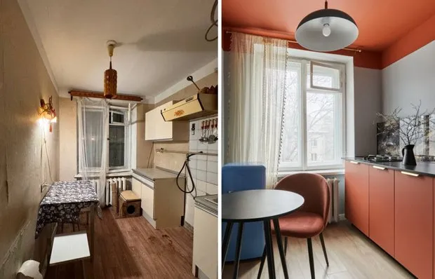 Before and After: Stunning Transformation of a 'Bored' Kitchen in a Brezhnev-Era Apartment
 9 Classy Design Solutions Inspired by a 47 m² Studio Apartment
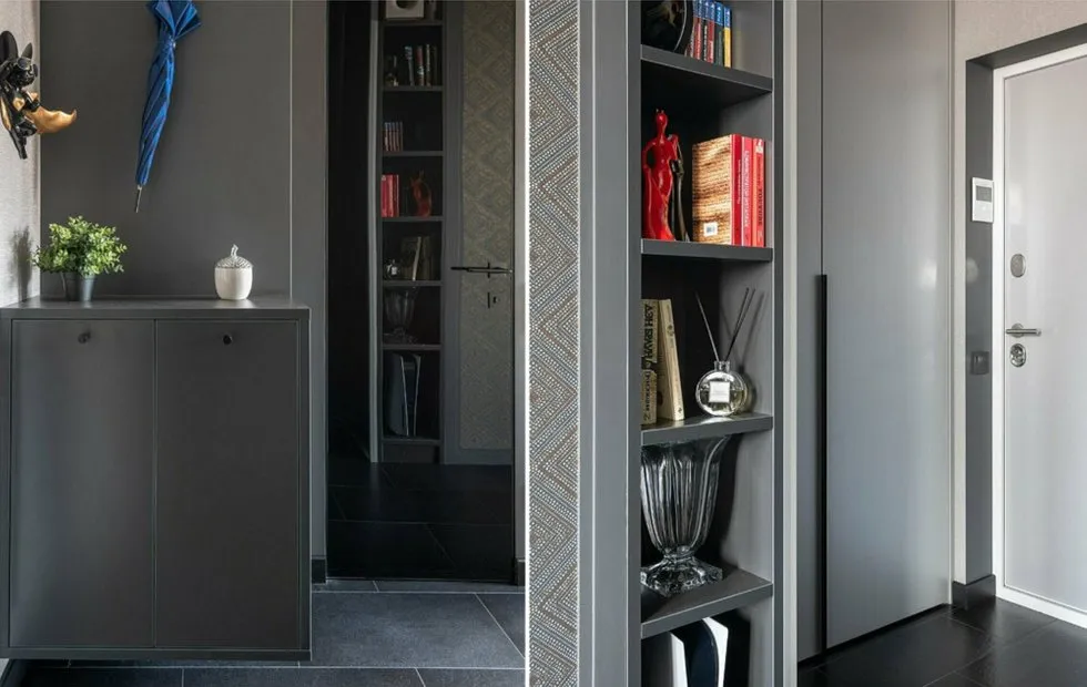 Small Entryway Won't Be a Problem Anymore: Designer Tips for 3 sq. m
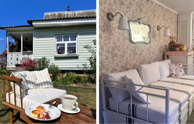 How to Transform a 75 m² Bare Cottages into a Cozy Country Cottage on a Budget
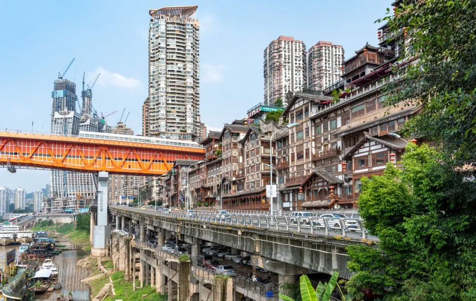 Secrets of Chongqing: The Most Unexpected Facts About This Multi-Level City That Will Shock You
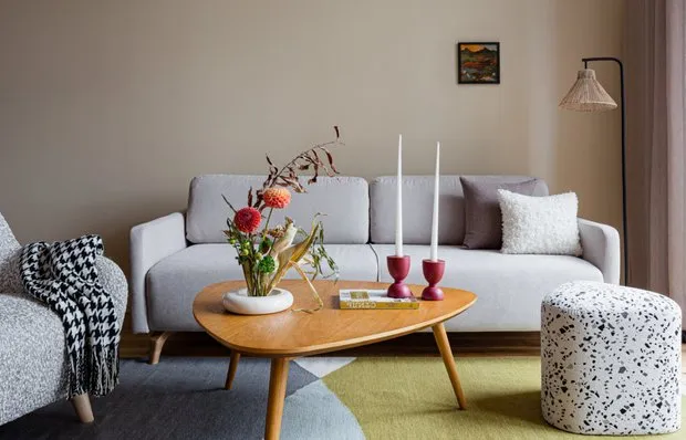 Soft Furniture for Home: Top-10 Trendy New Arrivals
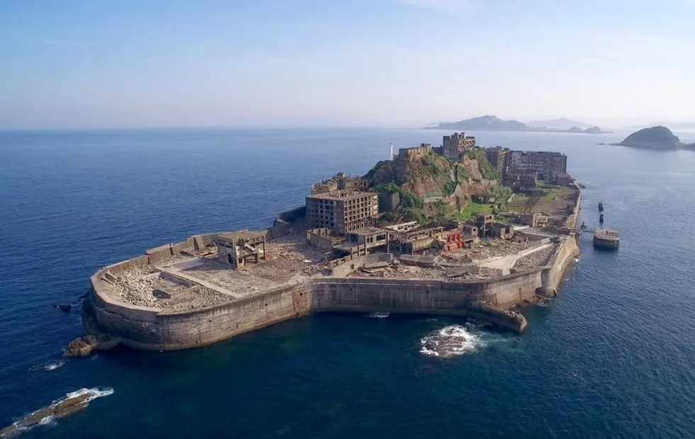 Abandoned Paradise: What Hides the Island of Hasingama, Left Behind 50 Years Ago
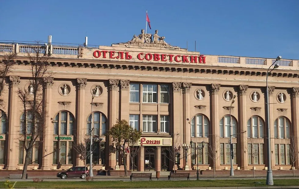 "Stalinist Empire in the Middle of the Forest": Mystery of the Soviet Hotel