Clearly Noticeable: 6 Signs of an Outdated Interior
Some details are not immediately noticeable, but it is precisely because of them that the design looks 'worn out'
An interior can become outdated not only due to trends but also because of wear—small details that we stop noticing. At the same time, the feeling of a 'worn out' apartment does not always come from furniture or finishing: often, the problem lies in the overall atmosphere, poor lighting, and elements that have lost their relevance.
Mistakes are easy to fix without major renovation. The key is knowing what to pay attention to. We've collected the details that make an interior visually outdated. If you notice at least three of them in your home, it's time to refresh the atmosphere.
Glossy suspended ceiling and chandelier with 'drops'
Suspended ceilings with glossy surfaces are out of fashion. They create a mirror effect, visually 'flip' the ceiling downward and produce unnatural reflections under lighting. Outdated are options with pearl, perforation or patterns—flowers, clouds, abstraction.
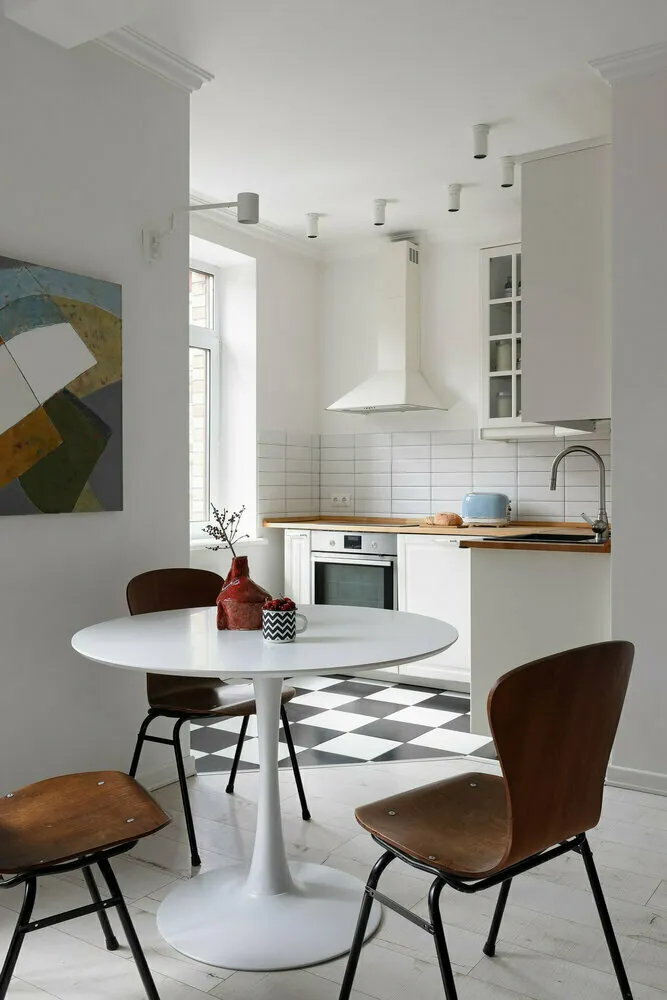
In Julia Pоздняк's project, ceilings remain clean and modern thanks to a matte finish and neat built-in lighting.
The second sign is a central chandelier with pendants in the form of drops, petals or 'crystal branches', as seen in catalogs from the early 2010s. Modern ceilings are matte, neutral, with local lighting and without visual noise.
Wallpaper with glossy pattern, curls, and 3D effect
Wallpapers with shiny patterns, complex curls or convex relief are outdated. Especially those where a pearl pattern is printed on a dark background or stylized vignettes—decoration looks heavy and immediately reveals an interior from the early 2010s. Popular were also 3D wallpapers simulating brick, stone or textiles but executed too literally.
In Tatiana Kozhevnikova and Valeria Kurakova's interior, smooth walls with cornices replace wallpapers and create an effect of noble severity.
Another signal is wallpaper with photo printing: Eiffel Tower, night megapolis, forest in mist on an entire wall. Previously considered a striking solution, today it's seen as visually outdated decoration. Finishing overloads the space, does not pair well with furniture and quickly tires the eye.
Heavy curtains with valances, tassels, and fringe
Valances, draperies, heavy curtains on lining with tassels and gold fringe are classic elements of interiors that have become obsolete. Solutions came from the 2000s when it was believed that drapery in multiple layers made a home 'luxurious'. In reality, this visually overloads windows, steals light and reminds one of a banquet hall décor. This is especially noticeable in small rooms where airiness is desired.

In Maria Sablina's project, textiles are chosen boldly and with taste—curtains become a full-fledged accent without overloading the space.
A valance hanging in waves on the ceiling makes ceilings appear lower and visually breaks vertical lines. Such curtains are less common now: you can see them in interiors that have not been updated for the last 10–15 years.
Floral carpets on the floor and wall hangings
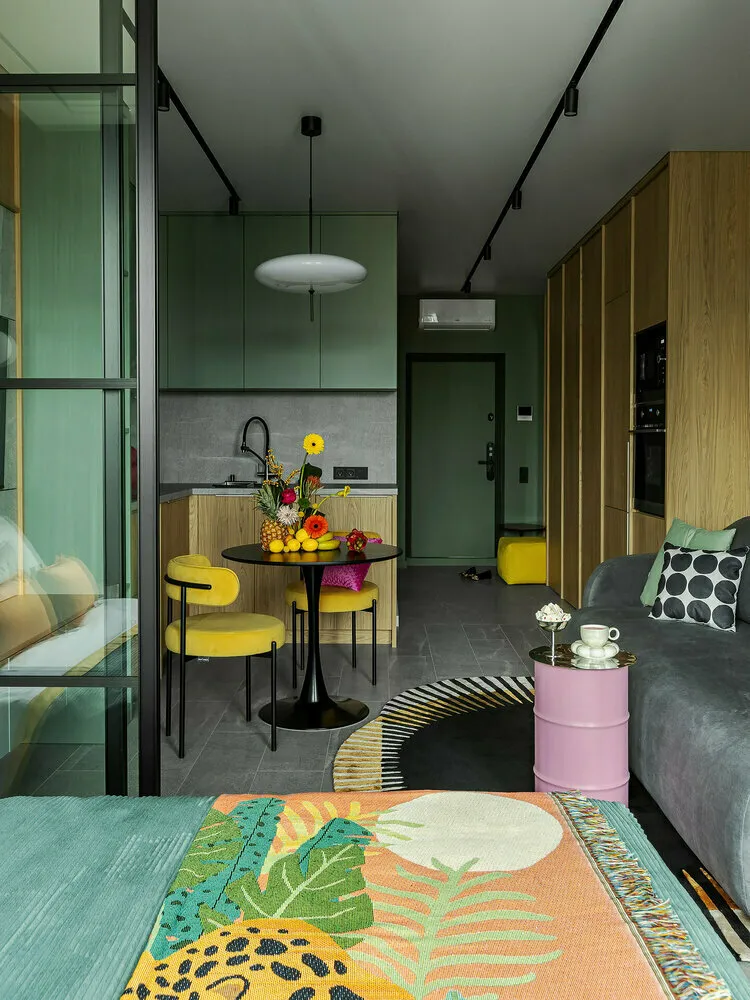
A carpet with a border and large floral pattern is a typical element of outdated design. Especially if it takes up the entire room, including space under furniture. Items are associated with Soviet and post-Soviet apartments where they were a symbol of comfort and wealth. Another sign is a carpet hanging on the wall behind the sofa. Even if it's in good condition, the format 'carpet as a tapestry' is perceived as an outdated relic.
In Alla Kunicyna's interior, a carpet with an abstract pattern supports the palette and gives it relevance without being tied to time.
Such carpets make an interior visually dark, break up the space and conflict with modern furniture. Today, relevant are carpets with soft textures, geometric patterns, subdued tones or vintage patina. But not floral ones on a cream pile.
Central chandelier
A light fixture in the center of the ceiling—especially a classic chandelier with glossy horns and white bulbs—is seen as an archaic relic. This solution dates back to standard renovation schemes when lighting was not zoned and the entire load fell on one fixture. If the light is cold with a bluish undertone, the room looks lifeless even if it has expensive furniture.
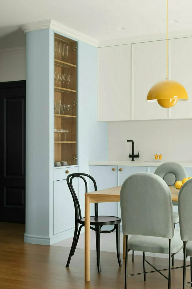
In Dizzo Design studio's interior, a glossy chandelier works as an accent, adding modern rhythm to the calm palette of the kitchen.
Modern approaches are based on layered lighting: warm light, local scenarios, different levels—from table lamp to built-in lighting.
Over-decorating
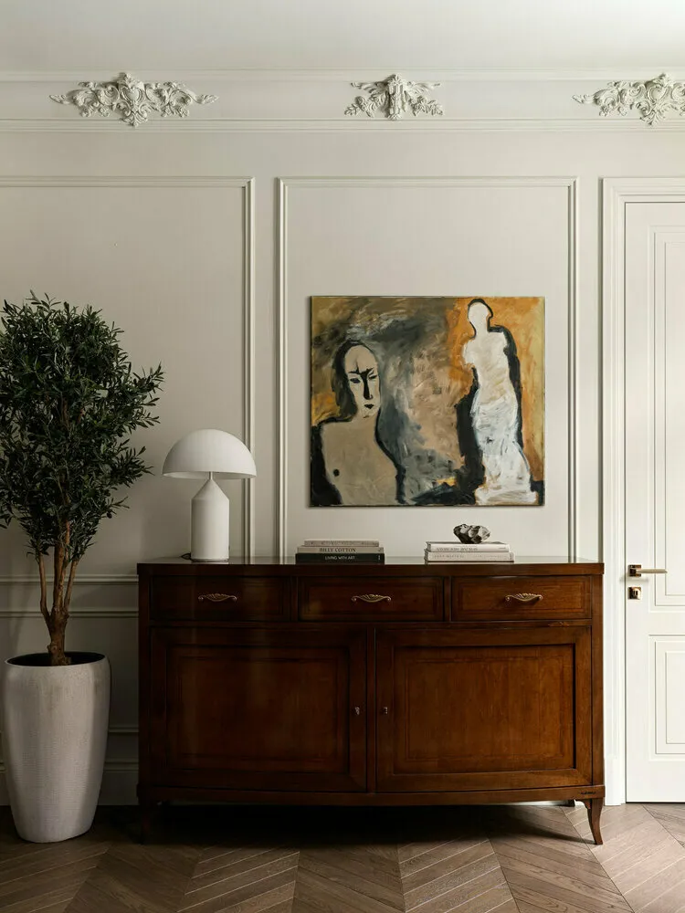
When every shelf, cabinet and windowsill is filled with small items, the space instantly looks outdated. Especially if gift souvenirs, angels and artificial flowers in pots are used. Decoration creates visual noise and prevents the eyes from resting. Moreover, elements often don't match in style or color and look like a chaotic collection.
In Maria Stepanova's project, decoration is kept to a minimum: each item works on the overall concept without overloading the space with unnecessary details.
Remember: excess is only appropriate in cottage or eclectic styles, but even then with precise balance—not in the format of 'I keep everything I'm too sentimental to throw away'.
What to do if you recognize your interior here
Outdated elements are a reason to reassess the design. Sometimes it's enough to simply remove several details for the space to breathe: replace the chandelier, clear a shelf of small items. The key is to look at your interior critically as if you were entering an apartment for the first time.
Need a renovation specialist?
Find verified professionals for any repair or construction job. Post your request and get offers from local experts.
You may also like
More articles:
 How to Make a Narrow Corridor Wider: 7 Simple and Effective Ways
 8 Most Anticipated Movies and Series of Spring 2025
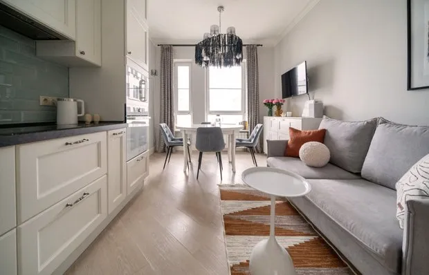 How We Transformed a Panel Apartment in 3 Days for 208 Thousand Rubles
 7 Cool Ideas We Spotted in a Small Stalin-era Apartment
 Communication Nightmare: How We Defeated 7 Types of Pipes in a Stalin-era Apartment and Saved 400 Thousand
 5 Bright Designer Solutions for the Kitchen
 6 Cool Ideas for a Small Apartment, Inspired by a Tiny 20 m² Studio
 Raw Renovation: Where You Can and Cannot Save Money