How a Designer Visually Expanded a 62 m² Apartment Using Finishing Touches
We tell the story through Lidia Bolshakova's project
Lidia Bolshakova from NW-INTERIOR studio created a modern classic interior in the clients' new apartment. A 62 square meter space accommodated a kitchen-living room and two bedrooms. However, the most attention-grabbing part is the finishing touches and furniture. The designer chose a neutral beige color palette without bright accents. Thanks to interesting techniques and carefully selected material combinations, the interior does not look boring — and additionally, visually expands the space. We explain how this was achieved.
Kitchen-Living Room
The kitchen cabinet is corner-shaped, and the furniture was built into two niches. The facade color matches the wall color, so the kitchen doesn't look bulky. To prevent it from fully blending into the decor, a more contrasting stone was chosen for the backsplash and countertop.
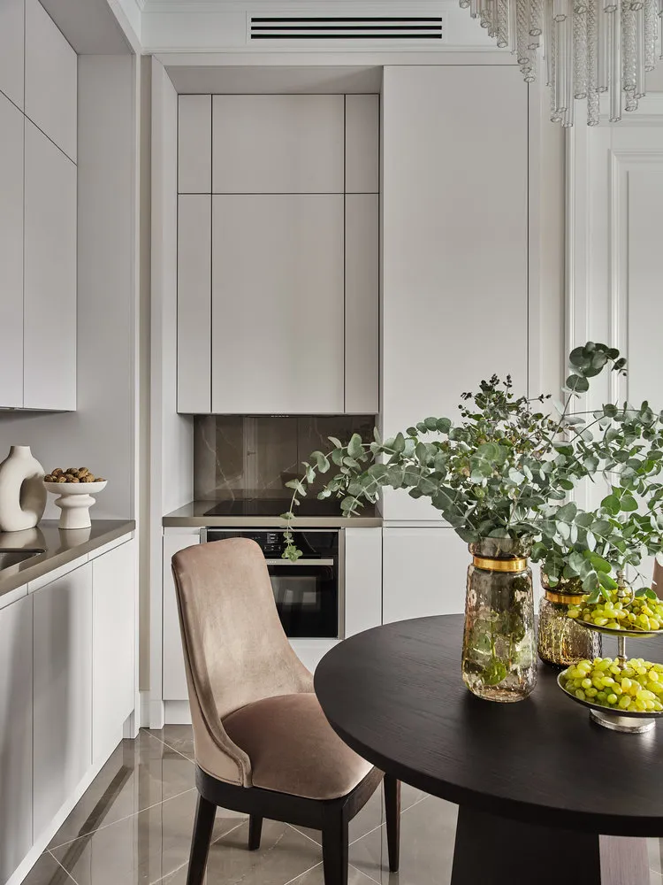
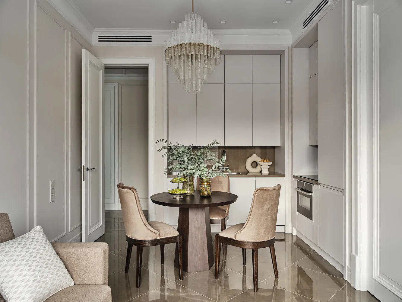 The dining area was accentuated with a dark table and an exquisite chandelier that cannot go unnoticed.
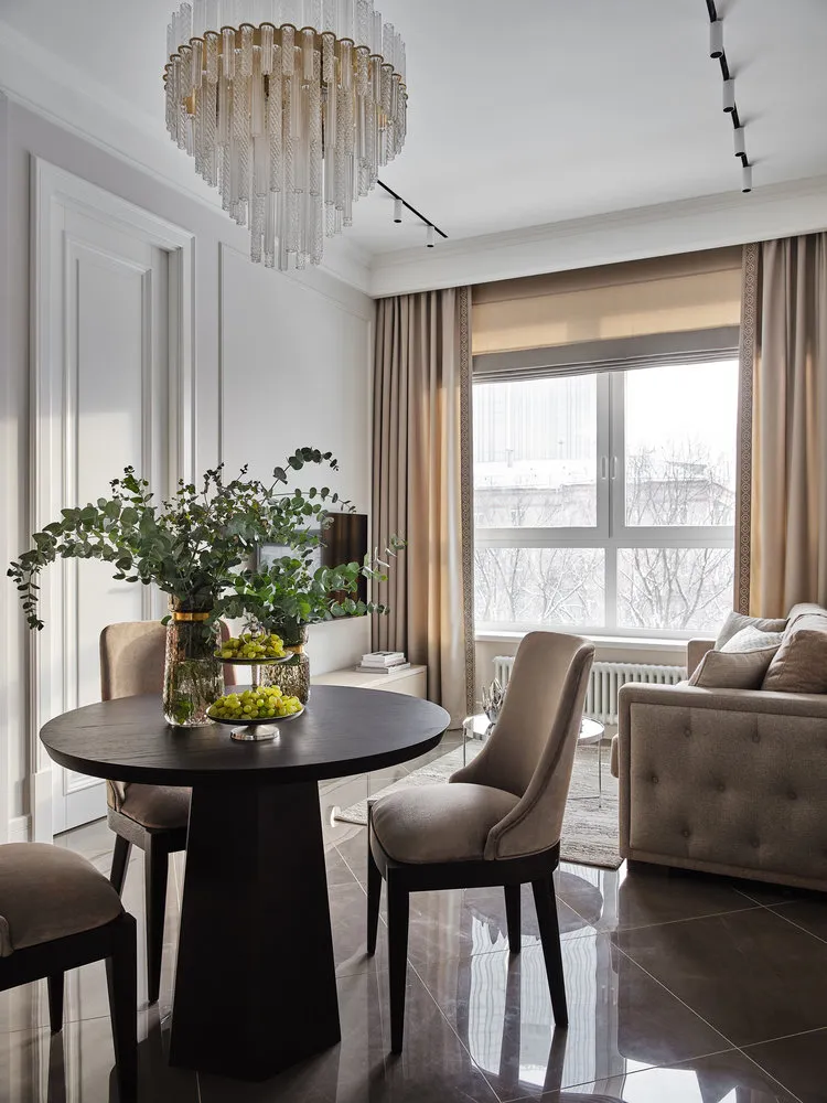 The floor covering in the kitchen-living room is uniform, it's glossy ceramic tile in a gray-brown tone that reflects light and visually adds volume to the room.
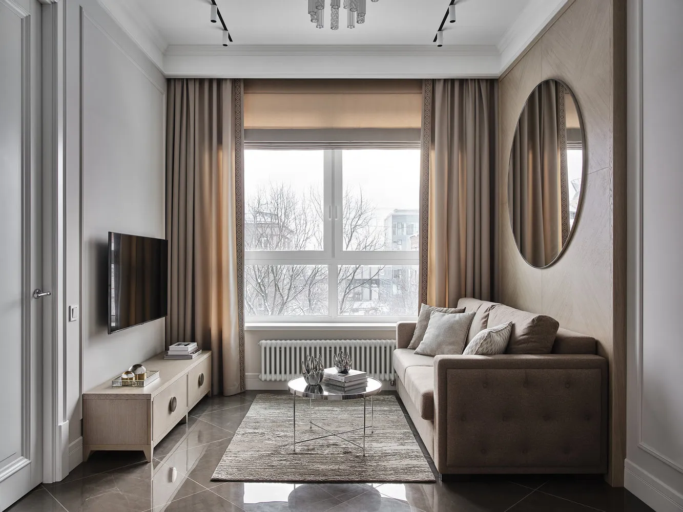
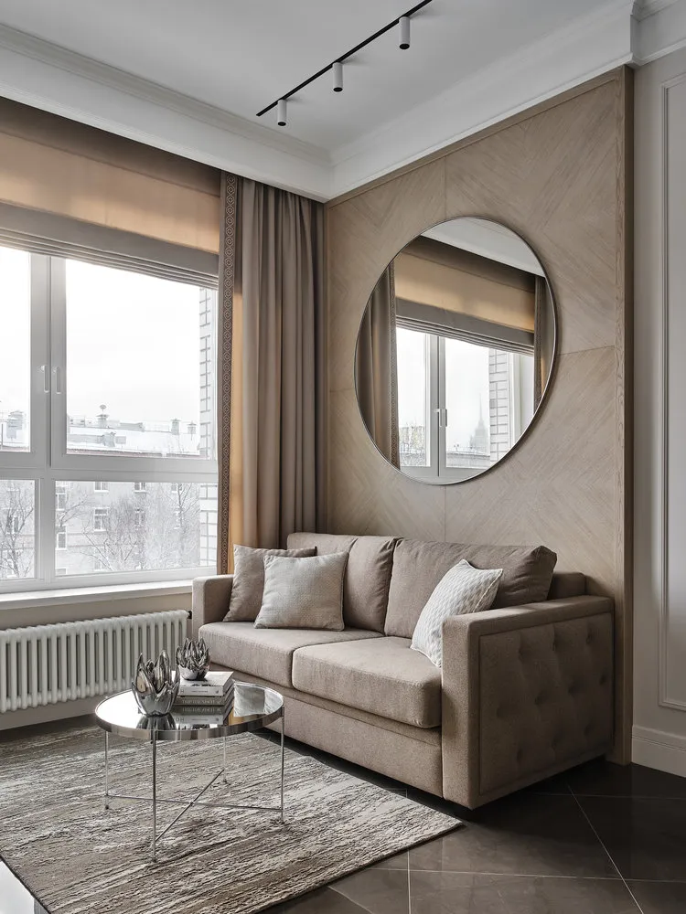
The furniture arrangement in the living room is standard — a sofa facing the TV. However, this area doesn't seem ordinary due to the striking wall decoration behind the sofa. These are veneered panels in a pleasant natural wood tone, which adorned a very large round mirror that expands the room's boundaries.
Bedroom
In the bedroom, the headboard wall was finished with relief panels and mirrors — it seems like the room expands in the opposite direction. The picture appears to hang in mid-air.
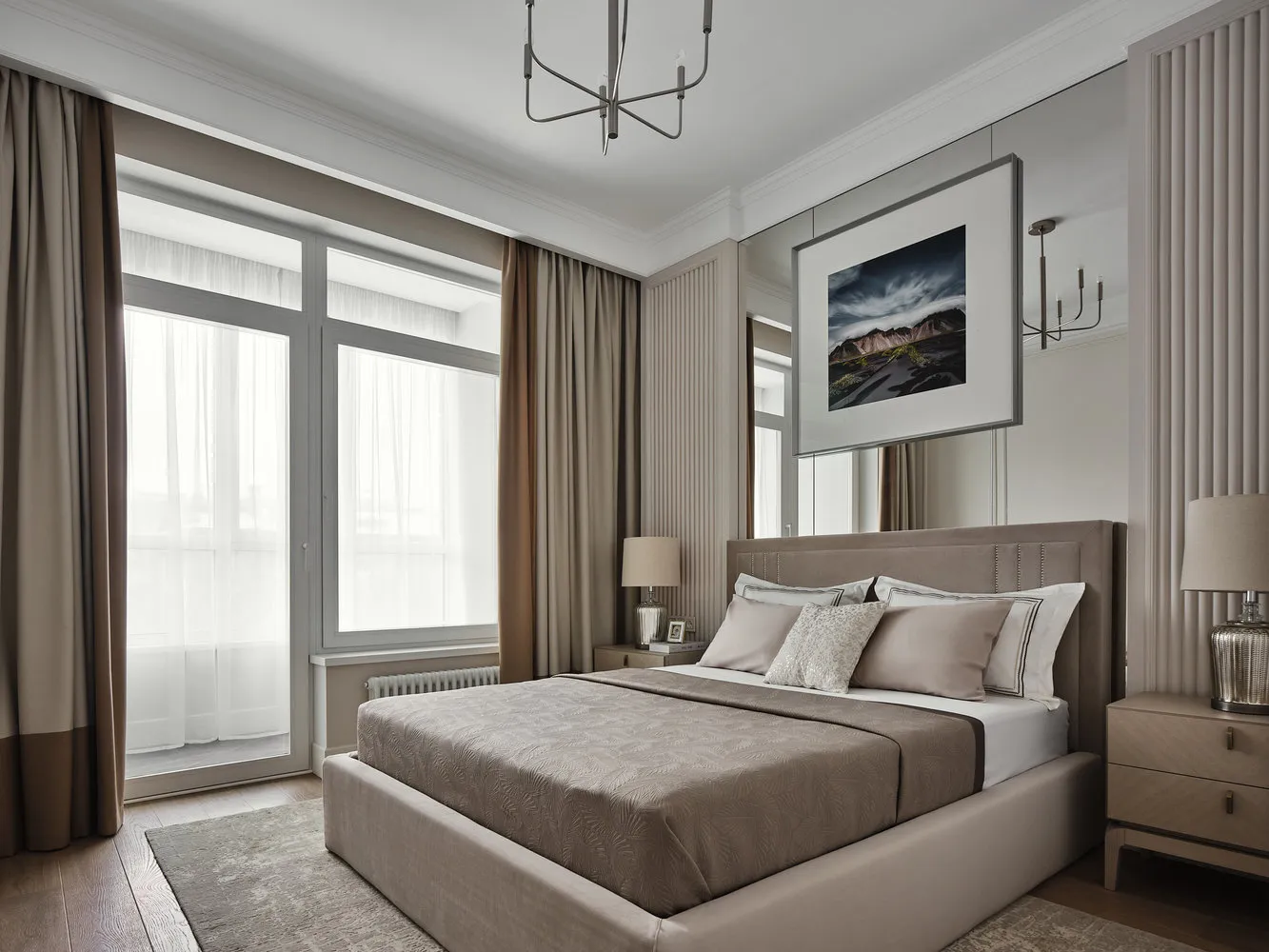
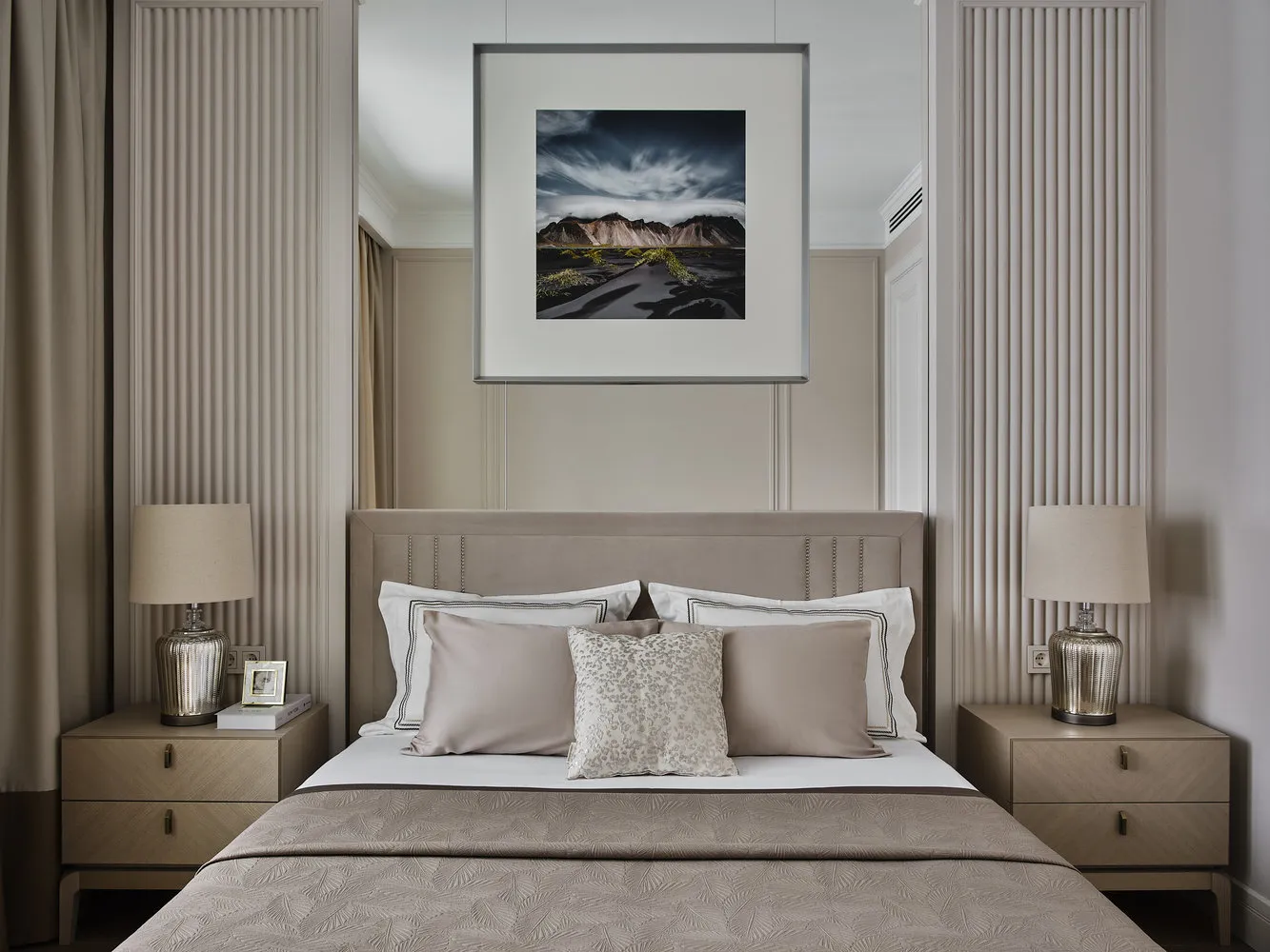 Vertical stripes on the panels stretch the room upward, adding a sense of air and volume.
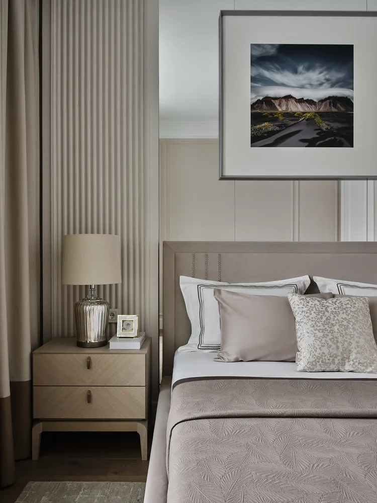 Photo with an Icelandic landscape above the bed was bought from a photographer, printed and framed.
Guest Room
The second bedroom is used as a guest room and office. The space was divided by a small partition to create two niches: one for a wardrobe, the other for a sofa.
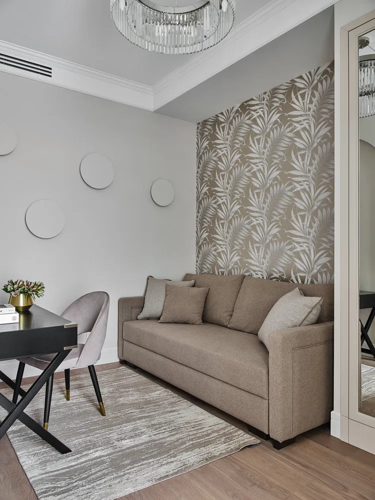
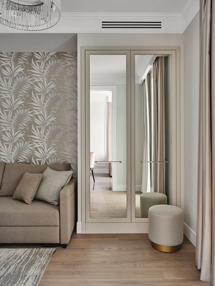 Mirrors were also used on the wardrobe fronts to expand space. In the niche – accent wallpaper with a plant pattern.
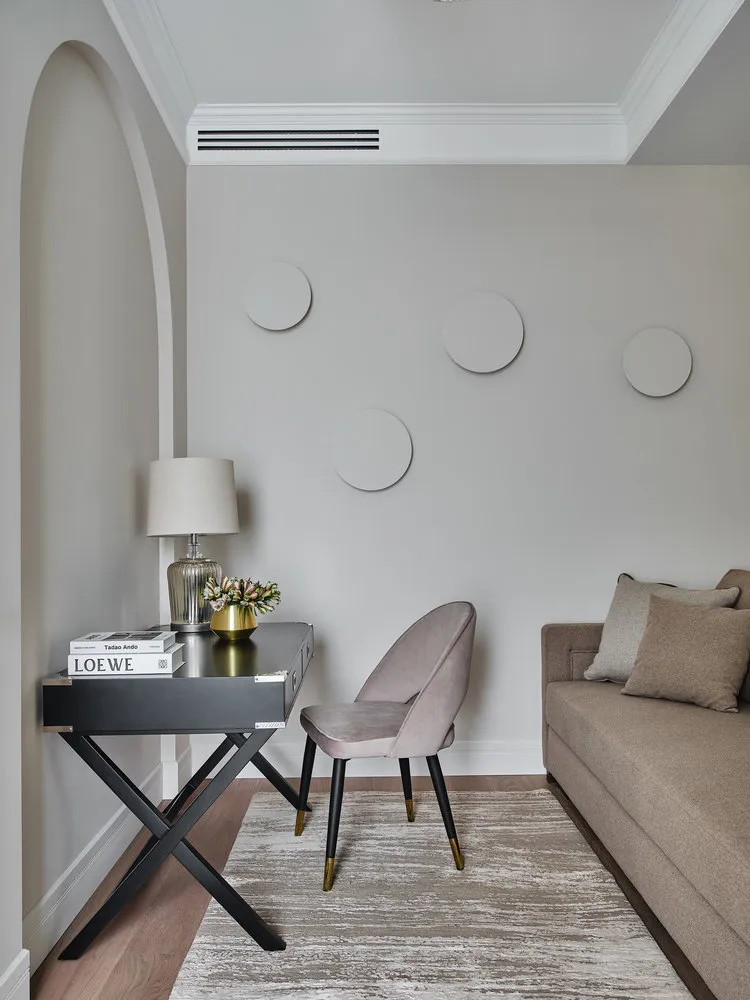
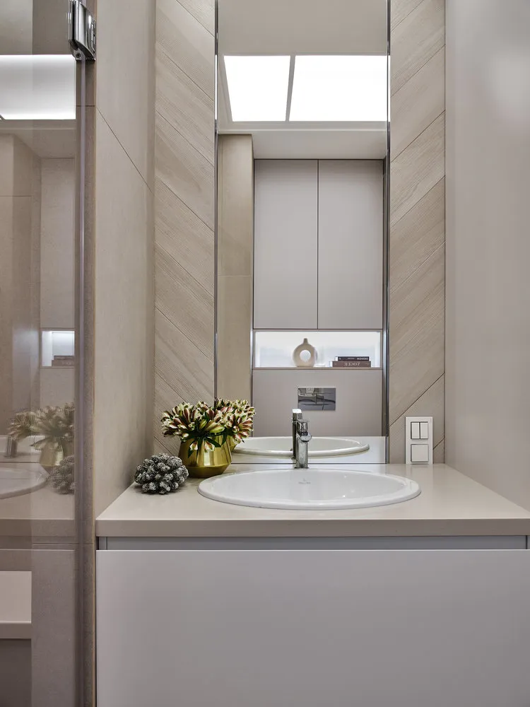
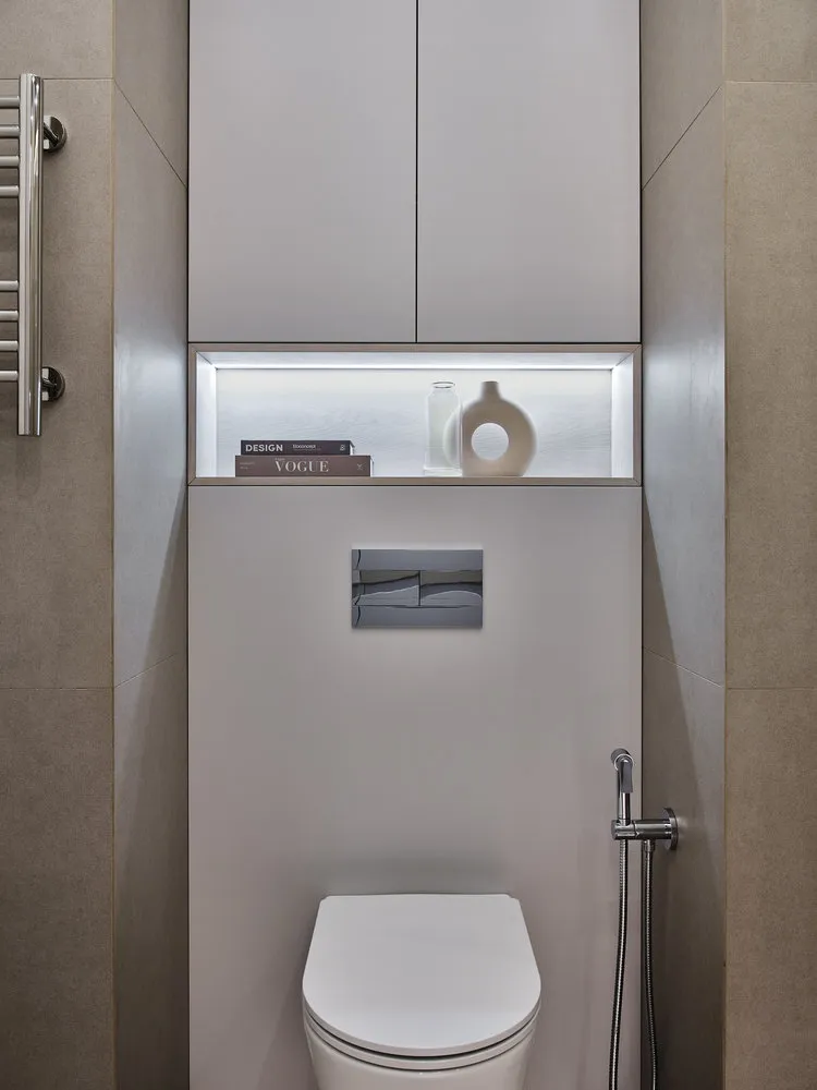
Bathroom
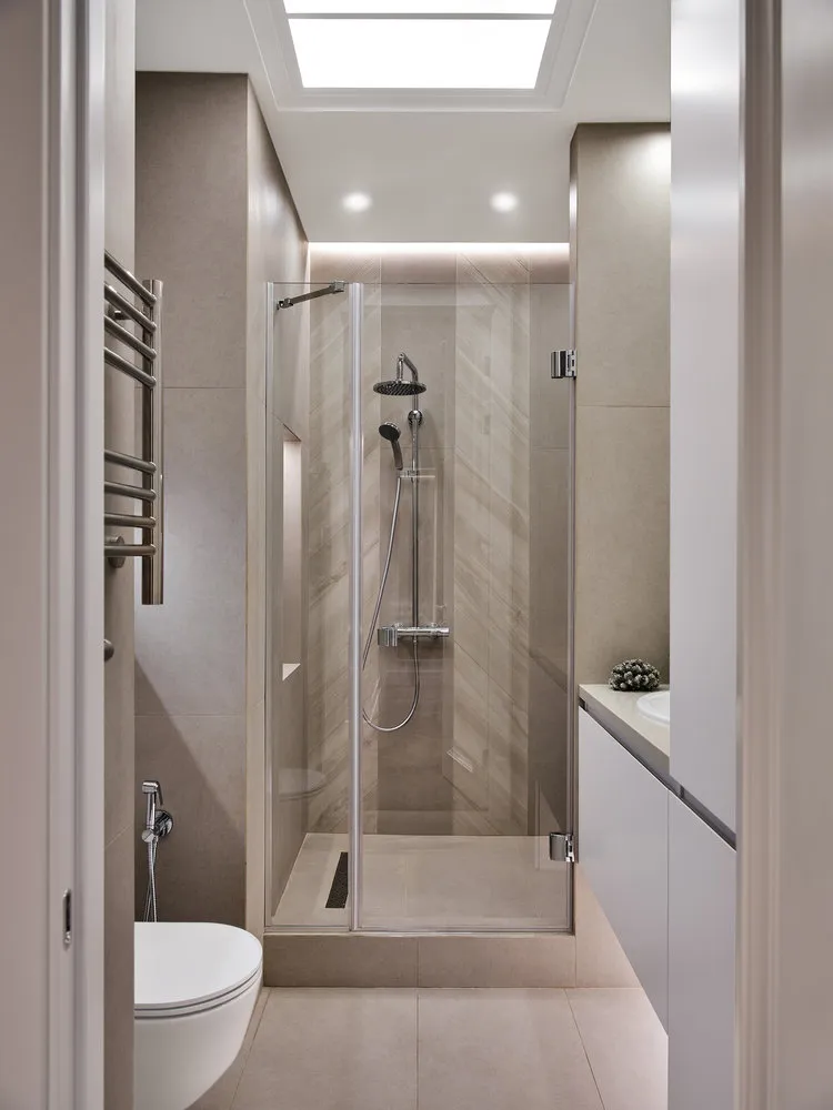
The bathroom turned out quite spacious: a shower in the original construction, a toilet with an installation and a cabinet for storage on order. Due to identical finishing and ceiling lighting, the room looks bigger than it actually is.
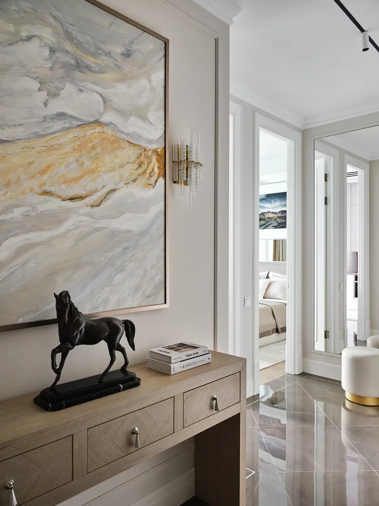
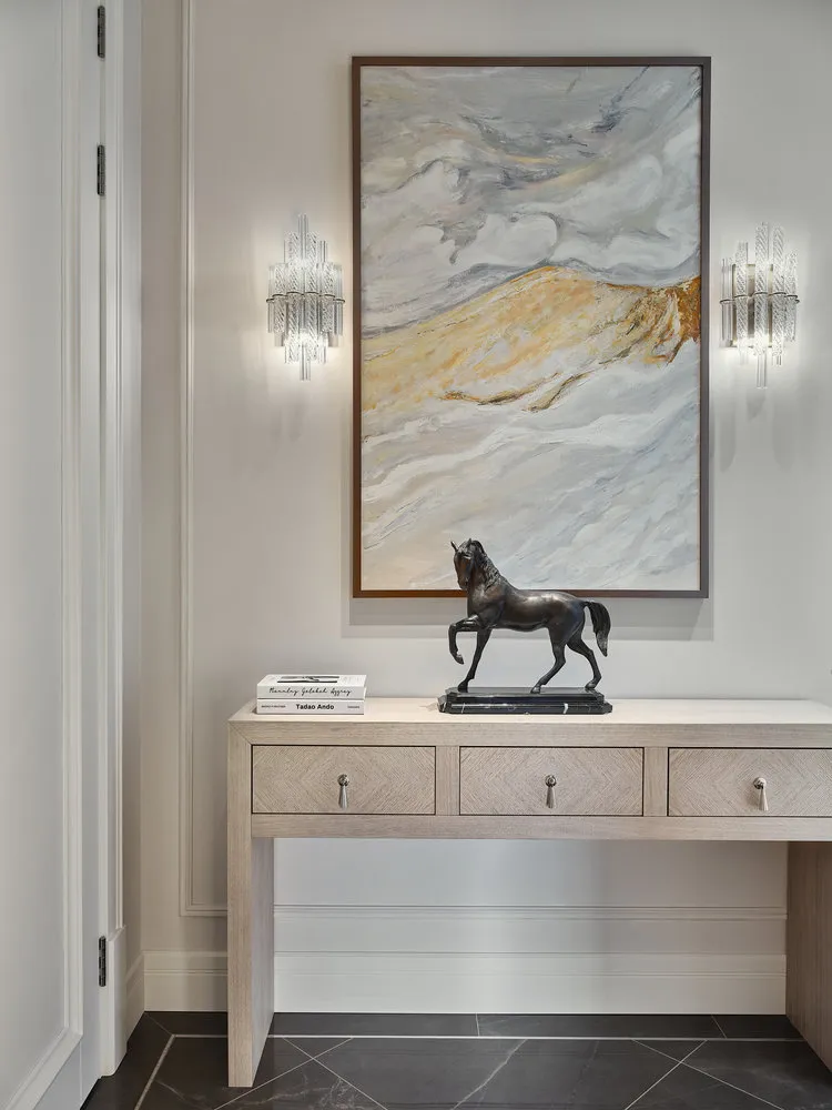
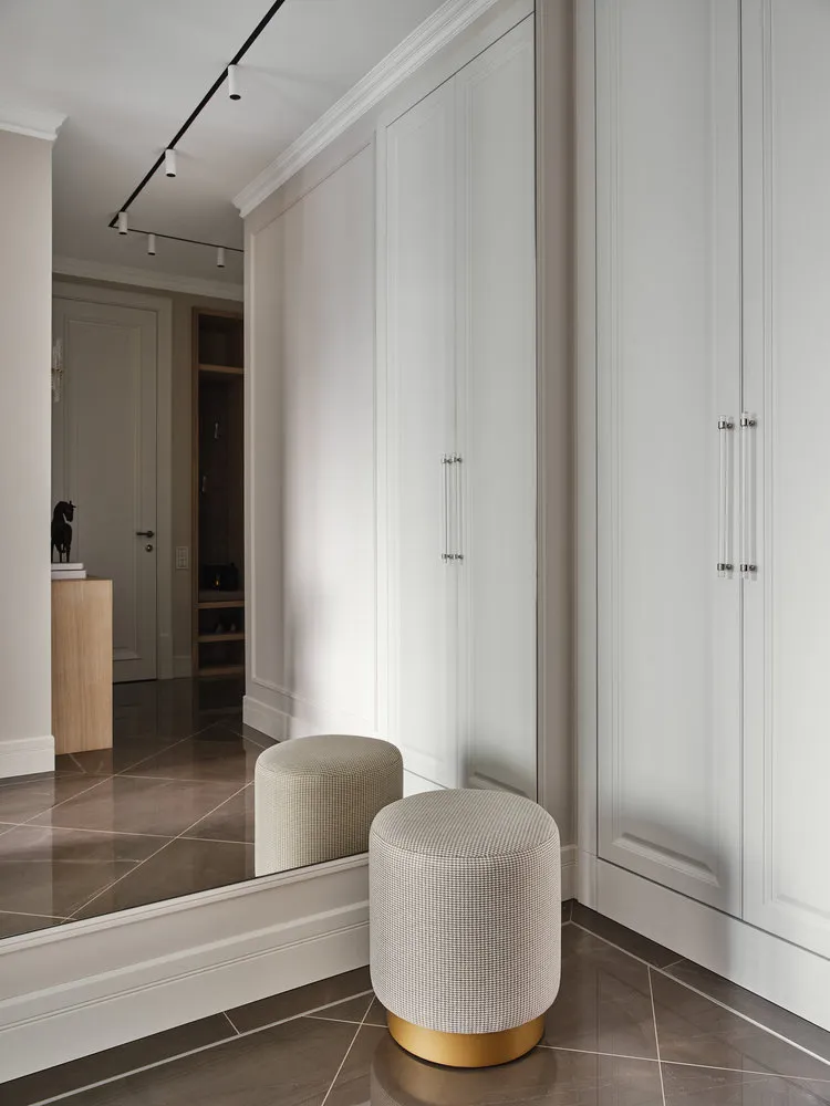
Hallway
The hallway also didn't go without mirrors. The room's volume is further enhanced by large decor elements: for example, a big painting above the console.
Photographer: Eugeniy Kulibabа
Brands featured in the project
Kitchen-Living Room
Finishing: Sherwin-Williams
Flooring: ceramic tile, MaxFine by FMG
Furniture: chairs, R-mebel
Cabinet: Hellen Farben
Appliances: Neff; Liebherr
Faucets: Blanco
Sink: Blanco
Lighting: DeLight
Textiles and decor: And home
Bathroom
Finishing: tile, Atlas Concorde
Plumbing: Villeroy & Boch
Decor: Art Mirror
Faucets: Hangsrohe
Hallway
Finishing: Sherwin-Williams
Flooring: ceramic tile, MaxFine by FMG
Decor: painting, Lika Shoniya
Lighting: DeLight
Bedroom
Finishing: Sherwin-Williams; Archpole
Flooring: Tarkett
Textiles and decor: And home
Lighting: Louvre Home
Would you like your project to be published on our website? Send photos of the interior to wow@inmyroom.ru
Need a renovation specialist?
Find verified professionals for any repair or construction job. Post your request and get offers from local experts.
You may also like
More articles:
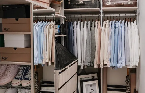 Wardrobes in small apartments: luxury or necessity
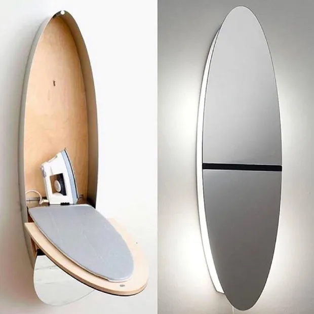 7 Ideas for Hiding an Ironing Board in Interior Design
 How Designers Transformed a Studio Apartment into a Two-Room Flat with Wardrobe and Guest Bed
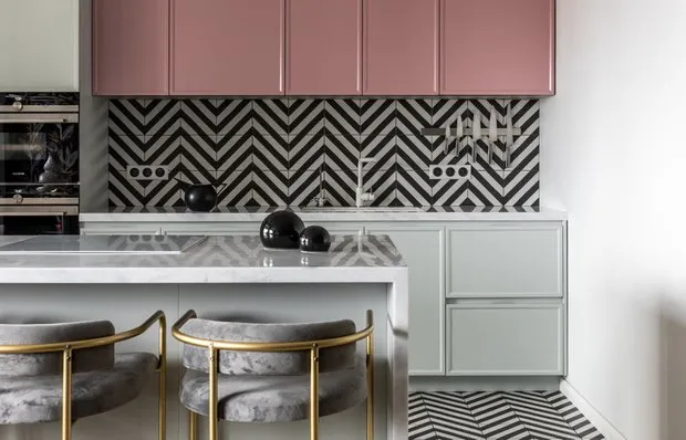 5 Best Kitchen Gadgets You Don't Know About But Should
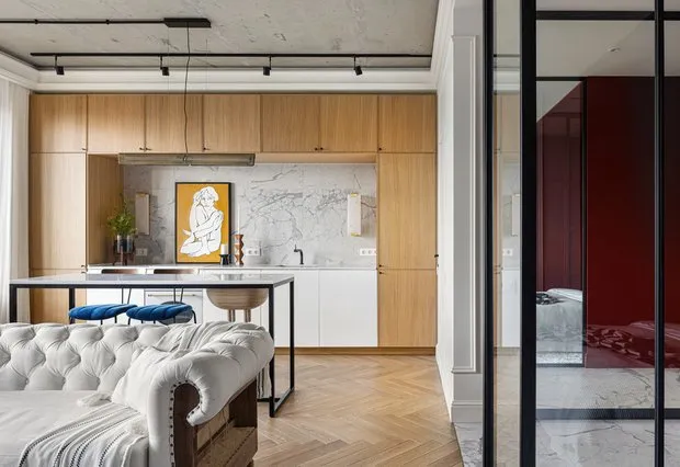 Designer Renovation of a 44 m² Studio with European Boutique Hotel Atmosphere
 Scandi Studio Apartment in 10 Months: Minimalist Interior for a Family with a Child
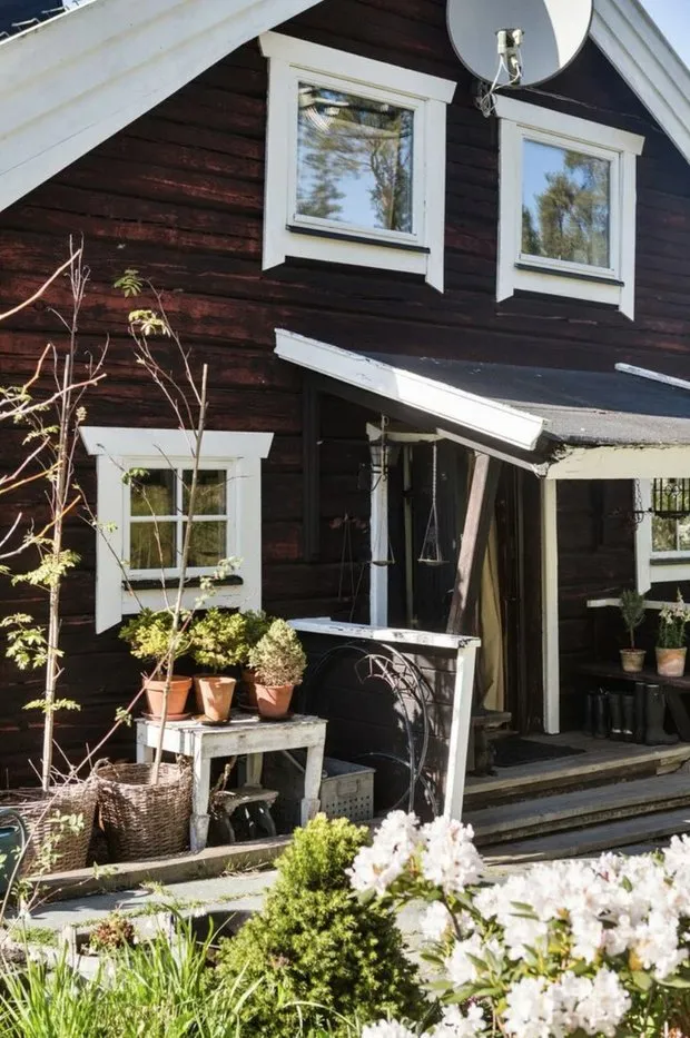 How a Couple from Sweden Transformed an Old Hunting Cabin
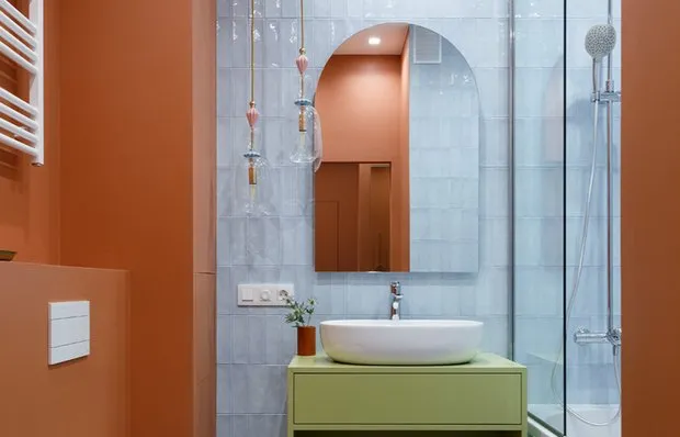 Socket Placement Schemes in the Bathroom + Detailed Guide from a Professional