How to Choose a Color Palette for Each Part of the Apartment
All about colors and shades that designers love to use in their interiors
Today's palette is no longer limited to just seven colors of the rainbow and includes a wide range of hues. Designers have long taken this into account and have already managed to decorate many interiors.
A kitchen doesn't always have to be white, and a bathroom — blue. Let's see in which shades each part of the apartment will look aesthetically pleasing.
Living Room
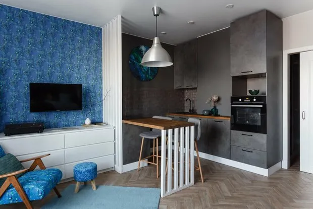
There are no special rules for decorating the space of a guest room, but experts consider berry, floral, blue, and violet tones most suitable for this area.
Natural pigments like ochre, sienna, and umber can help create a sense of comfort and calm.
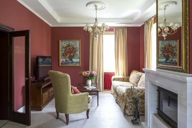 Design: Lavka-design
To visually expand the room, it is better to use a bright and refreshing yellow.
Brilliant turquoise will look great in combination with citrus shades.
 Design: Anastasia Zarkua
Kitchen
Choosing the right color accents on the kitchen is a responsible task. This part of the house is closely connected with waking up in the morning for a cup of coffee and pleasant evenings around the table.
A yellow shade works perfectly for walls or a kitchen cabinet, and the space will remain sunny even on cloudy days outside.
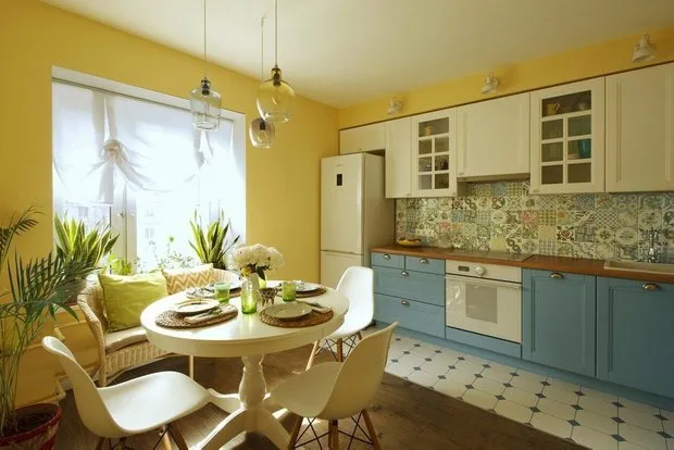 Design: Katya Chistova
If you're planning to create a kitchen-dining area, pay attention to more traditional dark blue, blue-gray, cornflower, and sapphire tones.
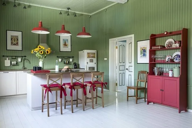 Design: Zhenya Zhudanova
Bedroom
A bedroom is not only about pastel shades. You can create a relaxing atmosphere using variations of blue.
In an ethnically inspired interior, exotic and deep indigo colors will look harmonious.
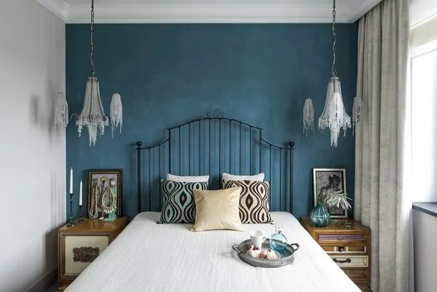 Design: Zhenya Zhudanova
A touch of luxury in the bedroom can be added with ultramarine tones.
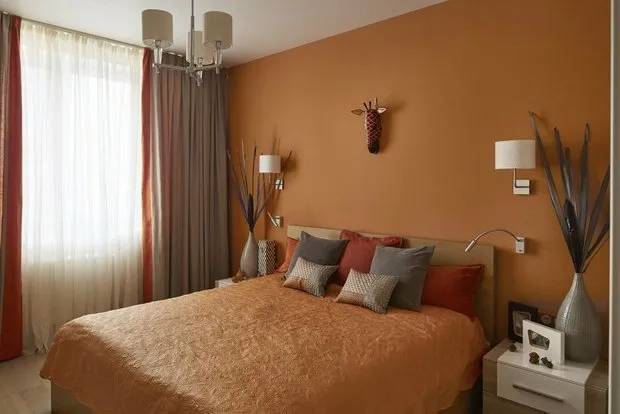 Design: Bon Home Design
Child's Room
Children perceive colors much more vividly than adults, so you need to think carefully about the decoration of a child's room.
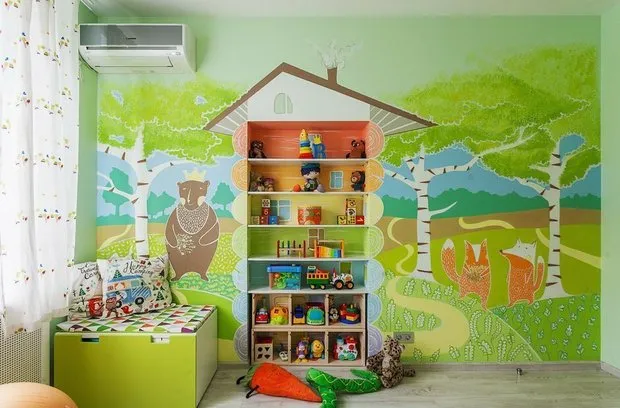 Design: Stella Balakhnina
For example, an abundance of red can cause outbursts of aggression and sleep disturbances, while orange, on the contrary, promotes self-confidence and creative activity.
If a child is already in school, it's better to decorate their room in yellow tones — they stimulate mental activity.
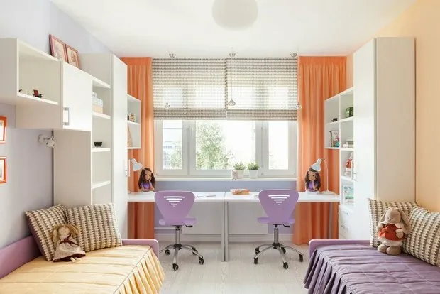 Design: Irina Krivtsova
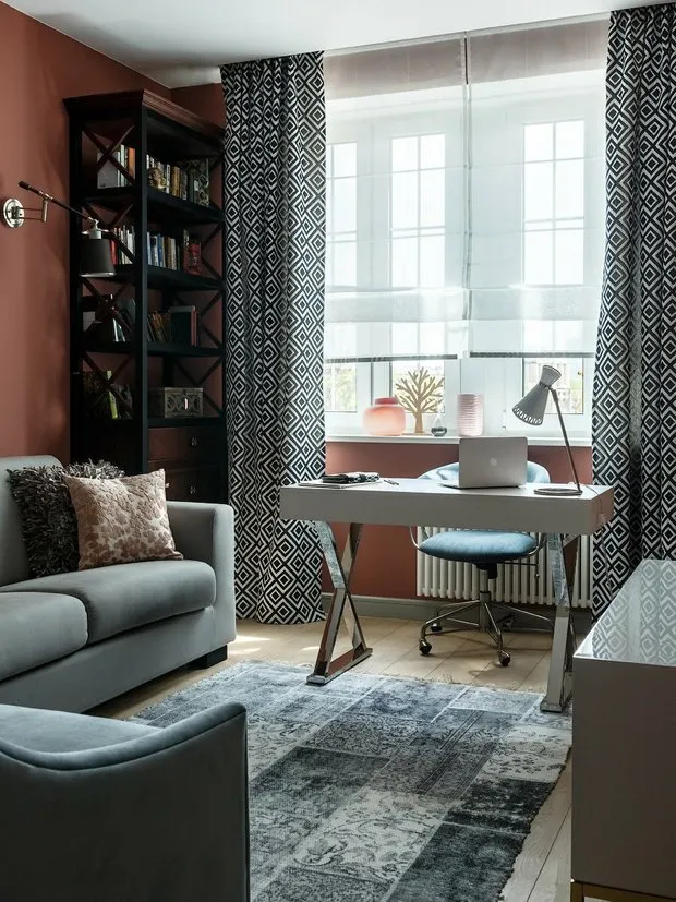
Home Office
Since many people now work from home, it's important that a home office has a welcoming atmosphere.
Blue color can help boost productivity, activate inspiration, and reduce appetite.
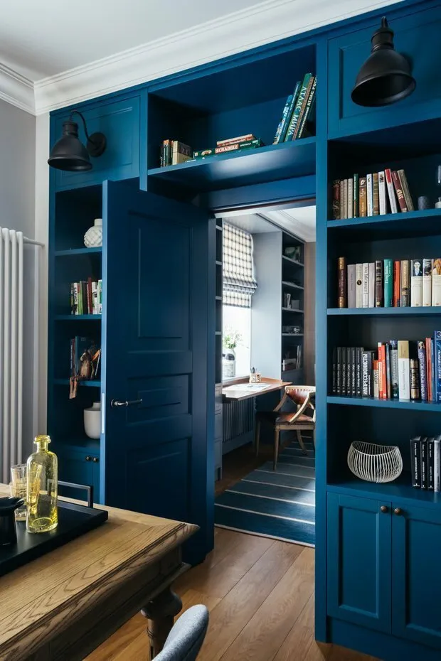 Design: Enjoy Home
Light green shades have a calming effect on the psyche and don't strain the eyes. Green is also an excellent antidepressant and helps build stress resilience.
 Design: Enjoy Home
Bathroom
The most vivid accents are better suited for the bathroom, as it is used for only a small part of the day.
Red-brown color works well for a bathroom, which can be softened with light furniture and textiles.
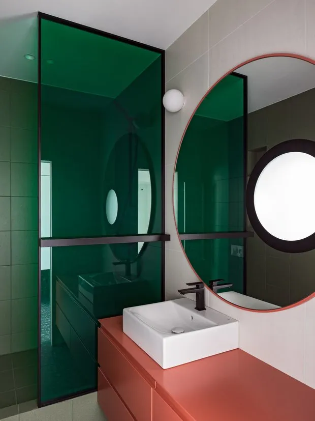 Design: VAE design & architecture
Forest green in bathroom interiors not only lifts the mood but also expands the space.
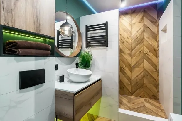 Design: Yuri Lutsenko
Entryway
A hallway is the face of any house and should make a proper impression. In an entryway, it's better to focus on contrast color schemes and limit the use of decoration.
Brick and caramel tones as well as cooler blue and violet hues will delight the eye from the threshold.
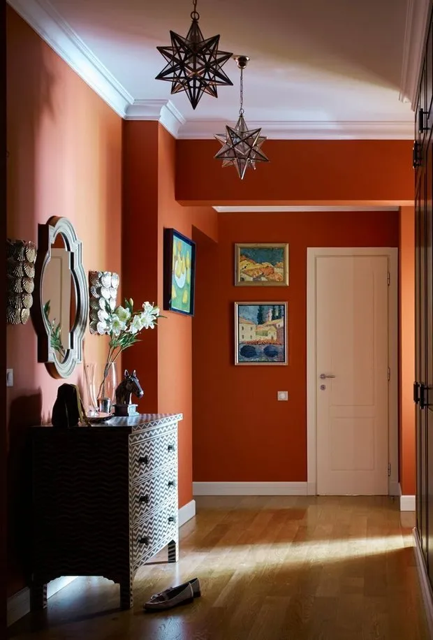 Design: Enjoy Home
Need a renovation specialist?
Find verified professionals for any repair or construction job. Post your request and get offers from local experts.
You may also like
More articles:
 Redesigning a 28 m² Studio for Living and Working for 600 Thousand Rubles
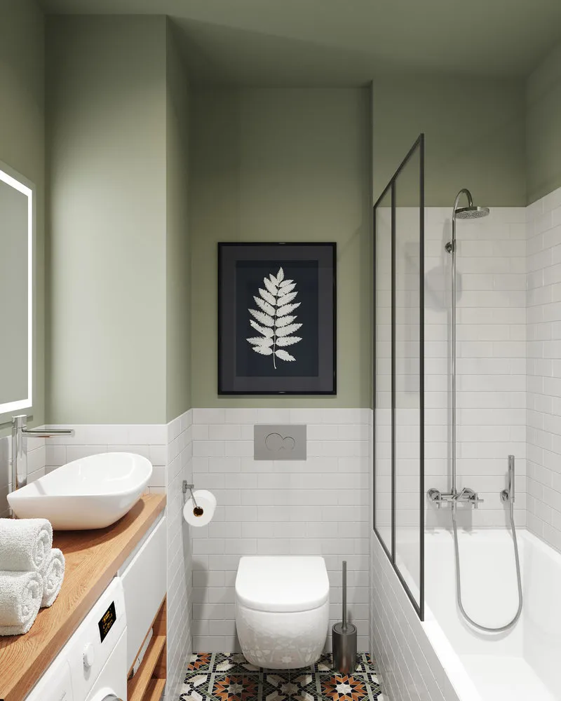 Top 10 Small but Coziest Bathrooms
 Studio Apartment in Loft-Eclectic Style on the North of Moscow
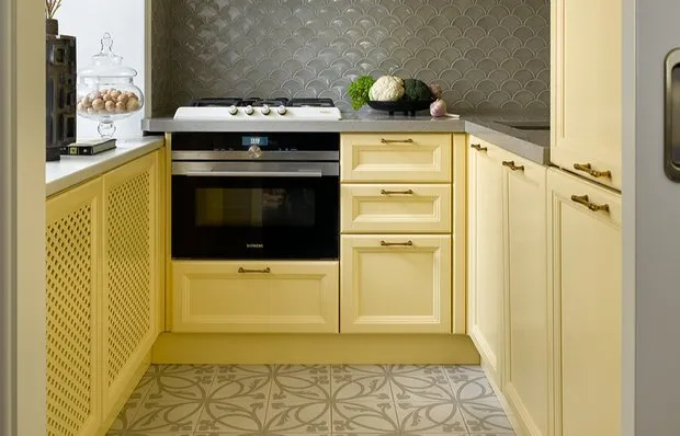 7 Cool Tips from a Designer That Everyone Can Easily Replicate
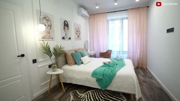 Thoughtful Bedroom Decorated Without a Designer
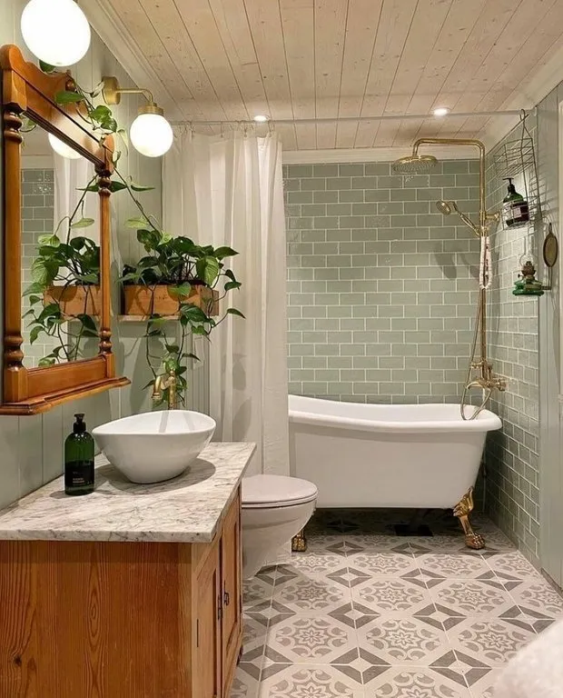 Top-5 Beautiful Bathrooms in Sweden That Will Inspire You to Redesign Your Own
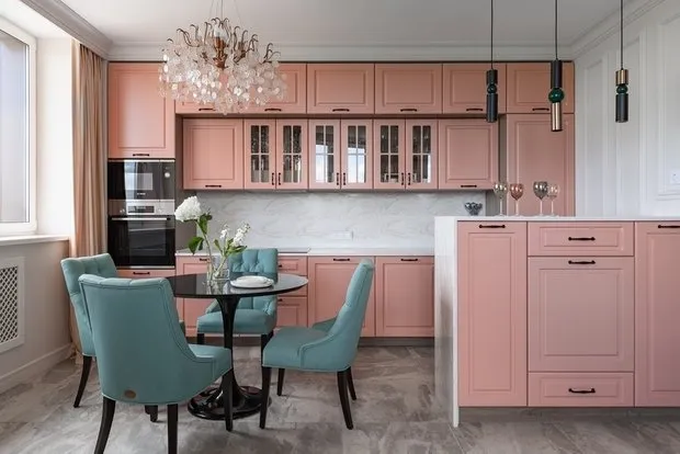 7 Interiors in Soft Tones with Romantic Atmosphere
 Everything Done by Ourselves: Budget Kitchen Renovation with Open Storage