Why You Don't Like Your Apartment: 10 Possible Reasons
We explain what can ruin your interior and show how to fix it
Uncomfortable layout and furniture placement, plastic corners and bathroom hatches — these and many other mistakes make the interior uncomfortable.
We've prepared tips to help you avoid embarrassing mistakes when decorating your apartment.
Furniture arranged along the walls
It is considered that placing all furniture against the walls saves space in the room. But a free central area of the room next to cluttered walls looks uncomfortable.
Solution: to make the interior comfortable, you need to use the free space rationally and not be afraid to involve the center of the room.
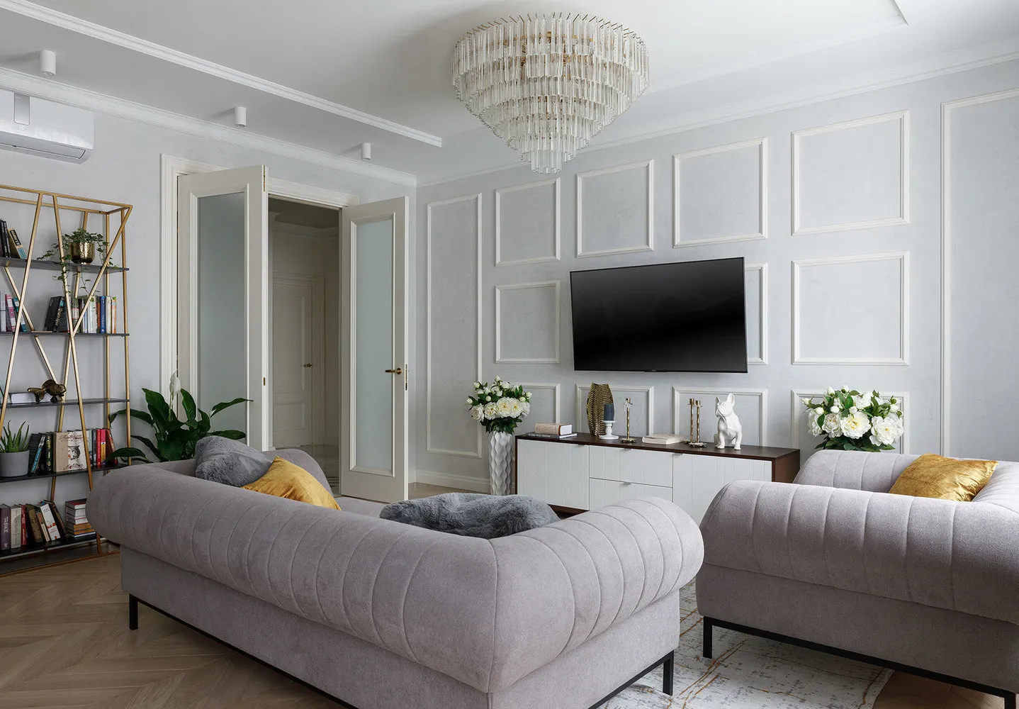 Design: Kirill Ponomarenko
Furniture barricades
The opposite situation: the space is filled with furniture items that hinder free movement in the room.
Solution: you need to maintain a balance between spaciousness and clutter, regardless of how small the room is.
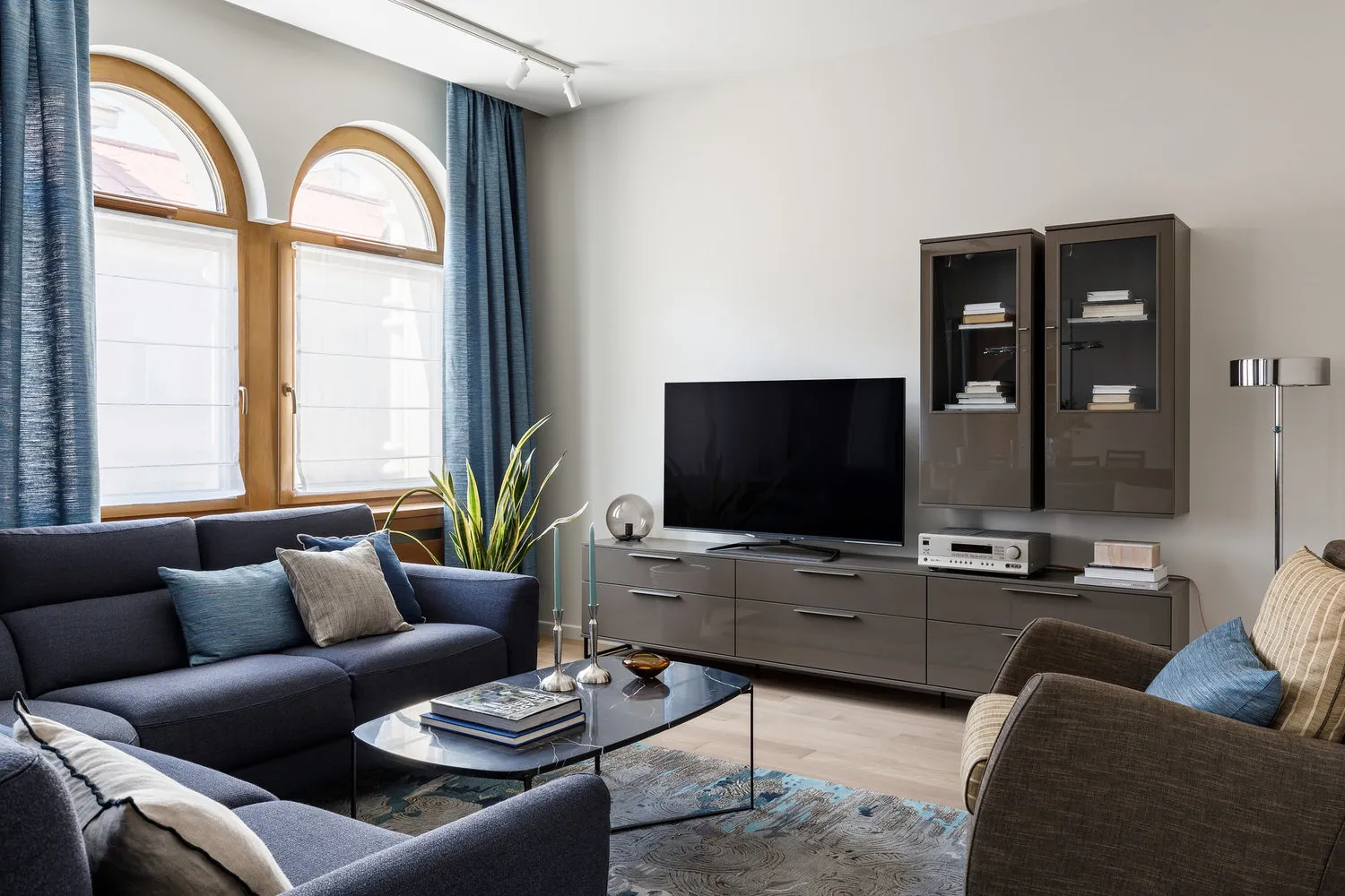 Design: Aushrine Zhelozhnova
Insufficient lighting
Proper lighting makes staying in the room comfortable, sets accents, and gives the interior a finished look. Lack of light can ruin the harmonious atmosphere.
Solution: in addition to central lighting, it is necessary to plan additional light sources such as floor lamps, wall sconces, and built-in lights.
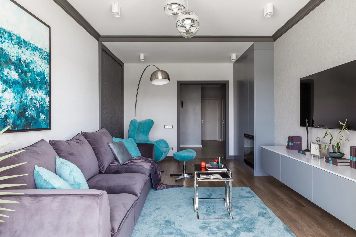 Design: Archigram Studio
Over-decorating
In an attempt to add individuality to the interior, you might accidentally go too far. You started by filling an empty wall in the living room with paintings, then placed vases, candlesticks, boxes and other trinkets on the shelves. As a result, the room looks like a storage room where instead of comfort, you feel cluttered.
Solution: when choosing interior accessories, it is important to follow moderation. Decorative items should harmoniously blend with each other and the overall style of the interior.
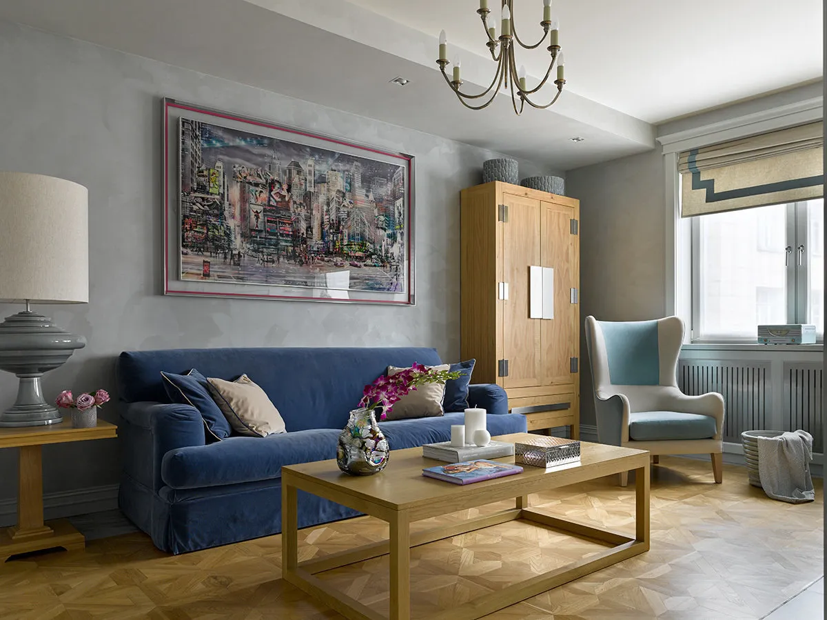 Design: Varvara Shabelnikova
Insufficient storage space
This mistake is most common on kitchens, as there are many different items to store from dishes to household appliances. If there is not enough space in the cabinets, you will inevitably start using the work surface and dining table as shelves.
Solution: planning storage systems in the interior should be as careful as designing furniture. This needs to be done before finalizing the design project and construction teams begin implementation.
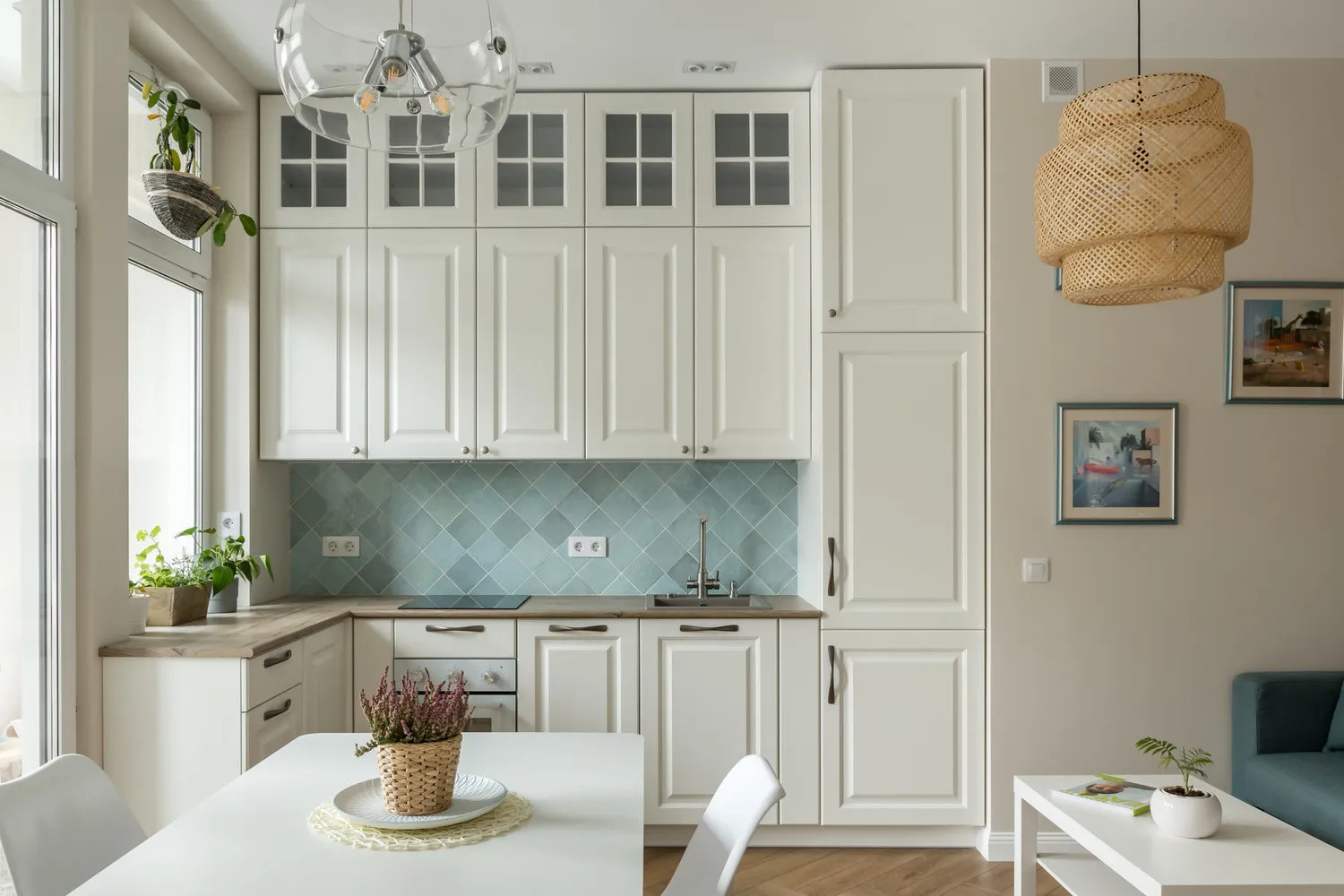 Design: Buro Brainstorm Studio
Sink in the corner
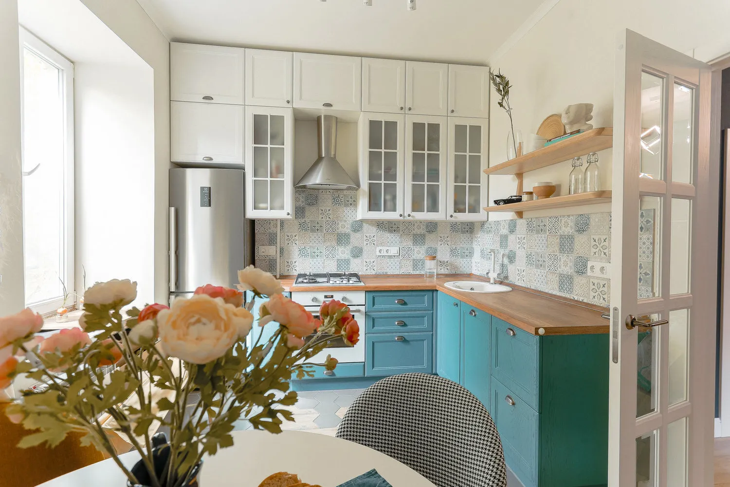
One of the frequent mistakes on small kitchens is placing the sink in a corner. The reason is clear — it saves some space on the countertop. However, such placement makes washing dishes extremely inconvenient.
Solution: it is better to move the sink and place it at a convenient distance from the edge on the linear part of the countertop. Even if you lose a few centimeters of working surface, it will be more convenient to do household chores near the sink.
 Design: Anna Smolyakova
Refrigerator next to the stove
This mistake is more common in corner kitchen layouts, as this format implies compact furniture and appliance placement. If the refrigerator is placed too close to the stove, it's not only inconvenient but also harmful. Heat from the stove affects the refrigerator’s operation — it starts freezing more intensively. In the end, this will reflect on your electricity bills.
Solution: when designing the kitchen, it is necessary to provide at least a small space between the stove and refrigerator, such as a work surface or cabinet.
 Design: Anna Rogacheva and Polina Strokova
Dark tiles in the bathroom
Dark tiles require more careful maintenance than light ones. They show dust, water droplet marks, and soap streaks. By the way, removing streaks after washing surfaces is also quite difficult.
Solution: for the “wet” zone in the bathroom, it is better to use light neutral finishes, and dark tiles should be used for walls where water splashes do not reach.
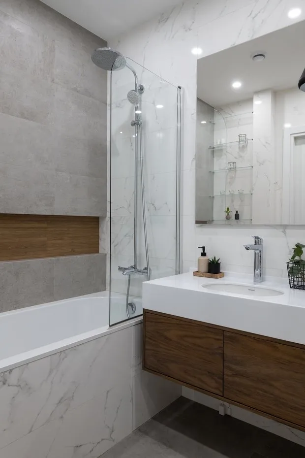 Design: Roomba Interior Studio
Bathroom corners
Necessary corner pieces usually appear when tiles are laid before installing the bathtub, and a gap forms as a result. Plastic corners may look fine at first, but they yellow after a couple of years.
Solution: ideally, tiles in the bathroom should be laid without corners. First, install and secure the bathtub on a frame, then lay the tiles. The first row should be placed directly on the surface of the bathtub, and use epoxy grout for the gap, which is waterproof.
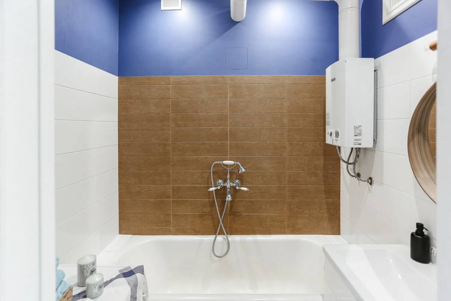 Design: Alena Rogacheva and Polina Maslenkina
No hatch in the bathroom
You have planned a comfortable bathroom interior, selected beautiful tiles and quality plumbing fixtures, but forgot about the hatch for engineering utilities. Sounds familiar? In the end, a technician arrives and installs a white plastic hatch in plain sight, which ruins the entire interior.
Solution: the installation of a hatch should be planned at the initial stage of planning. Hide it behind tiles so that when closed, it creates a perfect surface.
 Design: Kirill Ponomarenko
On the cover: design project by Buro Brainstorm Studio
Need a renovation specialist?
Find verified professionals for any repair or construction job. Post your request and get offers from local experts.
You may also like
More articles:
 Illuminating + Ultimate Gray: Pantone 2021 Is Two Colors in One
 6 Small but Charming Entrances
 8 Successful Ways to Zone a Studio Apartment
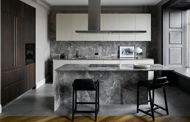 5 Common Mistakes Designers Make That Lead to Problems and Delays
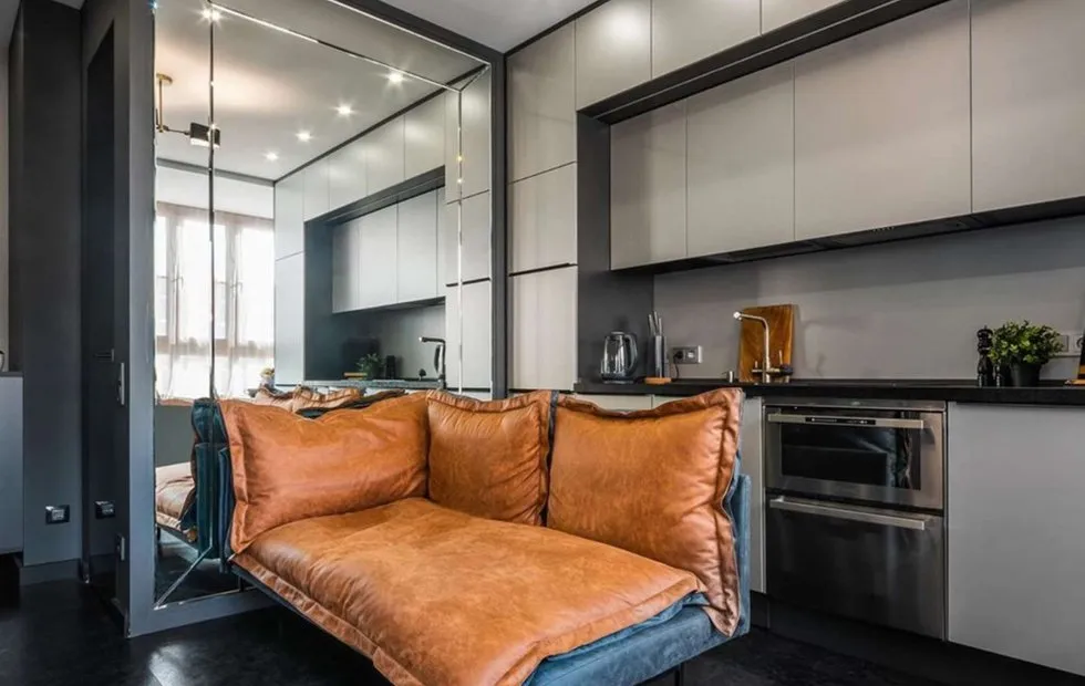 How to Turn a Tiny Apartment into Comfortable Living Space: 5 Cool Tips
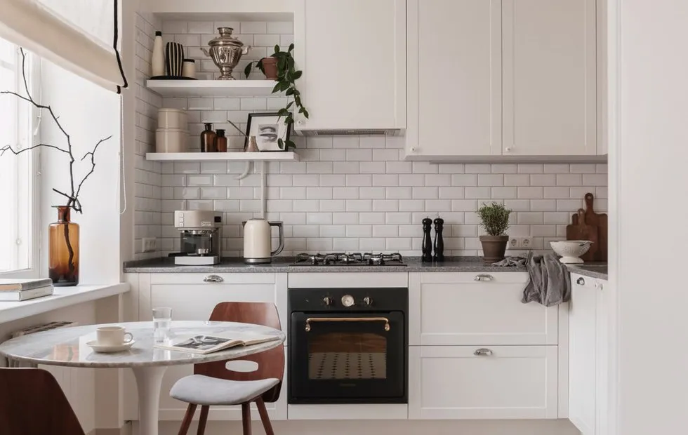 5 Apartments with Budget Renovation That Look Like Covers
 Stylish New Year's Table Decoration: Guests Will Be Amazed!
 Winter Sale at IKEA: 13 Great Finds at Discounted Prices