The Color of 2020 Named: How to Use It and What to Pair It With
Have you already found out what brand Tikkurila named as the main color of the upcoming year? We tell you how to use it in apartment or home interior. And we share inspiring ideas from our projects
As a replacement for the Flamingo color, a not less vivid and cheerful shade comes next. We tell you all the details so you can always stay in trend.
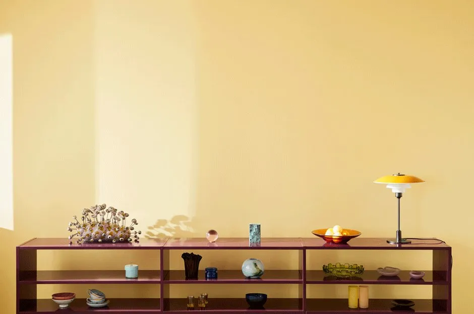
The Color of 2020 — H300 Lemonadelemon-yellow was chosen by designer Laura Yuljus and architect Lilli Maunuola together with the Tikkurila brand. For inspiration, they turned to the world of design and fashion and studied modern trends.moregreat shades can be found in the vibrant Tikkurila 2020 palette. It includes eight warm and cool colors that don't look alike but perfectly complement each other.ASSOCIATIONSwith H300 — happy childhood memories, summer, sunshine glimmers and just finished warm rain. And, of course, a glass of cool homemade lemonade on the table.
How to Combine?
Combine the color of the year with pastel greens and muted mustard shades. A great idea for an interior in warm tones reminiscent of summer.
Y383 Cucumber
N388 Wasabi
L392 Dukato
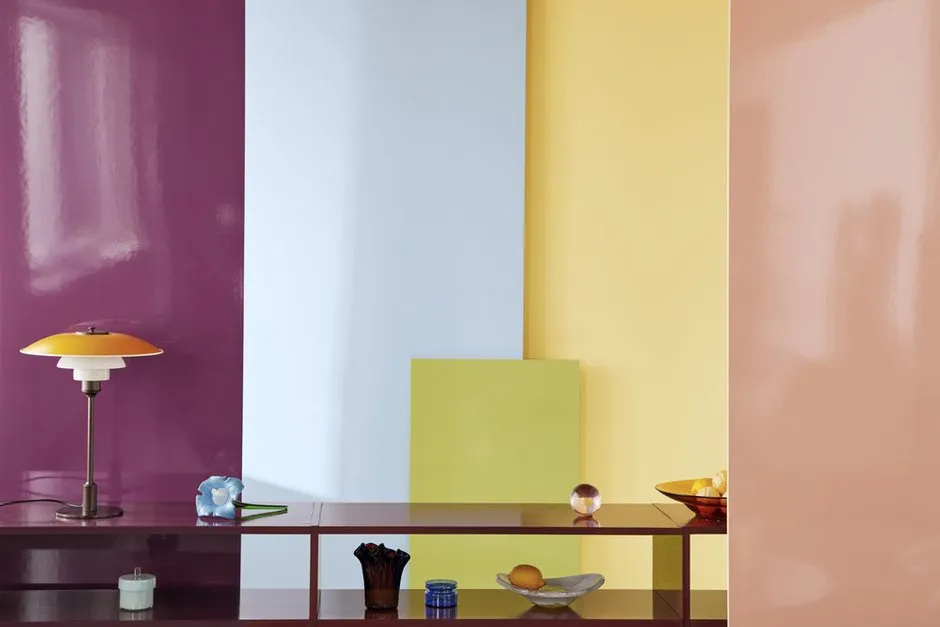
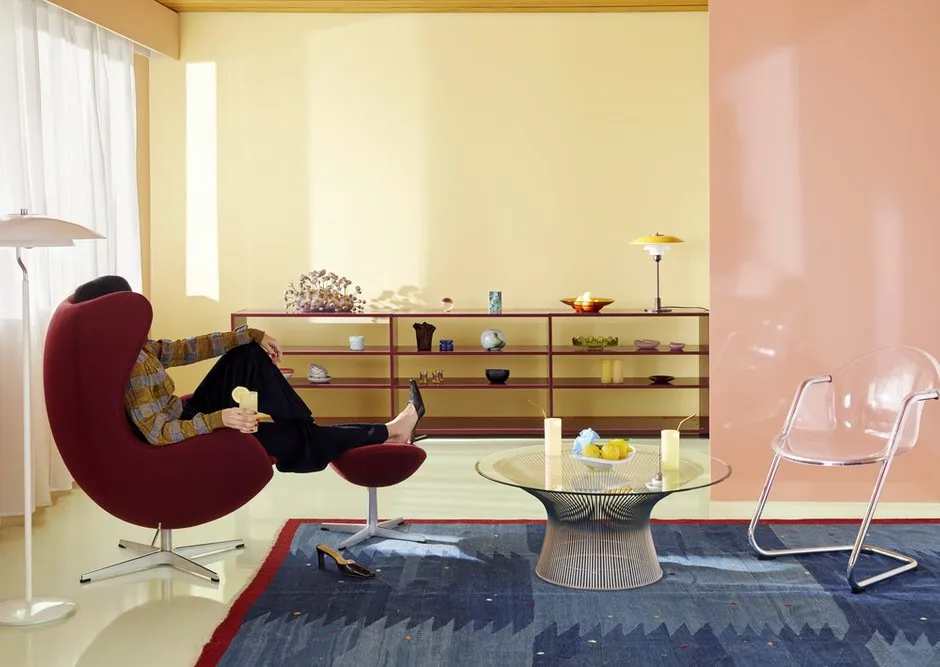
Or with Contrasts
For bolder experiments, mix the trendy shade with cooler and contrasting colors. Let them not be too bright but slightly muted — that way, the interior color palette will be harmonious and not too flashy.
J407 Siesta
N338 Wild Rose
M339 Tango
H353 Forget-me-not
What Do Experts Say?
Laura Yuljus and Lilli Maunuola
Experts
Laura is a designer, Lilli is an architect. They selected the main color of the year together with the Tikkurila brand
Colors in interiors (and beyond) should never be chosen randomly — always listen to your preferences and rely on trends. We associate yellow with warmth and happiness, so it's perfect for apartments at any time of the year. When we look at the main shade of 2020, we always remember this phrase:
If life gives you lemons, make lemonade!
This shade can be used in any style — from modern to cottage and classic. It works well as a base and for small color accents.
See How Russian Designers Use This Color in Their Projects
If you think that the yellow color is too bright for wall finishing, take a look at this stylish living room from Anna Moghara's project. Probably, the “most yellow” apartment was designed by Galina Yuryeva. To prevent the color from dominating the whole space, she complemented it with contrasting whites, browns, and purples.
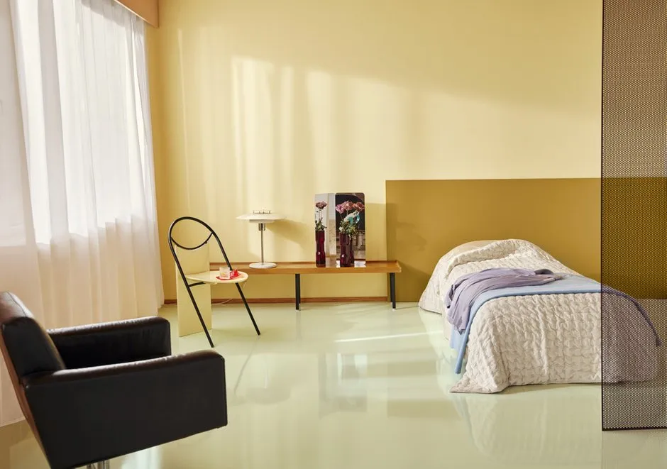
How about a lemon-colored bedroom? Inna Tedzhoeva and Zina Broyan from Berphin Interior chose a vibrant shade for the walls and didn't miss. It turned out cozy.
In another project, designer Katerina Chistova again used a lemon shade for the living room decoration. Light walls can be combined with more saturated colors: for example, with bright yellow curtains.
It’s not necessary to use the main color of 2020 too actively. The team at Sweet Home Design decorated a living room wall with yellow paint.
Olga Shapovalova decided to paint the walls of her country house in a soft yellow shade. The result is a pleasant atmosphere for family relaxation.
In their apartment, Stella and Ilya Balakhnina decided to use a variety of bright colors: yellow, red, and blue. They all complement each other well, and the house always feels festive.
Katerina Chistova decided to decorate the kitchen in a Mediterranean style: a mix of lemon-yellow, white, and blue shades will always remind you of summer.
The Lemonade shade can even be used in bathroom finishing. Designers from the UD Base studio combined bright paint with light tiles.
Need a renovation specialist?
Find verified professionals for any repair or construction job. Post your request and get offers from local experts.
You may also like
More articles:
 Completing the September Sale and Promotion Season
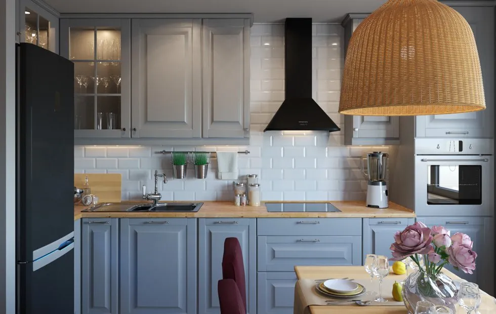 How Interior Designers Use IKEA Furniture in Interiors
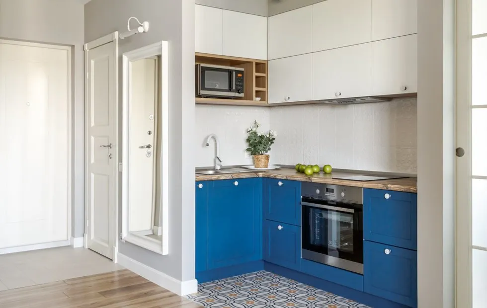 Apartment Redesign: New Opportunities and Materials
 How They Turned a Dairy Farm Into a Family Home in Just 2 Months
 5 Cozy Bedrooms from September Projects
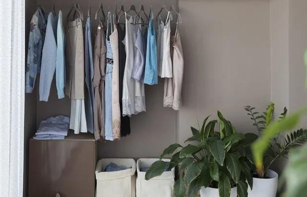 Summer Clothes Storage: Where to Store and How to Organize?
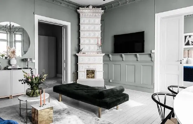 Perfect Apartment in the Center of Stockholm: Ideas You Will Find Useful
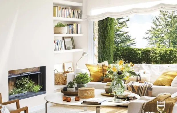 Summer House in Barcelona with Panoramic Windows