Cheatsheet for Choosing Interior Colors: 6 Rules
Color in interior design is the first thing that catches the eye and the main factor influencing our mood and well-being. Let's explore how to choose successful shades even without any design experience.
Base Color — Neutral
Choose one base color that will carry the main load. It can be white, beige, peach, turquoise, pistachio, and other light pastel shades.
It's not recommended to use dark tones as the base color — you risk making the space feel gloomy.
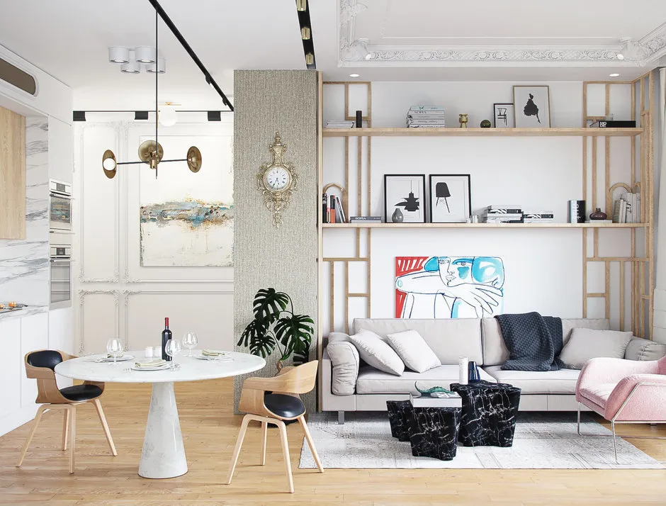 Design: Sergey Klyochkov
Don't Mix Warm and Cool Tones
It's hard for a non-professional to effectively combine tones with different color temperatures. So, decide on the overall palette — warm or cool — and stick to it.
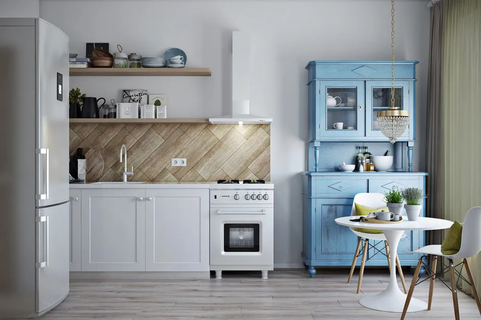 Design: Olga Buravkova, Anna Dobrokovskaya
Light and Cool Tones for Small Rooms
Small spaces will visually expand with colors from the cool palette: classic white walls for painting, light tiles in the bathroom. These shades can also help visually raise the ceiling.
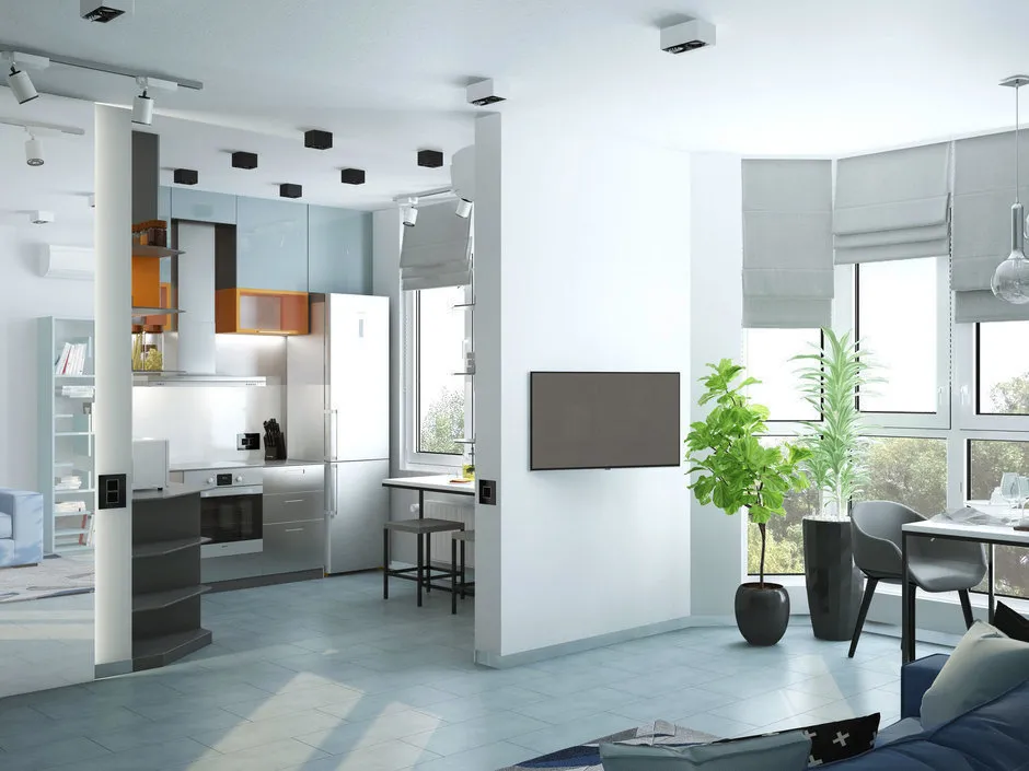 Design: We Create Studio
Each Room Has Its Own Color
Colors influence our mood — consider this when decorating your apartment.
Turquoise and blue shades bring a feeling of lightness and freshness. Yellow and orange energize — use this when setting up an office. Black looks stylish, but must be handled carefully: it can make a room feel gloomy. Muted and soft tones suit bedrooms and relaxation zones, as they help to relax. Warm red and orange shades make the space cozier. Green is considered the most natural and pleasant color to look at, associated with nature and stress relief.
Stick to Proven Combinations
- A classic combination that always looks great — beige + blue.
- To create a bright and sunny atmosphere in a room — white + beige + yellow.
- Lack of vivid accents? Add red tones.
- A bedroom in beige tones can be softened with muted green and pink — it looks beautiful.
- For a children's room, ideal colors are green, pistachio, and peach tones.
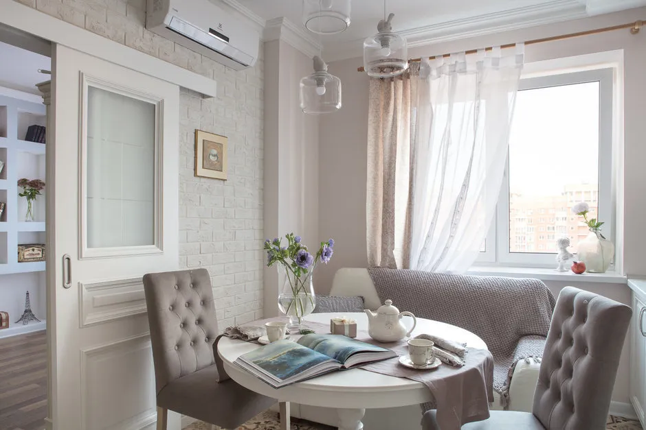 Design: Anna Eлина
A Safe Bet — The Color Wheel
Using Itten's color wheel, you can select a palette of related or complementary colors. All designers use it!
For a bold, contrasting interior — mix colors directly opposite each other. Want more colors? Visually draw an isosceles triangle and take shades located at its vertices. If you want even more color, draw a rectangle: one color is primary, two others are supporting, and the fourth is for accents. Another option: combine colors that are neighbors to each other — but no more than 5 shades.
Need a renovation specialist?
Find verified professionals for any repair or construction job. Post your request and get offers from local experts.
You may also like
More articles:
 How to Cheaply Update the Interior of an Old Apartment
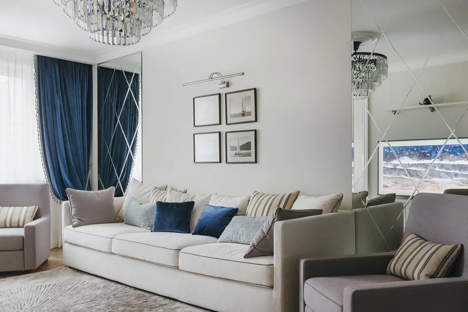 Decorating Living Room in Neoclassical Style: 5 Examples + Products
 How to Place Art in Interior Design: Tips from Oxana Butman
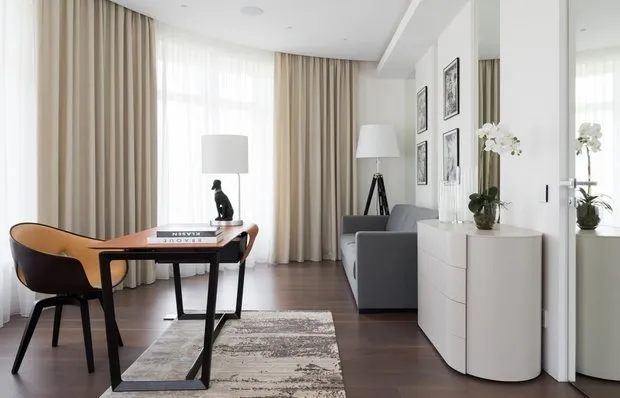 Interior Normcore: Trend or Banality? Expert Opinions
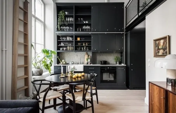 Apartment in Stockholm with a sleeping place under the ceiling
 7 Secrets of Perfect Order
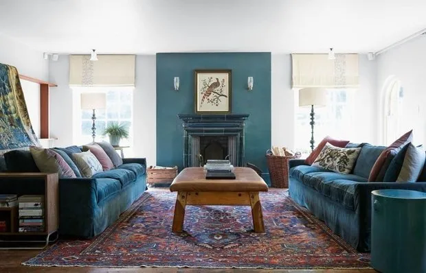 Bright Interior of a House with a Children's Living Room
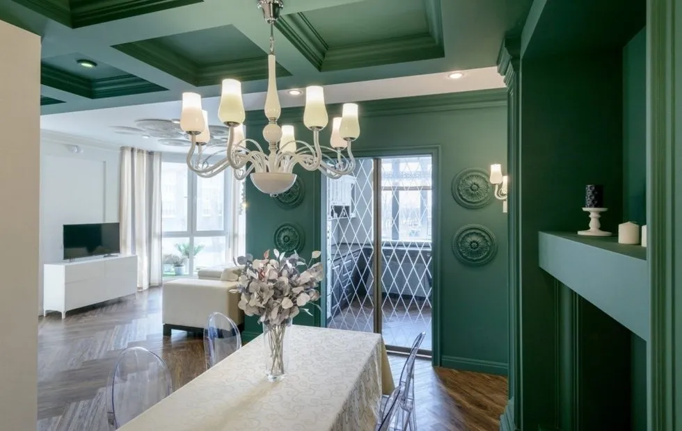 Living Room in New Classical Style: Tips, Furniture, Decor