Living Room in Gray Tones
In fact, it's not true at all: the secret lies in choosing the right shades. Only then will a living room in gray tones transform into a fashionable and stylish room, comfortable for relaxation and meeting guests.
Pros and Cons of Gray Color
The popularity of this shade among designers is mainly due to its versatility and practicality. Also, gray color unifies various details and other tones. Other advantages include:
- possibility of decorating a room in any style;
- if gray tone is the main one, you can easily change the room's design by simply replacing textile colors, which will radically transform the living room – with minimal costs;
- gray color is practical: it doesn't fade and stains are not very noticeable;
- dominance of gray color in the living room promotes deep relaxation.
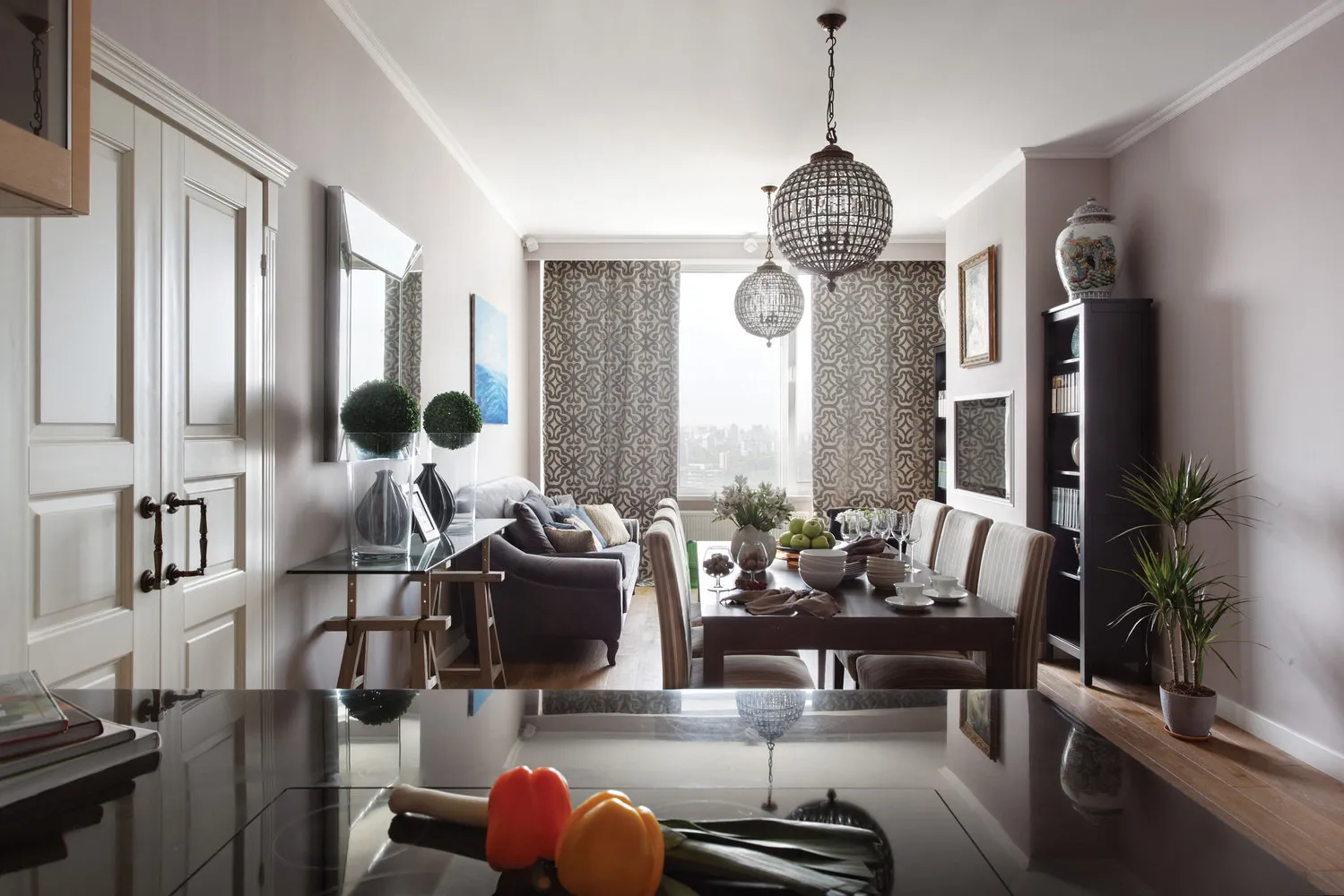
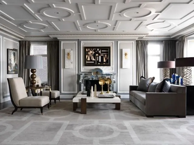
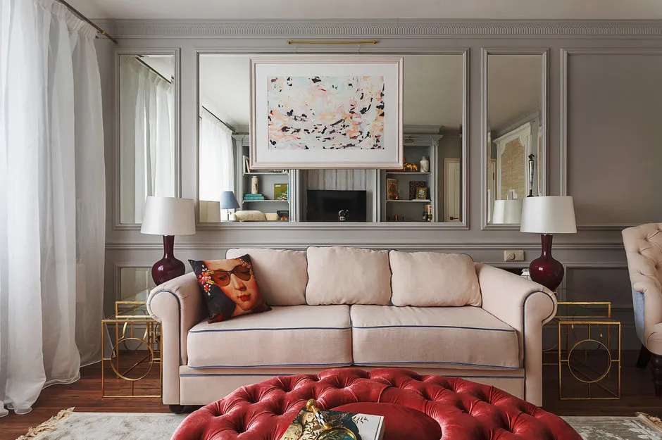
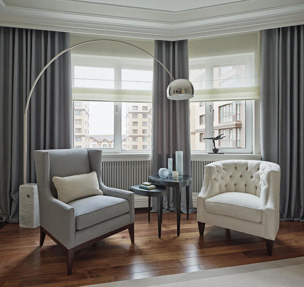
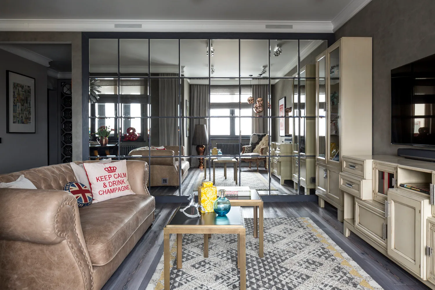
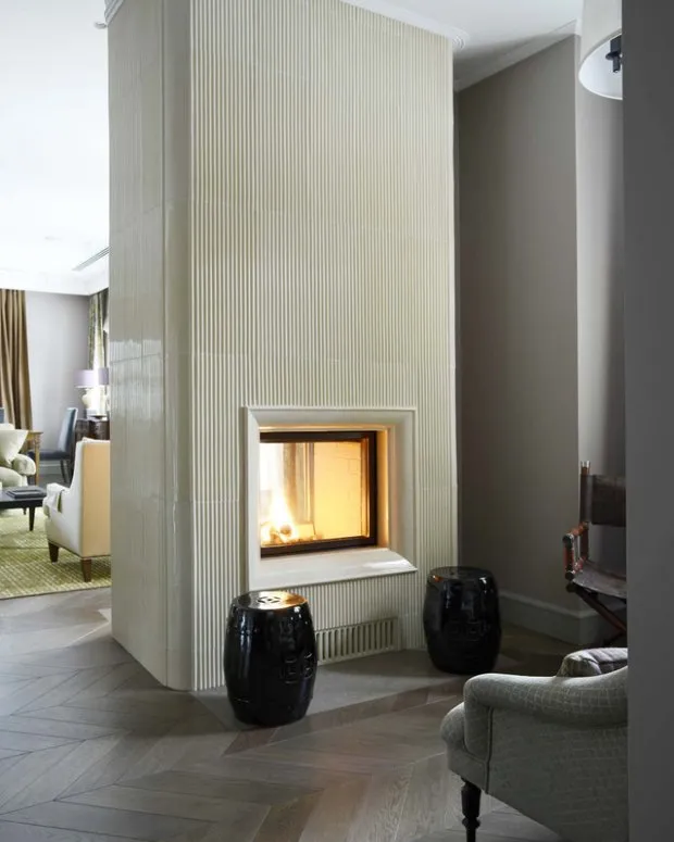
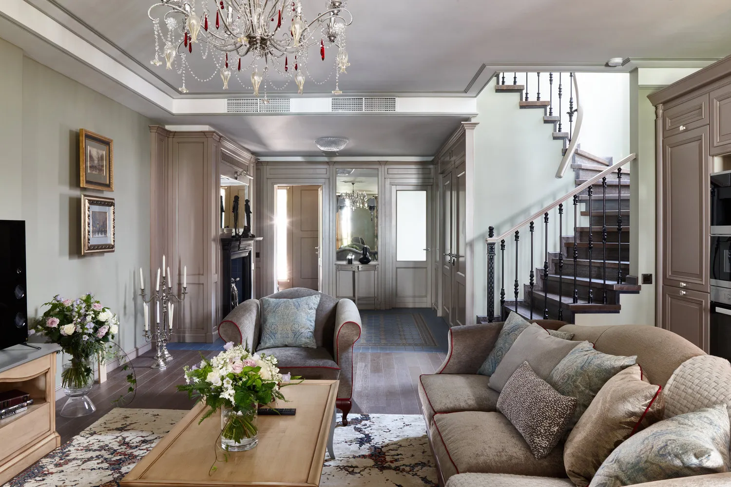
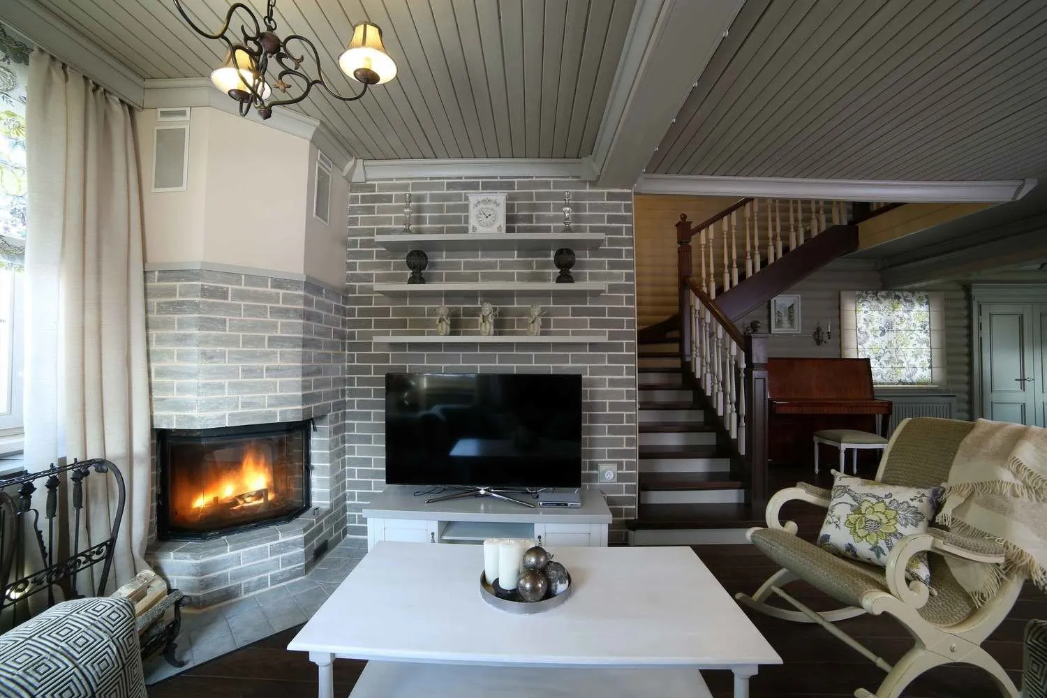
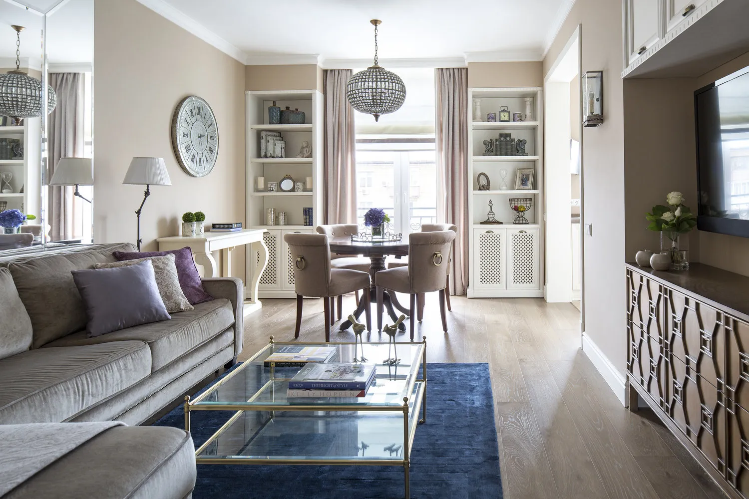
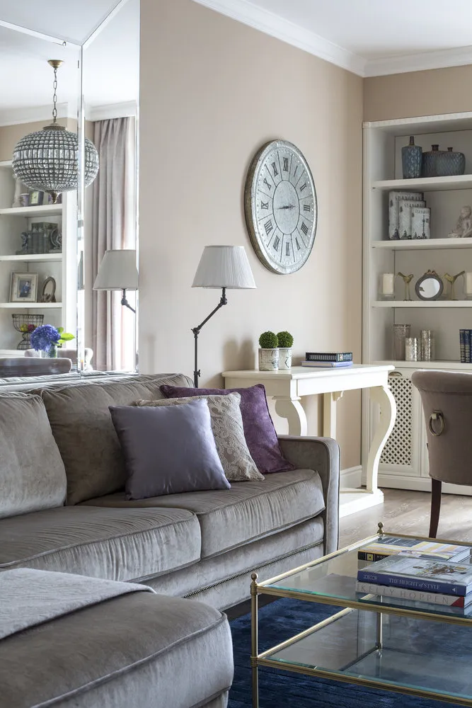
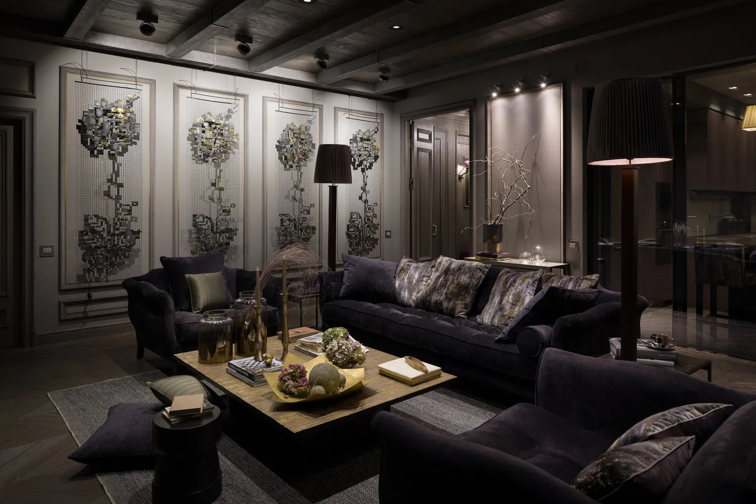
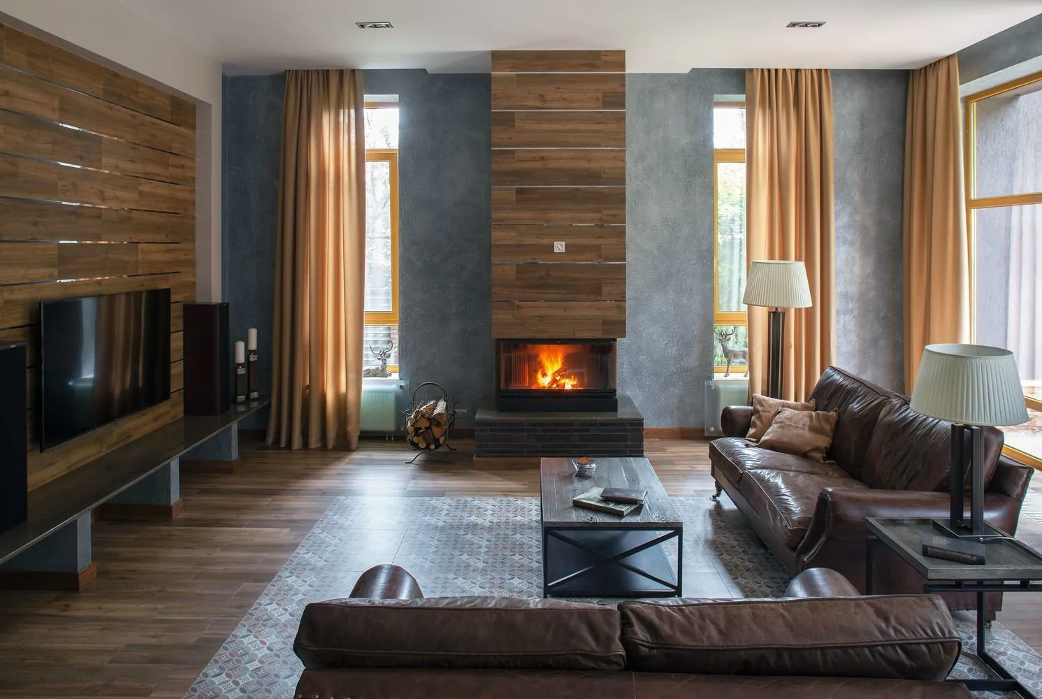
Design: Olga Chernenko
Main Rules for Using Gray Color
To make gray color show its maximum advantages when using it, you need to follow some rules. This will help you create a truly cozy interior.
- When using this shade as the main one, for small rooms choose only light shades.
- In a monochromatic interior, lighten the background with pastel colors: beige, peach or cream.
- In a small living room, make the ceiling as light as possible and the protruding walls and niches – dark. This will visually increase the room's volume.
- For spacious rooms, boldly use monochromatic decoration. A successful combination is gray with pearl, graphite or anthracite tones.
- If the room is narrow and small, use warm shades: gray-green or natural black wood. For spacious living rooms, cool tones work well: ice, silver, steel.
- When buying furniture, keep in mind that it should not have exactly the same shade as the walls: otherwise, the pieces will simply blend into the overall setting. Cabinets and sofas, armchairs, shelves will be clearly visible on the main background if their tone is lighter than the walls. But there is an exception for extremely small rooms: here it's acceptable to place furniture of the same shade as the walls. This way, you can reduce the bulkiness of the items.
- Bold decorative elements for a living room in gray tones are essential. These can be classic statues, paintings in original frames, posters, green indoor plants, photos with landscape images or posters (for the loft style).
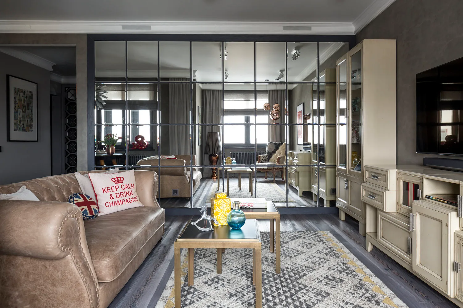
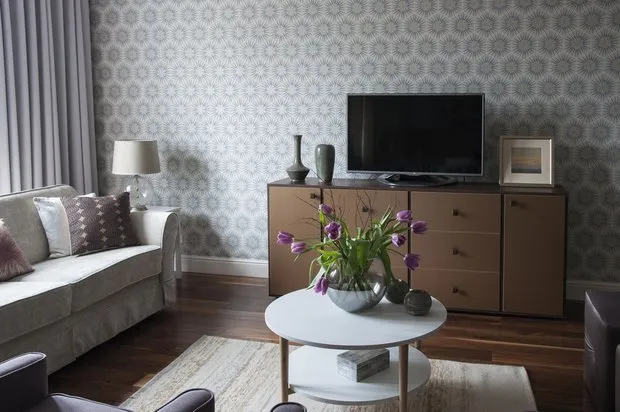
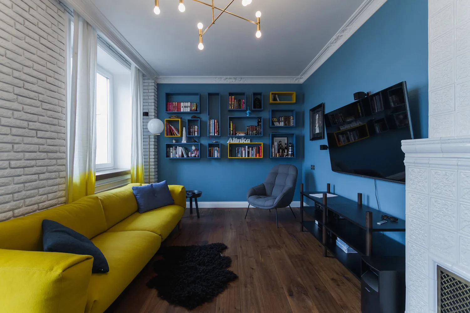
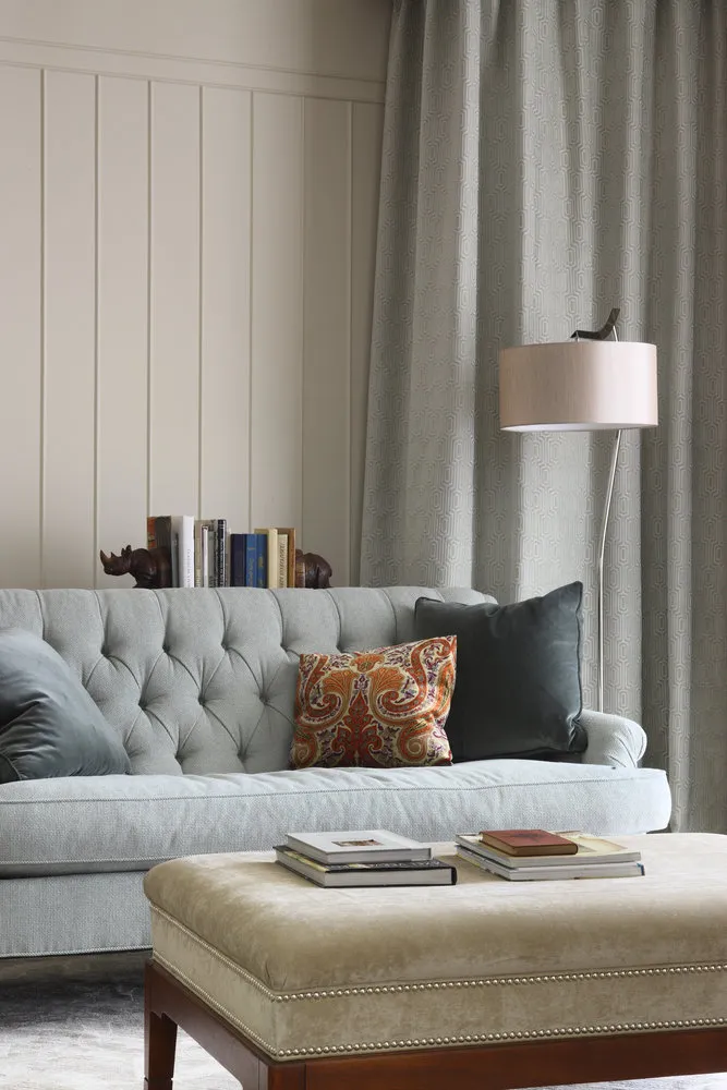
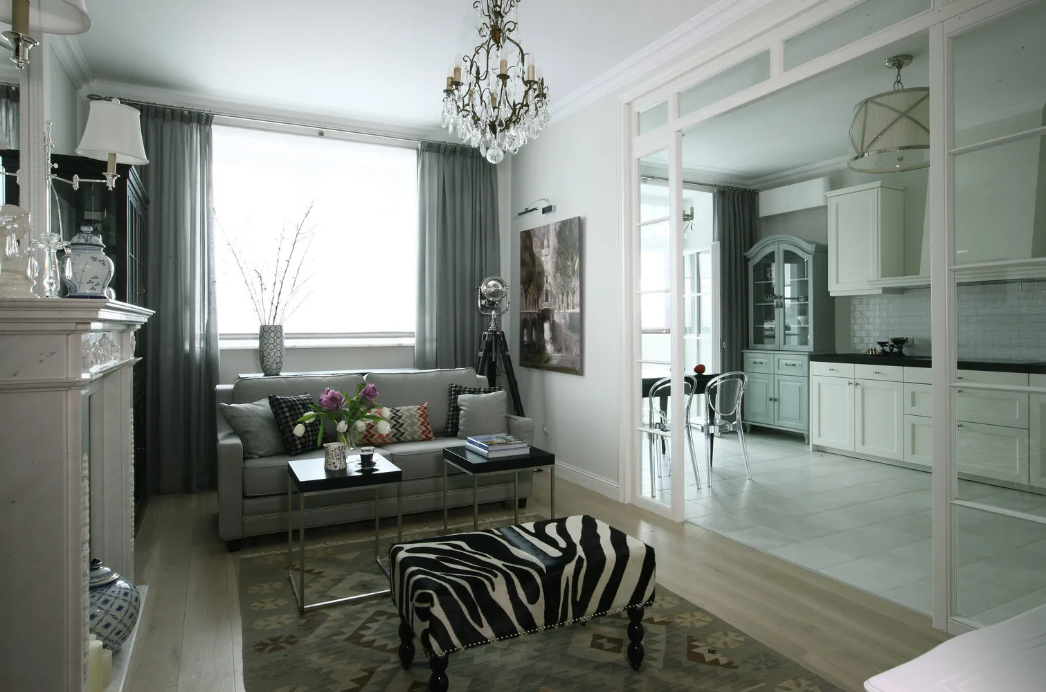
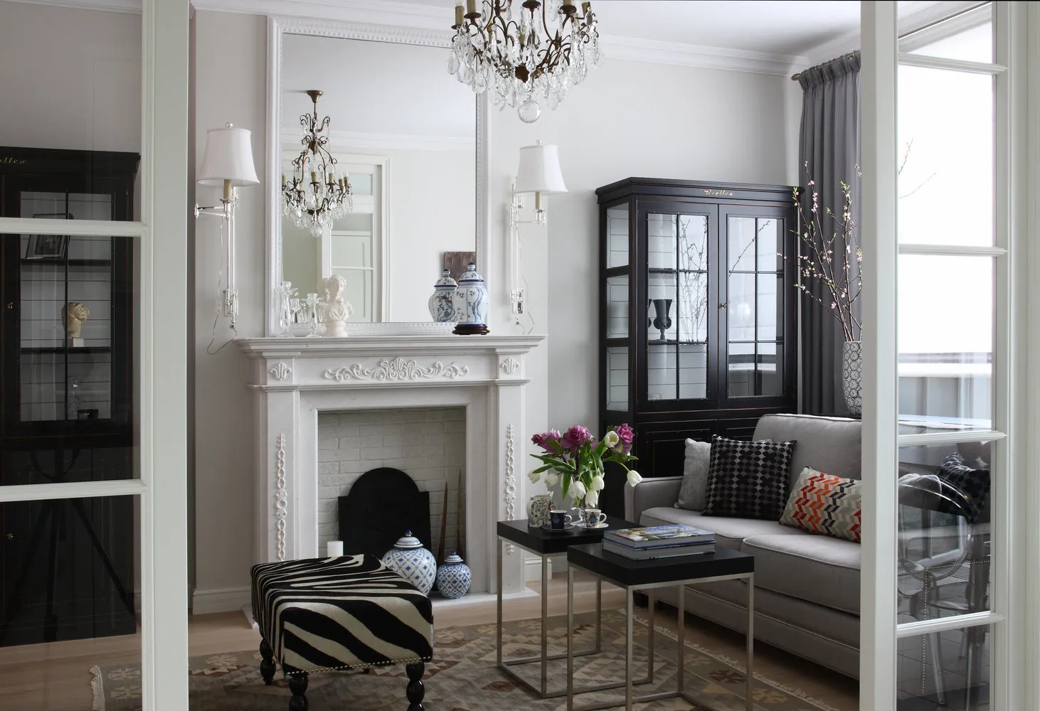
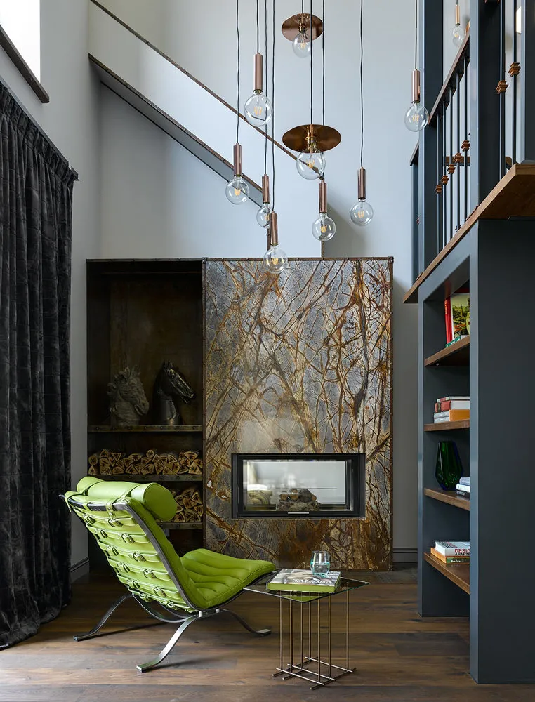
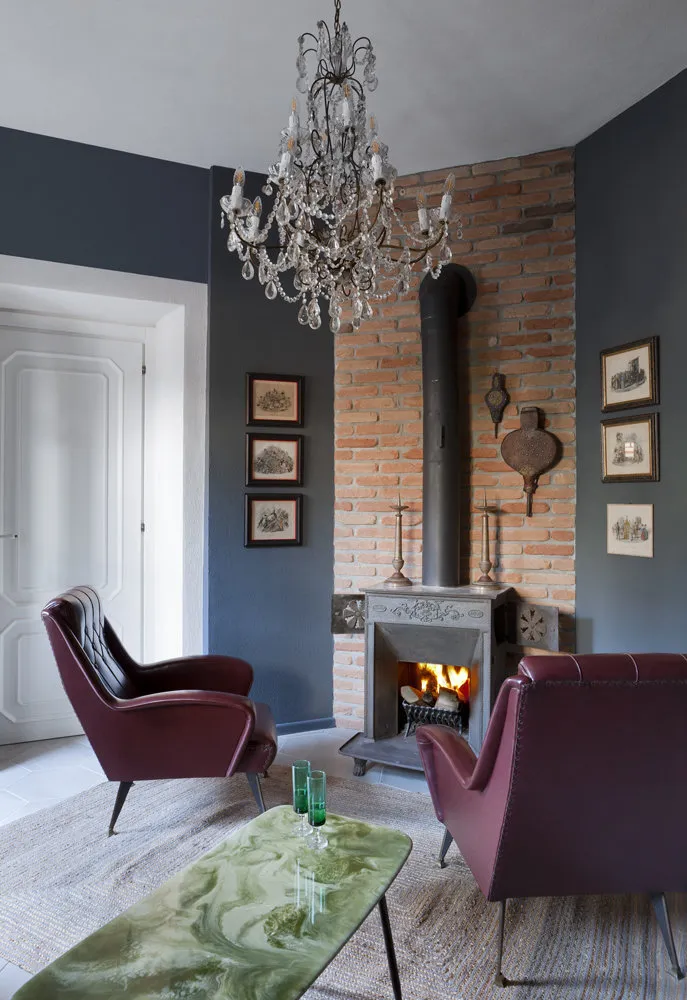
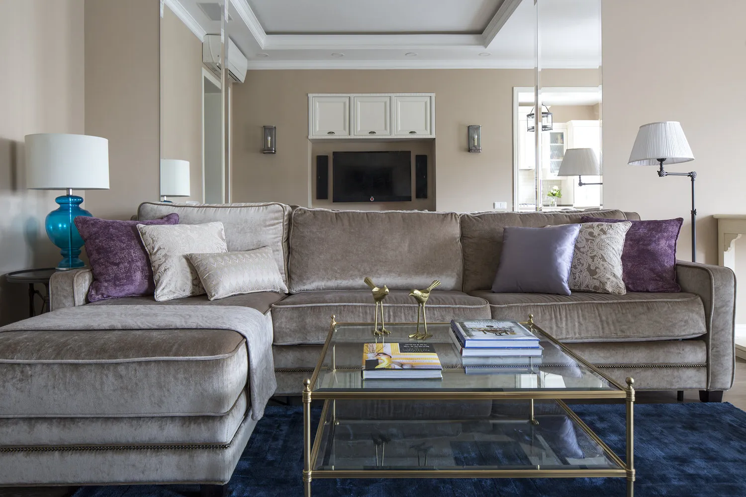
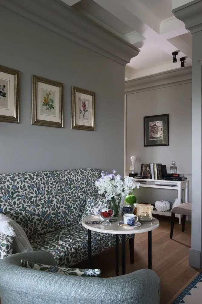
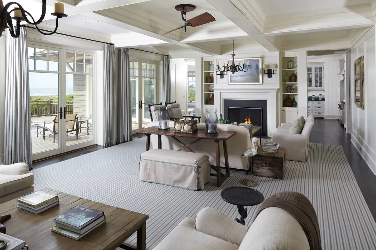
Design: Zhenya Zhdanova
Vibrant Accent Elements in Interior Design
The living room is where the family gathers and guests come; therefore, this room should attract attention and please everyone. Vibrant colors can help in this regard, enlivening a living room in gray tones. Accent elements can be accessories or furniture with brown, yellow, red or green color.
Blue also works well – it adds some strictness and coolness to the interior, which suits business people accustomed to relaxation in public places like clubs or restaurants. Bright elements can be used boldly, such as sofa cushions, vases, lamps, rugs. Sometimes wallpaper with bright small inserts is also used. The key here is not to overdo it.
Wall Decoration in Gray Tone
First, you need to decide on the shade choice, which requires assessing the room's lighting level. In a well-lit room use darker shades and vice versa. When choosing colors for floor and ceiling finishes, apply the following rules:
- flooring should be darker than walls;
- ceiling – lighter than wallpaper;
- floor – darker than furniture.
A lightened ceiling adds more volume to a living room in gray tones. The same can be said about the walls. If the wall finishing material is quite light, the room visually expands. There is a small nuance: in an overly elongated hall, the side walls should be decorated with dark shades – this will visually make the living room wider and shorter.
It's not advisable to make the floor overly light. In this case, there is a feeling of lack of support. Conversely, a dark ceiling seems to bring the walls closer, causing a sense of cramped space. Using gray material for wall decoration is most appropriate in styles:
- high-tech;
- minimalism;
- modern;
- abstract art.
When decorating a living room in gray tones, wallpapers are usually preferred. Manufacturers offer a wide range of options: you can select material with various textures and shades.
Combining Gray and White
These are two similar monochromatic colors, so together they look very harmonious. Gray and white shades are actively used in creating a modern interior, art deco, and less commonly, classic style. Many replace pure white with its shades: cream, dark milk and others. Interesting combinations can also be created by using different textures – for example, wallpapers or plastering. All this helps create a cozy and comfortable interior.
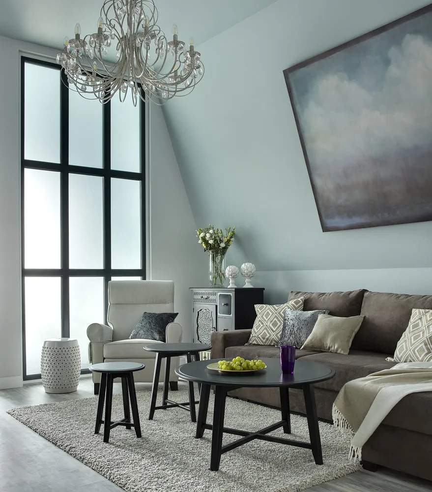
Design: Jean-Louis Dénio
Gray and Brown
This type of living room decoration usually evokes associations with a country-style interior, popular in Great Britain. Brown in combination with gray calms down: the proximity of these tones appears elegant and soft. At the same time, this combination does not distract from decorative elements. Decorating a living room using gray and brown can be done in several ways:
- furniture made of natural wood and gray wallpapers;
- milk-colored furniture plus brown-gray duvet or rug;
- brown-colored walls and gray furniture items (the latter look sophisticated, luxurious and expensive, convincing guests of the owner's excellent taste).
Design: Yana Molodых
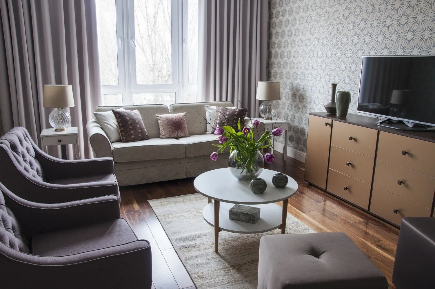
Combination with Pink
This combination looks fresh and gentle, never irritating and conducive to good relaxation. It's precisely because of this that the family spends time in the living room. If you use a bright pink shade, it creates an original accent typical of high-tech or loft styles.
Design: Elena Lazareva
Add Green Color
In this case, the interior becomes natural. This is because green color is natural. You can use indoor plants with wide leaves or curtains, rugs of the same tone. It's important to remember that too much green should not be used. Choose from shades like olive, malachite, salad, etc.
Design: Marina Zhukova
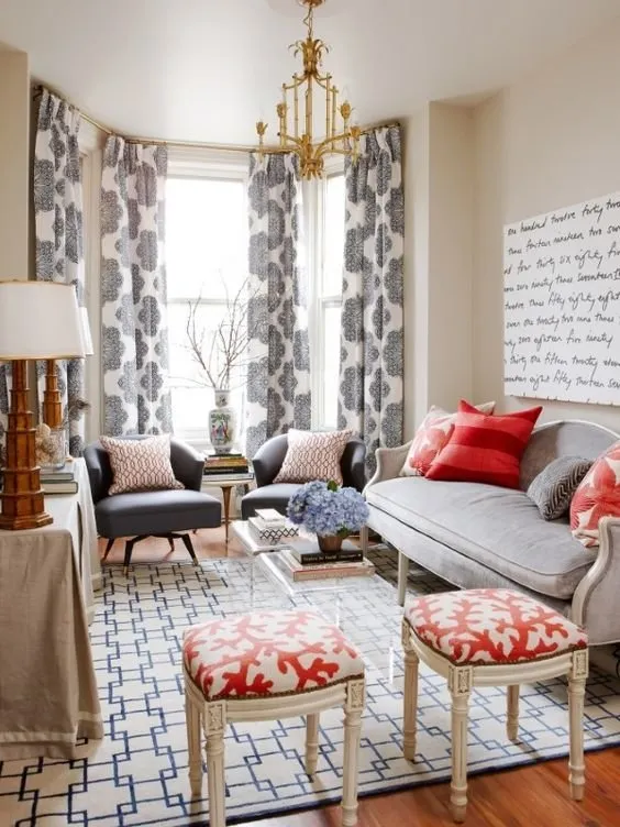
Gray and Red
This is a very interesting combination. But it's important to remember that red color is quite eye-catching, so it shouldn't be used in large quantities. In a gray living room, it's enough for red shade to appear in curtains or armchairs, plus a few decorative elements.
Design: Olga Kulikovskaya-Eshbi, Interior Box
Lighten with Blue Color
This combination gives the living room peace and tranquility. Blue color is characterized by richness and depth. When choosing blue shades, try to make the furniture lighter than the walls. A good addition can also be gold and silver tones, which are used in accessories: curtains or sofa cushions.
Design: Nikolay Nikolaev
Gray and Blue
This combination is used when blue color seems overly rich. The presence of blue adds airiness to the room, making it fresh and airy. Based on this combination, you can decorate a living room in the Mediterranean style. When using this combination, make the walls gray and the furniture items blue (or vice versa).
Design: Marina Pilipenko and Ekaterina Fedorova
Various Shades in the Living Room: From Dark to Silver
The tones are in a wide range, from almost white to almost black. This variety allows choosing the most suitable variant of decoration according to your taste. It should be noted that the described tone is achromatic, i.e., it lacks other color pigments. Warm and rich color adds nobility and some luxury to the room. Cool tones, reminiscent of steel, are associated with an industrial-style interior. With such shades, you need to work carefully, even in pseudo-industrial styles like high-tech or loft. Manufacturers of finishing materials know these features and usually offer the following shades:
- smoke;
- ash;
- French gray and others.
The most popular cool shades are white lead and tin.
Design: Alexander Akimenkov Studio
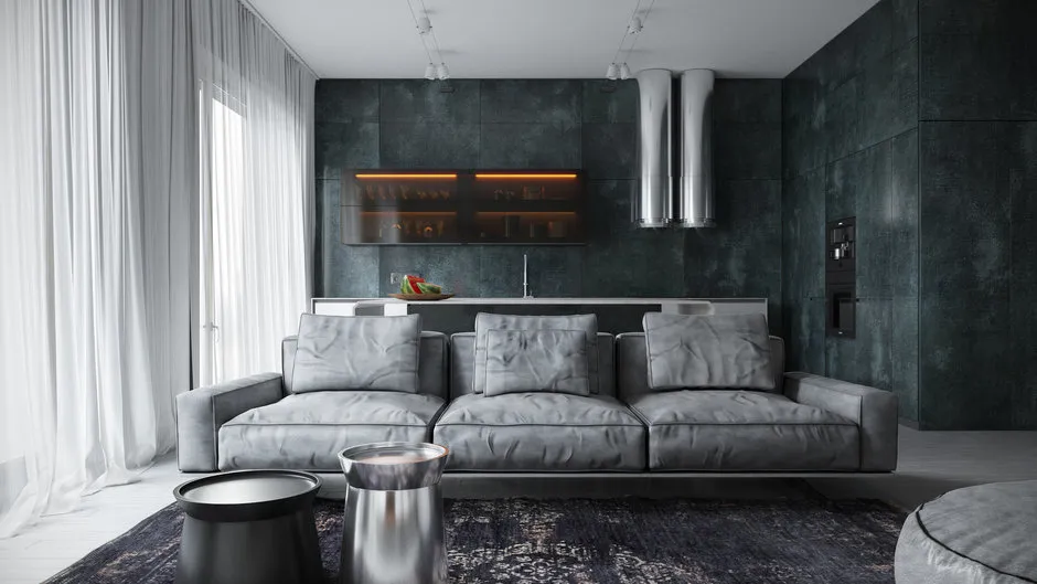
Furniture in a Gray Living Room
If you visit a furniture store, you can see that this color is used quite often. Usually, it's upholstery that looks very sophisticated. The most popular are metallic shades, as well as concrete or wet asphalt. The latter gives soft furniture a luxurious and expensive look: the upholstery material can be natural leather, in some cases – a tapestry.
In the described shades, you can use not only sofas and armchairs but also an elegant coffee table of a dark milk shade combined with chairs of a milk shade. It's not necessary to buy all furniture items in gray color only.
For example, it looks interesting to combine a natural brown wood tone with a concrete leather sofa. Outside the relaxation area, this shade is suitable for wall-mounted shelves and cabinets. Gray color gives elegance and at the same time somewhat lightens the interior, not cluttering it.
Design: Marion Studio
Gray Textiles and Additional Elements
Many forget that one of the key components of interior design is elements that are not immediately noticeable at first glance. Yet these elements often form the character of the design. If your furniture and surfaces are light, then buy decorative details in darker shades. Curtains of wet asphalt color look exceptionally stylish. Silver tones of lighting fixtures will bring elegance to the interior, and attention-grabbing sofa cushions seem to pull you toward relaxation.
Stylistic Directions
According to most designers, the described color is appropriate in modern interior design. These include loft, minimalism, high-tech, and modern or underground styles. The characteristics of these stylistic directions can be revealed precisely by gray color, whose palette allows emphasizing vintage elements in decoration.
These shades can also be used in classical directions: baroque, empire, classic style. But here it's recommended to use soft tones that provide retro styling. As mentioned above, a good effect is achieved by using a combination of blue and gray with pearl tones – in fact, this is a ready-made Mediterranean style decoration. However, it's important to ensure proper natural lighting (preferably with windows facing south).
An interior in gray tones is quite elegant and can satisfy the demands of even the most demanding design enthusiasts. To a large extent, this is due to the wide selection of shades of this popular color. On our website, you can choose the most suitable variant for decorating your living room.
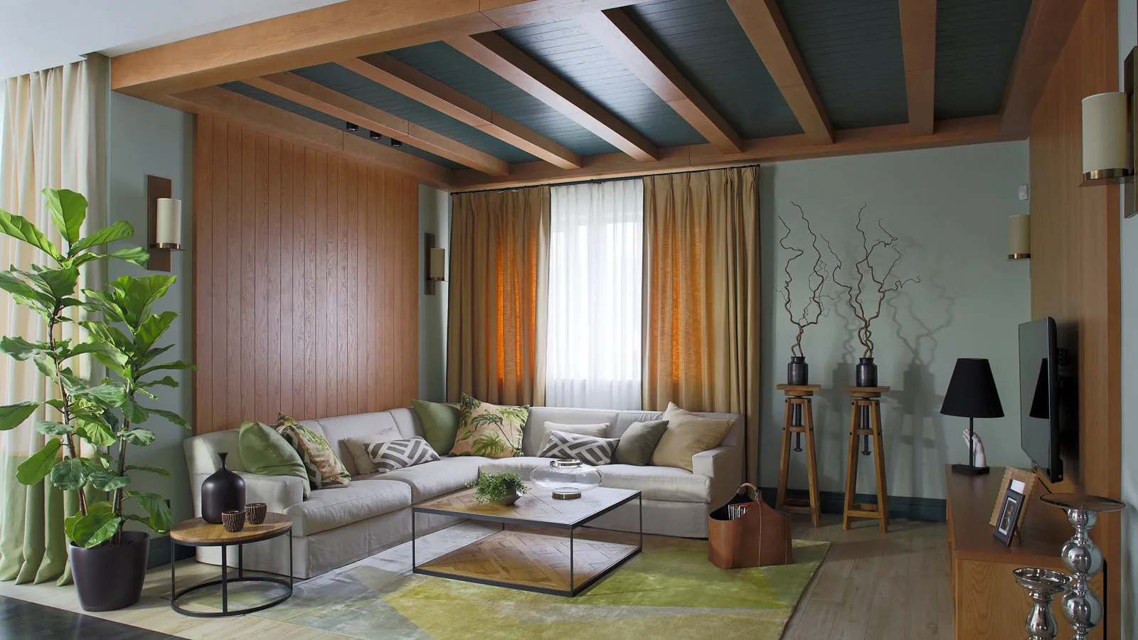
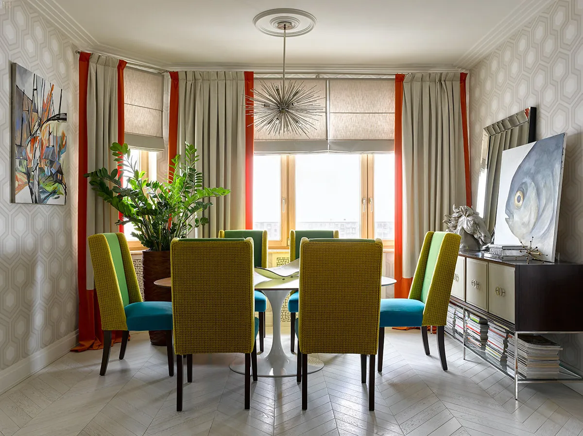
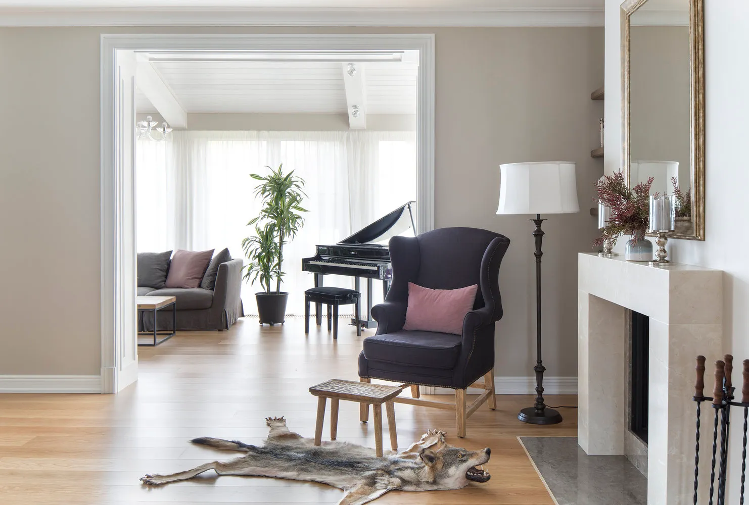
Design: Lina Lenskikh
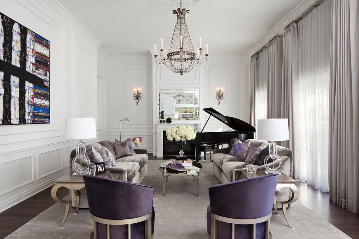
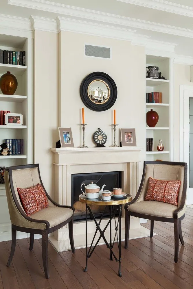
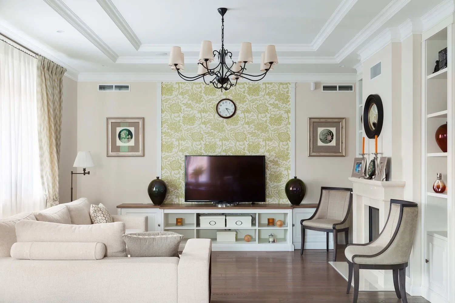
Recommendations from Designer Viktoriya Tarasova
Design: Yana Molodых
Design: Nikolay Nikolaev
Design: Alexander Akimenkov Studio

Design: Kameleono Studio, Pavel Lichik and Anastasia Ivanova
Examples of Living Rooms in Gray Tones
Need a renovation specialist?
Find verified professionals for any repair or construction job. Post your request and get offers from local experts.
You may also like
More articles:
 Design of Small Kitchen: Interior Photos of Corner and Straight Kitchens
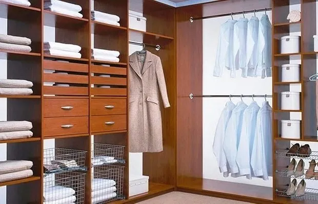 Corner Wardrobes
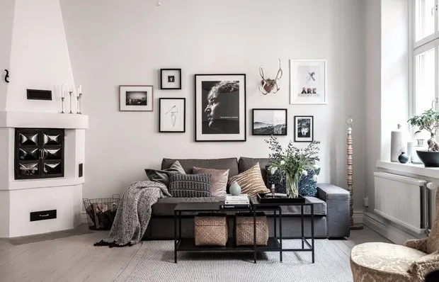 Comfortable Layout and Invisible Wardrobes: Apartment in Sweden
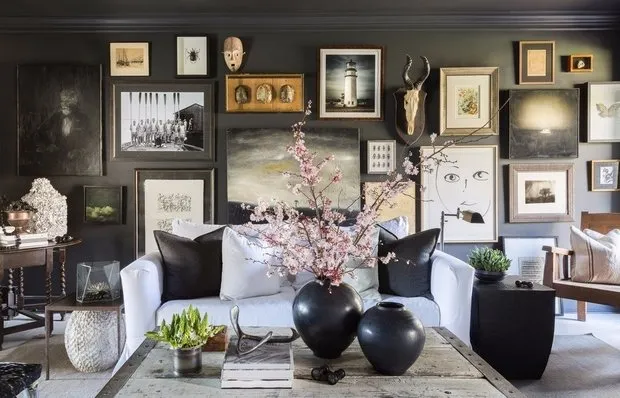 Andersen's House: Visiting an American Designer
 Handmade, Eco-Shick, and No Hype: Wall Decoration Trends
 Modern Style Bedroom
 Bedroom on attic
 If Not Tile, Then What? Decorative Materials for the Bathroom