6 Secrets of Cover-Ready Interior Design You Should Know
When planning an interior, people often take interior photos as a reference. Why are glossy interiors so perfect?
True design is invisible. It lies in functionality, ergonomics, and everyday aesthetics. But for interior photography, a wow effect is needed. A decorator always works with the photographer on set. Their job is to make the interior lived-in and achieve that wow effect for photos. We explain what tricks make "cover-design" so appealing.
Perfect Color Palette
One of the favorite tricks of decorators and designers is matching all elements in the frame within a single color palette. Books on shelves, flower pots, textiles, picture frames or posters, a throw blanket on the sofa, seemingly carelessly placed to animate the composition – all of these are harmoniously selected.
But in real life, the color palette is often disrupted first. If changing color tones breaks the image, it means the interior lacks a foundation.
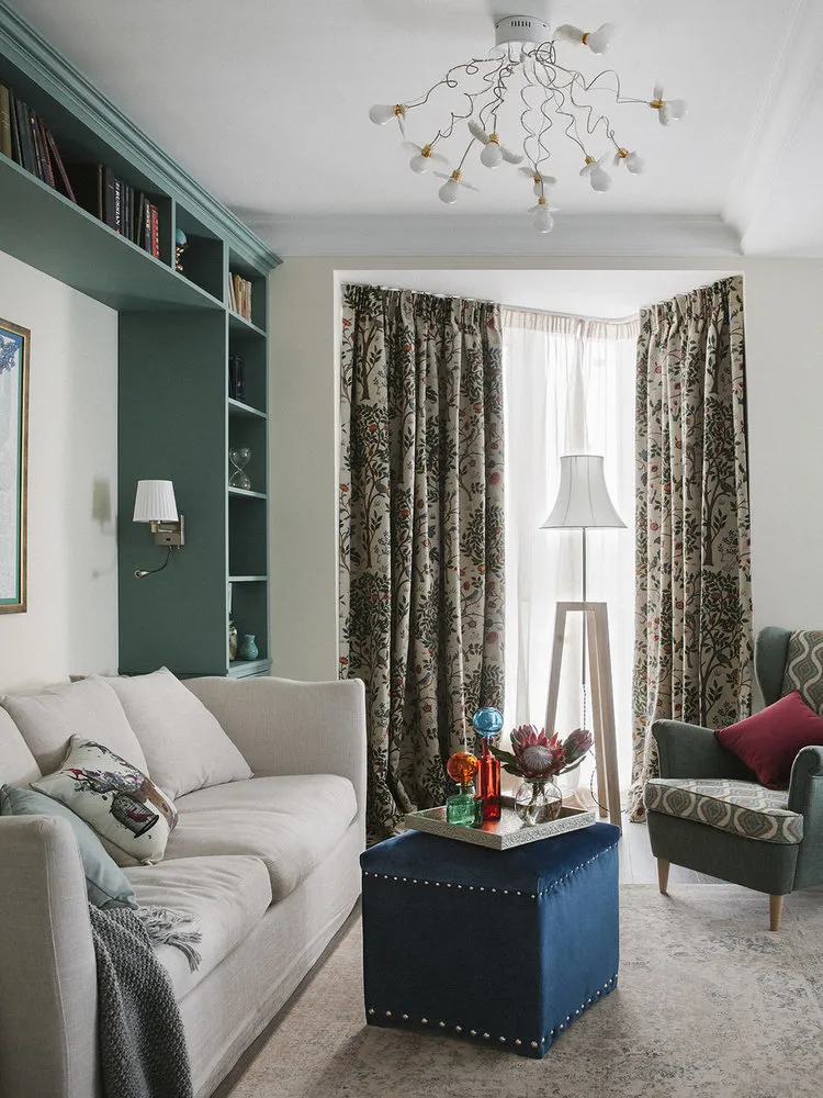 Design: Inna Velichko
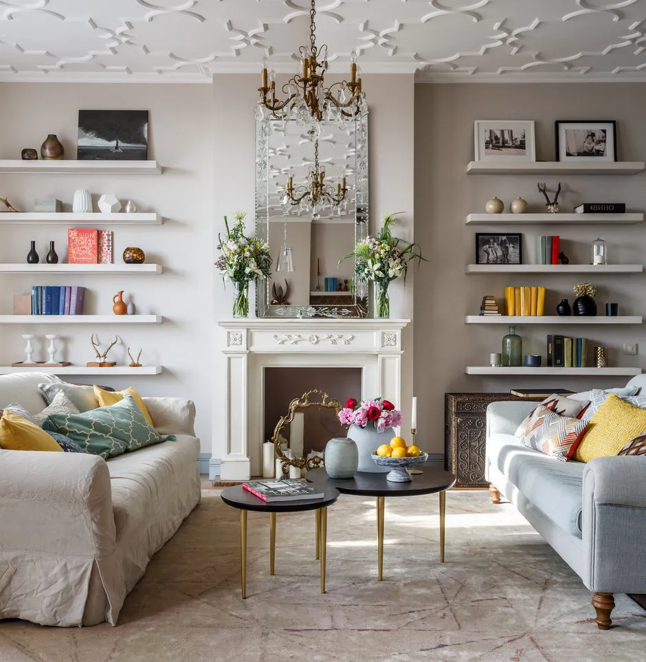
Perfect Order
Before the shoot, perfect order is always arranged in the frame. No extra items remain here. This is especially true for minimalist and loft-style interiors.
In real life, the living space gradually accumulates everyday details that nullify the effect of the design: a towel carelessly left, a gallery of jars on the countertop, shoes not put away by the door, a charging cable for a smartphone or laptop, a comfortable pillow under the back, a case for glasses and bills on the nightstand – all of these in random colors.
 Design: Anna Muravina
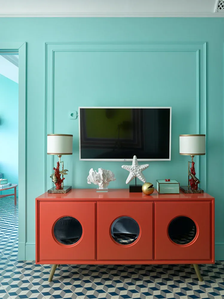
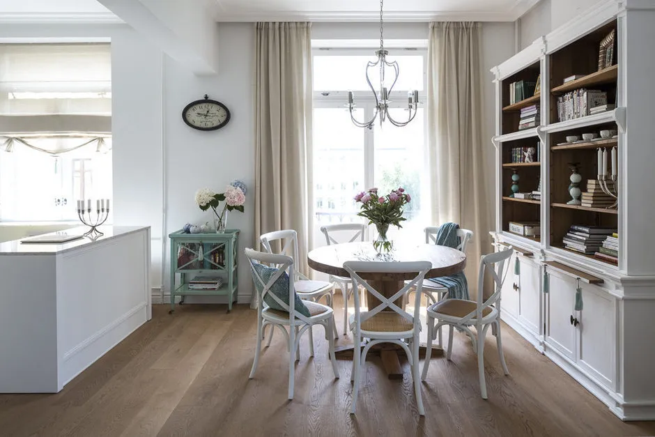
Perfectly Selected Decor
On the other side of the coin – perfectly chosen decorative elements: vintage items, paintings, lifestyle accessories, even everyday-use items fit right in. In most cases, homeowners see all this for the first time. The designer had prepared ahead of time for the shoot, planned the frame, collected necessary accessories from all over the city, moved furniture, and arranged flowers in vases. Few will remember wall color or whether there were curtains in the room. Without these details, a space looks significantly less impressive.
Besides, an abundance of decorative elements either turns the owner into a "Cinderella" or the interior into a dust collector.
 Design: Enjoy Home
Perfect Lighting
Another clever trick is achieving perfect lighting in the frame through additional studio light. Even a dark corner will look sunny under such conditions. In real life, of course, the light won't highlight colors and textures as effectively, so the image will be simpler and darker.
 Design: Lavka-design
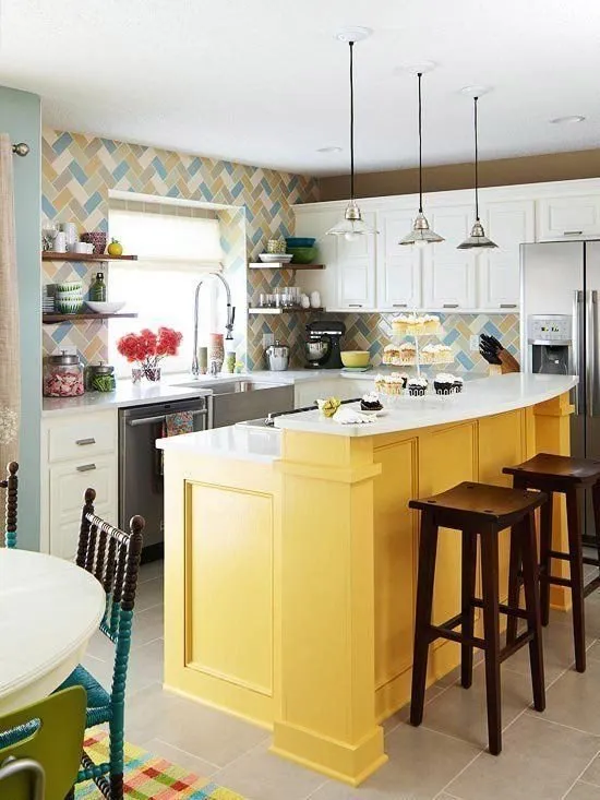
Bold Choices
The center of the frame features a bold, eye-catching design decision. For example, a kitchen island and an impressive composition on it. Attention is not drawn to the rest of the less successful setup. In this case, the cramped space arises precisely from the bulky island.
 Professional Photography and Photo Editing
And the most obvious and popular – using professional photography equipment and post-processing in graphic editors makes an interior much more inspiring than amateur photos. For the desired effect, proportions can be altered, and furniture adjusted. For example, these photos artificially created an illusion of a spacious room.
 Design: Zhenya Zhudanov
On the cover: Design project Enjoy Home.
Need a renovation specialist?
Find verified professionals for any repair or construction job. Post your request and get offers from local experts.
You may also like
More articles:
 6 Cool Things Designers Made Using a 3D Printer
 Studio Design 25 Square Meters with Photo
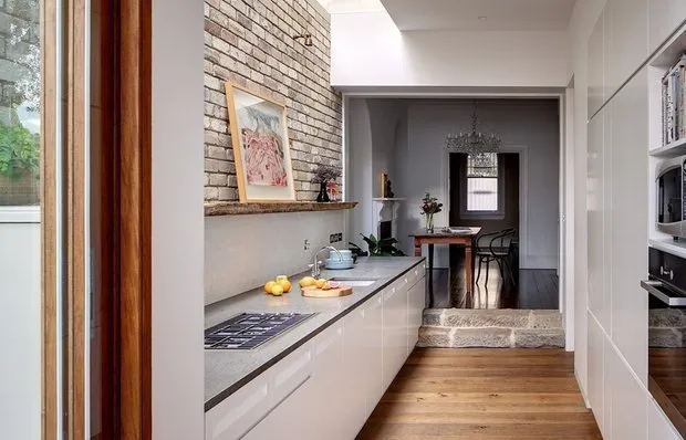 Kitchen-Entryway
 Modern Studio Design 20 Square Meters with Photos
 Black Suspended Ceiling in Interior with Photos
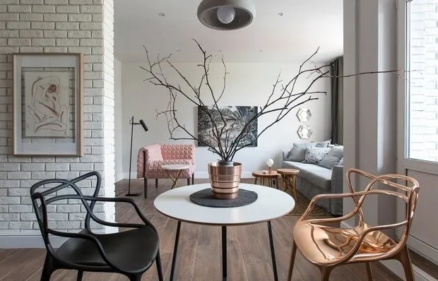 11 Posts You Must Read If You Own a Studio Apartment
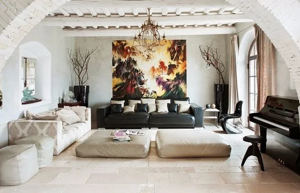 Italian Interior Design
 Houses with bay windows: photos