What Colors Do Designers Prefer to Use in Interior Design?
Color in interior design is not just decoration: it can revitalize outdated settings and lift your mood. Gray routines, monochromatic landscapes — where else but at home to experiment with shades? Which one to choose for each room, we explain today.
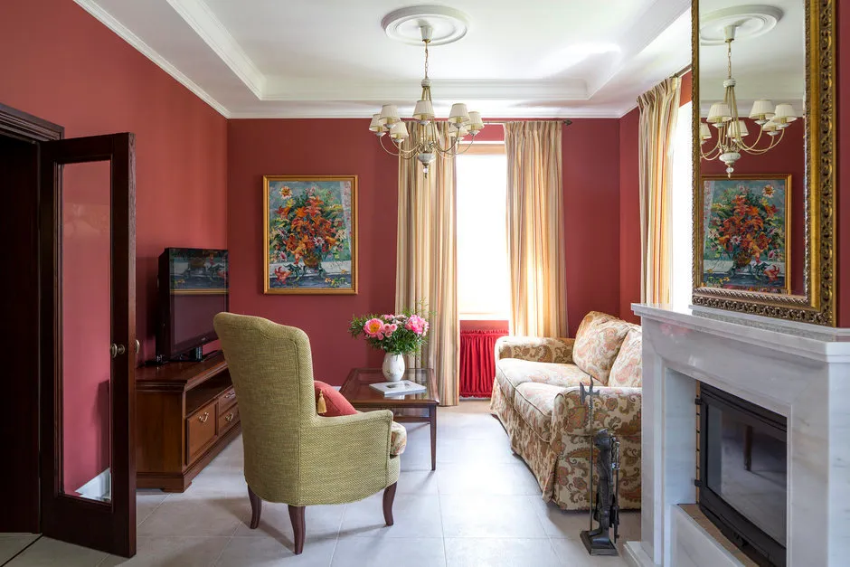
1. Living Room
There are no rules for choosing colors in living room design — and our designers actively use this freedom. Rich berry tones, floral shades, blue and violet hues — their favorites.
Ochre, sienna, umber — natural pigments that bring a sense of calm to every home.
Fresh yellow not only energizes but also visually expands the space — proven!
Vibrant teal color looks particularly striking when paired with citrus tones.
 Design: Lavka-design
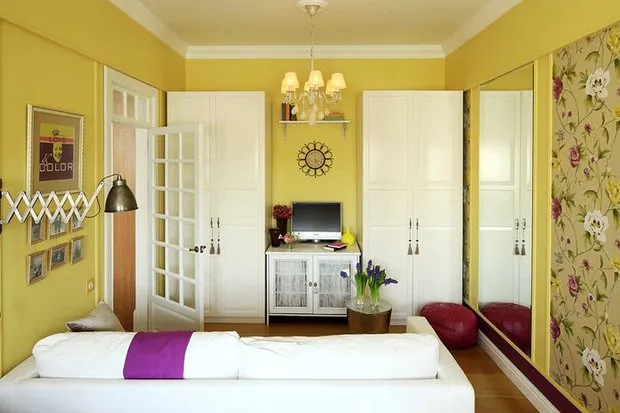 Design: Galina Yurieva
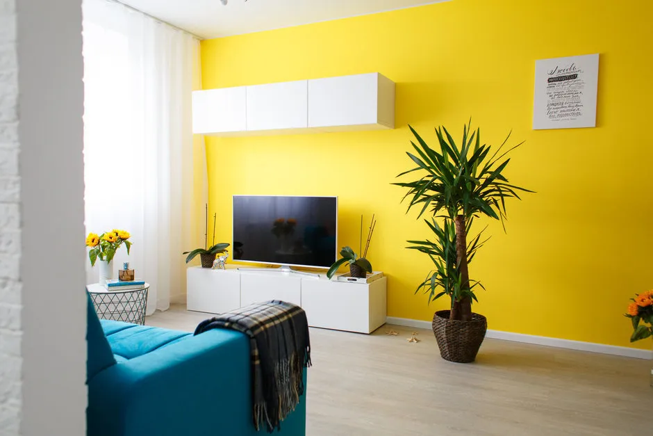 Design: Irina Sobylenskaya
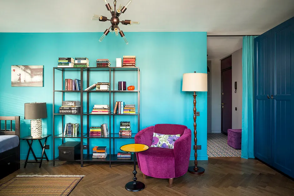 Design: Lavka-design
 Design: Julia Piskareva
2. Kitchen
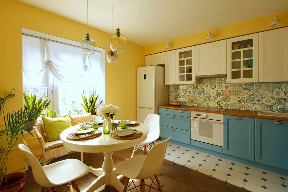
To add energy in the morning or create a relaxing atmosphere for dinner, reduce or increase appetite — color in the kitchen interior can do a lot.
Yellow color is an excellent choice for the kitchen: use it in wall or cabinet finishing. Even with insufficient natural light, the interior will always feel warm and sunny.For a more classic look in a kitchen-dining room, consider deep navy blue shades. Blue-gray, cornflower, sapphire — unbeatable options.
 Design: Katya Chistova
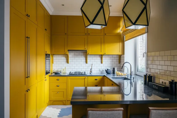 Design: Enjoy Home
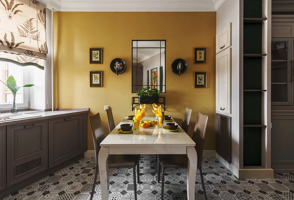 Design: Marina Sarkisyan
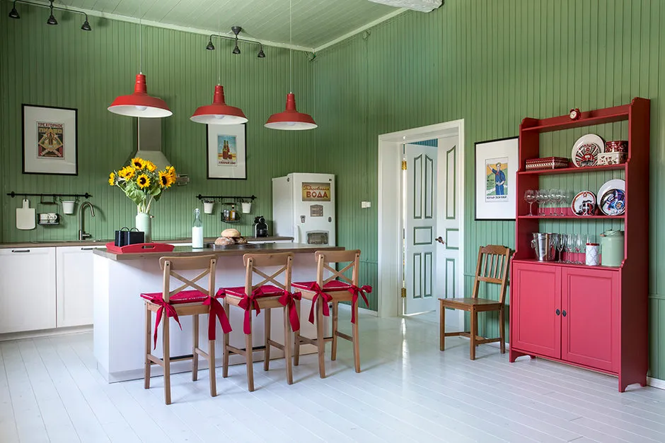 Design: Zhenya Zhdanova
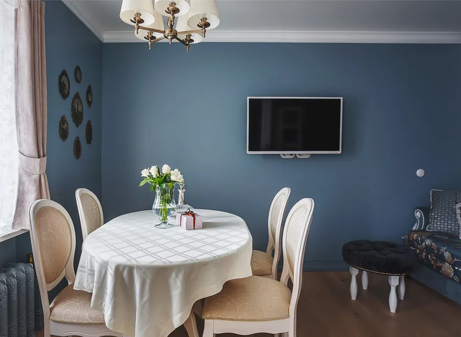 Design: Ksenia Yusupova
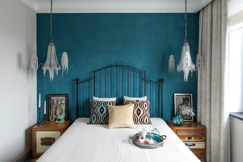
3. Bedroom
Who said pastel shades should dominate bedrooms? Create a cozy space with various shades of blue — it is associated with calm and relaxation.
The color indigo, brought to us from the Far East, evokes associations with something exotic — perfect for ethnic interiors.
 Design: Zhenya Zhdanova
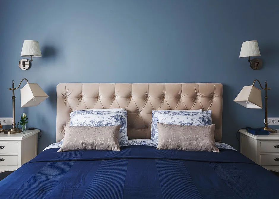 Design: Ksenia Yusupova
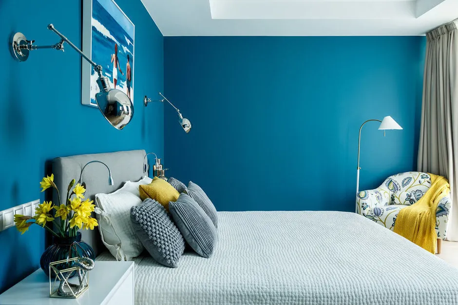 Design: Enjoy Home
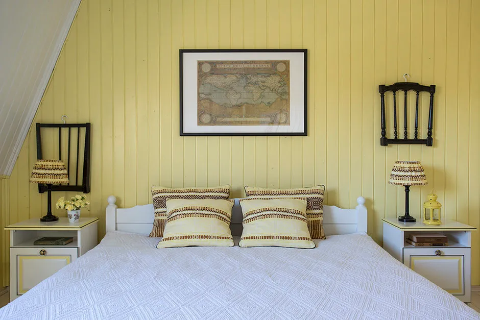 Design: Zhenya Zhdanova
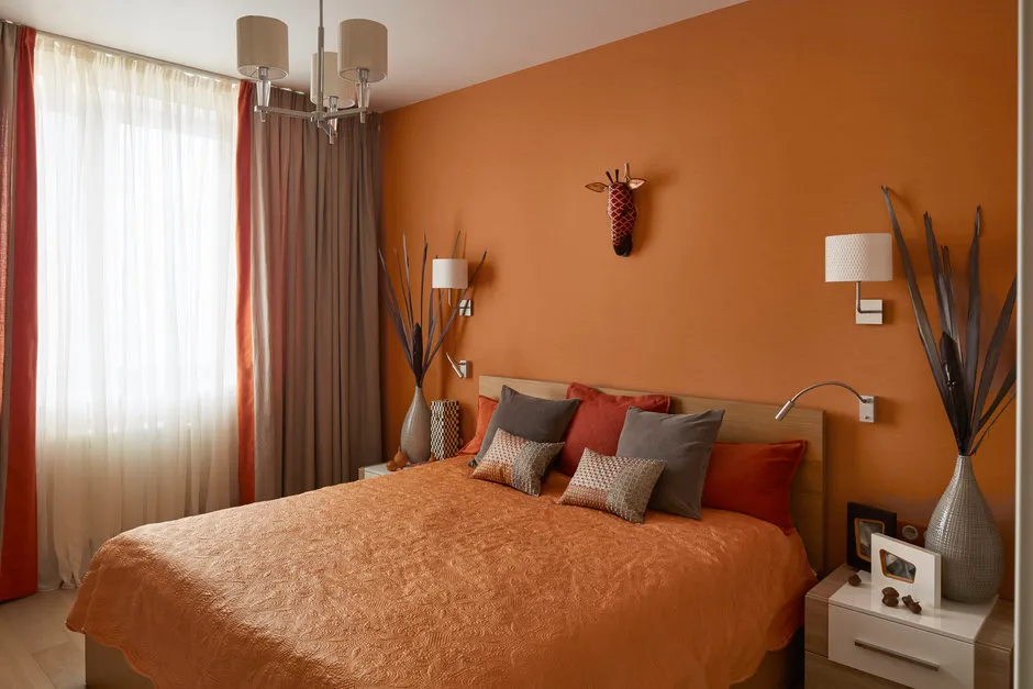 Design: Bon Home Design
4. Kids' Room
According to psychologists, children are more sensitive to color than adults. Keep this in mind when choosing paint.
Red in large amounts causes aggression, depression, and hinders sleep. Orange, on the contrary, boosts creativity and provides a sense of confidence and comfort. Don't forget about yellow: it supports mental work — A grades guaranteed.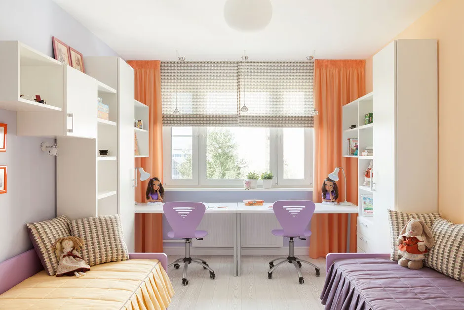 Design: Irina Krivtsova
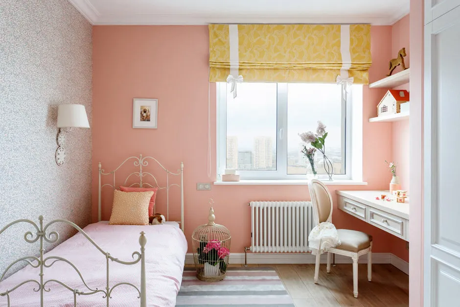 Design: Enjoy Home
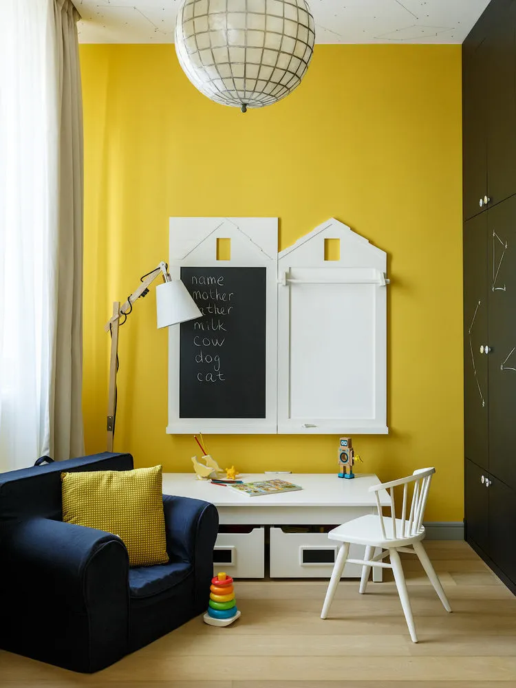 Design: Enjoy Home
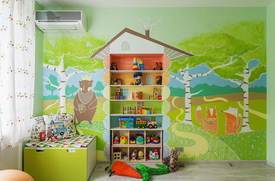 Design: Stella Balakhnina
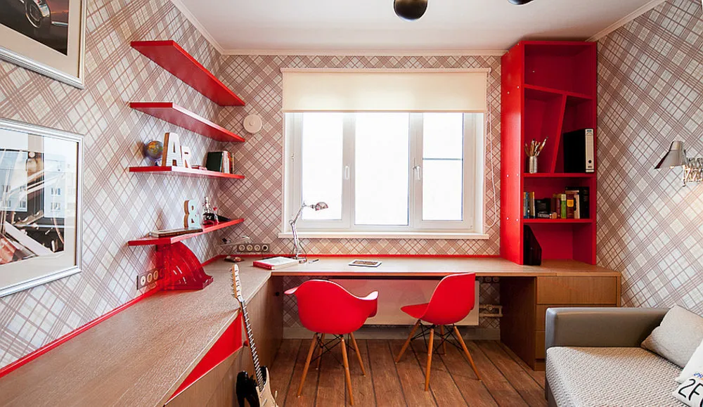 Design: Kateryna Kolegova
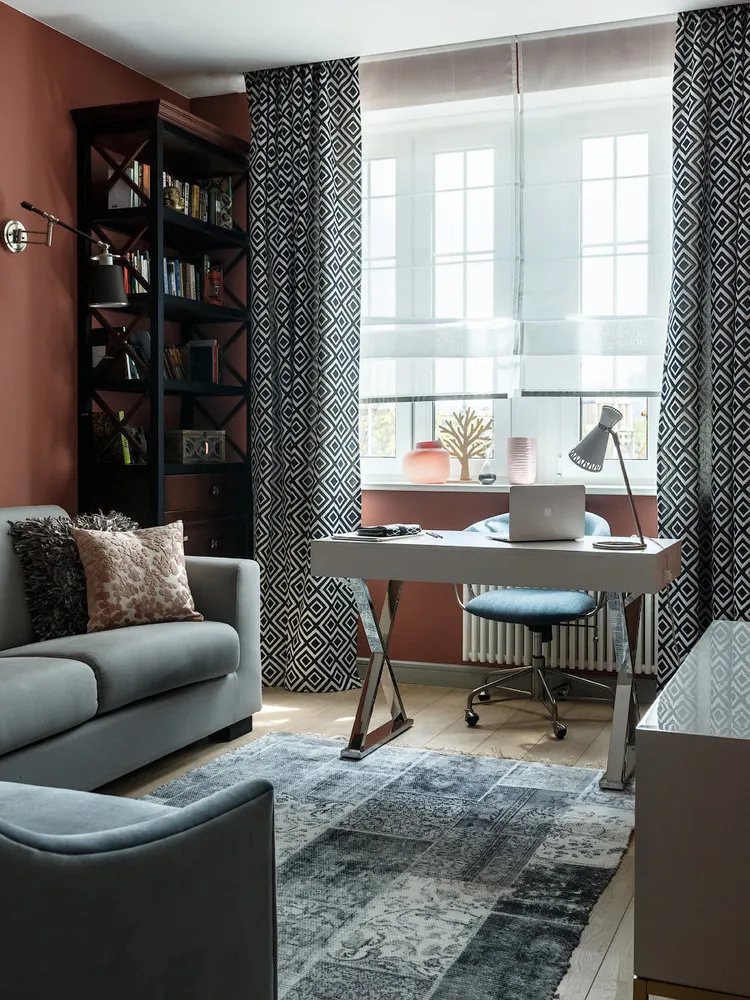
5. Office
Rest or work — in a home office, we prefer the latter. Therefore, the interior finishing should match.
Choose blue — you won't go wrong: it increases productivity and inspires creativity. It also suppresses appetite, so you won’t be tempted to snack.
Greenish tones soothe and reduce eye strain. Moreover, it's an excellent antidepressant: if you tend to get anxious easily, green is the best choice for your home office.
 Design: Enjoy Home
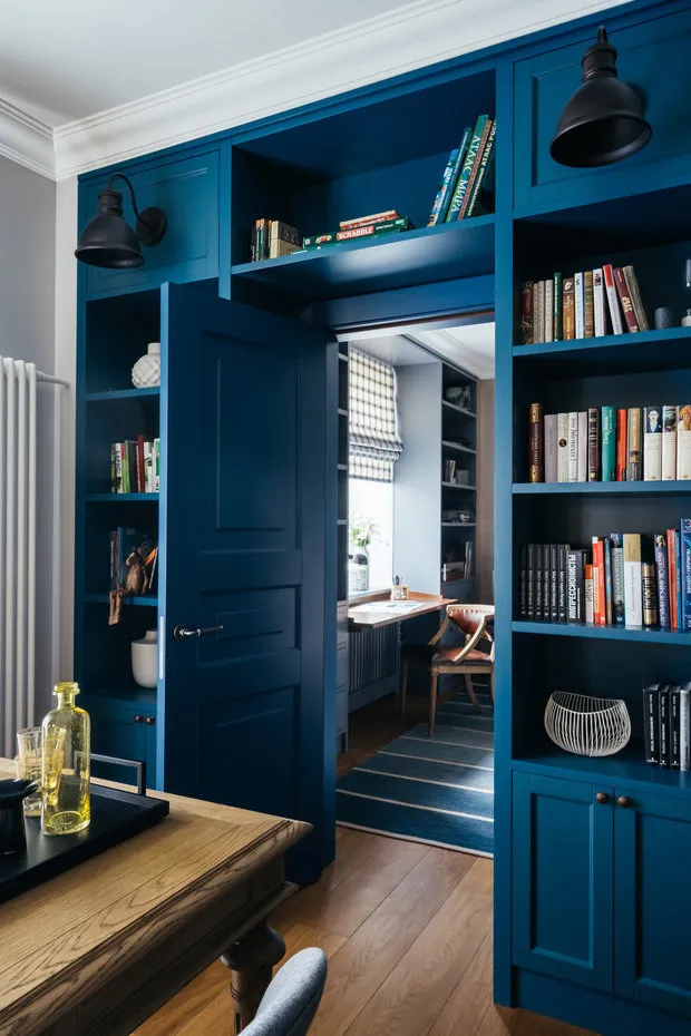 Design: Enjoy Home
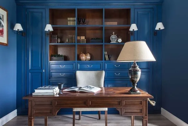 Design: Daria Shirokova, Inga Arshba
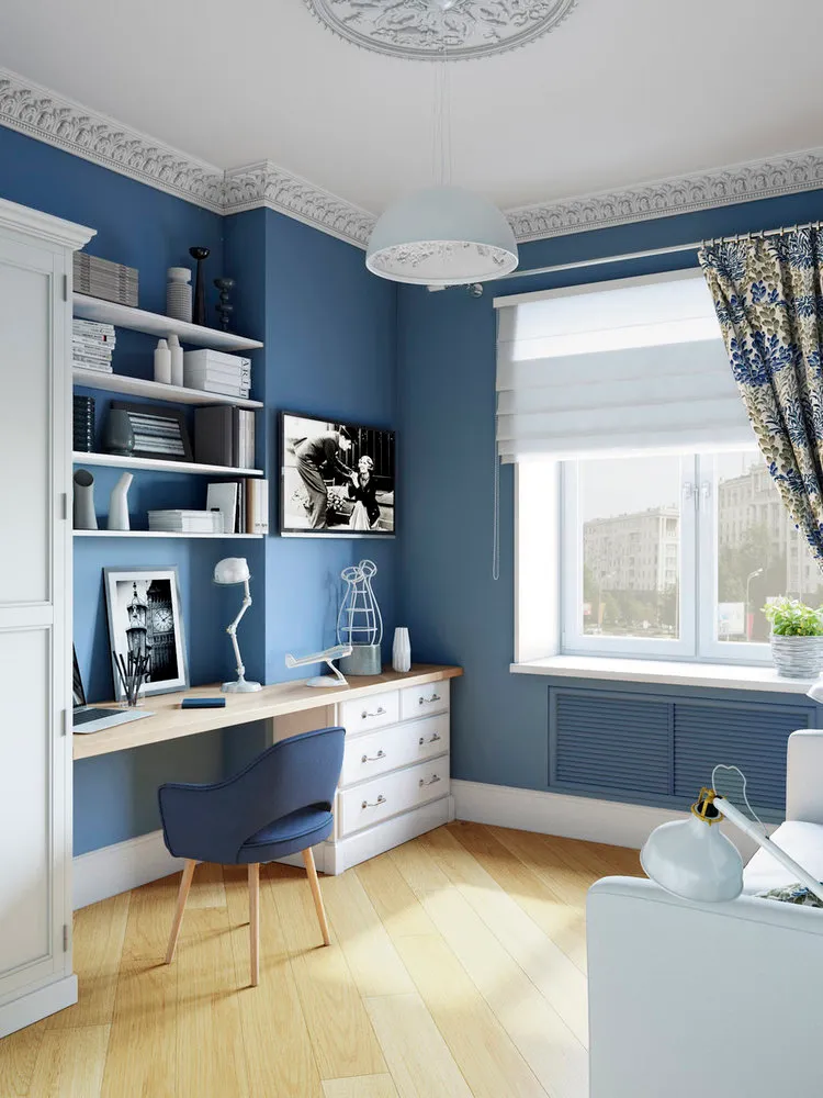 Design: Alena Yudina, Nadezhda Kireeva
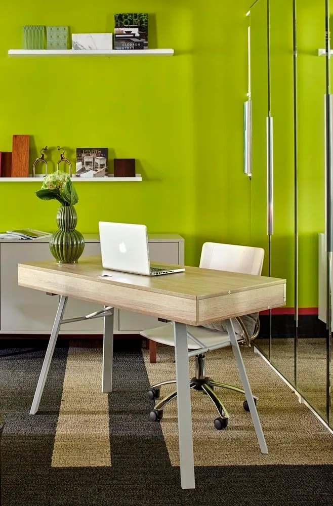 Design: FB Interiors
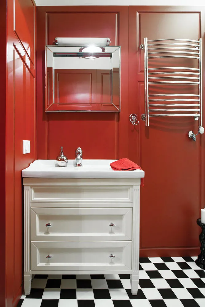
6. Bathroom
We spend the least time in the bathroom: prepare the most vibrant colors — they won’t get boring here.
Reddish-brown color is too intense for living rooms but perfect for a bathroom. Don’t forget to soften it with light furniture and textiles.
Emerald green — the 2017 Color of the Year by Pantone. In bathroom interiors, it lifts your mood and expands small spaces.
 Design: Enjoy Home
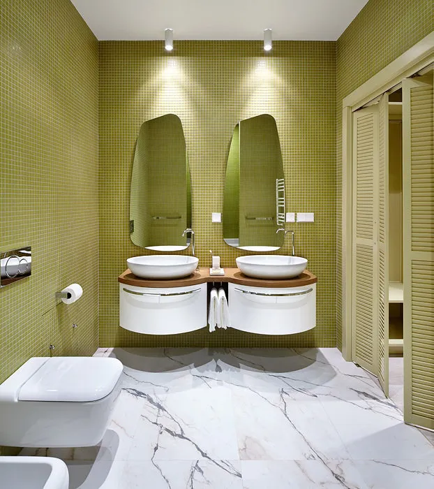 Design: Berphin Interior
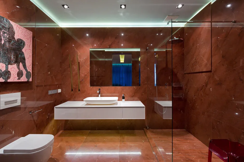 Design: Yuri Zimenko
 Design: Anna Zhemerova
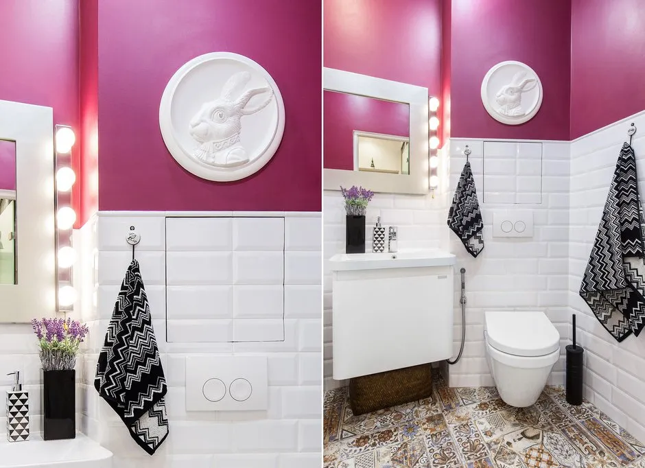 Design: Julia Piskareva
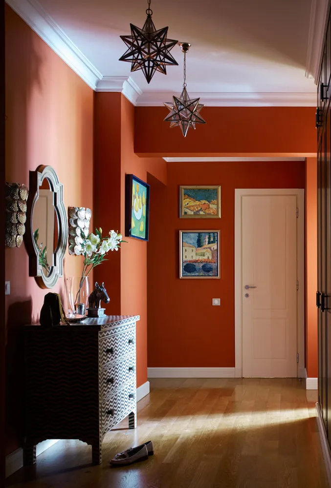
7. Foyer
The foyer is the home's business card. What impression do you want to make from the threshold? Use minimal decor and emphasize a bright color palette — brick red, caramel, and cinnamon tones won’t leave guests indifferent. Those who prefer a cooler tone should consider blue and violet palettes.
 Design: Enjoy Home
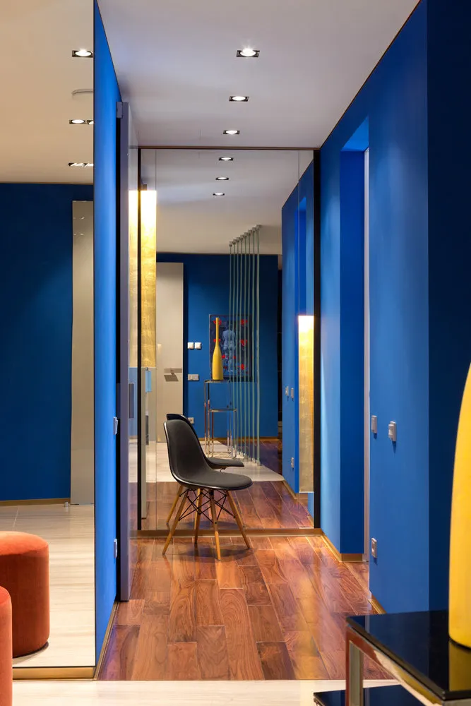 Design: Yuri Zimenko
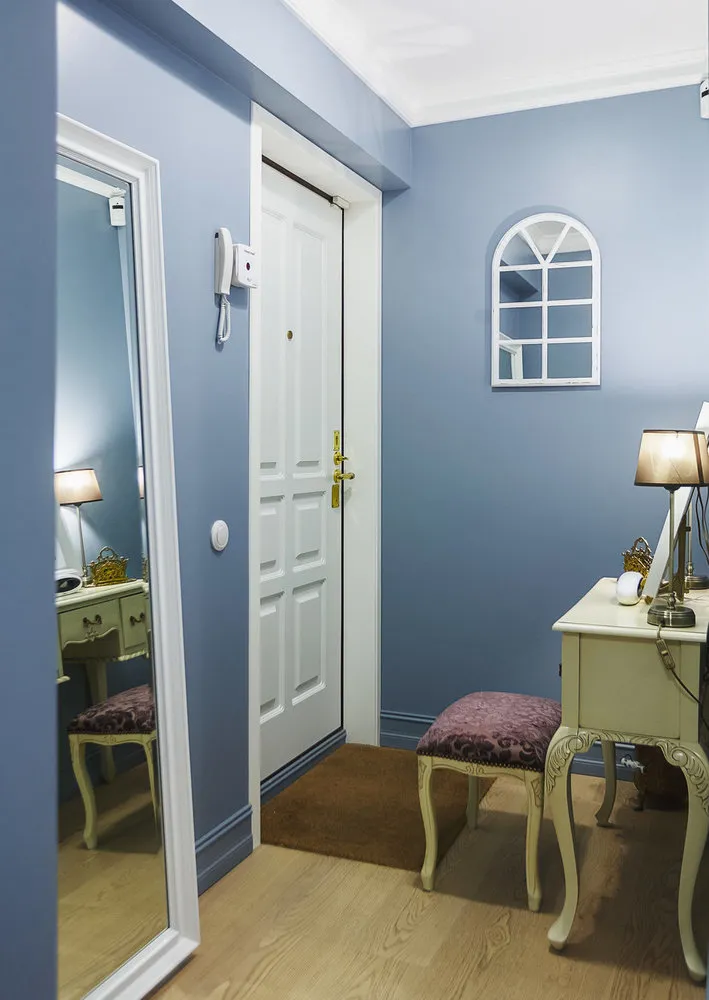 Design: Ksenia Yusupova
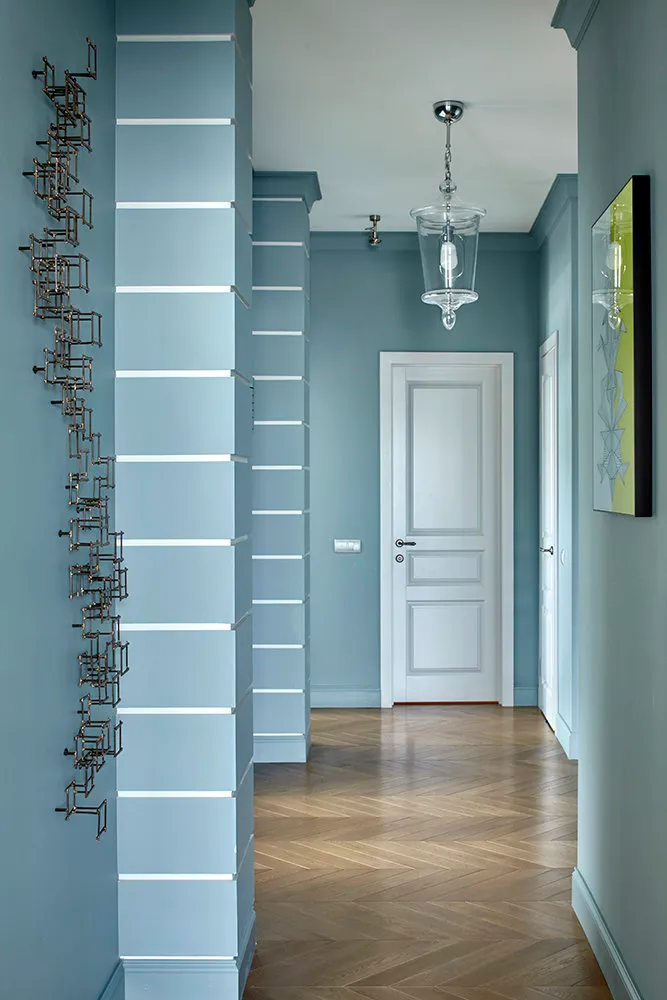 Design: Lavka-design
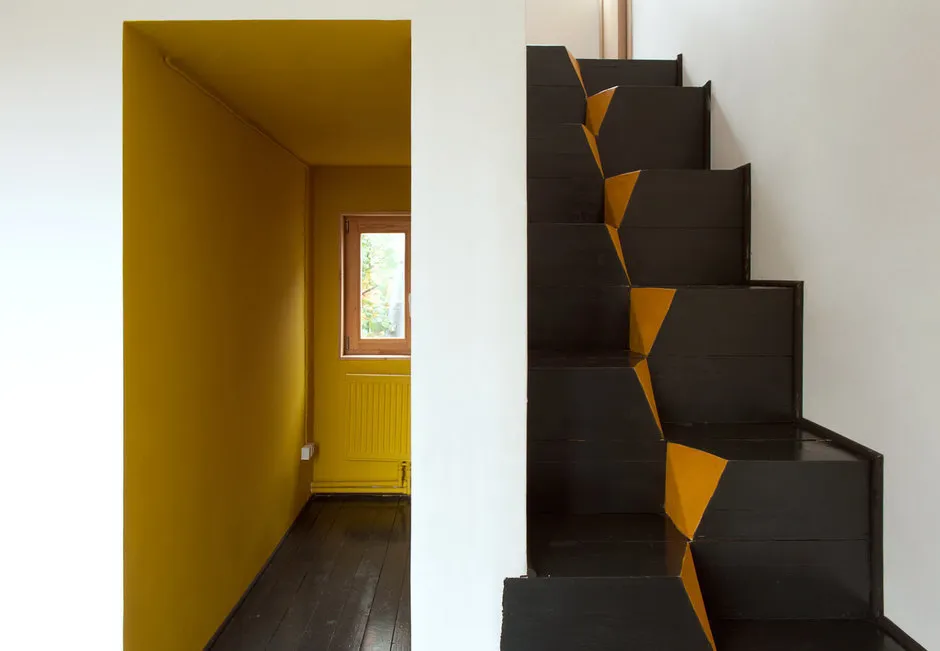 Design: Le Atelier
Need a renovation specialist?
Find verified professionals for any repair or construction job. Post your request and get offers from local experts.
You may also like
More articles:
 11 Tips on How to Easily Prepare Your Home for the New Year
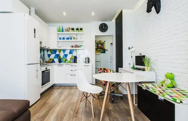 5 Things That Make It Easier to Maintain Order on the Kitchen
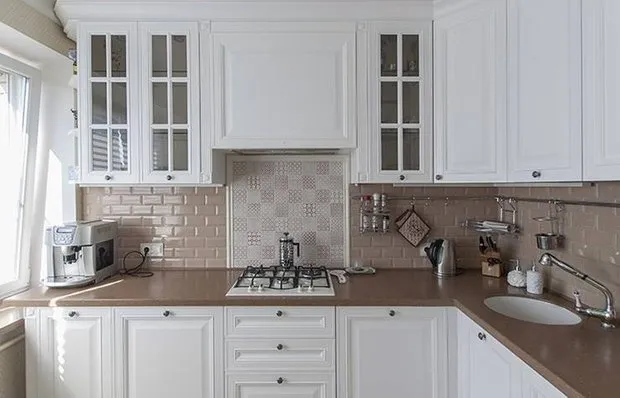 How to Properly Lay Tile for a Kitchen Backsplash
 After Holidays: 10 Ideas for Quick Cleaning
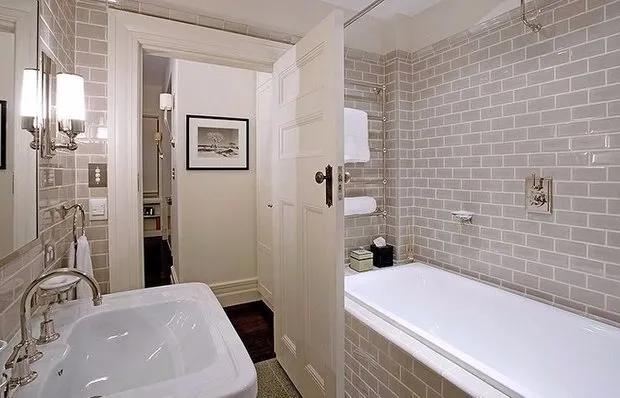 8 Mistakes in House Cleaning You Keep Making
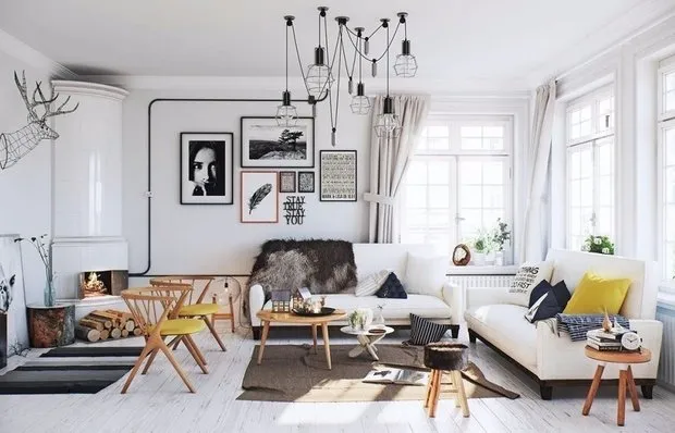 6 Things That Will Definitely Improve the Quality of Your Life
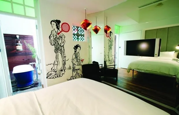 Mine, Factory, Prison: 5 Design Hotels You'll Love
 Pros and Cons: Cordless Vacuum Cleaner