What to Do Right Now: Choosing a New Color for Interior
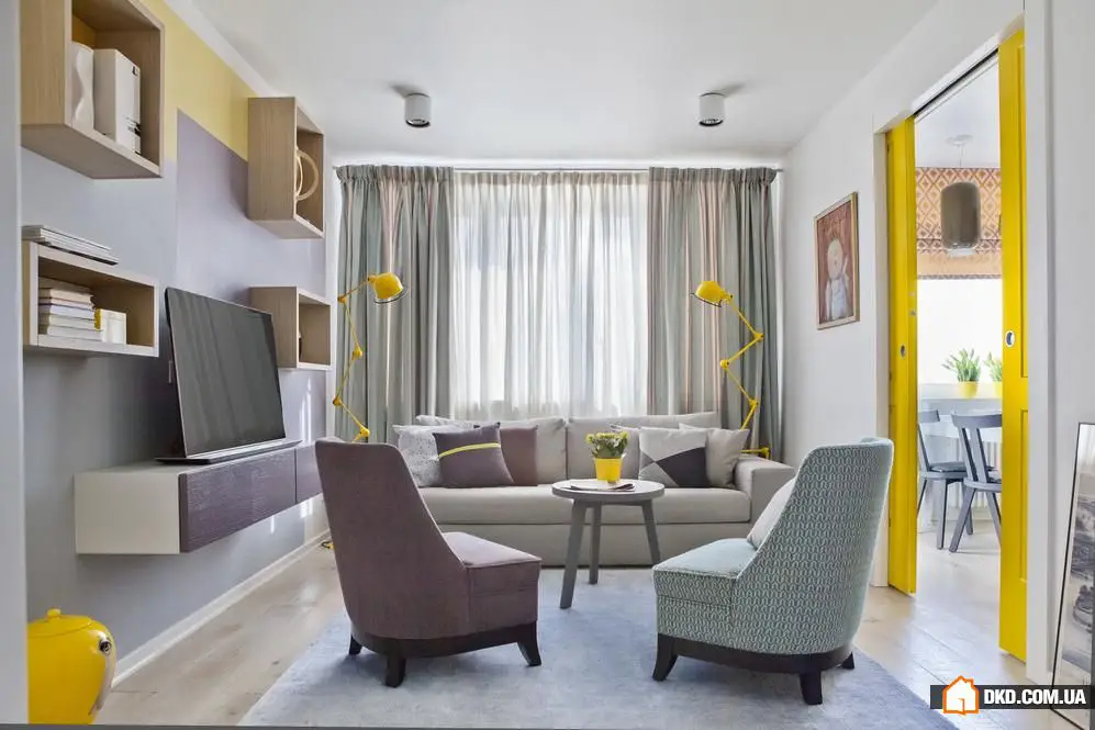
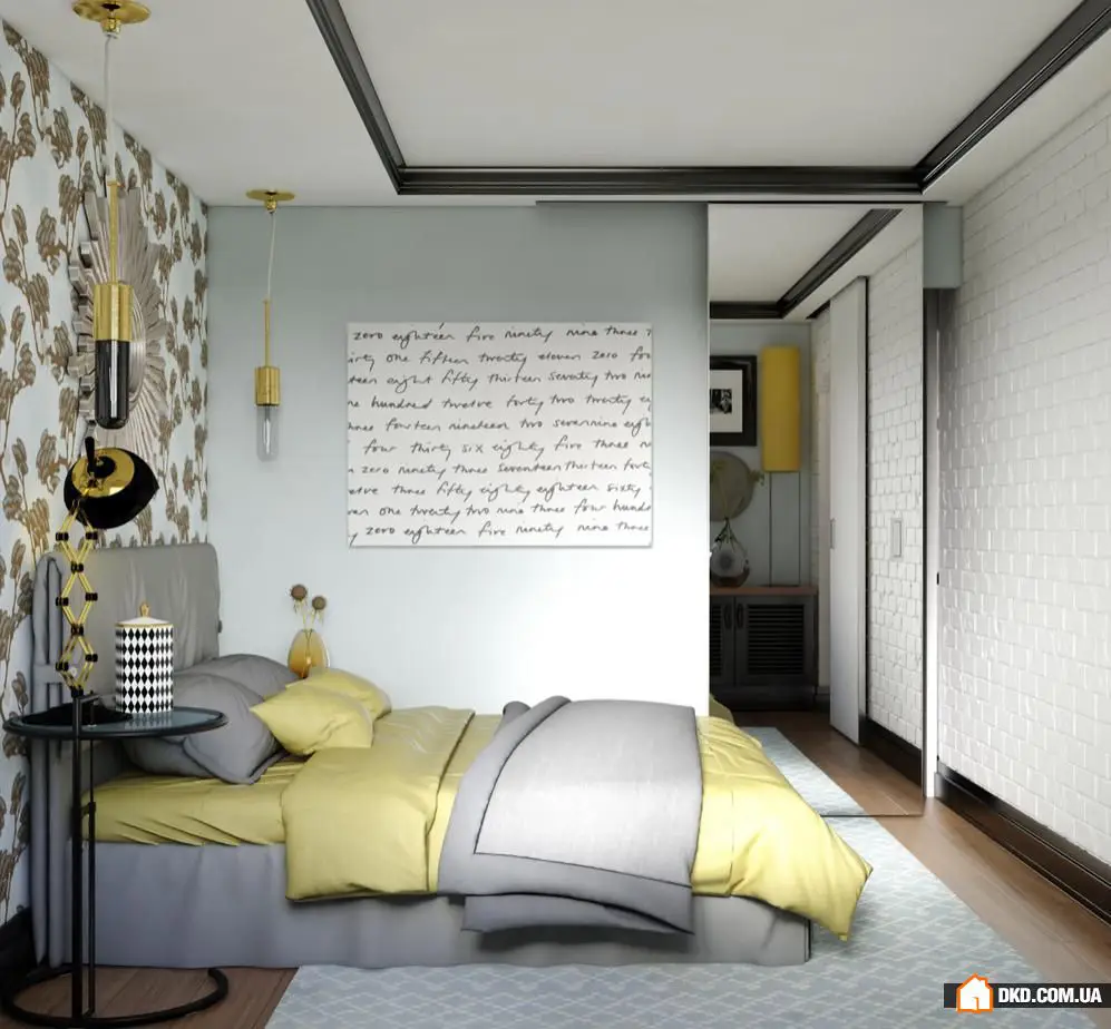
Bright sunshine
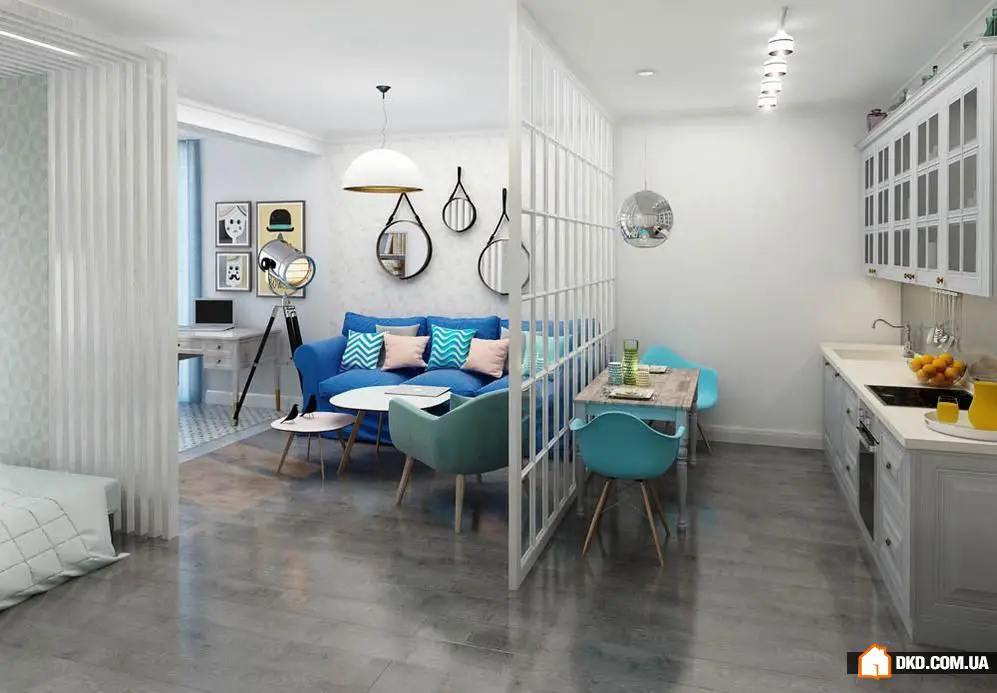
A yellow sofa and curtains can easily liven up a tired interior – that's a fact. But yellow is far from the easiest color; it is very powerful, and its strength can overwhelm any space. If there's too much yellow in an interior, you'll get tired quickly, and if there's not enough, yellow accent spots risk disappearing altogether, becoming completely unnoticeable.
Yellow color in your home: what to consider
A few key pieces of furniture – for example, a sofa and footstool in the living room – can be in yellow tones, but choose light gray, white, and natural shades for the rest. Warm citrusy tones should be paired with cool gray tones. Combine yellow with white to maintain both a cheerful mood and a sense of calm. Yellow accessories and decor are great for quick room makeovers – use yellow textiles, floor lamps, and vases boldly.
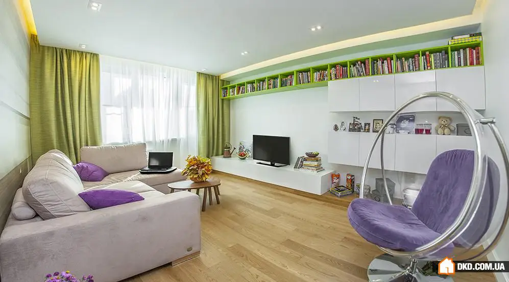
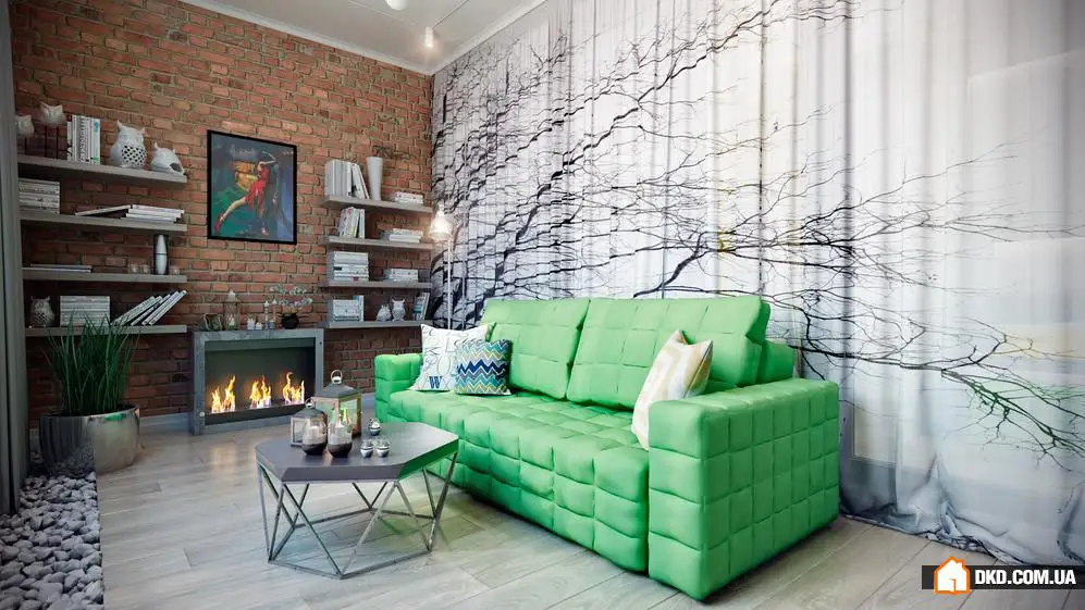
Fresh green
If you want to bring spring into your home not just for three months, but at least for a couple of years, use green shades in your interior. Psychologists claim that this color is beneficial for human psychology, it relaxes and gives a feeling of security (which is in short supply these days). Green tones are ideal for bedrooms, living rooms, and kitchens.
Green color in interior design: main rules for use The most important thing is not to overdo it with gloomy or overly bright, acid-like tones throughout the entire room. A few accent points are enough. Natural textures and tones make perfect partners for green shades. Botanical prints are welcome, and they find a place not only on textiles but also on furniture. Combine rustic wooden furniture with elegant accessories featuring floral patterns or nature motifs.
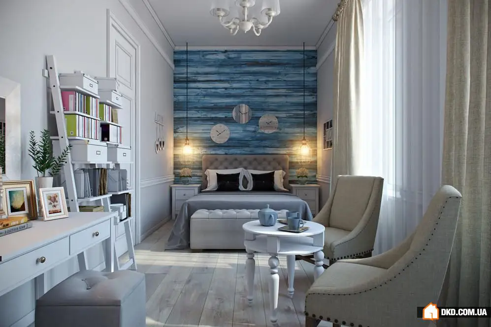
Blue not frost
Will you insist that blue in interior design is too cold and strict? Possibly, but only if it's not used correctly. Soft gray-blue and light shades will prove otherwise.
Adding blue color: what you need to know If the windows of a room face south, southeast, or southwest, then you can confidently use blue in interior design. Dark and saturated blue tones don't work well in large rooms; they're best suited as contrast accents for chairs, curtains, and decorative cushions. Light blue, soft turquoise, and pale violet shades are perfect for painting walls or even the ceiling. Plan artificial lighting carefully. Warm light from chandeliers, floor lamps, and wall sconces neutralize the strictness and chill of blue. To turn a living room into a place for relaxation reminiscent of the sea and summer, combine blue with sand and white. Light furniture, a white ceiling, and azure textiles – all that remains is to wait for vacation.
Flame of fire
Orange in interior design is a bold statement. The maximum benefit comes from using it sparingly. For example, on one wall or near a fireplace. Orange color serves as a vibrant backdrop for accessories.
Orange color in the room: how to apply correctly
If you're aiming for a more dramatic effect, combine orange with geometric or ethnic patterns, while calm yet vibrant pairs well with soft pastel shades and wooden furniture. A little cooling of the active orange can be achieved using cool blue tones. Cobalt with terracotta or azure with amber – that’s the golden mean. Avoid using orange for wall decoration in small rooms, as it tends to visually bring objects closer. It’s better to use it for visual correction of volume in tall or narrow rooms. If you’ve chosen orange soft furniture and want a harmonious color palette in the interior, choose white, light blue, gray, or mint shades for wall decoration.


Need a renovation specialist?
Find verified professionals for any repair or construction job. Post your request and get offers from local experts.
You may also like
More articles:
 Painting Walls in Bathroom: 6 Major Misconceptions
 Closer to Nature: 10 Ideas for Decorating an Apartment in Eco Style
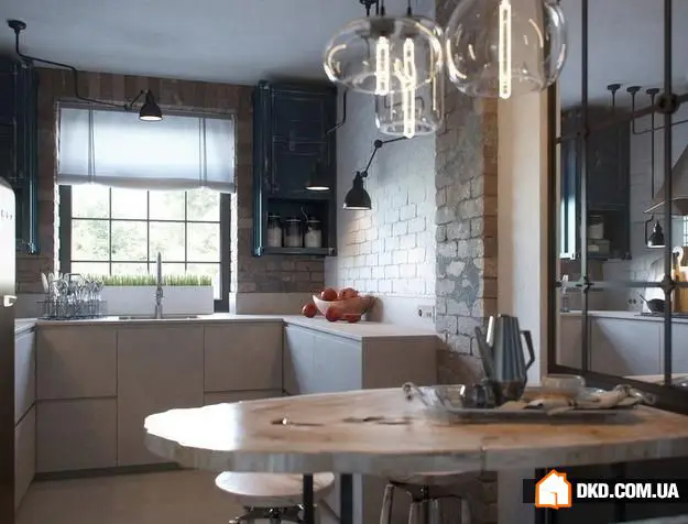 Kitchen Layout and Design: 7 Best Examples
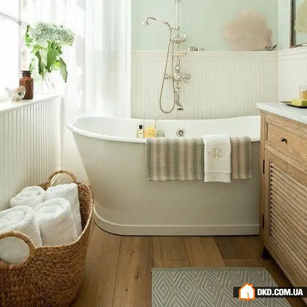 Small Bathroom: 13 Life Hacks That Will Save the Day
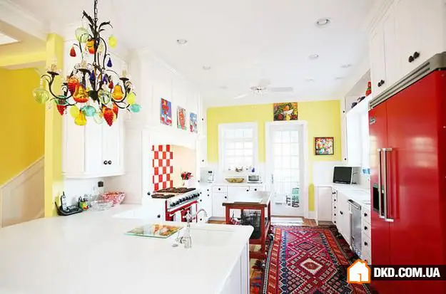 No Remodeling: 8 Ideas to Quickly Improve Kitchen Interior
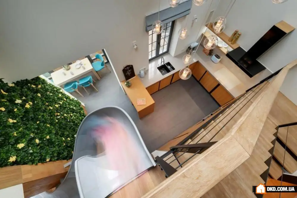 Design of a Two-Story Apartment in Kharkiv
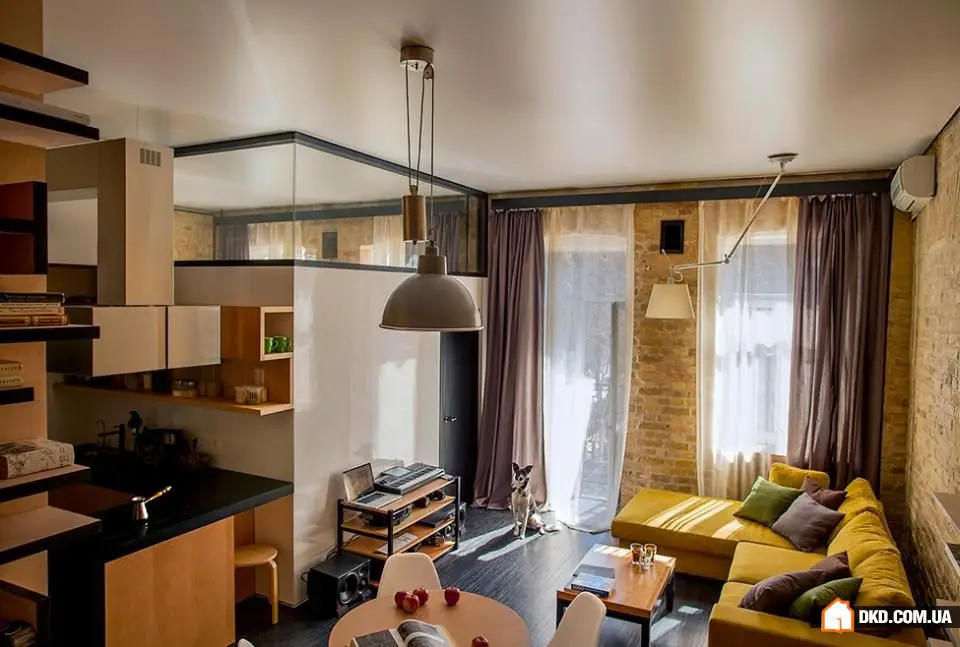 Unusual Renovation of a Two-Room Apartment in Kyiv
 Kitchen Window Sill: 5 Ideas for Its Use