Perfect Pairs: 8 Winning Color Combinations
It seems that painting a space in pastel tones in subtle combinations is always easier than creating an interior with contrasting elements. In reality, choosing soft, harmonizing colors within one palette is a task for professional colorists. But bright opposite colors always support each other. For InMyRoom, designer Nina Romanuyk has selected 8 combinations that look great together under any circumstances in various rooms.
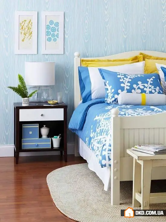
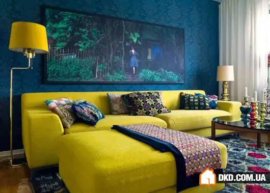
1. Yellow and Blue
This pair has long been a classic combination. They look bright and organic, flawlessly complementing each other – like bread and butter. Designers often use these colors in traditional or neoclassical interiors. But with a desire, they can decorate any style – from cottagecore to modern. As primary colors, they don't need additions, look very self-sufficient, and make the interior cozy and joyful.
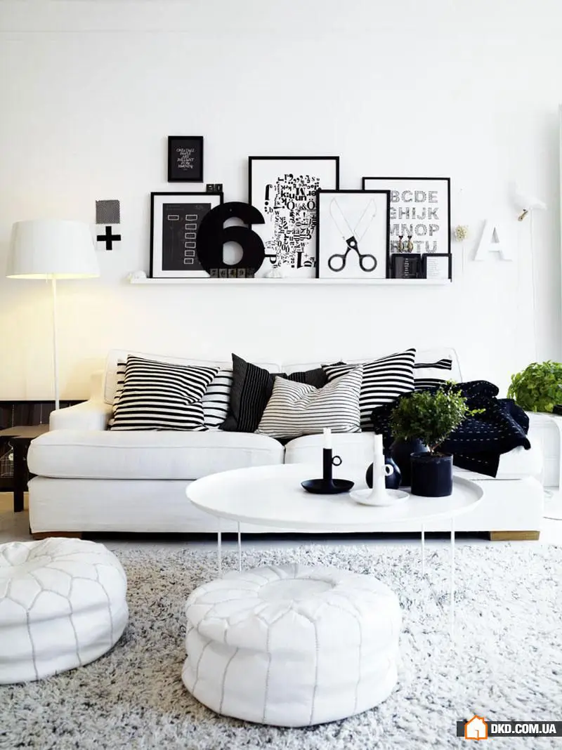
2. Black and White
This color combination lives outside of time and trends. If you decide to use black and white in your interior, it will still be in style even in 5 years. These colors create drama, dynamism, and rhythm. They give any room an elegant and refined look. What's most pleasant is that any color accent that speaks to your soul will fit perfectly here – whether it's green, red, or even pink. A winning choice for every situation.
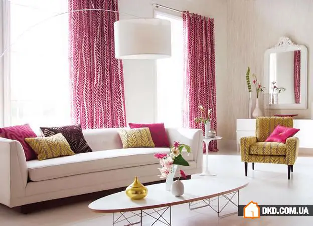
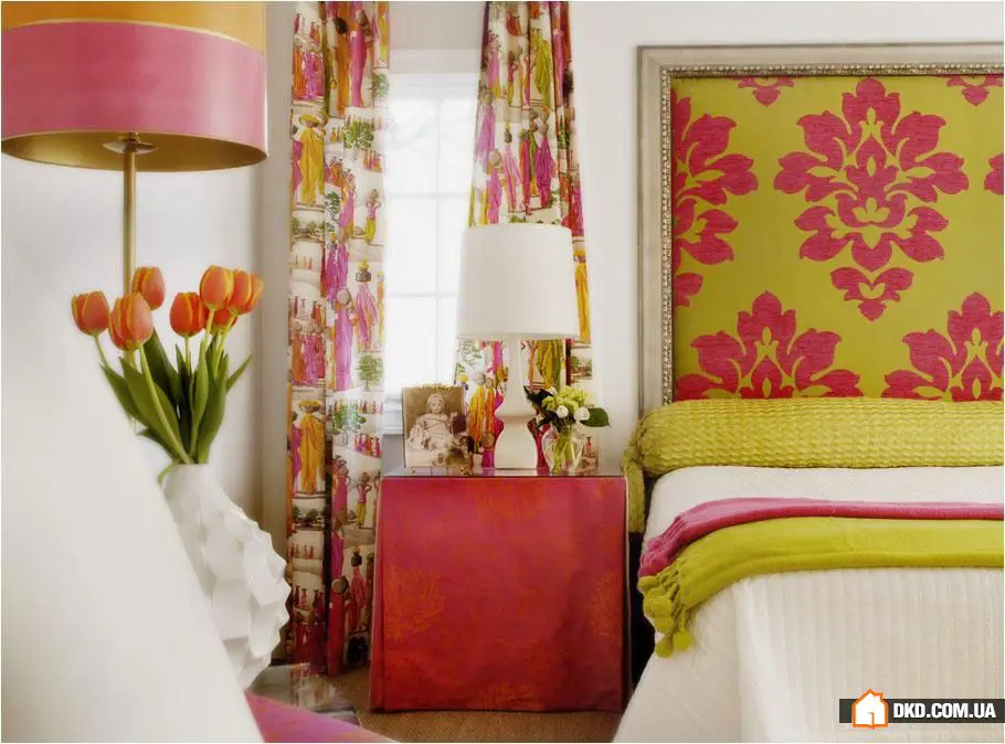
3. Pink and Green
Why such a bold combination can be called 100% reliable? Let's look at examples from nature itself, as it never makes mistakes. Pink flowers on green stems, delicate peonies wrapped in leafy greenery – such a combination always looks fresh and spring-like. To avoid even the slightest hint of doll-like or childish coloring, use several muted shades of each color, layering one over the other.
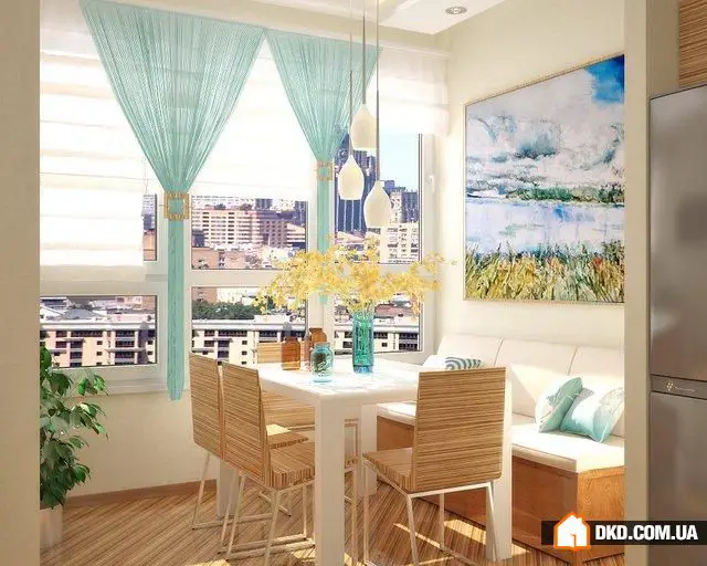
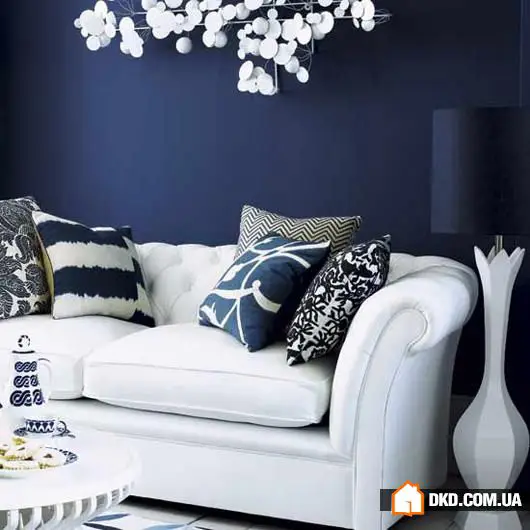
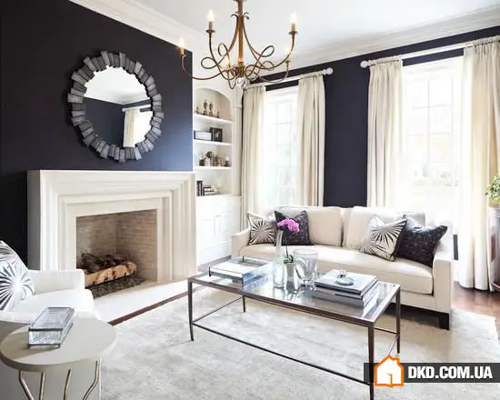
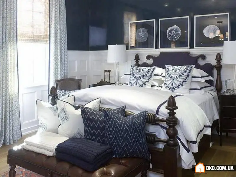
4. Dark Blue and White
These combinations never go out of style – all because the white and dark blue combination always looks elegant and cozy. Of course, this pair fits perfectly into a nautical interior. You'll just need to add white furniture, linen curtains, and several maritime accessories.
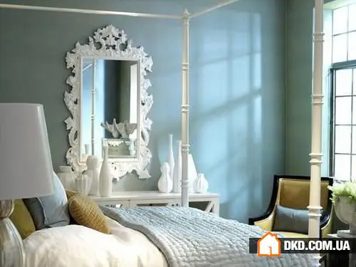
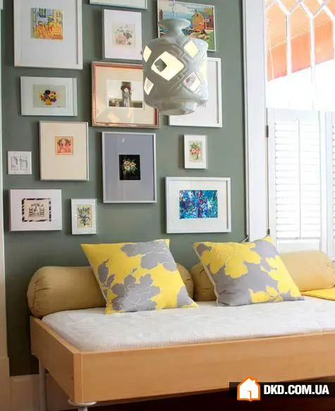
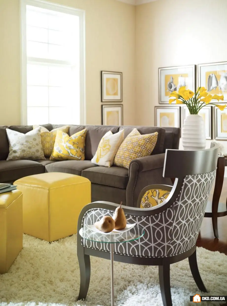
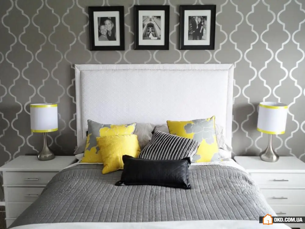
5. Grey and Yellow
Probably, this is the most contradictory pair, as these colors are so different. But what's most amazing is that they complement each other perfectly. Sunny yellow gives gray a glow, while gray balances yellow and prevents it from overwhelming the interior.
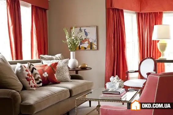
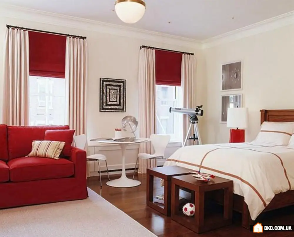
6. Red and Beige
This pair is somehow reminiscent of the previous one. Here, one color is more assertive and active, while the other is calm and restrained. But they share each other's tints perfectly and together create a cozy and welcoming atmosphere.
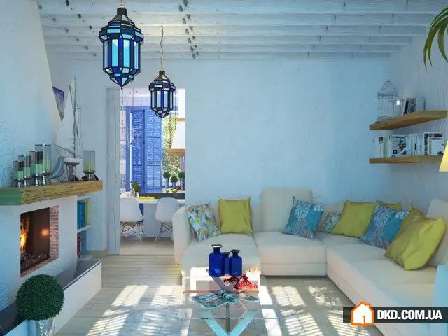
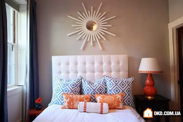
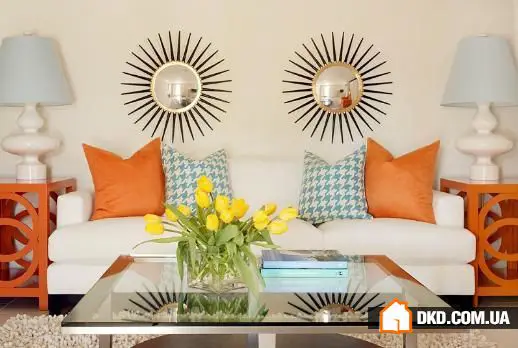
7. Orange and Blue
These are complete opposites on the color wheel – which means they will definitely make each other brighter. If it's hard to imagine your interior in saturated blues and orange tones, just tone down the pigments. Soft coral and light turquoise will make a good substitute for overly bright colors.
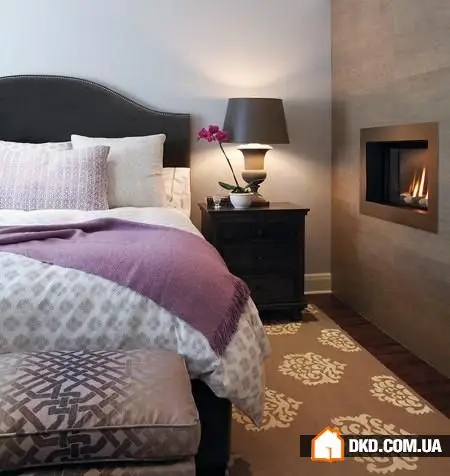
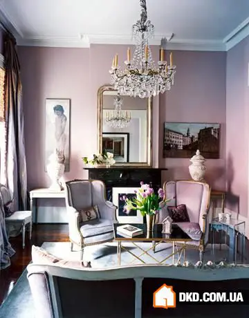
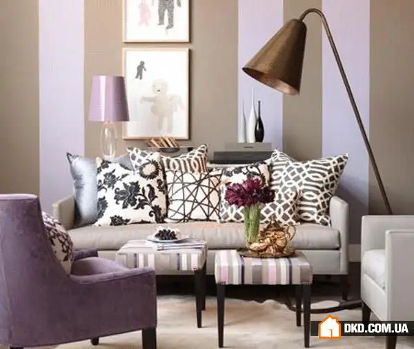
8. Chocolate and Lavender
The softness of lavender color beautifully complements warm brown. The key rule here is to choose the right shade of lavender – it should not be too bright. Then its lightness and freshness will be especially noticeable in contrast with the chocolate background.
Need a renovation specialist?
Find verified professionals for any repair or construction job. Post your request and get offers from local experts.
You may also like
More articles:
 Weekly Project: Family Apartment in Loft Style
 Repair in Practice: How to Paint Plastic Windows
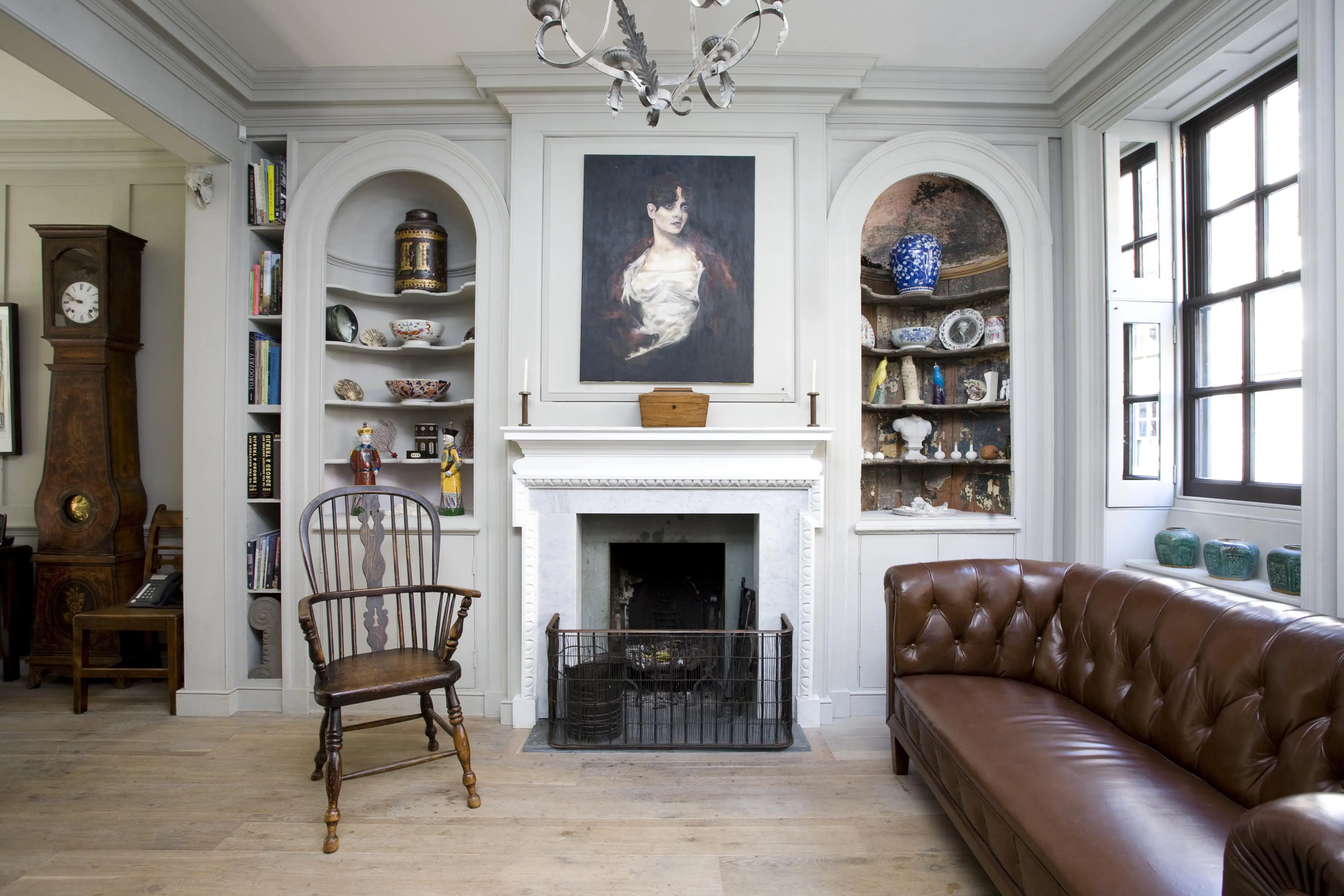 English Style in Interior Design: 5 Key Features
 Celebration of Colors: Scandinavian Interior That Boosts Your Mood
 Inspired by Bedroom. 20 Modern Beds from Roche Bobois
 How to Create a Welcoming Living Room: Real Example from Moscow
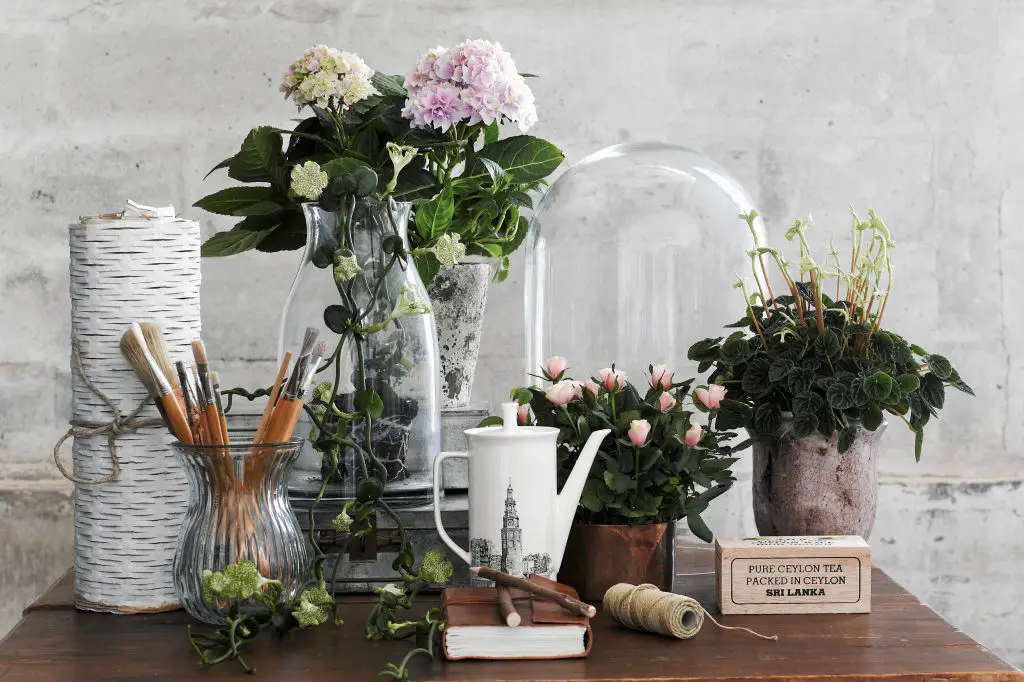 Flowers in Interior: 5 Original Ways to Green Your Apartment
 Spring Prep: Doing a Deep Clean