Light Pink and Dark Gray Combination in Interior Design
The walls of this apartment have a color between beige — light pink — taupe, depending on who is looking at them and from which angle (lighter or darker), some will say one color, others another, it's hard to determine from photos.
This is a color that helps create a warm and feminine atmosphere, while the matte shade — frosty and smooth — disperses light without creating unnecessary shine or glare in the room.
It also pairs well with a matte dark gray or gray — almost black, forming a harmonious and elegant combination.
In this 41 m² apartment, these colors are thoughtfully planned and used very well; they are well-balanced: for example, on the kitchen, a dark color is used for furniture, with appliances in nearly the same shade that blend between cabinet doors and a light color for the non-furnished area.
Another color they used to create contrast is black: a lamp, shelf, dresser or chairs are made in this color and disrupt the combination of the other two, but in a proportional way.
1.
 Pinterest
2.
 Pinterest
3.
 Pinterest
4.
 Pinterest
5.
 Pinterest
6.
 Pinterest
7.
 Pinterest
8.
 Pinterest
Need a renovation specialist?
Find verified professionals for any repair or construction job. Post your request and get offers from local experts.
You may also like
More articles:
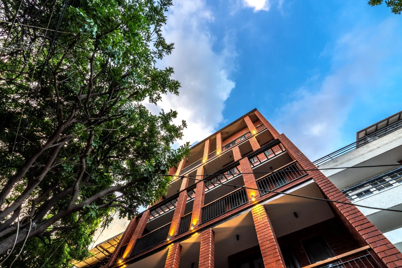 Off-the-Grid House by UnBox Design in Delhi, India
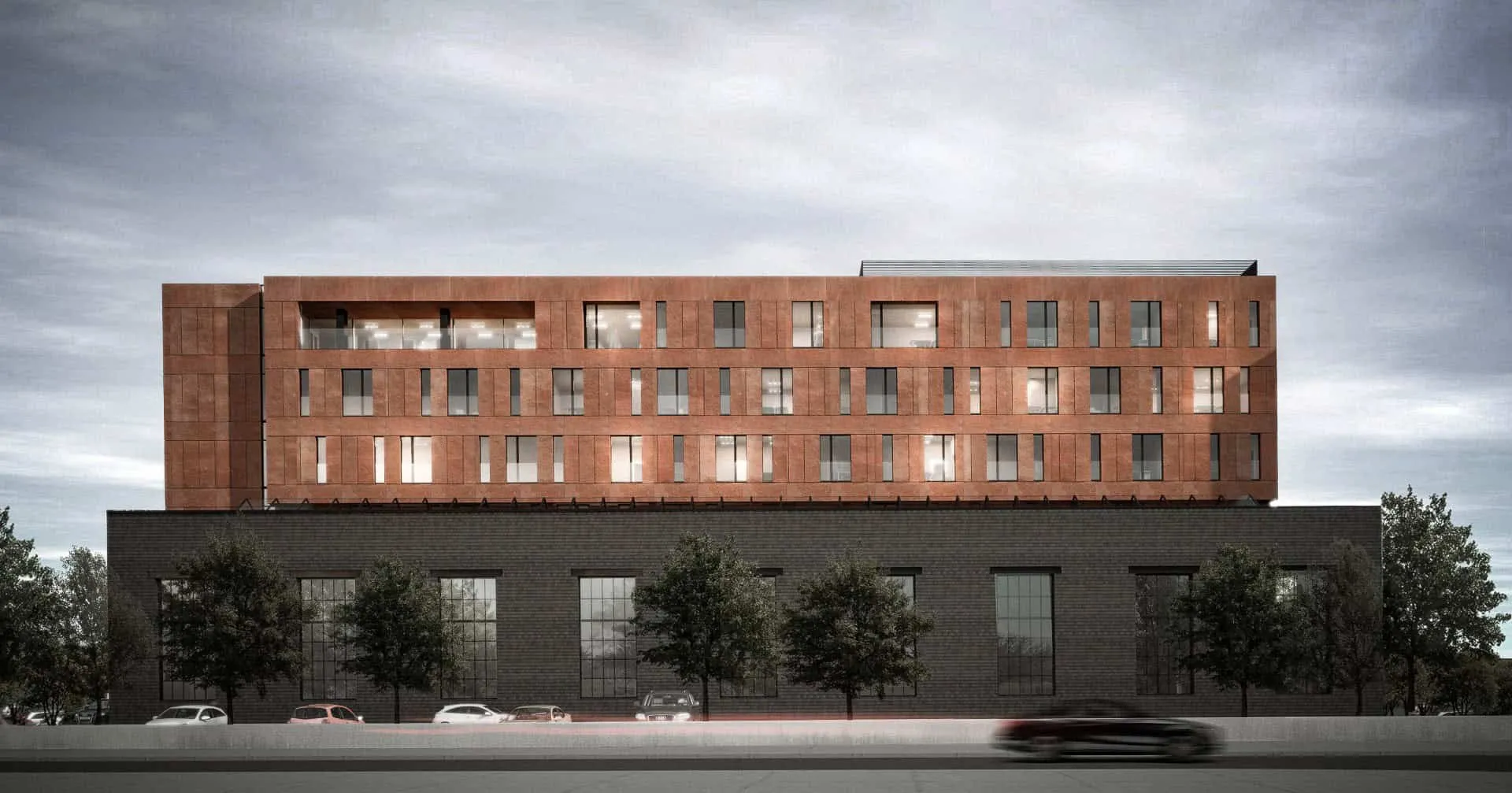 Office Building Extension in Poznan by EASST Architects
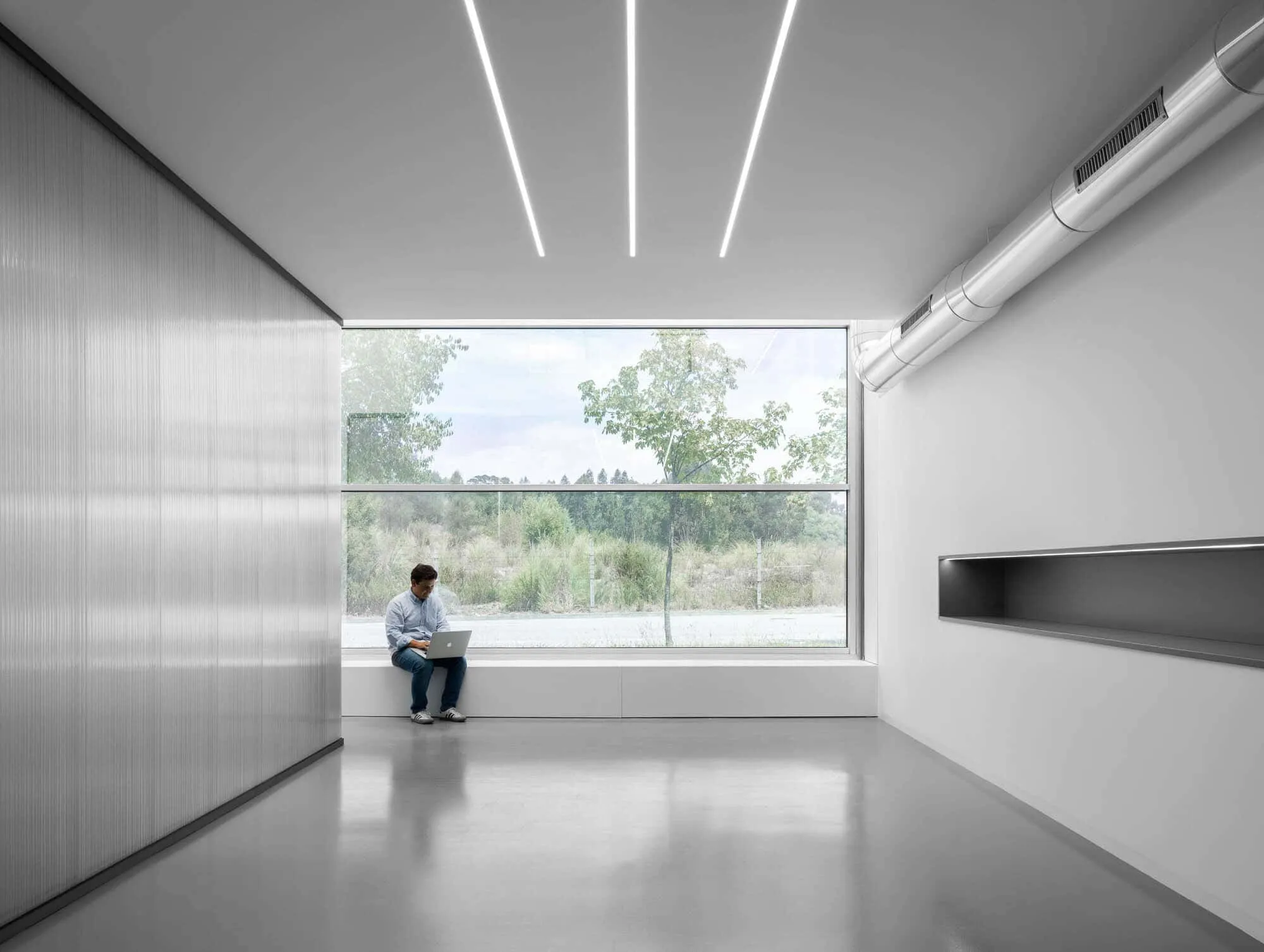 Office MA — Transparent Office Design by éOp – Architecture and Design in Porto
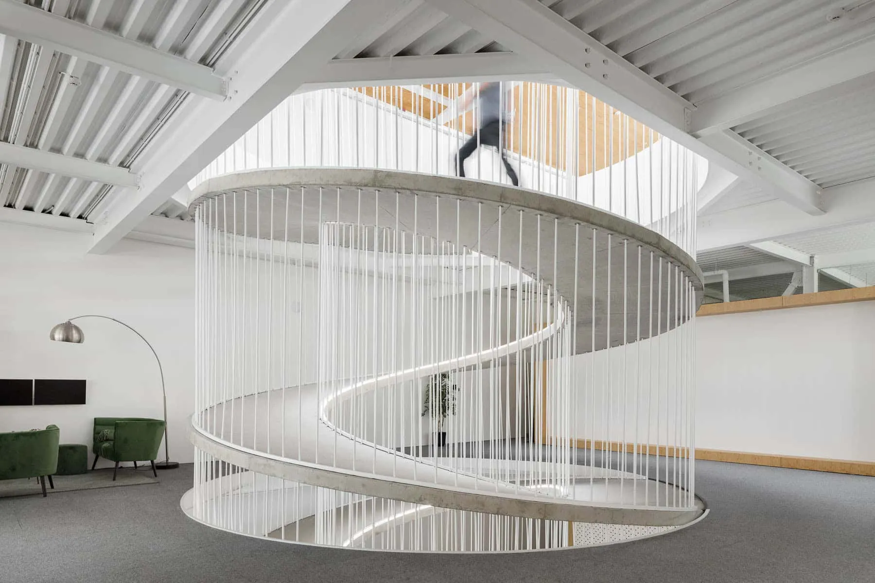 Office Stairs as a Sculptural Element Designed by Paulo Merlini Architects
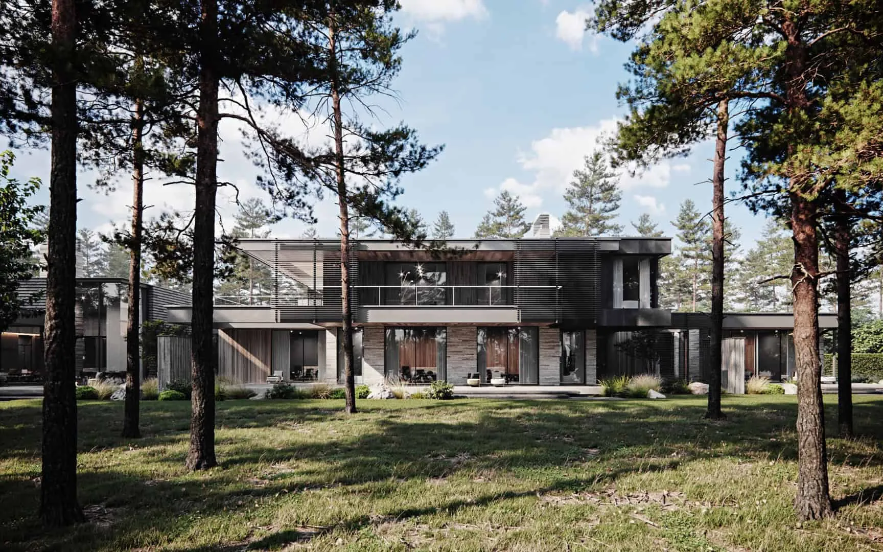 Ocolica Project by Kerimov Architects: Nature and Architecture in Rhythmic Harmony
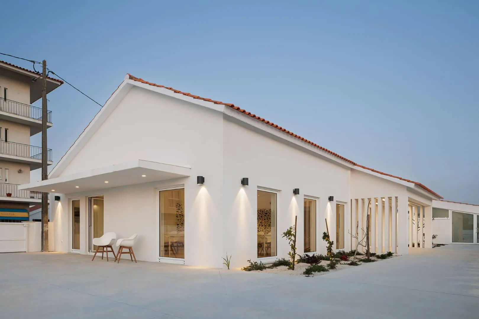 Old Elementary School Building Gets New Life in Vagos, Portugal
 Ideas for Decorating a House of Old Wealth That Never Go Out of Style
 Inspiration for the Interior of a Mansion