What Was Trendy in Home Renovation Five Years Ago, But Now Looks Outdated
Let's figure out which solutions it's time to put on retirement
Remember 2019? Everyone was doing gray interiors, sticking brick on walls and dreaming of loft style. It seemed these trends would be eternal. But fashion in interiors changes faster than we can get used to new renovations. What five years ago looked ultra-modern now screams that the owners are stuck in the past. Let's figure out which solutions it's time to put on retirement.
Main points from the article:
- Gray palette and concrete imitation have given way to warm natural tones;
- Decorative brick and loft style have lost their relevance;
- Glossy kitchens replaced matte facades and natural textures;
- Contrast black-and-white interiors look too graphic;
- Open shelves and industrial furniture are no longer trendy.
Gray, fifty shades: when monochrome got old
Five years ago, gray was considered universal and stylish. Gray walls, gray floors, gray furniture – the whole interior was drowning in noble monochrome. Designers convinced: gray is the new white, it matches everything and never gets old.
Got tired of it. And how! Gray interiors became synonymous with boredom and blandness. Today, warmth is in fashion: beige, terracotta, olive tones. Colors that create coziness, not office buildings. The 'gray period' in interior design ended as abruptly as it started.
Decorative brick: when loft became mainstream
Remember the boom of decorative brick? It was glued everywhere: in bedrooms, kitchens, hallways. It seemed an interior without an accent brick wall was incomplete. Manufacturers released bricks in all imaginable shades — from white to coal-black.
The problem was that loft, a subcultural style, became mass phenomenon. When identical brick walls appeared in every other apartment, they lost their uniqueness. Today, decorative brick looks like a cheap attempt to mimic industrial style. Real loft is about the history of the building, not glued panels pretending to be brick.
Glossy kitchens: shine that cuts the eye
White glossy kitchens were every housewife's dream. They seemed to be the pinnacle of elegance and practicality: easy to clean, visually expand space, look expensive. Furniture manufacturers stamped glossy facades in industrial scale.
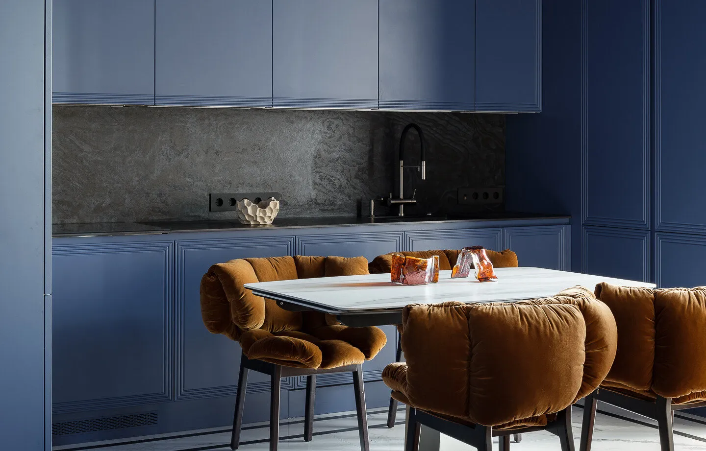
But gloss is treacherous. It shows every fingerprint, water drop, and slightest dust. Such a kitchen requires constant cleaning and after a few years looks worn out. Today, matte surfaces and natural textures are in trend – wood, stone, metal with patina. They create a feeling of nature, not sterility of an operating room.
Contrast interiors: when black and white are too graphic
Black-and-white interiors seemed to embody style. White walls, black furniture, graphic prints – everything was clear, contrasty, 'like in a magazine'. This approach worked on Instagram, creating striking shots with high contrast.
In real life, such interiors were found to be uncomfortable. Sharp contrasts tire the eyes, and lack of midtones makes space cold. Modern trend is using multiple shades of one color, smooth transitions, nuances. Monochromatic graphicness has given way to painterly layered richness.
Open shelves: beautiful in photos, inconvenient in life
Open shelves were a symbol of modern approach to storage. Beautiful dishes, books with designer covers, decorative items – all in view like in a museum. Bloggers showed perfectly organized shelves, where each cup stood in its place.
Reality was harsher. Open shelves require constant tidiness, all items quickly get dusty and greasy (especially on the kitchen), and finding something among 'beautifully arranged' items is often impossible. Now, closed storage systems are returning – practical and hygienic.
Industrial furniture: when factory chic got old
Tables on metal legs, chairs in 'factory stool' style, lights from plumbing pipes – industrial furniture was an essential attribute of a trendy interior. The rougher and 'more industrial' the piece looked, the more desired it was.
But living among fake factory equipment proved uncomfortable. Metal furniture is cold to the touch, rough welds scratch clothes, and sitting on 'industrial' chairs for several hours is a test for the spine. The trend toward 'humanity' in interiors brought back demand for comfortable furniture with soft forms.
Minimalism to the last spoon: when emptiness doesn't equal style
'Get rid of everything unnecessary' was the motto of minimalists five years ago. Empty rooms with one sofa in the middle, kitchens without a single item on the countertop, bedrooms where there's nothing but the bed. It seemed that the fewer items, the more stylish the interior.
The pandemic changed everything. Home became not just a place to sleep, but a full-fledged space for life, work, and rest. It turned out that for comfortable living you need things – books, blankets, plants, family photos. Sterile minimalism gave way to 'warm maximalism', where every item has its own story.
Pay attention to the video: Neutral palette: when beige became the new gray
Beige-cream interiors were considered a safe choice. Neutral tones, natural materials, no bright accents – you got an interior 'for life'. Designers promised such solutions would never go out of fashion.
But neutrality can be different. Cold beige tones with gray undertones already look a bit dull. Warm, saturated neutral colors are in trend now – ochre, terracotta, olive. They create atmosphere, not just serve as background.
What's come to replace it: new trends 2024-2025
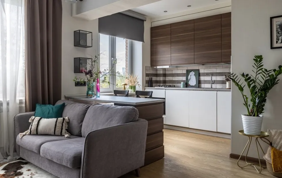
Modern interiors strive for naturalness and individuality. Instead of mass trends – personal approach. Natural materials without imitation, vintage furniture instead of fake 'old-style', live plants instead of artificial decor.
The color palette has become richer and warmer: deep greens, terracotta, blue tones. Textures – diverse but natural: wood, stone, metal, ceramic. Lighting – multi-level and atmospheric, creating coziness rather than just visibility.
Design: Anush Arakelyan
The main change is that interiors again reflect the personality of owners, not blindly follow fashion canons. Maybe this is truly the trend – to be yourself even in choosing wall colors.
Cover: Design project by Anush Arakelyan
Need a renovation specialist?
Find verified professionals for any repair or construction job. Post your request and get offers from local experts.
You may also like
More articles:
 Repair in a Khrushchyovka: Where You Can Save Money and Where It's Better Not to Skimp
 Trendy Pendant Lights for Interior: 10 Finds
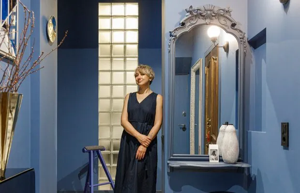 In the Designer's Home: 10 Favorite Interior Items of Ekaterina Kotalyevskaya
 What to Hang on the Wall in the Hallway: 7 Fresh Ideas
 Table Lamps for Your Interior: 10 Trendy Finds
 5 m² Bathroom: How to Fit Everything Without Going Crazy
 Before and After: Redesigned Kitchen with Modern Renovation
 Old Apartment: Bathroom Before and After a Bold Transformation