Color Trends 2023/2024: Which Palettes Designers Choose for Interiors
Transform your space with current colors
When decorating interiors, it is important to consider modern trends: with this approach you create a stylish and aesthetic space that will delight you for many years. Today, a calm and natural atmosphere in the room is coming to the forefront: professionals turn to natural palettes and expressive colors. Together with designer and studio head of Art Group, Daria Vasylko, we tell you which trends dominate in 2023/24.
Daria Vasylko, Designer, Studio Head of Art Group
White as a Universal CanvasMy rule for choosing color palette for interior: white color works best for rooms with large windows (living room / bedroom / kitchen). It expands the space and provides an opportunity for future experiments. It becomes a kind of "canvas" for implementing any customer's wishes.
This rule applies to about 90% of our projects. White color is perceived differently depending on the lighting in the room: if windows face west, sunlight gives amazing shades. The chosen white shade is perfectly suitable for those who decided to leave the walls as a "canvas". To keep the canvas truly white, a deep matt paint such as Tikkurila Harmony Perfecta is ideal, which is easy to maintain. It contains ceramic microspheres that create an especially durable surface. It's easy to clean, and the Ceramic Barrier technology ensures mechanical strength of the surface.
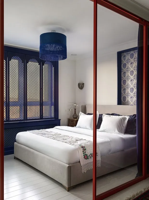 Design: Daria Vasylko
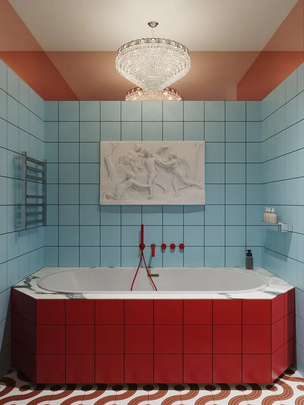
Colorful Palette for Dark Spaces
For rooms without windows (storage, bathroom, hallway), saturated tones are more suitable. For example, a bathroom can be decorated in dark blue color: deep matt paints from Tikkurila Harmony premium line will emphasize the richness of the selected shade. For contrast, green can be added: this is a calming color that helps create a relaxed atmosphere - an ideal solution for a bathroom or entrance hall. Blue, in turn, has a positive effect on the psyche - it is the shade of the sea and air, and it suits a bathroom.
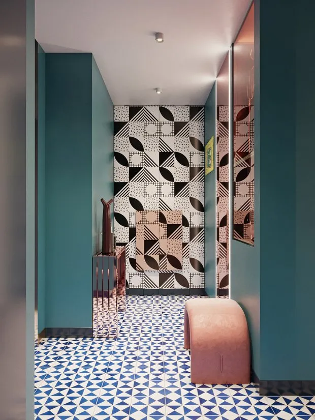 Design: Daria Vasylko
Tip INMYROOM: to create a special atmosphere in rooms, it is important to choose quality paint. The palette of the premium brand Tikkurila includes over 20,000 shades: light ones for interiors with large windows and peaceful ambience, complex colors for those who want to create a memorable interior with character.
Today it is important to pay attention not only to the shade itself, but also to texture, which determines its intensity: Tikkurila Harmony Velure creates a deep matt velvet surface that you want to touch, and pleasant tactile sensations from interacting with the surface are another hot trend. The matt paint Tikkurila Harmony Satin creates a subtle silk-like shimmer - an elegant solution for a bedroom, children's room or living room.
Unique Dual Matt technology guarantees that the surface remains unchanged even in the presence of intense side light. The paint will look equally impressive from any viewing angle: the desired degree of mattness is maintained, no glare appears on the surface, color and beauty are preserved under any lighting.
Pay Attention:Wall and ceiling paint, Tikkurila Harmony Velure
Wall and ceiling paint, Tikkurila Harmony Satin
Wall and ceiling paint, Tikkurila Harmony Perfecta
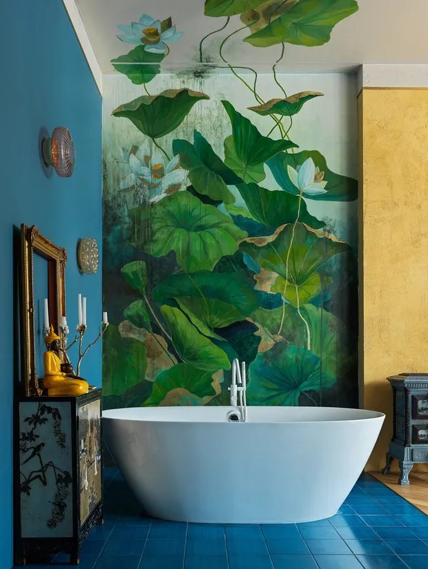 Design: Daria Vasylko
Designer's Life Hack:
When working with a designer, ask them to make two variants: the first - neutral beige, and the second - something extraordinary, for example, a black ceiling. Such solutions should not be feared: they can look interesting. Do not be afraid to experiment with color palettes, because updating paint in an interior is not difficult.
 Design: Daria Vasylko
Tip INMYROOM: to avoid color choice mistakes, use the advice of professionals. Tikkurila Inspiration 100 is a unique project in which top designers have selected 100 shades and created their own palettes. Colors from each palette will harmonize with one another and help you create a premium interior and transform the space.
The palette by designer Daria Vasylko is suitable for those who are not afraid of brightness. "When creating the palette for Tikkurila, we aimed to form a solution for a broad audience on one hand, and share our life hacks on the other. Our Tikkurila Inspiration 100 collection includes all the main bright colors. With this palette, you can address several functional zones in an interior. The space will be as bright as you want it to be, but the most important thing is that the colors will complement each other," - Daria explains.
 Tikkurila Inspiration 100 Palette by Daria Vasylko.
(Colors from left to right: M420, N434, M441, G446, Y502).Complex Colors as a Main Trend
Tikkurila Inspiration 100 Palette by Daria Vasylko.
(Colors from left to right: M420, N434, M441, G446, Y502).Complex Colors as a Main TrendColor is called complex when it uses several tones at once. At first glance, it can sometimes be difficult to understand which tone is primary. But exactly such a palette will make an interior noble and up-to-date. Complex are nude, wine, smoky, sage shades - they will look great in any room, and Tikkurila's deep matt paints will help reveal the color's multifaceted nature.
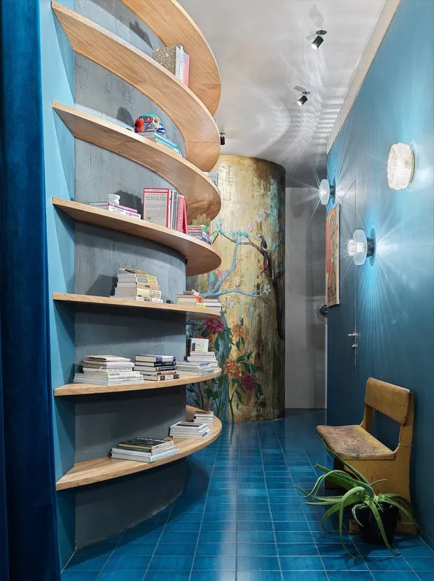
 Design: Daria Vasylko
Warm Tones
Another bold trend is interiors in warm palette, which literally wrap the atmosphere of coziness. You can focus on deep shades of brown, red and orange. The ideal embodiment of the trendy palette will be spices: paprika, saffron, cinnamon, nutmeg, turmeric or curry.
Colors blend well with wooden textures, which by the way are also a trend. Warm shades look great in any room - from the kitchen to the office.
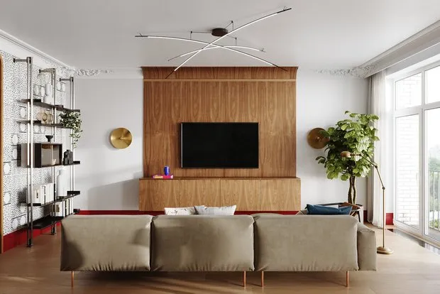 Design: Daria Vasylko
Noble Palette
Continue the trendy associative series: if warm tones are easier to study through spices, then for a noble palette, a jewelry box with ornaments will come in handy. Be inspired by precious stones: sapphire, emerald or ruby.
Elegant colors in a matte finish make an interior look more expensive and impressive. Why is it important to choose deep matt paints? Excessive shine spoils the impression of the shade.
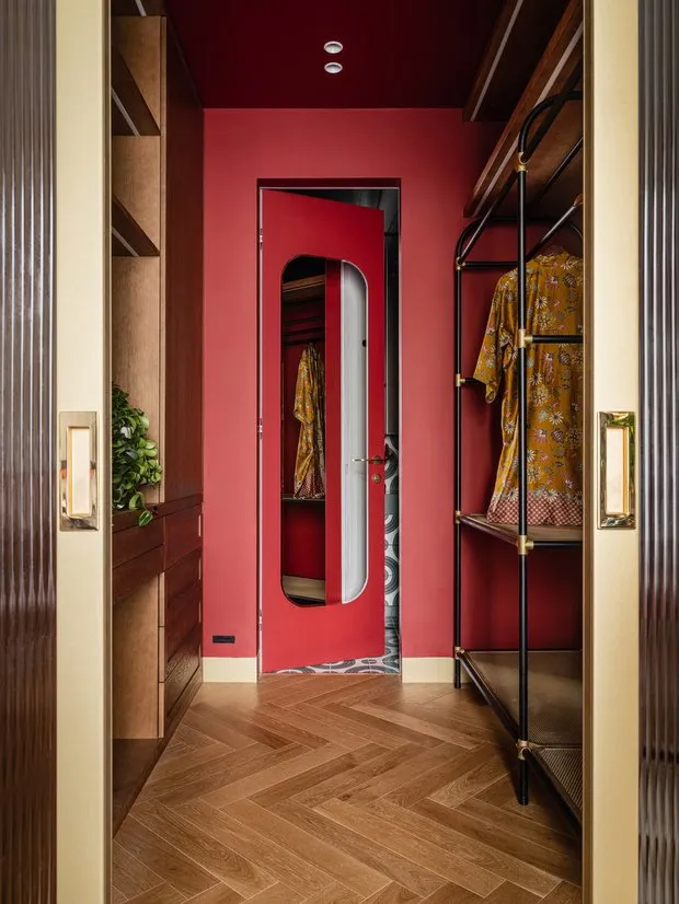 Design: Daria Vasylko
Daria Vasylko: "Any shine has reflecting properties - colors will reflect and be perceived differently depending on the lighting. With a matte paint, the shade is more truthful, as it looks in reality. With a glossy paint, even the slightest irregularities in the walls are visible (and they are almost never perfectly flat). With matte paint, this is not so noticeable".
Photo on the cover: Daria Vasylko's project.
tikkurila.ru. Advertisement. LLC "TIKKURILA". INN 7816424590
Need a renovation specialist?
Find verified professionals for any repair or construction job. Post your request and get offers from local experts.
You may also like
More articles:
 7 Tips from a Designer for Creating Comfortable Housing in Just 19 Square Meters
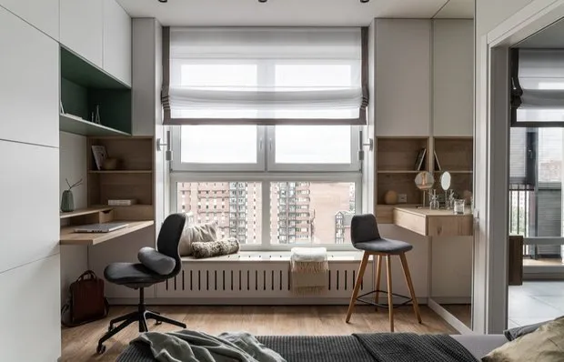 Convenient and Stylish Solutions in a 45 m² Studio Apartment
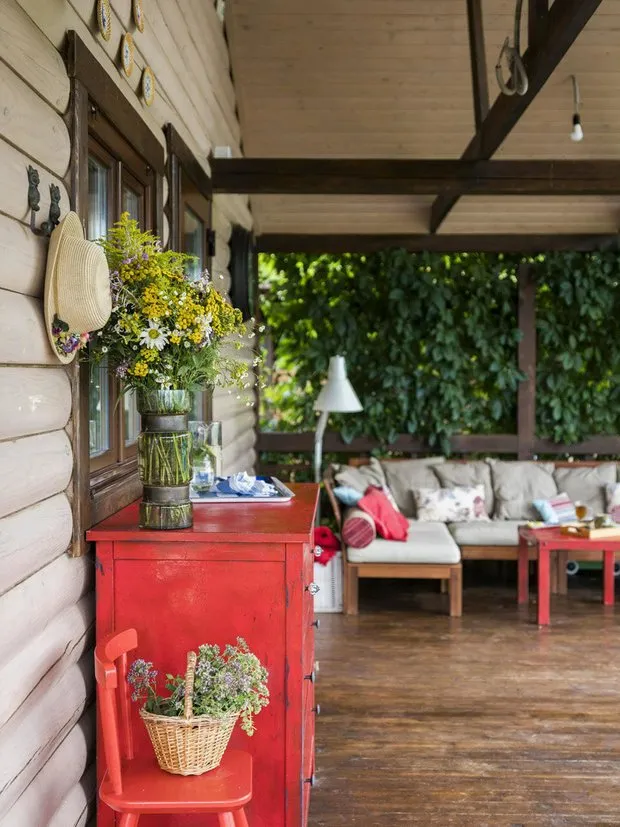 Secrets of Creating a Cozy Veranda on the Country Estate: Designer's Experience
 Small Studio 34 m² for Moscow Den Di
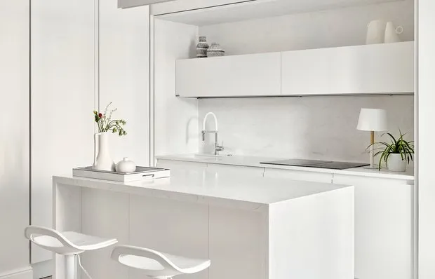 Studio 44 m² with a pristine white kitchen for a couple
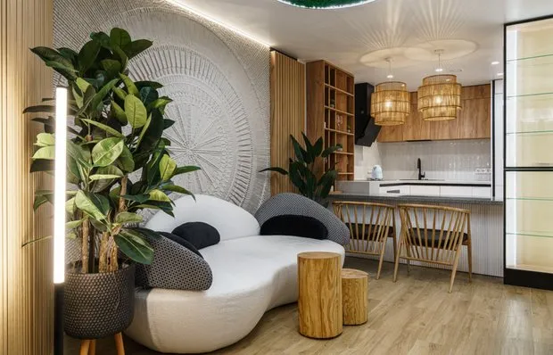 Two-bedroom apartment 74.7 sqm in Balinese style
 Functional 2-room apartment 42 sqm in minimalism style
 Soft Kitchen Interior of 7 sqm with Spacious Cabinet