Designer Reveals 8 Anti-Trends of 2022 That Will Ruin Any Interior
List of outdated solutions it's time to forget
What is already outdated in 2022, and are there alternatives to outdated solutions? Let's find out together with experts from the design studio 'ArtMonopolia'.
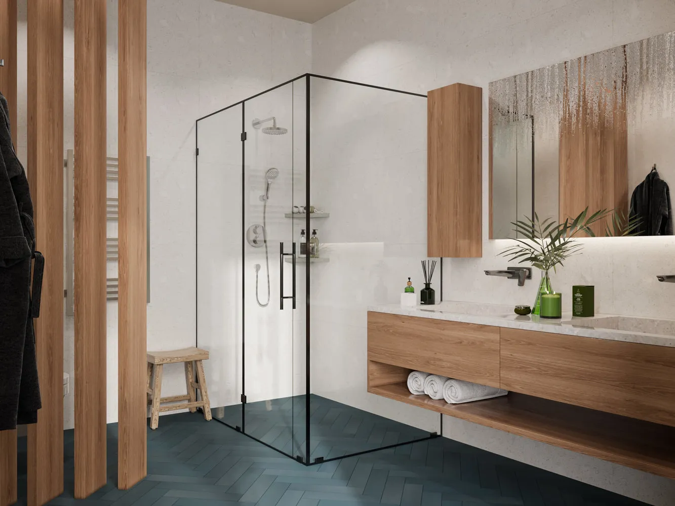
Shower Cabin
Not so long ago, even in expensive interiors, shower cabins were installed. They are bulky and usually ugly in design. And you probably won't use all the features of these cabins for more than a few months.
Now there is a more modern solution — a shower in construction execution. Such a shower will take exactly as much space as you can/desire to allocate for it. It will be executed in the tile you choose. And if such a shower was previously all equipped in apartments at your own risk, since 2021 it has become legal to install a shower tray in apartments.
Only two main rules must be followed: perform waterproofing of the bathroom and do not interfere with load-bearing structures (it is impossible to embed a shower tray into a slab, so take into account the maximum possible thickness of the screed + finish coating before starting to implement this idea). Also, replacing a bathtub with a shower tray is considered a re-planning of the apartment, and you will need approval for such modifications at Moscow Housing Inspection.
Multi-Level Ceilings from GKL
When the technology for producing ceilings from GKL appeared, it also became possible to make multi-level ceilings and complex-shaped ceilings: round, oval, wave-like, simple rectangular. Now this is completely out of fashion. It looks bulky and oppressive, cheap in almost any interior.
Of course, we don't cancel shadow lighting or curtain niches. We are talking about decorative multi-level ceilings specifically. Sometimes it may be necessary to make a duct for ventilation or air conditioning. For example, on the kitchen. If this cannot be avoided, it's better to place a kitchen cabinet directly next to such a duct using an adjustment. So the duct won't catch the eye.
But generally for ventilation and air conditioning, it's better to lower the ceiling throughout the area.
3D Drawings and Photo Wallpapers
Here you can say right away about floors, ceilings, and walls. Any 3D drawings look bad and make your interior cheaper. Pouring floors with patterns, glass backsplashes, 3D photo wallpapers — all of this cuts the eye and with a probability of 99% will make the design unattractive. If you really want to use large-area patterns in the interior, it's better to choose a big painting, poster, fresco, unusual mosaic rather than glueing 3D drawings under glass on a backsplash or pouring them into the floor.
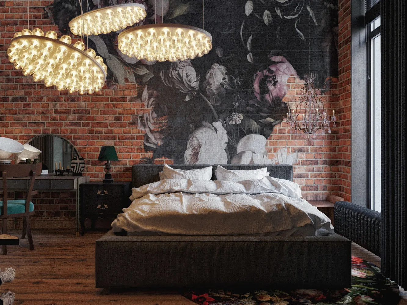
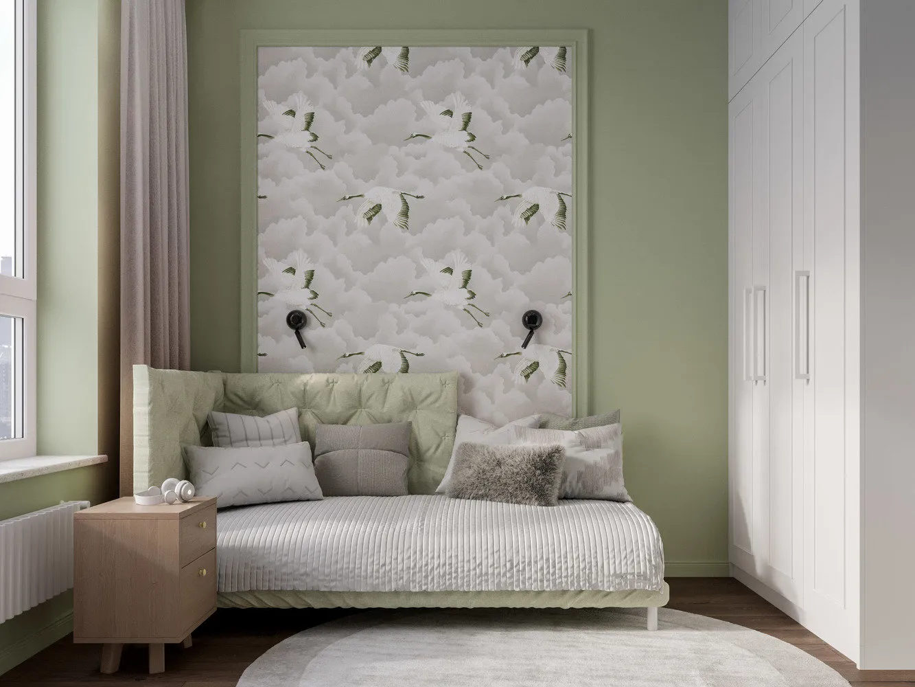
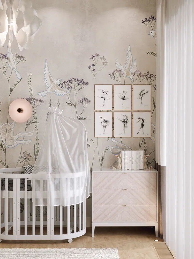
The same applies to photo wallpapers. Many designers and clients are afraid of using photo wallpapers because they are firmly associated with wild waterfalls, forests or skyscrapers. To some extent, this is true. When using this technique, you need to be really careful not to ruin or cheapen the interior. It's important to choose wallpapers only from quality manufacturers and correctly integrate them into the design. If you're unsure, it's better to replace the idea of photo wallpapers with wallpapers featuring an interesting pattern. This works particularly well for children's rooms. There are also beautiful and interesting frescoes now.
Ceiling Cloud Patterns — Another Example of How You Can Ruin the Design. Especially loved by children's rooms. Let's remember that we are still in a room and there are many ways to nicely decorate the ceiling, both for children's and any other rooms.
You can use ceilings of different colors, not just white: this is an interesting technique that will make the interior less boring and help properly work with geometry. An excellent solution that also helps increase room height is to highlight the top of the wall in tone with the ceiling.
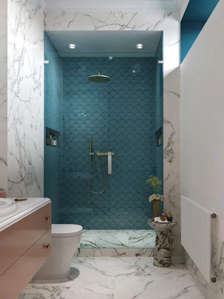
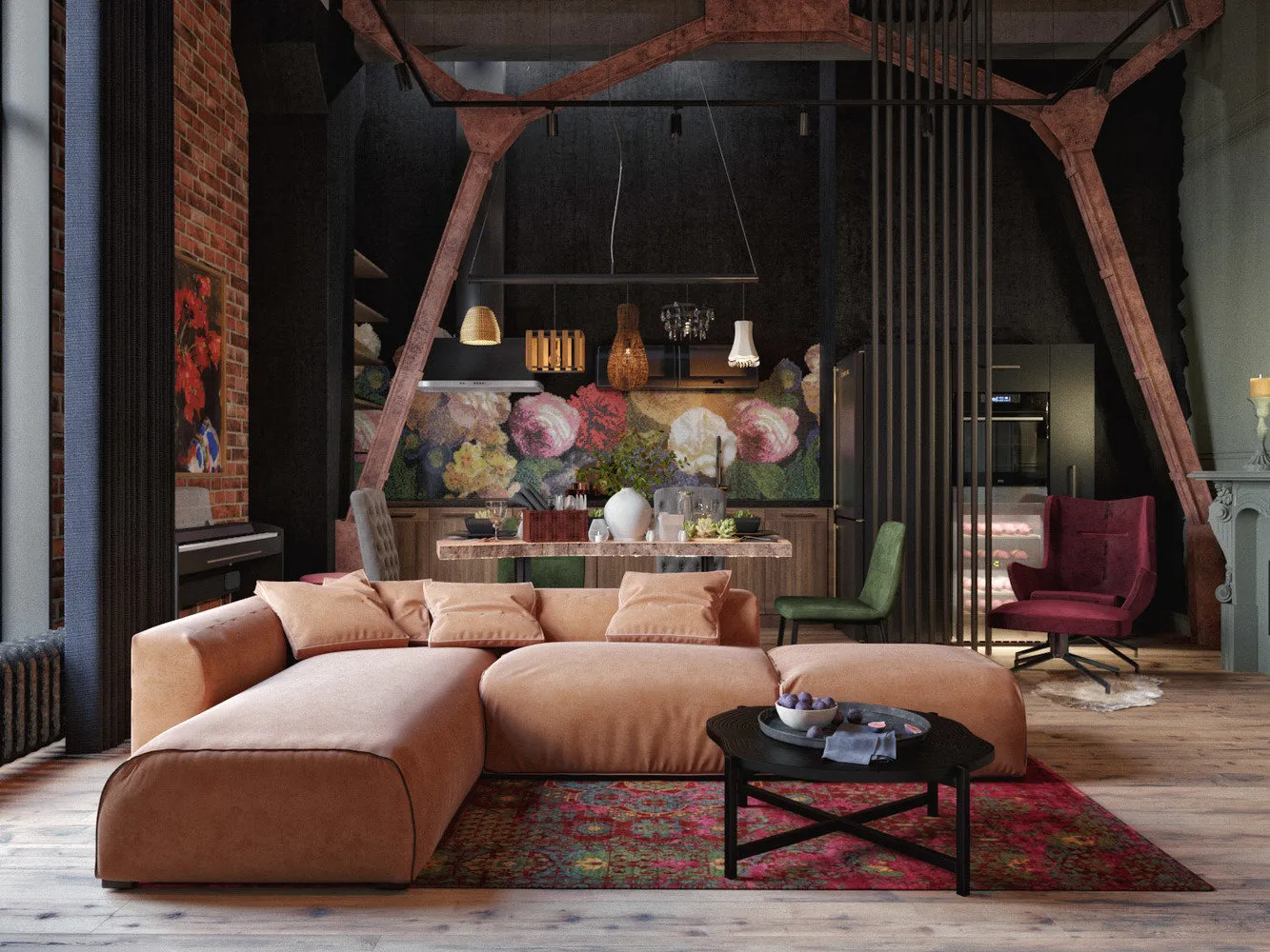
Open Bright Colors
If they were rarely seen in rooms — interiors were mostly beige (except for acid kitchen cabinets), then in bathrooms they were widely used. There, clients usually wanted to let go completely and show all the color splendor: orange, blue, red + decorative tiles. Now it's obvious to everyone that the bathroom should fit into the design of the rest of the apartment.
Small spaces shouldn't be bright. Bright colors narrow space even more and tire the eyes. Open colors always look cheaper. Kitsch in its designer form is rarely seen in the world and usually found in apartments of designers, artists or other creative people. Balancing everything stylishly is really difficult and not everyone can live in such a space.
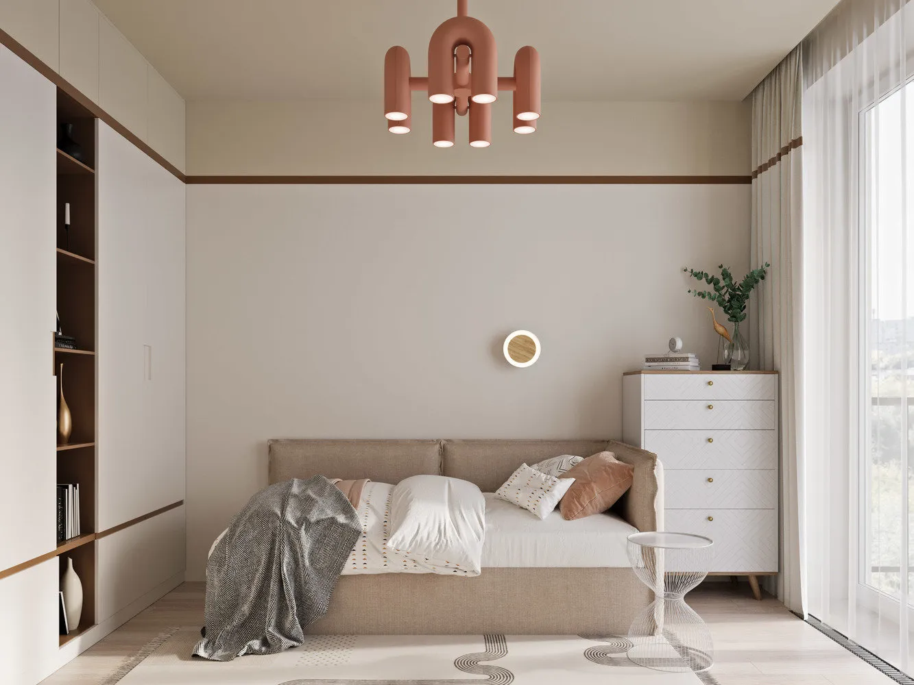
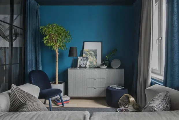
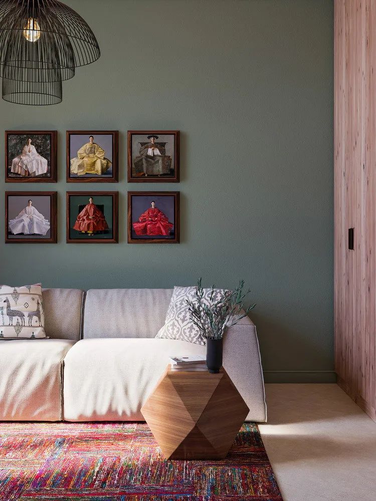
There's nothing wrong if you want color and brightness. Use bright colors sparingly — in details: textiles, decorative items, small standalone furniture (chest of drawers, nightstand). Maybe even a sofa or bed in a minimalist setting. Plants always help liven up a muted interior.
Choose complex shades with different tones. Deep saturated greens, blues mixed with gray, blueberries, burgundy, terracotta.
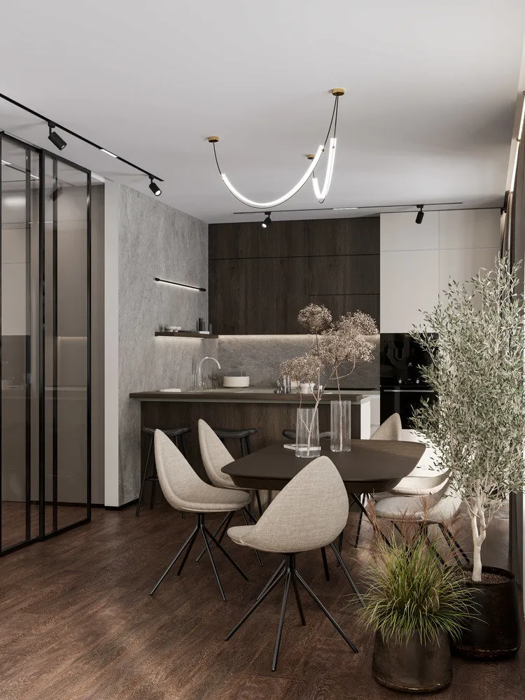
Spot Embedded Lights with Gold or Silver Trim
There are now enormous modern solutions for any budget: track lighting, built-in conduits, direct built-in spots, adjustable surface-mounted spots. Everything that will make your design modern and stylish. You should definitely give up standard built-in round fixtures in frames. And certainly redo the ceiling, even if you planned to keep it during renovation.
Acid Kitchen Cabinets / Round Kitchen Cabinets
You can still encounter them in apartments, and some people want to keep this beauty and incorporate it into new design. You definitely shouldn't keep them. Such films and enamel are still available in catalogs of large kitchen showrooms, but this does not mean they're relevant. If we've already talked about colors above, let's touch on shapes here. All wavy countertops, cabinets, round internal corners are better left somewhere in 2005.
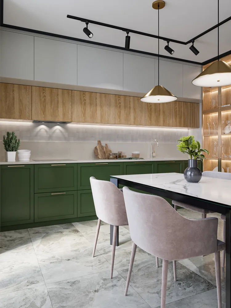
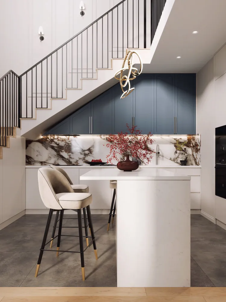
Bar Stools in Small Apartments
If you don't cook or eat at home, and can drink coffee with yogurt for breakfast — a bar stool might be an alternative to a table for saving space. But if you have a family or traditions of gathering on Sunday dinners, and maybe friends come over — don't try to squeeze both the bar stool and a table into the kitchen. It always looks ridiculous, eats up space, and you'll likely not use this stool often. If your kitchen area allows it and your soul desires, consider looking at semi-bar stools that adjoin the kitchen island and table. There are great integrated structures. The height of such a stool is usually equal to the kitchen countertop height. For it, semi-bar chairs are used which look organic and modern.
Excessive Ornamentation
It's not a problem if you create or love classical interiors. Classical interiors can also be refined and beautiful. It's bad when they're overloaded with details: ornate chandeliers, intricate handles, crystal, engravings, carved furniture. This shows lack of quality and expense rather than taste. Trends have indeed shifted toward more minimalist modern interiors among clients. Here, an analogy with clothing works well: 'I'll wear everything good at once' — is no longer a sign of wealth or taste. Interiors that are complex in shades and textures but minimalist in form look much more stylishly and expensively.
Need a renovation specialist?
Find verified professionals for any repair or construction job. Post your request and get offers from local experts.
You may also like
More articles:
 IKEA Style Furniture and Home Goods You'll Want to Buy Now
 Living Room in the IKEA Style: 10 Items That Fit Any Interior
 5 Superuseful Things in the Bathroom That Improve Quality of Life
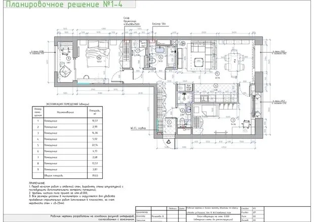 Amazing Trash Project Where Kitchen and Living Room Are Combined Without Compromises
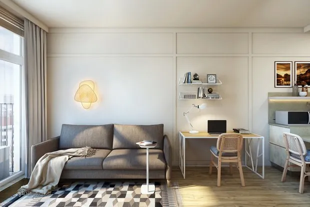 Small two-room apartment resembling a hotel you'd want to live in
 How to Build an Energy-Saving House: 11 Pro Tips
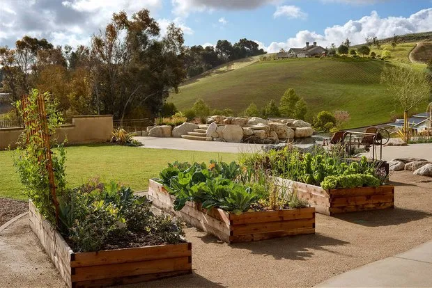 Top 10 Coolest Garden Beds for the Country Plot: Take Note
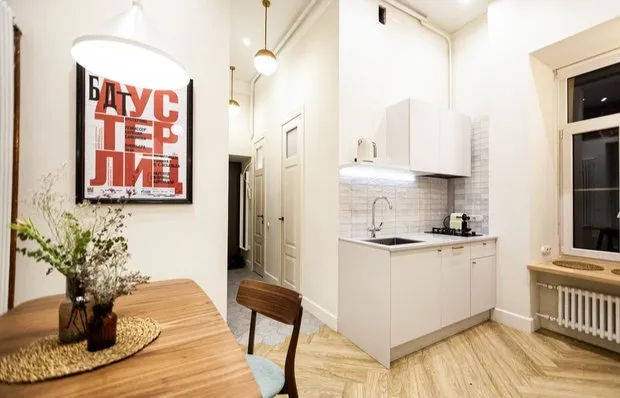 Transformation of a Vintage St. Petersburg Two-Room Apartment (44 sqm) into the Perfect Space for an Actress