Pink Color in Interior Design: Bright Examples and Designers' Tips
Color trends for the upcoming year promise vibrant, joyful hues. A bright example of this is the color of the year according to Tikkurila brand. We explain what this color is and how to use it in your own interior.
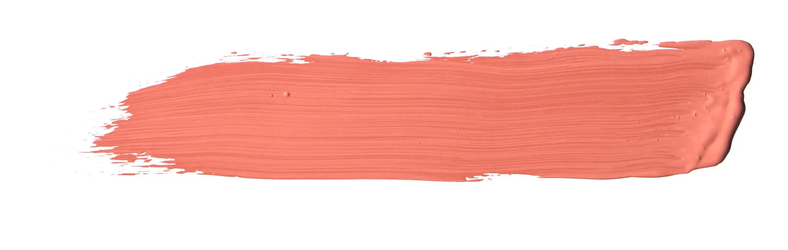
The Color of the Year 2019 — K319 Flamingo
Why exactly this color?
K319 FLAMINGO,
or peach-pink shade, was selected by Tikkurila experts in Stockholm during the annual Color Now meeting to define new year's trending hues.IN THE WORKSHOP FORMAT
designers, color experts and fashion analysts presented their vision of upcoming year's trending colors. The workshop results included a trendy palette of 16 shades and the main color of the year.ASSOCIATED WITH K319
— faded Miami landscapes, vintage fifties films, and of course, the feathers of elegant flamingos, where in a flock of hundreds of identical birds each one looks unique.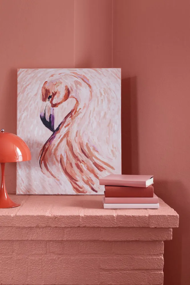
How to Combine? With Similar Tones
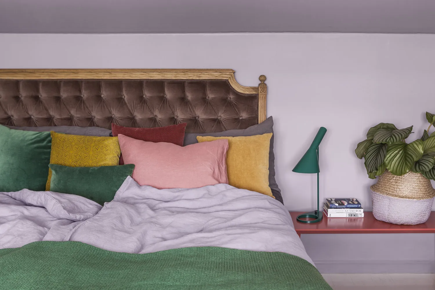
Combine the trendy color with three to four shades of pink and peach for a calm yet rich combination.
K319 Flamingo L418 Nectar M319 Reef H320 Magnolia
With Contrasting Colors
Another great way is to dilute the trendy hue with contrast. It works best if companion colors are of equal saturation — then the combination remains dynamic yet harmonious.
M386 Amazon L392 Ducat K319 Flamingo L433 Atlantis
What Experts Recommend
Irina Hanhisalo, Marketing Manager for Color at TIKKURILA BRAND, Color Expert and Trend Analyst
I like strange and interesting pairs. I recommend combining the Flamingo color with L392 Ducat shade — it works perfectly with the color of the year.
Susanna Björklund, Trend Analyst, Journalist
A well-known authority in design and future trends in Finland and internationally. I would combine the color of the year with a great G371 Crystal color.
How Russian and Western designers use this color in their projects? We've collected 9 trendy pink interiors.
The sofa in one of the rooms of this Stockholm apartment designed by Note Design Studio looks even softer than it actually is, thanks to the gentle peach-pink tone.
To decorate a palace in Lyon, designer Claude Cartier used the trendy shade even on the floor, laying down trend-setting carpets from brand CC Tapis.
When decorating an apartment in Barcelona, designer Miriam Barrio combined warm pink with gold.
Designers from FISHEYE Architecture & Design decided to include only peach-pink chairs in the decor of this loft — for a loft, it's probably enough.
A simple way to add trendy shades to an interior is to cover walls with wallpapers or panels, as designers of 'Design Point' studio did for a Moscow loft.
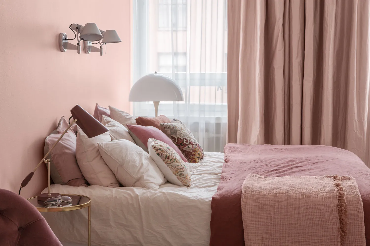
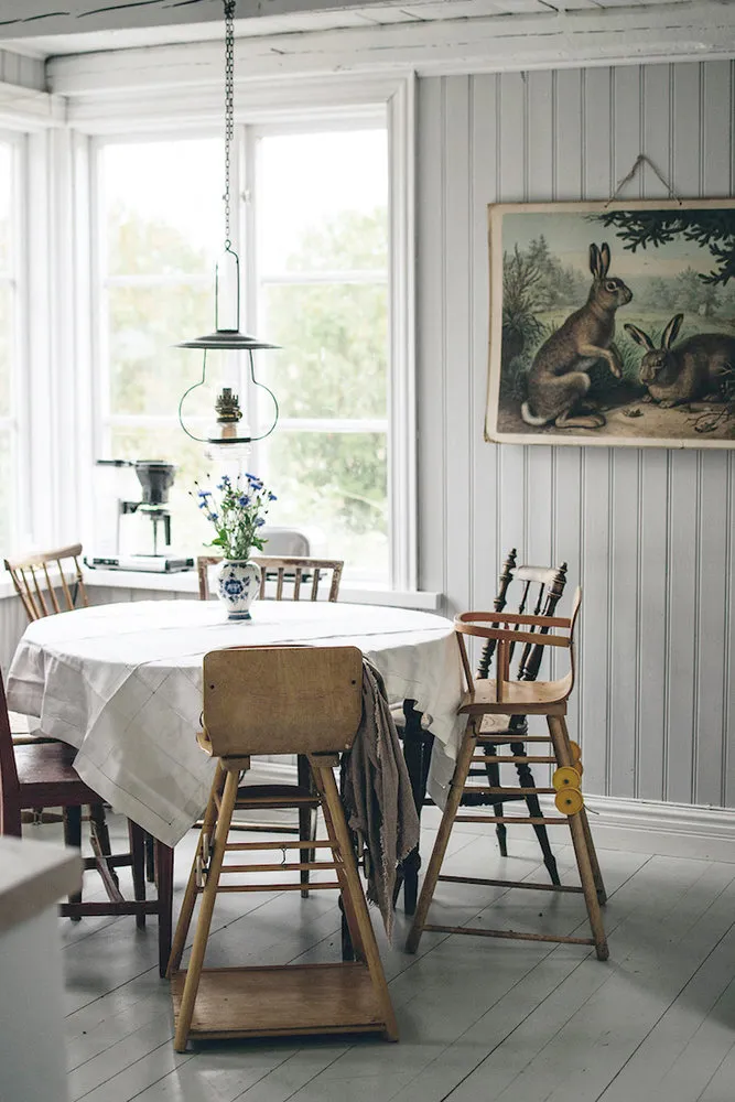
Or you can use plenty of textiles, as designers from Swedish real estate agency Nooks did in a small apartment in Sweden.
Flamingo is the color that doesn't come in large amounts: walls, chandeliers, and textiles in this shade make an interior cozy.
It will reveal itself more richly and diversely if this color is used in several textures at once.
A bright accent color + light tones — the formula for controlled use of warm pink by architects from CaSA Colombo and Serboli Architecture.
Need a renovation specialist?
Find verified professionals for any repair or construction job. Post your request and get offers from local experts.
You may also like
More articles:
 How a Swedish Blogger Decorated a Summer Cottage
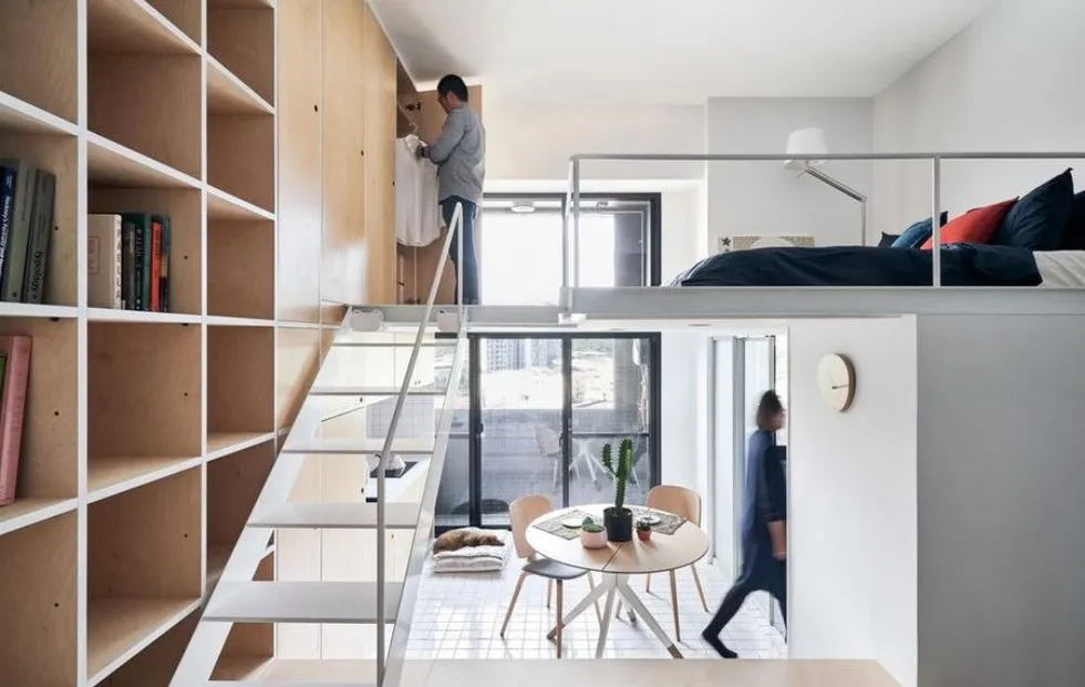 Large-scale plan: how to know if you live in a millennial apartment
 From Zamozhorskaya to the Airport: 11 Wooden Houses of Moscow
 How to Decorate a Small Bedroom: 7 Working Tips
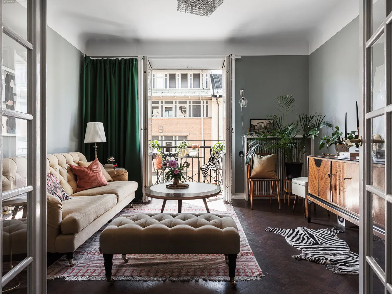 2-room apartment in Sweden with through kitchen
 How an Old Museum Was Converted into a Cozy Home
 How to Zone a Small Studio: Favorite Tips from Professionals
 Completing the Season of Big Discounts and Promotions