Color + Patterns in Interior Design, or Say Goodbye to Beige
Time to say goodbye to boring beige interiors! It's time to go for a vibrant interior
For the second year running, Pantone Color Institute has declared a juicy, intense shade as the Color of the Year. This means that bold colors have firmly established themselves among long-lasting interior design trends.
Together with the Center for Design and Interior «Expobuild on Nakhimovskoe», we've put together a cheat sheet for using saturated shades and prints to create a fashionable, colorful interior.
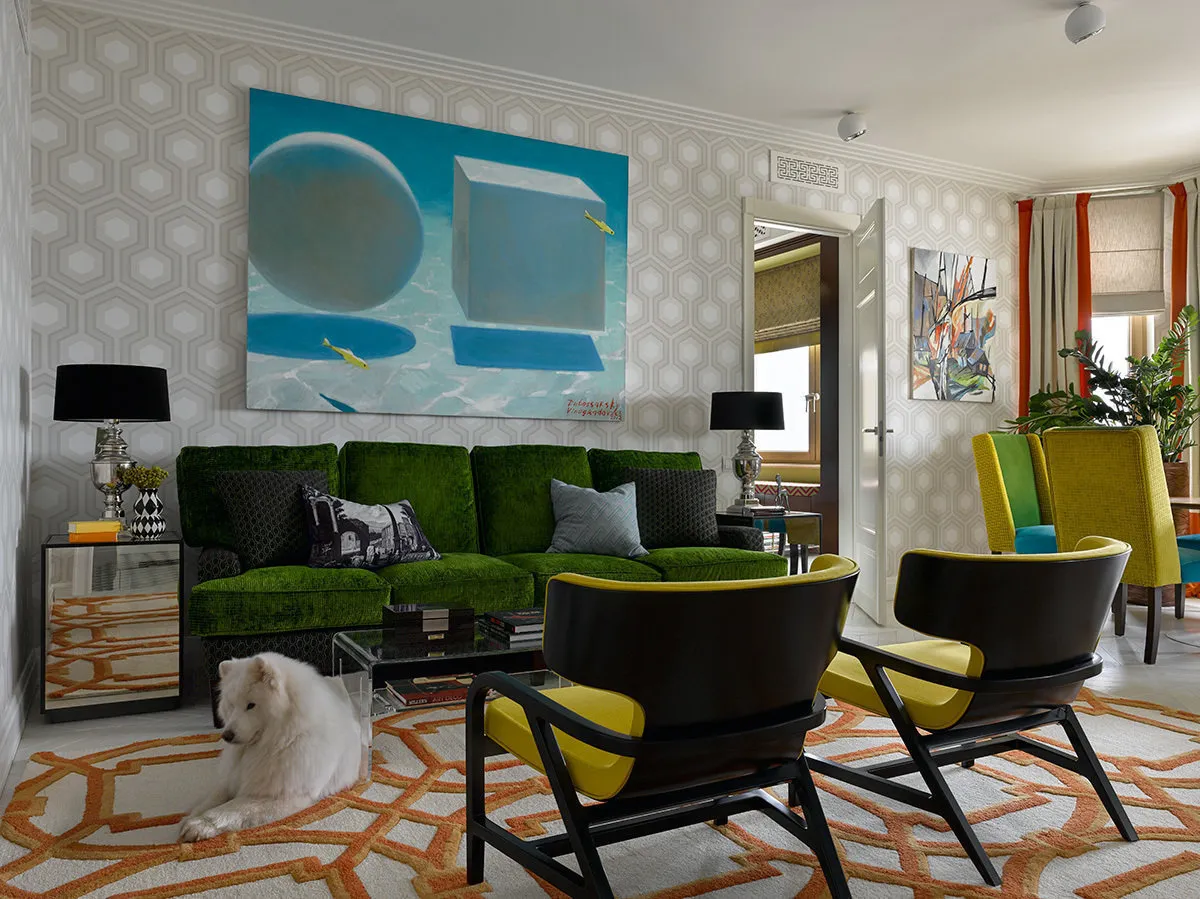
What are vibrant interiors good for? Apartments and houses decorated in bold, saturated tones can reveal the character and tastes of their owners much deeper than neutral beige or gray interiors. Moreover, color is the key to the mood of a home and everyone living in it. If seasonal gloom has lasted longer than it should, new wall color, a pair of colorful Western chairs, a bed in a rich tone with upholstery like the Houston bed, or vibrant lights such as the Barn Industrial pendant will refresh both the atmosphere and the perception of the world.
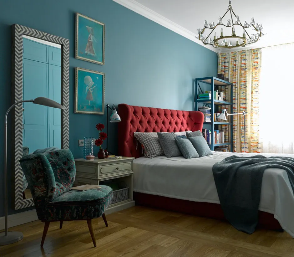
Design: Enjoy Home
How to introduce color into an interior?
First, set priorities. If you want to highlight the furniture, it's better to keep the walls neutral — and vice versa. Remember that matte paint will show color more deeply than glossy paint. Choose wallpapers that are pleasant to the touch — such as Sirpi Alvise.
If the idea of filling your entire interior with color is overwhelming, paint the walls of the entrance hall and corridors in a bright color: nobody stays there for long anyway, so color is unlikely to "overwhelm" or get boring quickly.
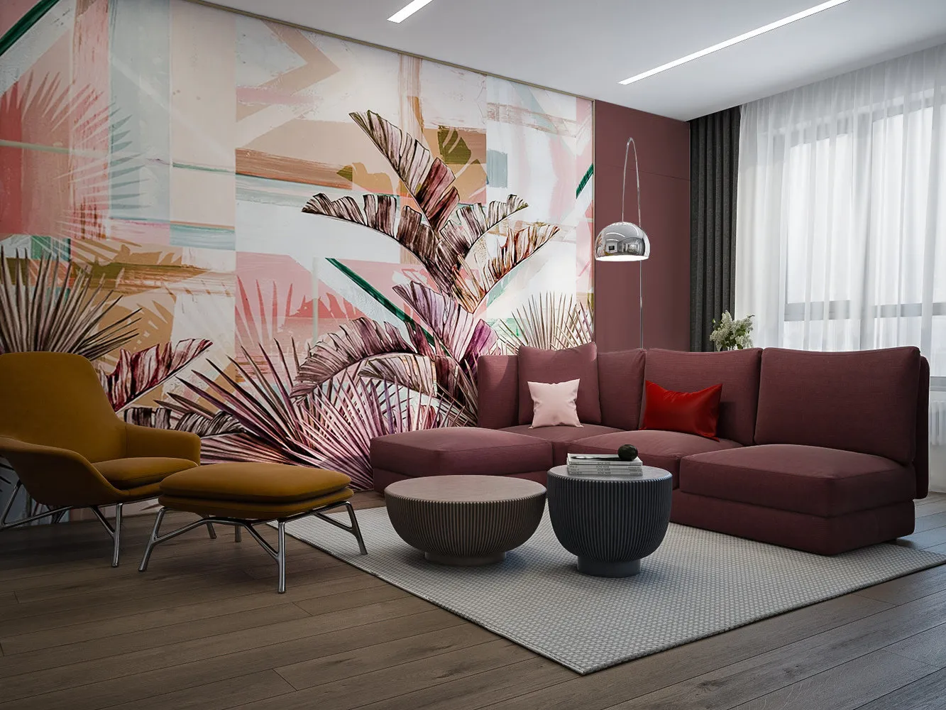
Design: 'Design Point'
In working on a colorful interior, use prints, complex or unusual patterns and interesting multicolor combinations. They will help you gently introduce color or support an existing palette.
- Wall Clock Watch Me
- Western Chair
- Barn Industrial Pendant Light
- BOTTICELLI Carpet
- ELEVEN Co — KALEIDOSCOPE Tile
- MALAGA Ceramic Tile
- Effebiquattro Facile Interior Door
- Sirpi Alvise Flocked Wallpaper
- Houston Bed
How not to overdo it?
Stick to accessories. Decorate a wall with something colorful and witty, like the Watch Me clock or arrange colorful candlesticks.
A good example of controlled use of color is installing interior doors in a saturated tone, like the Effebiquattro Facile model. With them, your interior will not only become brighter but also more graphic.
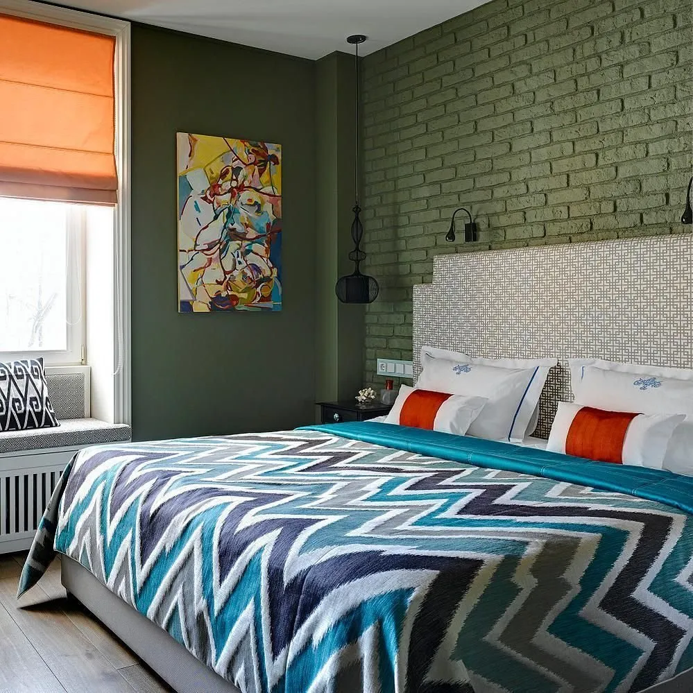
Design: Ekaterina Fedorova
Besides, it's important to take care of one or two spaces free of color. Decorate them in a calm color palette so the eyes can rest.
For which styles is it suitable?
In interiors such as baroque, art deco or empire, it's better to avoid bright, saturated colors and patterns. However, for modern styles, a few vibrant accents and vivid touches are never out of place.
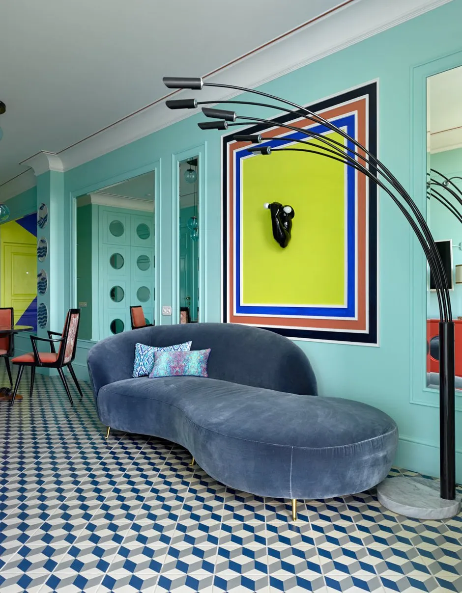
Design: Anna Muravina
How to choose?
There are many proven tools for selecting harmonious color combinations, such as color wheels or ready-made color schemes.
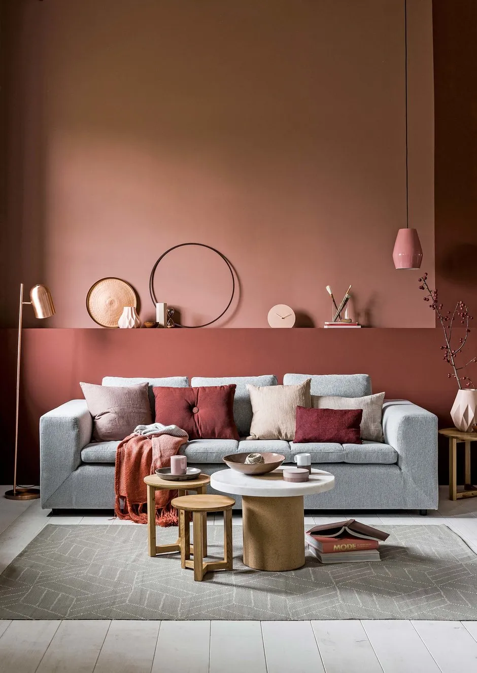
You can take a color combination from a wallpaper, carpet or lampshade that you like as the basis for your interior palette. For example, the colorful BOTTICELLI carpet has harmoniously chosen several vivid, cheerful shades that are easy to repeat by matching other items in tone.
Design: Marina Zhukova
What to complement?
The dosage of color is very individual, but any burst of colors always needs to be slightly calmed down with "calm" colors — black, white and gray. A universal solution would be flooring in a neutral color palette, like the "Lunar Velvet" engineered board.
Don't forget to include graphic patterns in bright colors in your interior, such as those found in ELEVEN Co KALEIDOSCOPE ceramic tile or MALAGA tiles. A monotonous, repeating pattern will soothe vivid colors.
9 Ideas for a Vibrant Interior
- Decorate an accent wall in the living room with a bright panel.
- Decorate the bedroom wall near the headboard with patterned wallpaper and upholster the headboard in calm fabric... or vice versa.
- Set the table with dishes featuring an interesting print. Choose unusual textiles.
- Paint interior doors in saturated tones.
- Include a colorful sofa and paint one of the walls in the hallway in a more subdued tone.
- Style your interior with a colorful screen.
- Use colorful grout in the bathroom.
- Choose a colorful bed linen set.
Need a renovation specialist?
Find verified professionals for any repair or construction job. Post your request and get offers from local experts.
You may also like
More articles:
 11 Questions for Designer Irina Krascheninnikova
 8 Mistakes in Repair That Everyone Makes
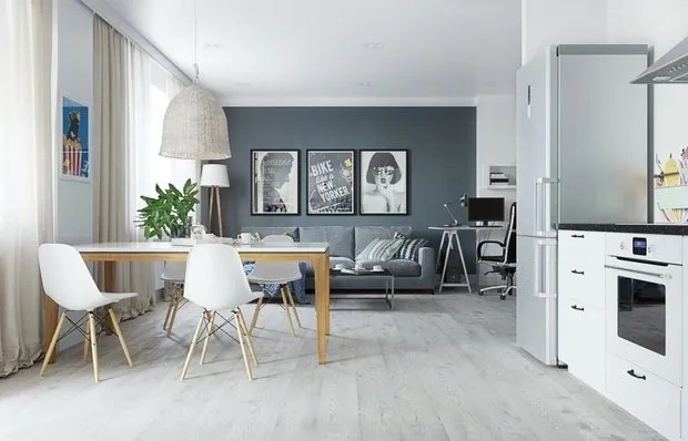 9 Classy and Useful Ideas from April Projects
 Express Living Room Repair: 9 Ideas
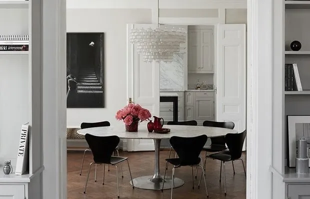 Convenient Layout and Scandinavian Palette: A Swedish Home
 Terrace on the dacha: how to decorate it beautifully, what to buy
 What to Buy: New Industriell Collection by IKEA
 How to Make a Small Apartment Spacious and Cozy