How to Choose and Combine Colors in Interior Design? 5 Tips
Have you noticed that design interiors always stand out with a special harmony?
If you have been looking at beautiful glossy photos for a long time, you surely noticed that the basis of stylish interior design lies in proper color selection and their exact combination. How designers combine colors, is explained by Veronica Kovalyova.
Veronica Kovalyova is an architecture expert and head of the project department at Artbaza.studio.
Consider Room Functions
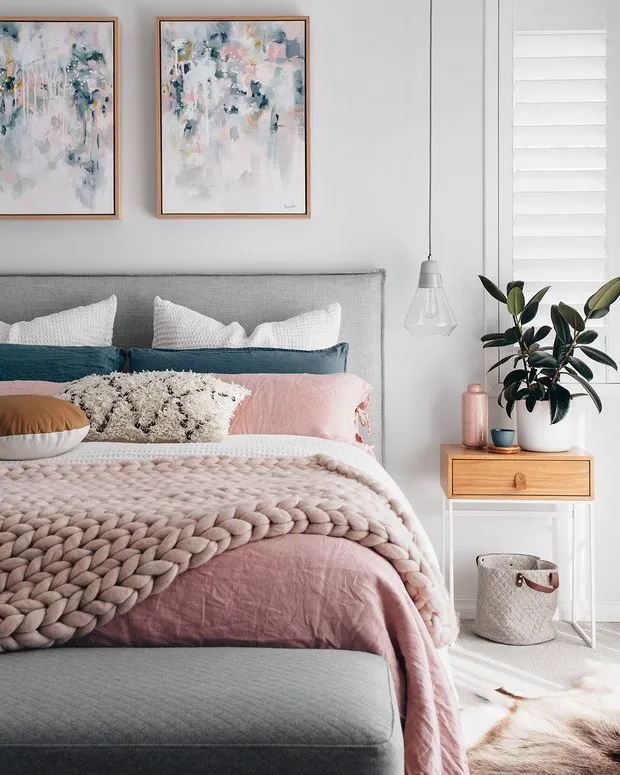
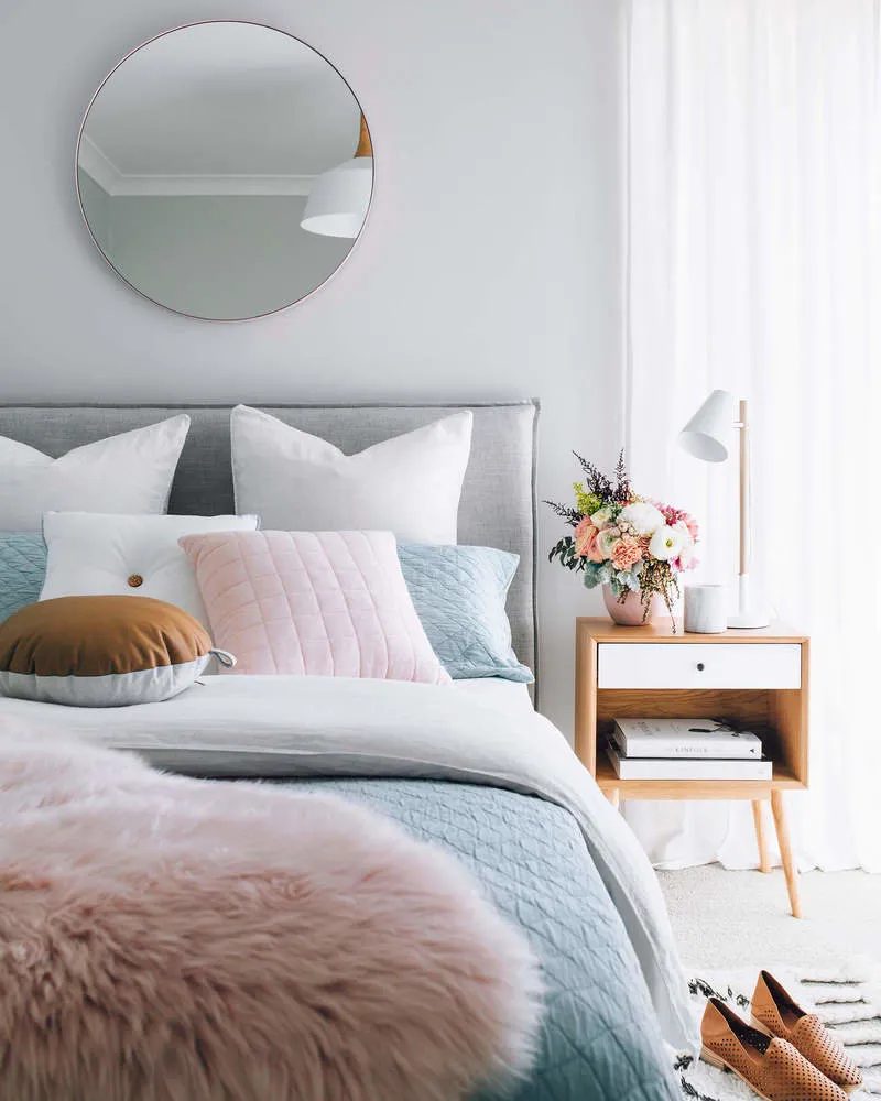
A bedroom, a child's room, a living room or an office - each room has its own mission. For an office, colors that help concentrate are needed - gray or beige; for a bedroom - pastel and calm shades, which invite relaxation.
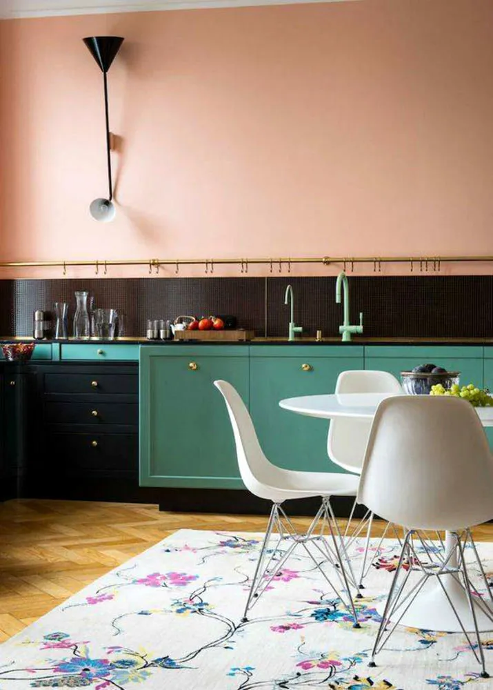
For a child's room, soft shades and bright prints on their background are suitable. On the kitchen walls, peach, yellow or salad green colors can be used: these tones stimulate appetite.
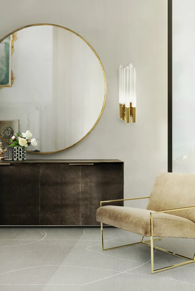
Another option is to rely on the always fashionable and universal white: any color in decoration will create an atmosphere on its background.
Don't Forget About Room Size
The area of the room, ceiling height, and the amount of light in the space play an important role. Remember: light shades visually expand the room, dark ones - reduce it.
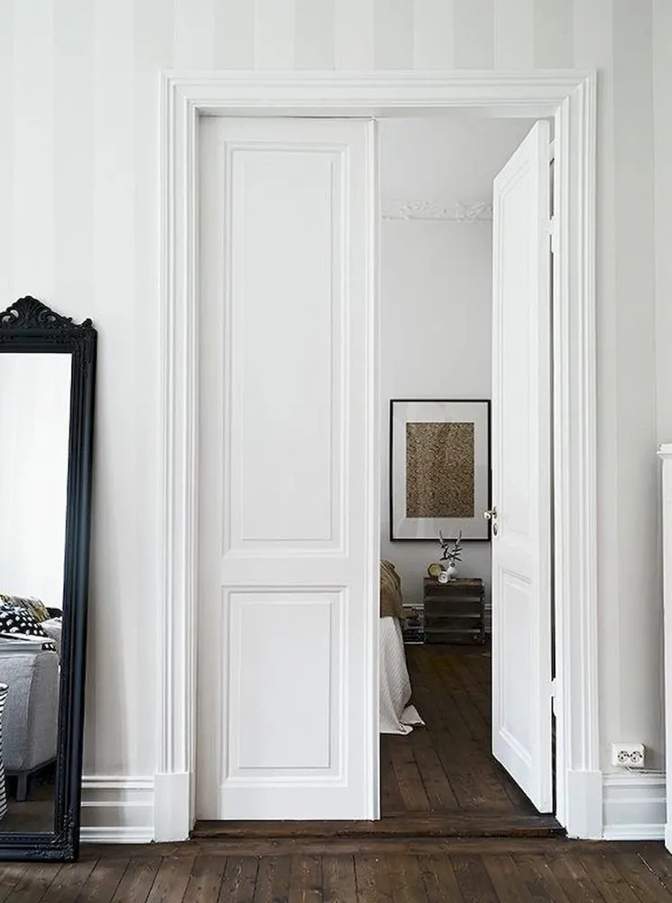
Need to raise low ceilings? Use light glossy shades of white. By the way, white is perfect when combined with dark flooring: this trick is loved by many interior designers.
For high ceilings, any color will do, but remember that dark ceilings and white walls - is an unfortunate combination, and the room will seem lower. If the floor and ceiling colors are the same, this scheme will expand the area but at the same time reduce the height.
Dark or bright floor combined with light ceiling and walls - a classic solution for expanding space. Identical wall and furniture colors are also a great technique.
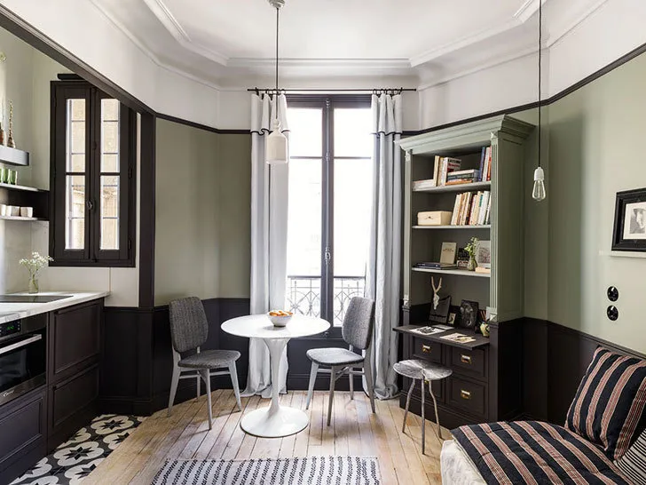
Small apartment in Paris
In a rectangular room, paint the walls that are shorter in dark color and light shades of the same color - longer ones. Any dark spectrum color visually brings objects closer, light colors - push them away.
Orient by Directions of Light
Cold rooms visually warm up, warm ones - cool down. Therefore, in rooms with windows facing south and southeast, cold tones will be appropriate. In interiors with windows facing north or west - warm tones.
Remember the Characteristics of Basic Colors
Remember the impact of color on mood. Here are characteristics of basic colors we use in our work.
White - classic, well matches any shade. To avoid a cold and uncomfortable white interior, use warm white shades or neutral warm tones - beige, cream.
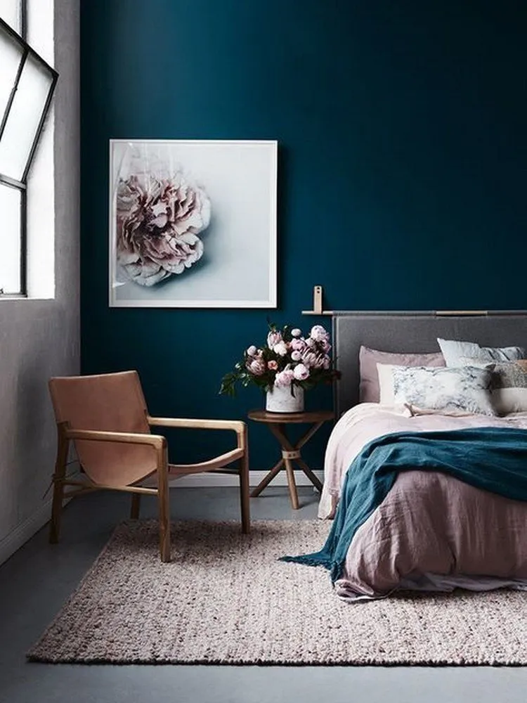
Blue - expands the room, makes it spacious, comfortable in such a space. All shades of blue also expand space, giving it infinity. Use it in rooms with windows facing south.
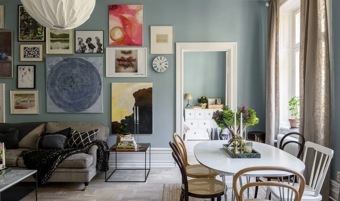
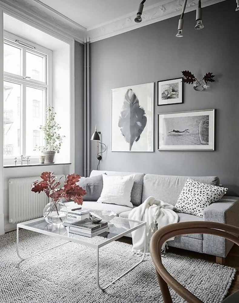
Two-bedroom apartment in Sweden
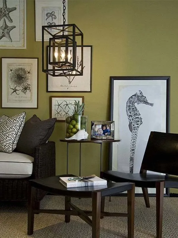
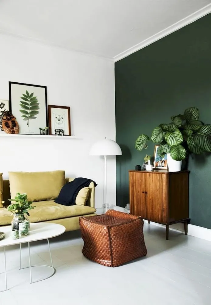
Green - comfortable for the eyes, in such a room one wants to stay longer, it brings peace.
Red - has an irritating effect. Work with it carefully.
Yellow and all its shades - visually expand space, make it sunny, perfectly suited for a child's room and dark spaces.
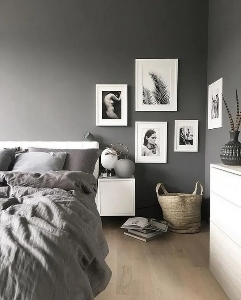
Gray - classic option for an office or bedroom, it's important to complement it with bright accents.
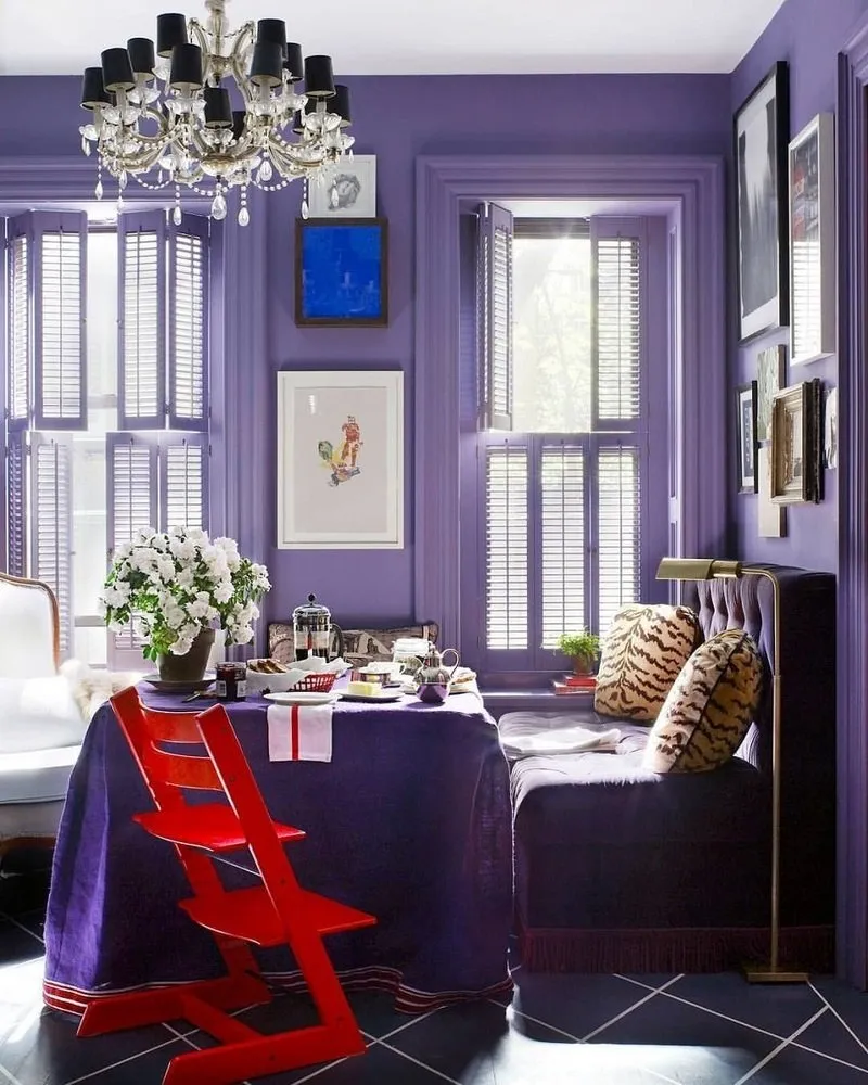
Violet suits spacious rooms, it reduces space.
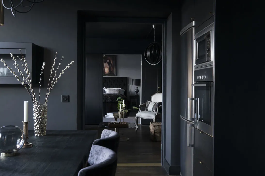
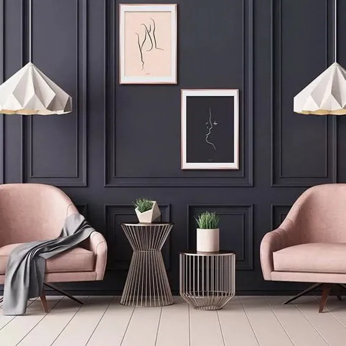
Black and all dark shades - also visually reduce space.
Apartment interior in Sweden
Use Designers' Secrets
The color wheel offers a full spectrum of colors and allows choosing suitable options. Its base is blue, yellow, and red. Then come their tints and colors obtained by mixing the primary ones.
How to Use the Color Wheel Correctly?
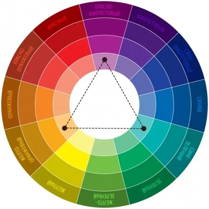
Combine Colors Directly Opposite Each Other
Draw a line from blue-green to red-orange at an equal distance from the center and get a contrast solution for a bold interior.
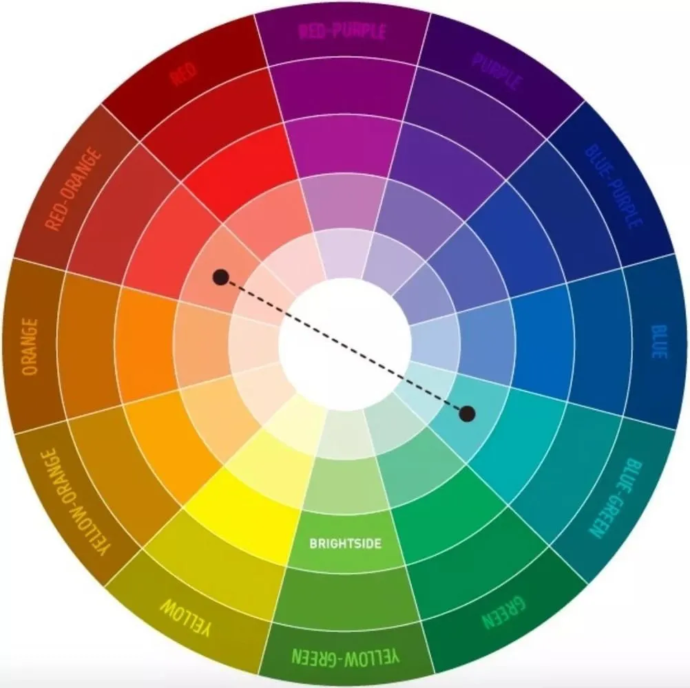
Visually draw an isosceles triangle in the circle, and you get colors of different spectrums that are compatible with each other.
For example, use the second or third sector from the center along the violet color branch. Together with it, boldly use neighboring colors that are on the same axis to the right or left. It's important to choose no more than five tints.
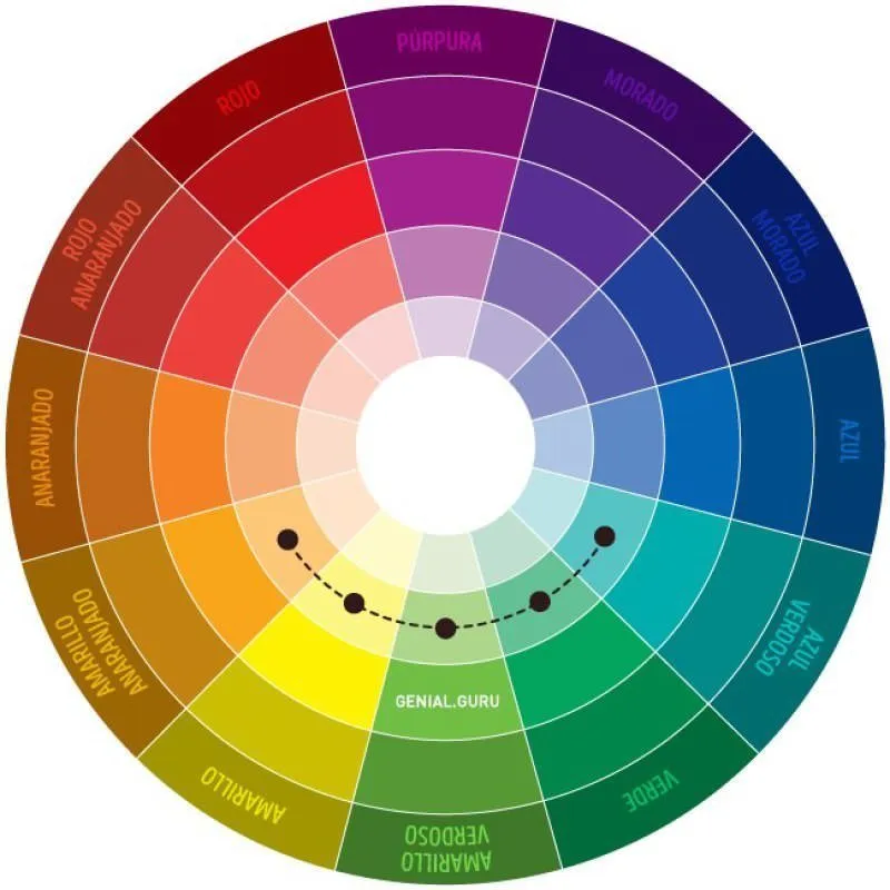
Use Adjacent Colors
For example, if you want to use muted violet as a base color - it's the second or third sector from the center along the violet branch. Use adjacent colors that follow this same axis to the right or left. It's important to choose no more than five tints.
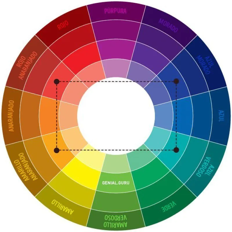
Remember the Rule of Selecting Four Colors, Each Being an Angle of a Rectangle in the Spectrum
For example, red, violet, green, yellow. One color will be the main one, two others - complementary, and the fourth - accent color.
If working with the color wheel seems too difficult, you can remember several simple color combinations.
- White - the most universal color, which pairs with all shades of any color. The most fashionable combinations are white with black, red, or blue.
- Popular beige will be perfect with brown, blue, black or red.
- Trendy gray will suit violet, blue, pink and red.
- Rich olive is ideal with brown, like tree bark, and all its tints.
- Go with green - orange, yellow, brown or gray, as well as black and white.
- And blue pairs well with gray, brown, orange and pink, white and yellow.
- And black - a universal color, playing beautifully with pink, orange, red, purple, yellow and, of course, white.
Need a renovation specialist?
Find verified professionals for any repair or construction job. Post your request and get offers from local experts.
You may also like
More articles:
 Stockholm Furniture Fair 2018 Exhibition: 10 Finds for Small Apartments
 Small Entrance Hall Design: 5 Examples + Products
 How to Hide Wall Irregularities: 10 Interesting Solutions
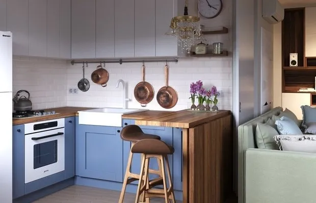 How to Decorate a Kitchen-Living Room in a Khrushchyovka: 5 Examples
 Modern Classic in Interior Design: Apartment in Sweden
 How to Decorate a Bachelor's Apartment: 5 Examples by Our Designers
 Before and After: A New Life for 'Killed' Apartments
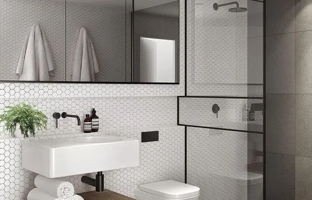 Creating the Perfect Bathroom: Ergonomics + Design Solutions