Design of Light-Colored Kitchen — Comfort and Energy for Everyone
In the Color Report, Pantone included natural shades: pale pink, blue, lemon green, gray, golden brown, and rose. All of them pair well with beige and white tones and will become an up-to-date palette for creating interiors.
Given the popularity of pastel and nude tones, we offer you options for designing a light-colored kitchen. Besides fashion trends, our mood is also influenced by the long winter and short daylight hours: such a palette can be a boost for good mood.
Characteristics of Light Color Schemes: How They Affect Interior Design
The more complex and non-linear the color, the cozier and harmonious the interior. In this respect, light multi-tonal shades provide space for ideas and visually make the room look more spacious.
The main designer principle is that the larger the surface, the lighter the tone. Rich colors in a light kitchen can be used as accent details: lampshades, aprons, countertops.
 Trendy Color Combinations in Light Kitchens
Designers particularly favor the following combinations:
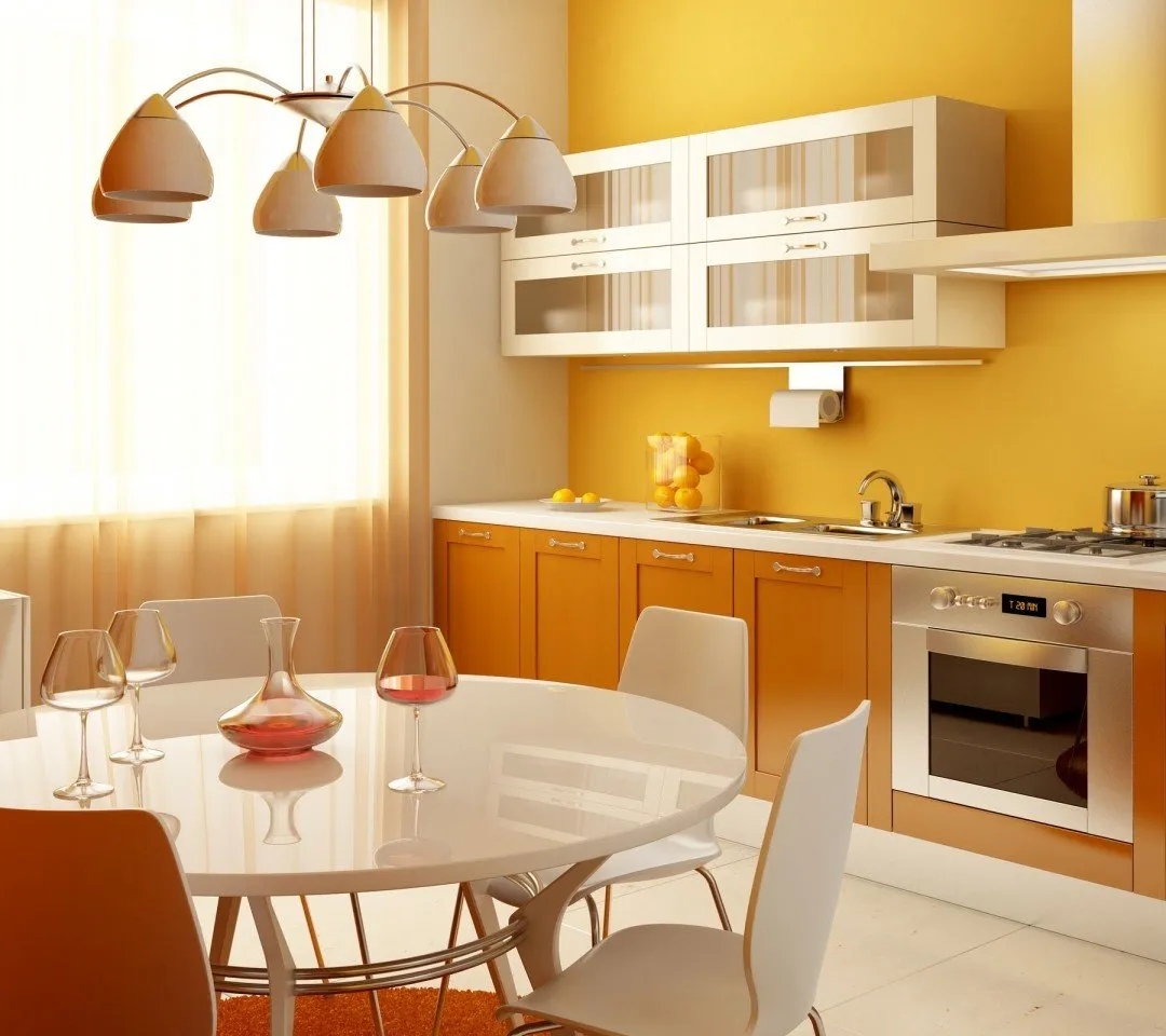
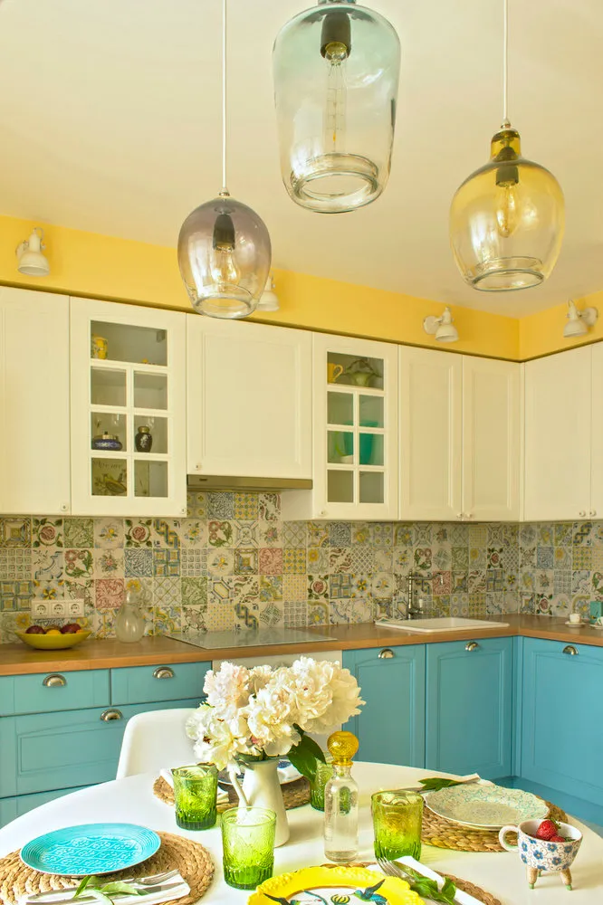
- Blue, yellow, lavender – create a fresh space. A light, airy kitchen in a yellow-blue palette.
- White, beige, yellow – a basic, cozy set. A beige-yellow kitchen with sandy tones can be decorated in any style
- Yellow and green – bring sunshine and warmth. These colors can warm up a room with little daylight, where windows face north.
When determining a color palette, you can use the rule: 60% main color, 30% helper, and 10% accent.
The main color is the one on which other tones will play well. It is painted on large surfaces like walls and floors. The helper color is for the cabinet, dining group, curtains. And the accent is used for bright spots – a mat, apron, countertop.
Each color in a group can have three tonalities – then it’s not boring. If it's beige, you can choose not only beige but also milk (slightly lighter) or wooden (slightly darker).
By the way, beige is often chosen as the main color when decorating a kitchen. It pairs well with other natural shades: blue, gray, green, brown.
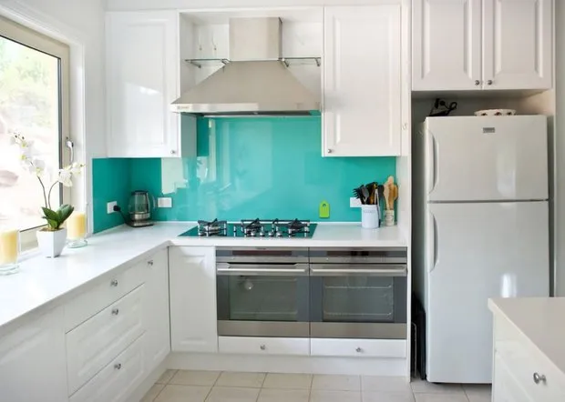
Especially trendy is the combination of beige cabinets and blue or turquoise aprons. It’s advisable to add textures to the composition – metal and wood.
Trends in Light Tones in Kitchen Interiors – yellow, blue, golden, gray. It seems this trend will last for years and remain a basic set. Therefore, you can decorate without fear of aging.
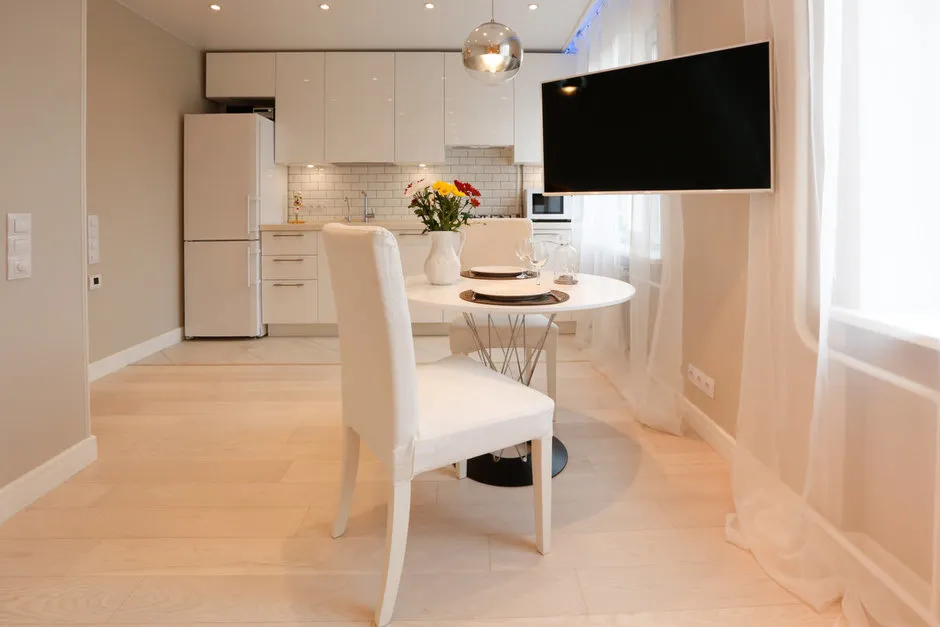
 Design: Katya Chistova6 Main Styles of Light Kitchen Interiors
Light pastel tones usually become the basis for the following styles:
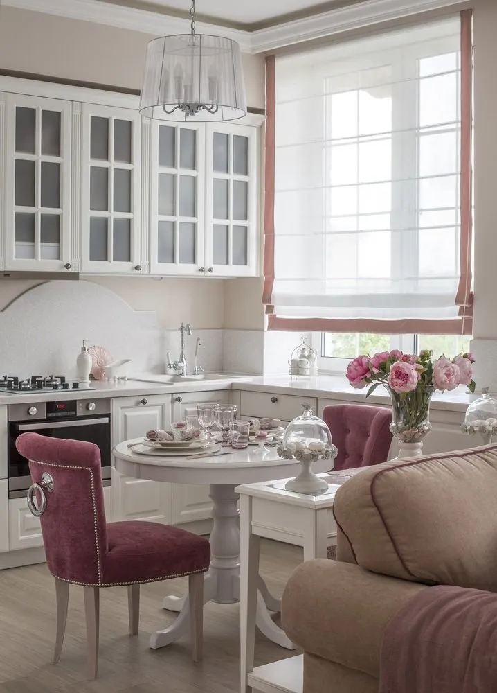
- In classical style — these are restrained colors, soft unobtrusive accents. Classicism is characterized by staticness: there are almost no bright zones, and the gaze moves softly across the kitchen.
 Design: Slavayu Yurkova
- Modern — light colors are slightly diluted with dark ones (chocolate, lilac, black) as accents. In classicism, accents are soft and smooth, while in modern style, there is contrast.
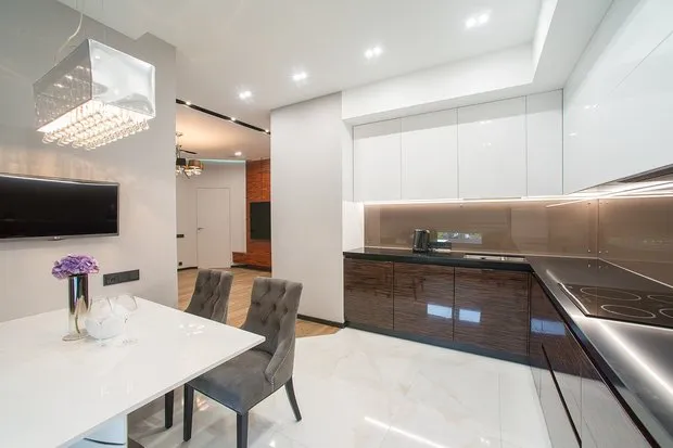
 Design: Buro Brainstorm
 - Hi-Tech and Techno — monochrome looks work well here, gray, white, black colors, clarity, lots of free space, appropriate use of glass and metal. By the way, one of the kitchen trends is stainless steel. Countertops and appliances made from steel fit perfectly into such an interior.
 Design: Sergey Sargin
- Light kitchen design in Scandinavian style — minimalism, lots of light, natural textures (cotton, wood, flowers). This is almost always beige, gray, white colors, plants in pots and planters.

- Pop Art — a variation where bright accents are placed on a light background (walls, floor, furniture). Even the most unexpected, cosmic palette is not condemned.
 In general, all modern stylistic directions differ from classicism precisely due to the presence of active dynamics: all zones seem to gain speed and the ability to move, becoming alive in the eye.
How to Choose Textiles
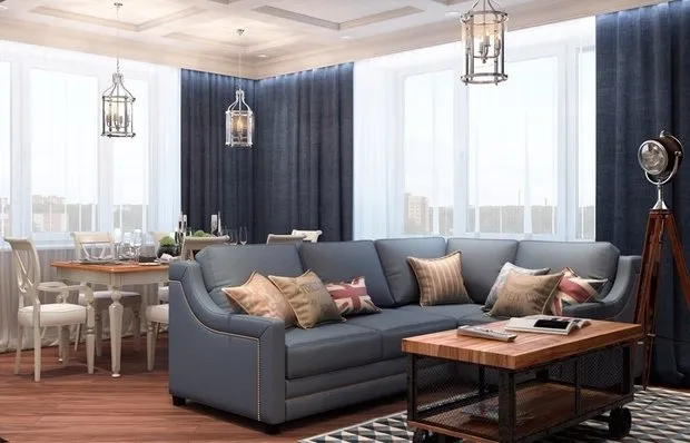
In terms of kitchen textiles, general rules apply: it's preferable to choose fabrics of the same type. Geometric patterns for upholstery are often combined with solid curtains. You can introduce variety by using fabrics of different textures: velvet with satin, fringes or padding. That is, use contrast not in the pattern but in the relief. Below is an example of two patterns: stripes and flowers.
Geometric pattern on covers works well with blinds, and contrasting pattern on cushions makes an accent
Try to do a fabric sample in the already completed interior — when walls, floor, and ceiling are finished, and the cabinet is installed. That is, curtains, chairs with upholstery, carpets, tablecloths are chosen last, after the design of the light kitchen is fully developed.
See how the fabric plays, its texture and pattern in the given lighting and how it combines with other colors. You may need to plan an additional light fixture or choose brighter lamps. Although in the store, it seemed that the fabric suited perfectly.
Don't hesitate to refuse unusual decor: chalkboards, magnetic boards, photo wallpapers, graffiti, stencils. This requires little work and money but greatly enhances the space, adding comfort.
 Color of Walls, Floor, Cabinet: Interconnection and Rules for Selection
Finishing walls, floor, ceiling is at least 60% of the entire room, and if you want a light kitchen, choose pastel colors. Currently, warm tones are in fashion, so a floor with a wooden texture or pattern is an excellent option. White, gray, and beige in all its variations: cream, golden, light gray, milk white. For a classical kitchen in light tones, inactive patterns are welcomed — monochrome remains trendy.
The ceiling should be lighter than the walls and floor: that way, it will seem higher in contrast.
With walls, it's not so straightforward. There are two rules:
If your kitchen is standard and you don't have trouble choosing a cabinet, you can decorate the walls first, then buy furniture.
If it's difficult to choose furniture due to the unusual shape or size of the room, first choose the cabinet and then paint the walls to match the cabinet color.

Below are the optimal color pairs for designing a kitchen in light tones.
Cabinet Color
Wall Color in Light Tones for Kitchen
Beige
Beige, caramel, cappuccino, sandy, white
Dark Beige
White with dark rare pattern
Lavender
Single-toned beige or white
Gray
Beige, other pastel shades. Combination is often used in light classic kitchens
Green
Beige, yellow, orange, if there's a pattern — floral or plant-like. Looks beautiful with white patches and wood imitation.
White
Blue, gray, possible bold pattern or photo wallpaper
Orange
Walls play the role of background — gray, pale green, white with orange pattern
Ocher
Bone color, gray, cream
Light Yellow
Golden, sandy, gray-yellow, mustard, ideally — white, blue
Light Blue
White, blue, peach, yellow

All the above pairs work in reverse too: for beige cabinets, light lavender wallpapers would be suitable. There is only one rule: the cabinet should stand out against the wall. Therefore, walls must be lighter.
An important rule in the interior of light kitchens: when beige walls are used, cold fluorescent lighting is not allowed. Beige becomes dull, gloomy, old. Choose lamps with yellow or golden light.
If your light-toned kitchen interior includes furniture with unusual architecture, massive, luxurious, then the walls should be monochrome, subdued, without shine or pattern.
 For Bright Accents: Countertops and Aprons
Apron — that moment when you can show creativity. If you want classicism, there are three templates:
Traditional apron from white tiles, which is good especially for small kitchens in light tones.
Mosaic — all colors that are in the interior should be present in the apron. On one hand, it's an accent and unusual, but on the other, completely safe, not standing out from the overall palette, and doesn't require special attention to color combinations. Suitable for classical-type kitchens in light tones and modern design. Example below on the photo.
Apron in subdued, neutral tones.
If you want a bright spot, designers recommend attaching such an apron not to the wall but to a removable panel. When it gets old or turns out to be an unfortunate choice, it can be replaced.

Countertop — another tempting element that can become an accent. But take into account the apron: if it's already bright and contrasting, better not to overload this area and make the countertop neutral or wood-like.
Choose color based on cabinet color:
White cabinet — countertop in stone or light wood. Dark countertop makes the overall look harsher. This variant is suitable only for spacious kitchens where there's a chance to soften the effect. The photo shows the difference.
Beige cabinet, any pastel tone cabinet — countertop in dark wood (brown, chocolate, pink).
If the countertop is an accent with a neutral apron, it can be made in a matching contrasting color or 2-3 tones brighter than the cabinet color itself.
 Several Tips for Large and Small Kitchens in Light Tones
Using a series of tricks, even with a limited palette of light tones in kitchen design, you can make an unusual interior:
- Highlight individual modules with color: using a color accent, furniture doesn't blend into one solid area and is separated, making the kitchen look organized.
- Don't clutter walls with cabinets and shelves — leave free space.
- For large light kitchens over 20 sq. meters, it's relevant to install large modules: fireplace-type hoods, island cabinets with separate sinks, long shelves.
- Alternate closed cabinets with open shelves.
 Design: Slavayu Yurkova
In a light kitchen, it's easy to create a supporting, main figure. Just highlight it with a contrasting color. For example, in a beige-peach kitchen, place a dining group in pink or orange color — this group becomes the center of the composition. There can be a maximum of 2 main figures in an interior; if there are more, it creates a feeling of disorder.
The main figure is needed for the human eye: it gives a sense of wholeness and calm.
For a small kitchen, in addition to light wallpapers and cabinets, it's relevant to choose glass furniture. For example, a table, cabinet doors, shelves. This visually lightens the design and doesn't create a feeling of clutter. Chairs can be chosen with metal thin legs or made from lightweight plastic.
 Useful Tips
Litris Aismen in her book "The Dao of Color" writes: "Color is the only important element in design that reflects mood and style. Color surrounds us and defines our world." You decide which color defines your world. Pastel tones are not only white or beige. It's the entire palette, but quieter, like classical music, which is harder to play and understand. A light kitchen is an excellent way to know yourself better.


 Design: Nikolay Barsukov
 Design: CO:interior

 Typical Swedish Cottage


 Design: Yulia Kharitonova and Natalia Maslova, bureau 3L Decor


More details about choosing wall color and kitchen design rules can be found in the video below.
Need a renovation specialist?
Find verified professionals for any repair or construction job. Post your request and get offers from local experts.
You may also like
More articles:
 Electrical Wiring: When to Install and How?
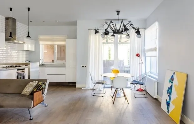 Quick Wall Leveling: 6 Pro Design Hacks
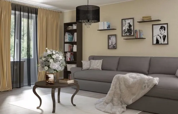 Updating Interior for Winter
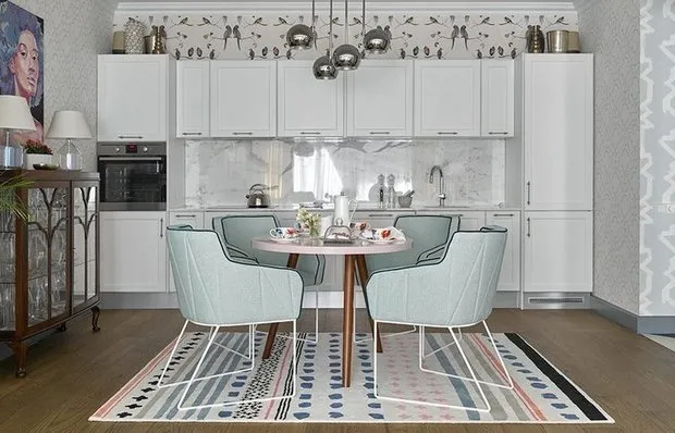 Kitchen Tables and Chairs with Photos
 New Year IKEA: 10 New Items for Holiday Atmosphere
 Black and White Living Room Interior
 Ceiling Design in Living Room with Photos
 6 Cool Things Designers Made Using a 3D Printer