Most Trendy Season Colors According to Pantone: Examples Explained
Among Pantone's favorites are the traditional autumn warm color palette, as well as blue and dark blue, gray, and brown shades. The charm lies in the fact that experts not only tell about fashionable colors but also provide examples of how to combine them.
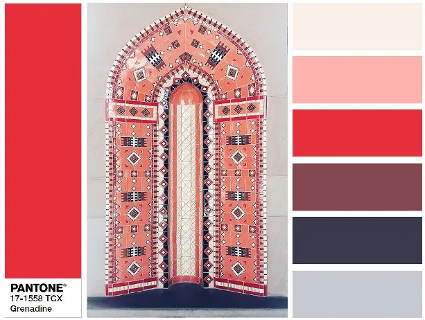
1. Grenadine: Pantone 17-1558 Grenadine
Experts promise that the pomegranate red, which will be at its peak popularity this autumn, can be found in all salons and collections of all brands. It always attracts attention, is dynamic and energetic, so be cautious – it should be used in moderation.
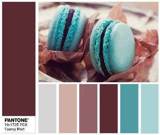
2. Tawny Port: Pantone 19-1725 Tawny Port
The name of the color indeed comes from the port wine variety, which changes color from wine to reddish-brown after several years of barrel aging. This complex shade is a sign of nobility and good taste, so Pantone experts recommend paying attention to it and purchasing a few items for interior design.
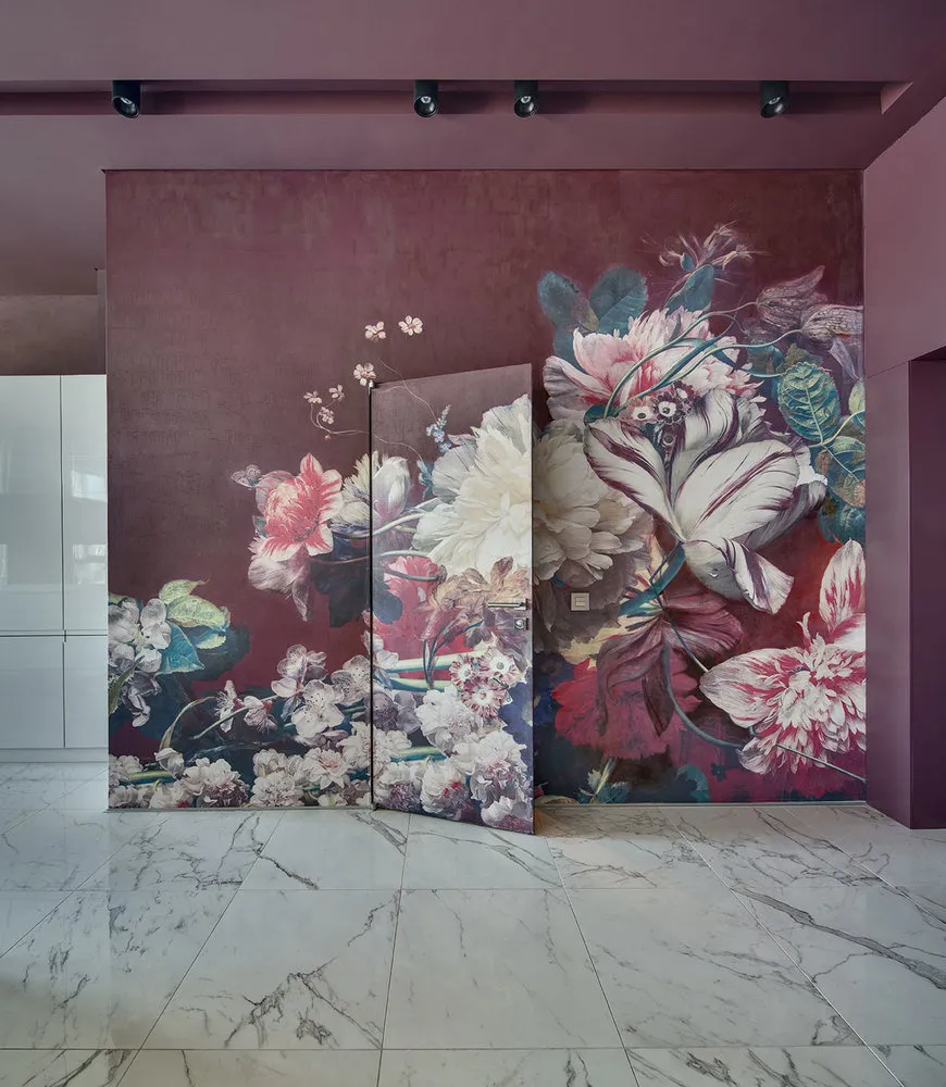 Design: Nika Vorotynetsva
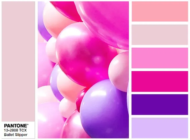
3. Ballet Slipper: Pantone 13-2808 Ballet Slipper
Pink is consistently featured in fashion catalogs, and designers actively use it from season to season. However, the light and cool shade of 'Ballet Slipper' is gentler and more refined than its palette companions. This tone, a mix of lilac, white, and beige, can be used as an interior base.
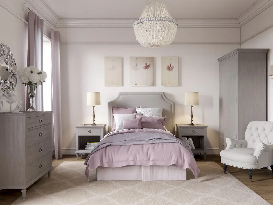 Design: Alexander Akimenkov Studio
4. Butterum: Pantone 16-1341 Butterum
The trend for natural and earthy tones continues, so beige remains at the peak of popularity. This truly autumnal, cozy, and warming shade with a reddish-brown undertone can also serve as an interior base.
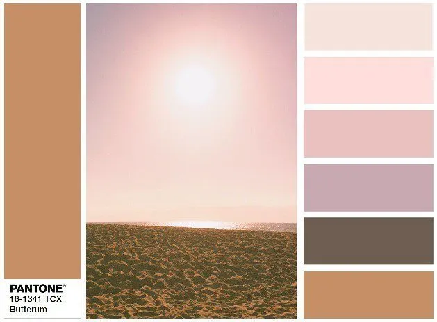
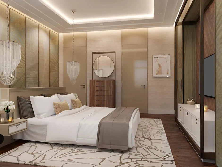 Design: FullHouseDesign
5. Navy Peony: Pantone 19-4029 Navy Peony
A calm and classic dark blue shade has become the key in the autumn-winter season. It is called multi-dimensional because its characteristics change depending on how it's used. Navy Peony pairs well with almost any color – from grenadine to lime green. It makes a perfect alternative to black – just as neutral and basic. But use it as an interior base, and you'll achieve a vibrant and bold design.
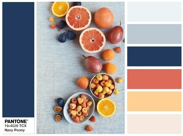
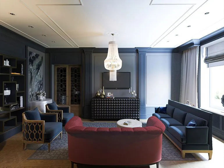 Design: Maria Nechaeva
6. Neutral Gray: Pantone 17-4402 Neutral Gray
Another result of the trend toward neutrality and naturalness is the Neutral Gray. It is versatile and suitable for any situation or style. This tone can serve as a base for a cozy interior or a backdrop for ultra-modern design, provided there are bright additional details.
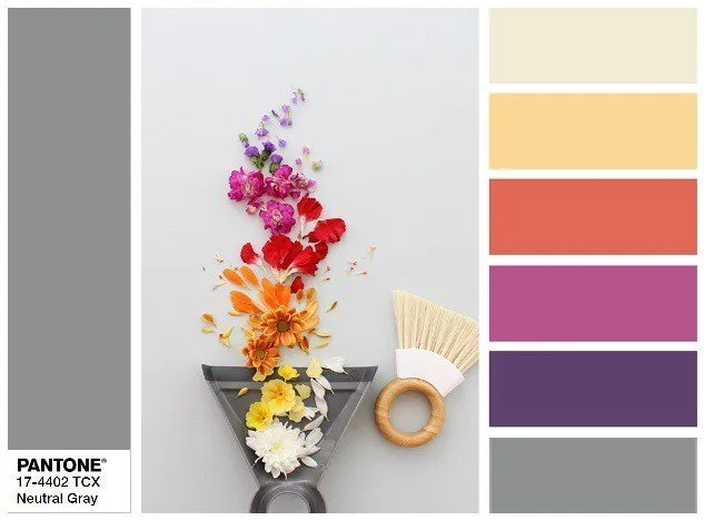
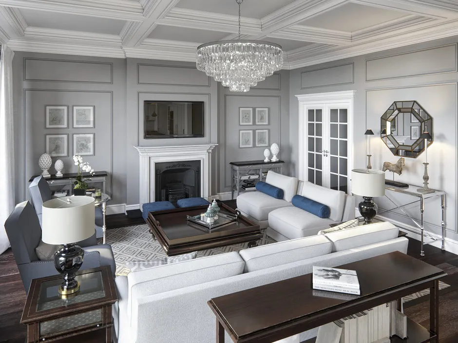 Design: Alexander Akimenkov Studio
7. Shaded Spruce: Pantone 19-4524 Shaded Spruce
If the previous season featured vibrant Greenery, this one sees a more serene shade of blue-green dominate. According to Pantone experts, it represents the tranquility and silence of a forest evening. Deep, rich, noble tone evokes the ocean depths. It soothes designers so much that they don't even fear using it in monochromatic ensembles.
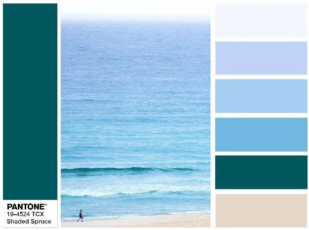
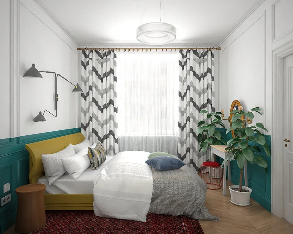 Design: Natalia Patrushova
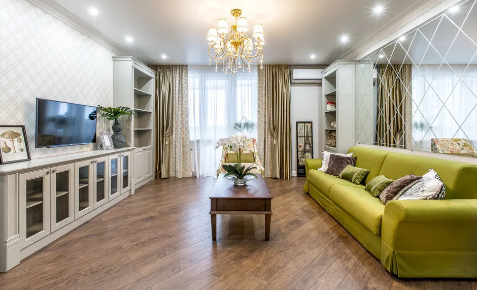
8. Golden Lime: Pantone 16-0543 Golden Lime
One of the most unusual shades in Pantone's fashion collection migrated from the spring-summer season. But now it’s more restrained, showcasing the mood of a real golden autumn. Golden Lime is indispensable for bright accents!
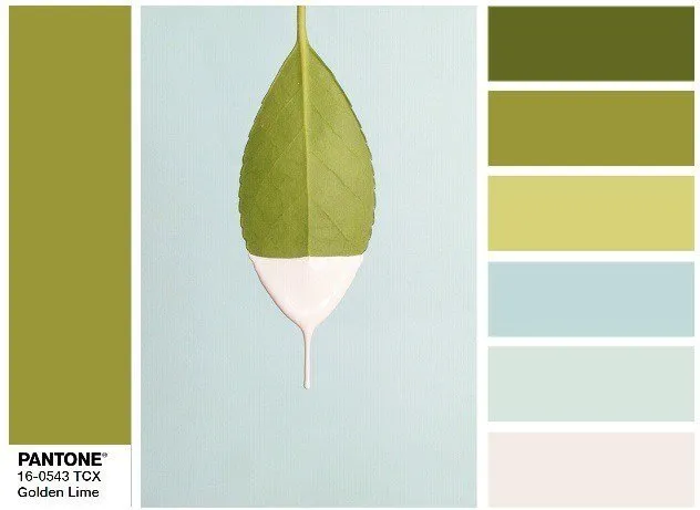 Design: Artek Design Studio
9. Marina: Pantone 17-4041 Marina
Against the backdrop of basic, neutral, and calm tones, vibrant blue has become the most anticipated color of the season. The only cool color in the fashion palette, experts suggest combining it with white and ivory, beige and gray, even all shades of red! The composition will be just as bright, fresh, and elegant.
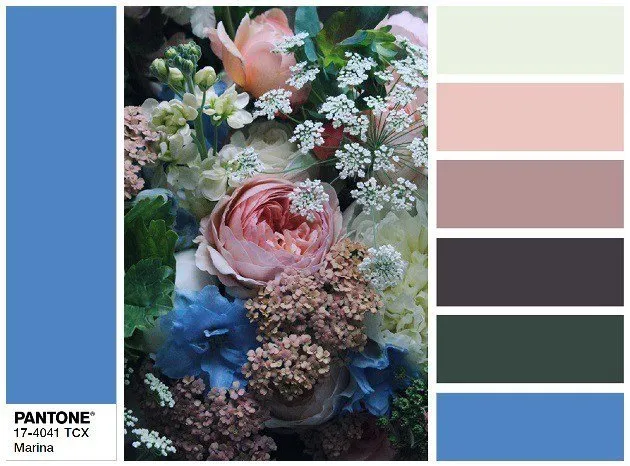
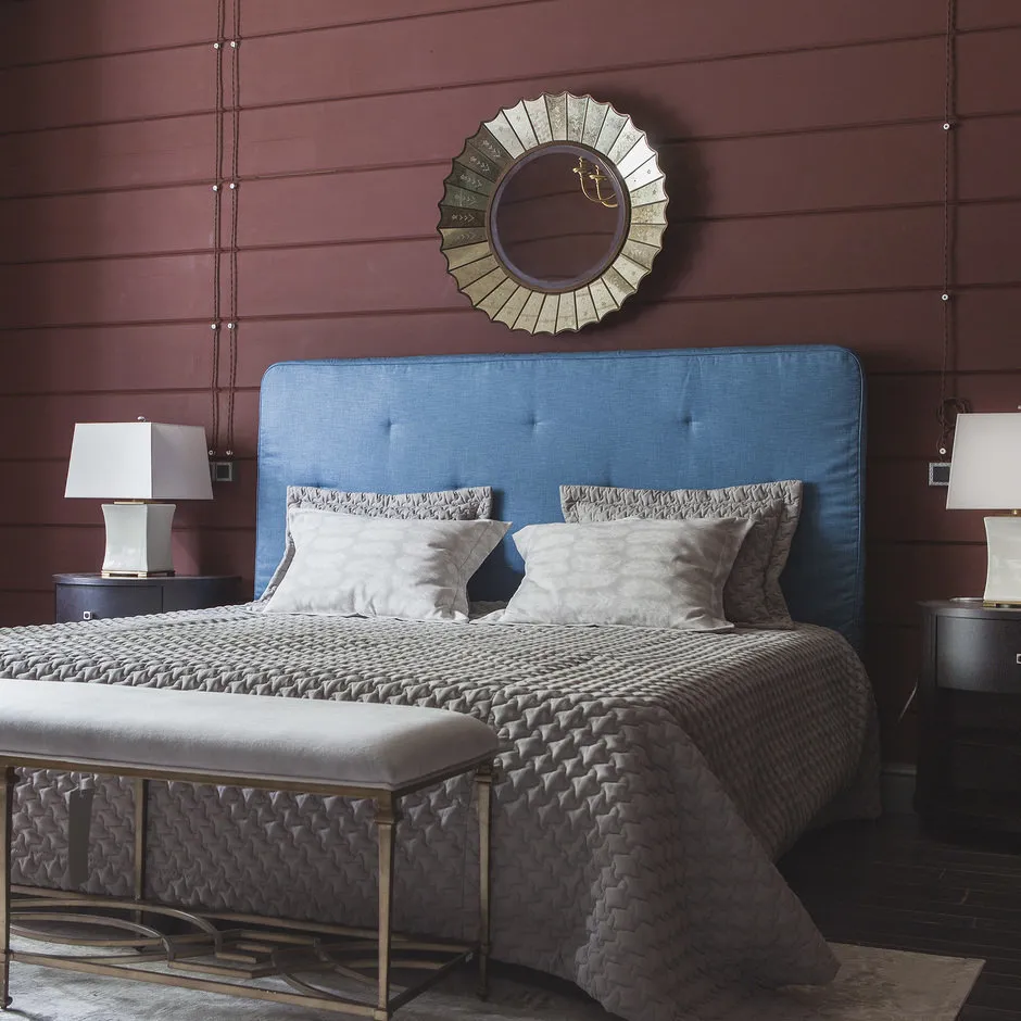 Design: Prosperity Studio
10. Autumn Maple: Pantone 17-1145 Autumn Maple
One of the most autumnal in the presented palette – the color of the autumn maple leaf, Autumn Maple. It is indispensable for creating an atmosphere of warmth and coziness. Bright reddish details with a rust tone will look great against neutral gray or blue.
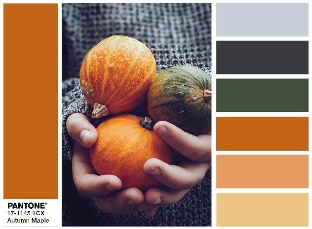
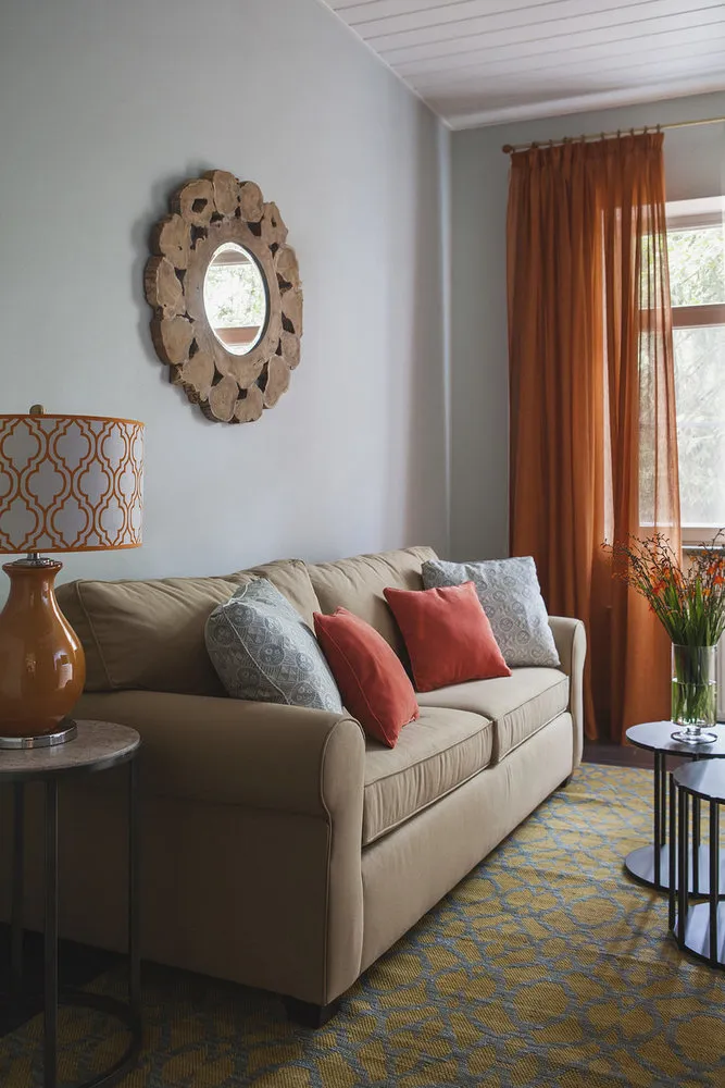 Design: Prosperity Studio
Also read:
- How to Create an Eco-Friendly Interior: Fashionable Ideas
- Following iSaloni 2017, or 10 New Arrivals from Fashion Designers
- From Old Brick to Graffiti: 5 Ideas for Fashionable Wall Treatments
Need a renovation specialist?
Find verified professionals for any repair or construction job. Post your request and get offers from local experts.
You may also like
More articles:
 Beautiful Kitchens
 Kitchen Countertops
 Modern Kitchen Design
 Modern Kitchen Design with Photos
 Interior Design for Private Houses with Photos
 How to Decorate a Small Kitchen: 15 Ideas from Designers
 How to Update the Interior of a Country House Without Spending Too Much Money
 How to Design a TV Zone in a Standard Apartment: 6 Examples