7 Stereotypes in Interior Design to Give Up
If you stick to old rules in everything, you'll never discover new ones. White floors, dark walls, mixing styles – all of this is not as bad as commonly believed, according to designers at BeInDesign studio
When decorating an interior, we often give up our chosen design or finishing materials because "it goes against the rules." Sometimes it's not easy to figure out where these so-called "rules" come from and why they're followed. Designers at BeInDesign reviewed 7 of the most common stereotypes and concluded that holding onto them is not necessary.
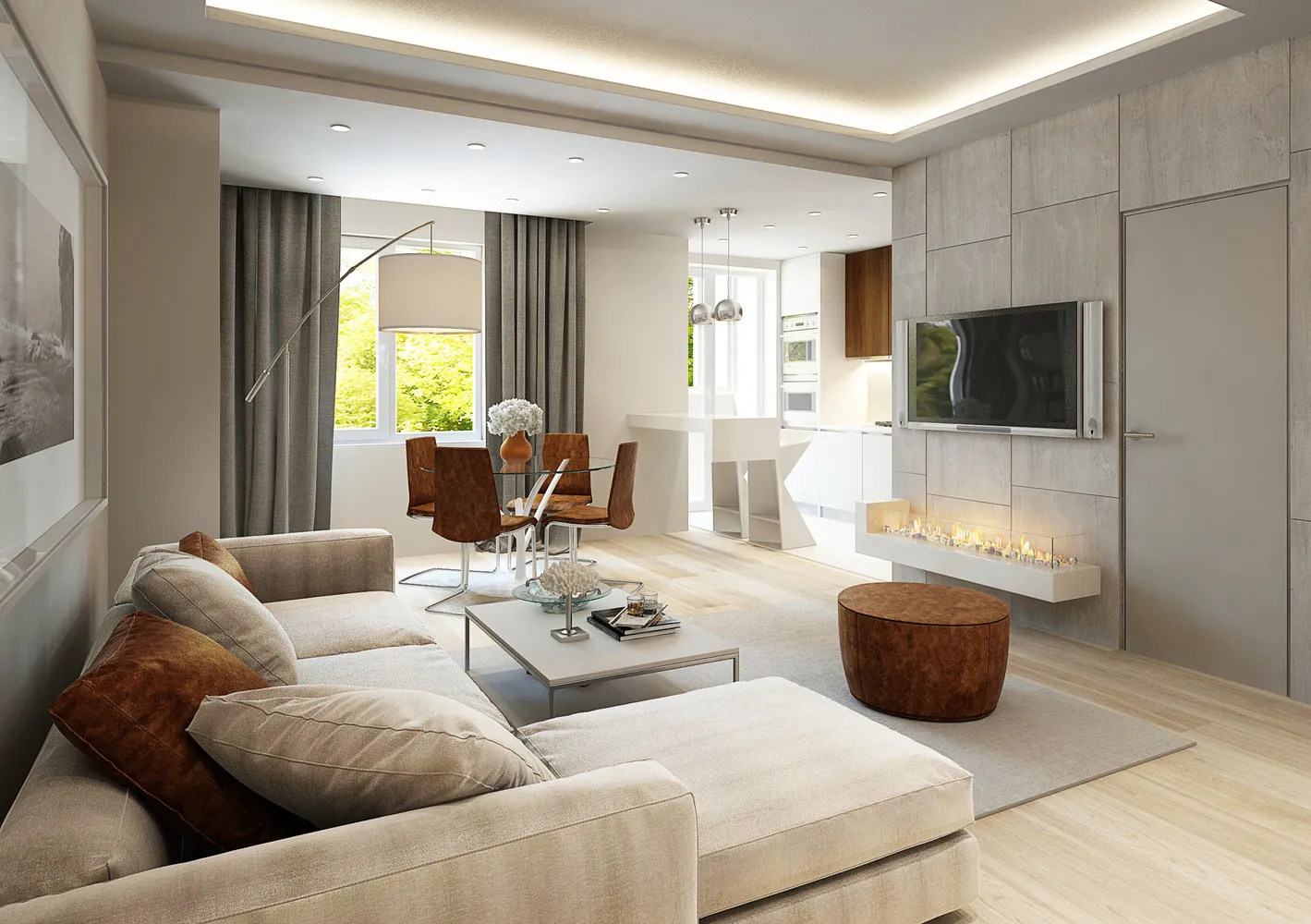
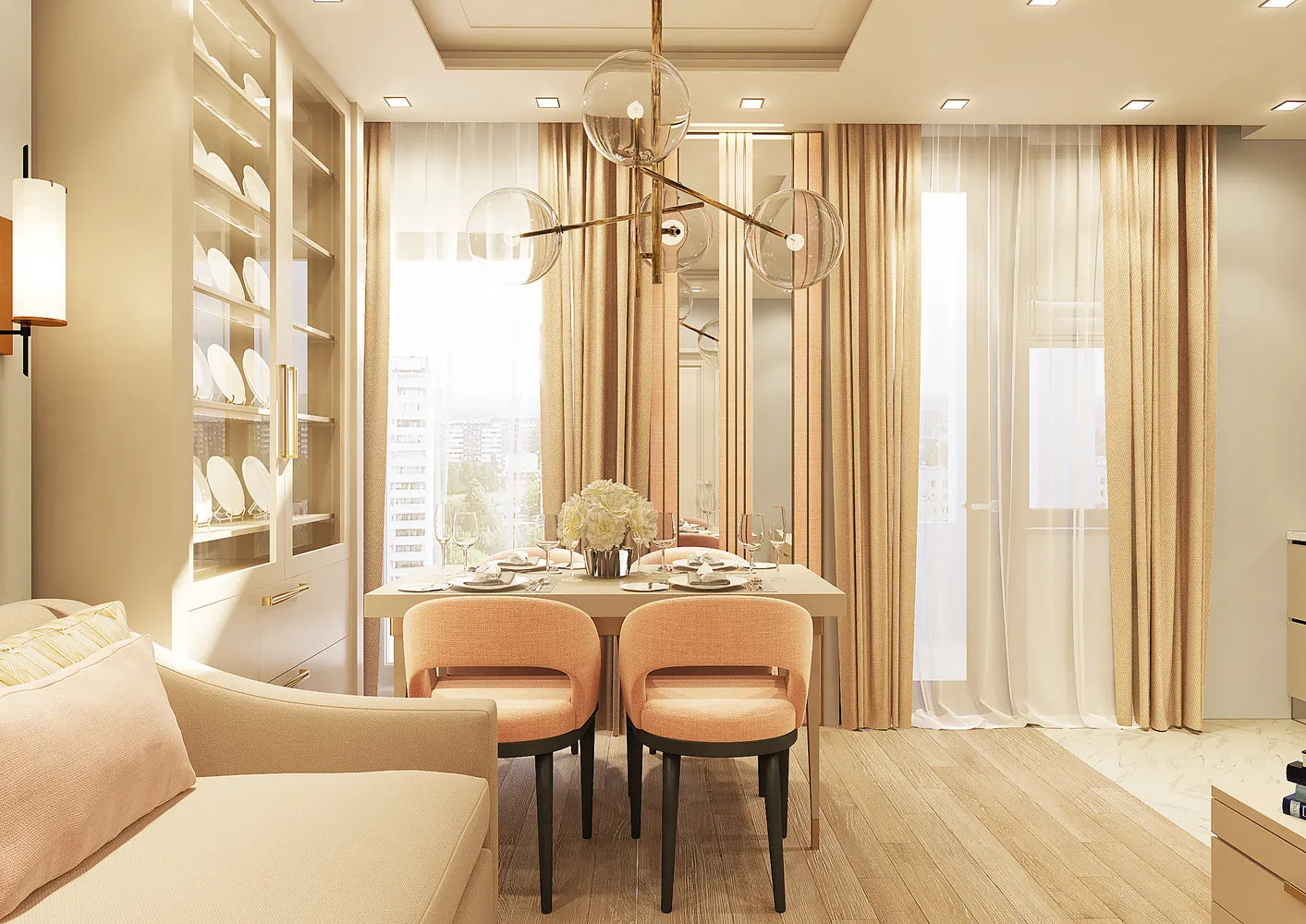
 BeInDesign – creative studio in design, decoration and architecture specializing in designing and creating interiors for private and public spaces. 1. White floors – not practical
It is commonly believed that light flooring is too delicate, and it's better to choose dark floors. But this is a mistaken opinion: according to most flat owners who prefer dark flooring, it's on dark floors that every dust particle is visible, thus requiring much more frequent cleaning.
What's the reality? Surprisingly, light flooring in practice is more practical – of course, if we're not talking about a pristine white fluffy carpet. Light floors also have another advantage – they visually expand and lighten the space, giving it a festive mood.
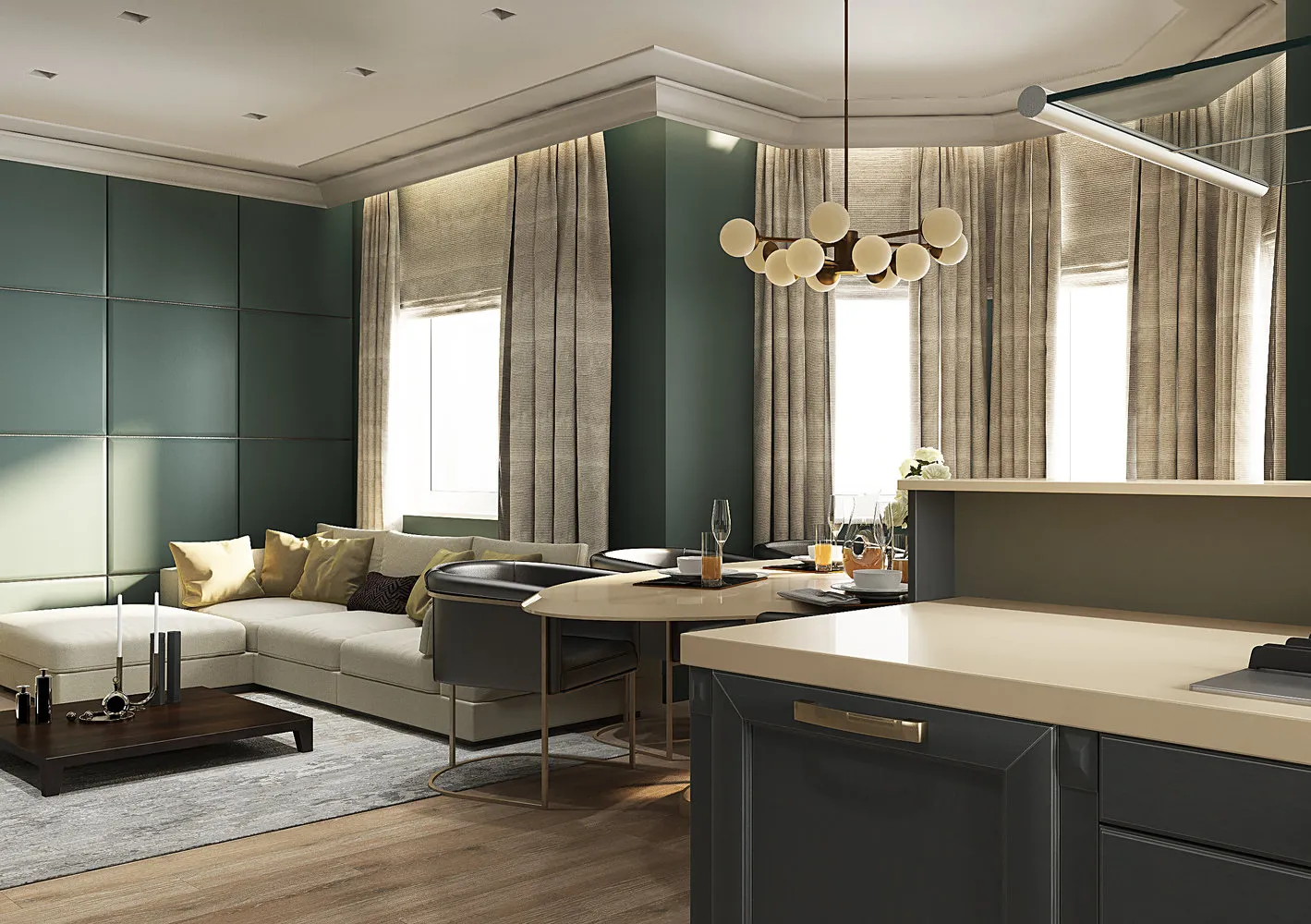
 Design: BeInDesign2. Walls should be light
It is believed that dark walls “press down” and steal space. Making walls dark in a narrow corridor is indeed not the best idea, but in spacious living rooms or studies, such an arrangement won’t spoil anything.
Why? Dark walls make a room warm, adding comfort and intimacy. Shades of dark gray, brown, and purple can completely transform a familiar bedroom, dining room, or study. Bright accessories and plaster decor look great against dark walls, making it interesting to play with light and add point-lit accessories.
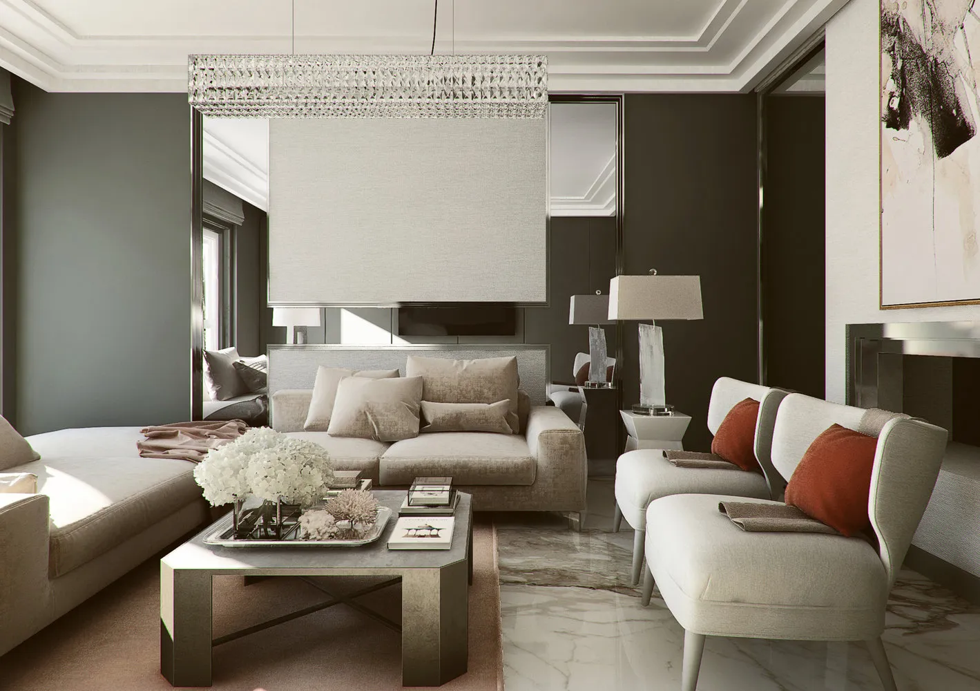
 Design: BeInDesign3. Gray in interior design looks boring
For a long time, gray color was used in office and institutional interiors but was completely unnecessarily avoided in private homes and apartments. It is believed that gray creates a suffocating atmosphere, but that’s not true.
Do you know all the benefits of gray? Besides its practicality, it has many other virtues. With proper color selection and the right balance with other colors, an interior in gray tones will look noble and refined.
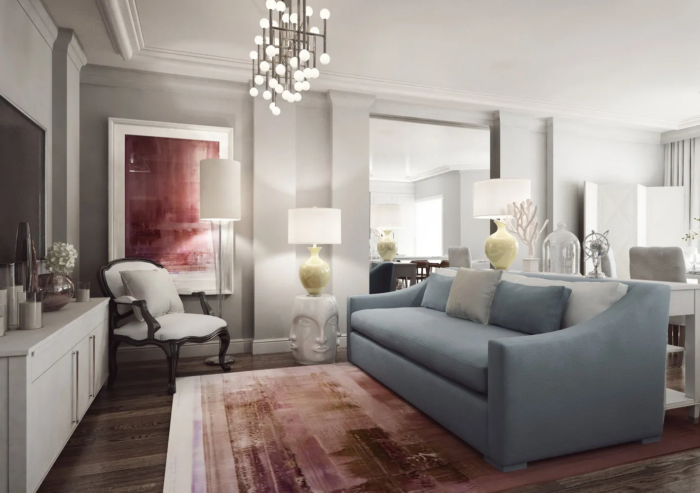
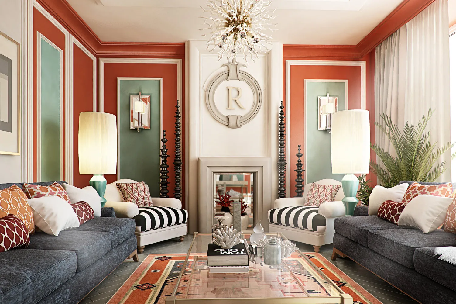
 Design: BeInDesign4. Mixing warm and cool tones is not allowed
Not at all: the belief that a room should stick to one color temperature is no longer relevant. Designers often draw inspiration from nature and borrow various combinations from it, and in nature there is no clear division in this area. Mixing warm and cool tones can look very harmonious, provided you avoid overly bright colors.
 Design: BeInDesign5. A small apartment cannot be comfortable
Overly spacious rooms and stylistically unresolved spaces can create a feeling of coldness and neglect, while a small space with a clearly planned layout will be cozy. The key is to zone the space correctly, avoid over-decorating it, and plan storage systems.
What to aim for? There are many layout solutions and design tricks that can turn a modest-sized apartment into a magical box.
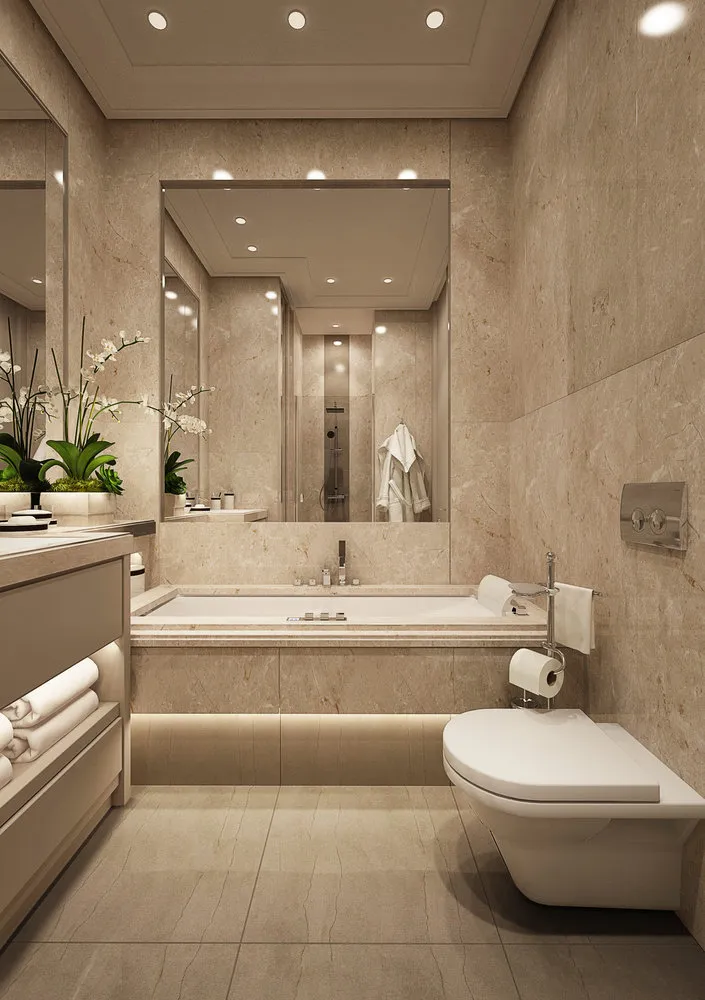
 Design: BeInDesign6. Maritime style – the best solution for a bathroom
The selection of bathroom accessories in maritime themes is very wide, but sadly, the idea itself is far from original. Maritime style can be an interesting option for a living room, kitchen, or study, but such decoration makes the bathroom dull.
What do professionals think? When you see another bathroom decorated with sinks, fish, and anchors, it feels like the creativity was missing in that particular room of the apartment, and the owners chose the “safe path.”
 Design: BeInDesign7. All details in decoration must be in the same style
Not necessarily scrupulously follow a single stylistic approach or color palette. Of course, all elements of an interior should be coordinated with each other, but that doesn’t mean monotony.
In interiors decorated in styles like eclecticism, fusion, or boho, you can find quite bold combinations of furniture and accessories from different styles and eras, which give the interior a special mood and unique appearance.
 Design: BeInDesign
On the cover: BeInDesign studio design project
Need a renovation specialist?
Find verified professionals for any repair or construction job. Post your request and get offers from local experts.
You may also like
More articles:
 6 Most Unusual Christmas Trees
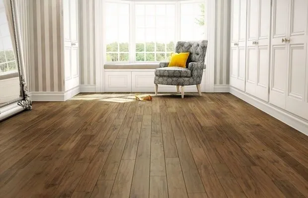 Choosing Floor Covering: Pros and Cons of Different Options
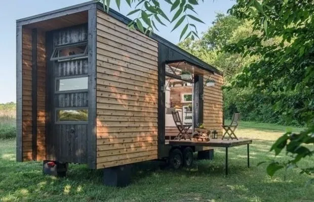 A Home Away From Home: A Cabin in a Van
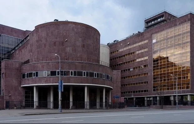 Clear on Architecture: 5 Buildings of the Soviet Avant-Garde Era
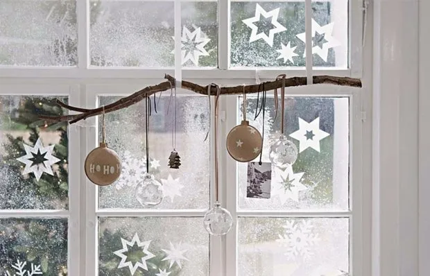 11 Tips on How to Easily Prepare Your Home for the New Year
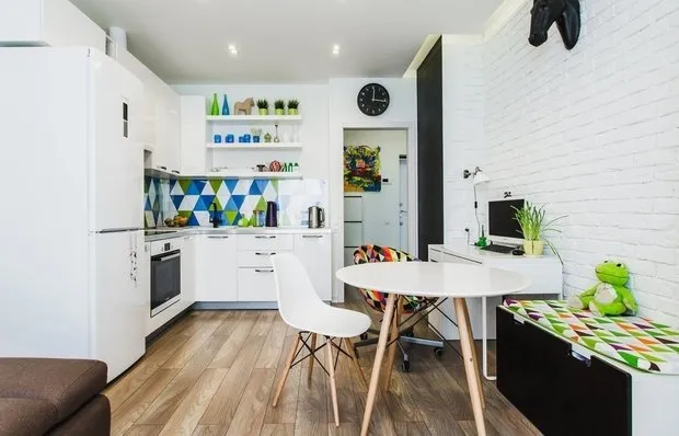 5 Things That Make It Easier to Maintain Order on the Kitchen
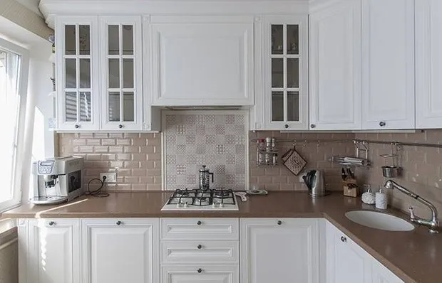 How to Properly Lay Tile for a Kitchen Backsplash
 After Holidays: 10 Ideas for Quick Cleaning