Classic Interior: How to Make It Beautiful and Save Money
Which finishing materials should not be used, why details matter, and how to properly incorporate affordable furniture into the interior – we share our experience of high-quality and budget-friendly renovation
The classic style attracts with antique perfection of forms and love for natural materials. But for most people, classic is an unaffordable ideal because it's better not to cut corners on materials and craftsmen here. But what if resources are limited, but you really want it? We tell you how.
Where You Shouldn't Cut Corners
1. On technical communications. If pipes burst or a short circuit occurs, the repair will be ruined.
2. On the layout project. If it's necessary for the renovation, you can't do without it. The cost of such a document in Moscow is about 20,000 rubles. It's prepared based on the floor plan. If you carry out a reconfiguration at your own risk, you won't be able to legalize it later or will have to pay in court for having a bathroom above a child's neighbor's room.
3. On the design project. A professional designer can suggest solutions that you wouldn't find on your own. For example, a specialist will choose the most convenient layout of engineering connections or extract maximum benefit from every square meter.
Design: Kvartrim
What Won't Fit Into the Interior?
What to definitely avoid – cheap imitations of luxury:
- linoleum «imitating marble» or «parquet»;
- cheap small-format tiles with the same pattern;
- plastic panels «imitating malachite»;
- «vintage» gold and silver in the finish;
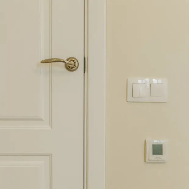
- cheap wallpapers made of foamed vinyl.
These materials don't look expensive. It's better to pay attention to simple details that create the impression of a good renovation: neatly «covered» pipes, thin metal thresholds, metal corners instead of plastic ones, proper tile laying (from the center) with double-sided cutting.
Design: Kvartrim
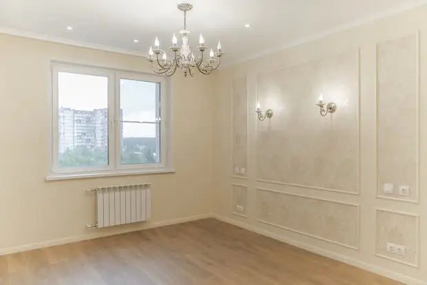
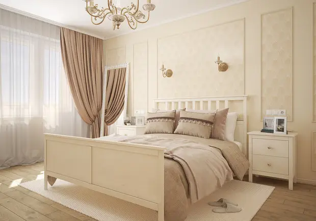
What Elements Work?
In modern classic style, it's important to convey harmony and smoothness of forms instead of pompous grandeur. Therefore, arches and luxurious columns should give way to elegant details:
- panelling on doors and kitchen cabinet doors, wardrobes;
- tall moldings and frames that enhance the space;
- decorative moldings that neatly frame windows, doors or room zones;
- geometrically perfect forms of sockets, sanitary fixtures;
- chandeliers and lights with solid suspensions or crystal candelabras.
Design: Kvartrim
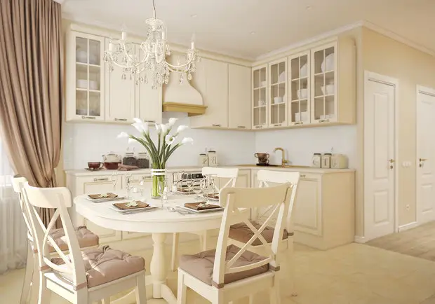
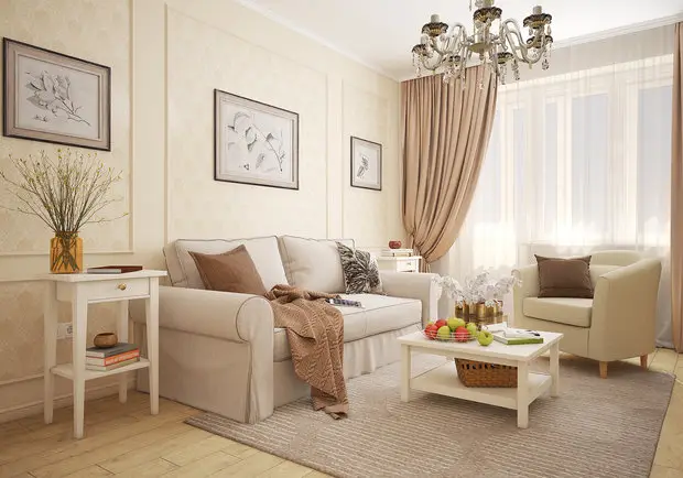
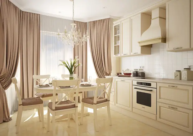
How to Choose Color and Texture?
Coziness in a classic interior is supported by color. This is an expressive and inexpensive decorative technique. A neutral background in familiar light tones (white, gray-beige, gray) «plays well» with any color. But darker grays, all the way to black, are just as expressive.
Add bright decorative elements to a neutral interior: textiles, cushions, curtains, rugs. Color combinations can be guided by special programs with color palettes.
The absence of complex forms is compensated by a variety of textures. These can be glossy surfaces (marble, tiles, glass, acrylic, lacquer, chrome, steel), as well as matte (wood, natural fabrics in solid colors or with a subtle pattern, stone). It's important to maintain harmony in both the finishing and furniture and decor selection. A designer's advice is especially helpful here.
Design: Kvartrim
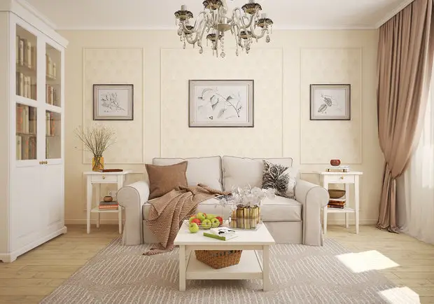
How to Save Money?
1. Avoid complicated ceiling constructions, gypsum arches, and floor covering zoning with curved thresholds. All of this requires expenses but quickly becomes tiresome.
2. If the apartment is from the Stalinist era and the parquet on the floor is still in good condition, leave it, sanding and coating with lacquer. Or lay laminate with a board pattern instead.
A good affordable option is natural pine flooring, which you'd want to walk on barefoot. The lower the quality of the boards, the more textured the floor will be: more knots and color variations. Another option is to «elevate» pine by tinting it to match valuable species: palisander, walnut.
3. Choose doors without excessive decoration (especially with patina and gold) and glass inserts. A smooth panel or small panelling looks better than pseudodesigner ideas.
Design: Kvartrim
4. Don't cover all walls with identical wallpapers, especially those with a large pattern or embossing. Better to make accents: place designer inserts on smooth monochrome wallpapers, like posters. Or wallpaper one wall with quality paper and make an accent there.
5. For bathroom tiling from floor to ceiling, a monochrome inexpensive tile without pattern will do. Decorate it with quality mosaic that requires only 1–2 meters, so it won't cost much.
6. Another option is to lay tiles only up to the middle of the wall. Modern waterproof paints will protect walls just as well as tiles.
7. For a classic interior, it's not necessary to buy expensive furniture. A nice look can also be achieved with affordable collections if you place them against a wall of the same color, rather than in contrast to it.
Design: Kvartrim
Need a renovation specialist?
Find verified professionals for any repair or construction job. Post your request and get offers from local experts.
You may also like
More articles:
 Summer Season Garden: How to Furnish a Wooden Cabin with a Summer Terrace
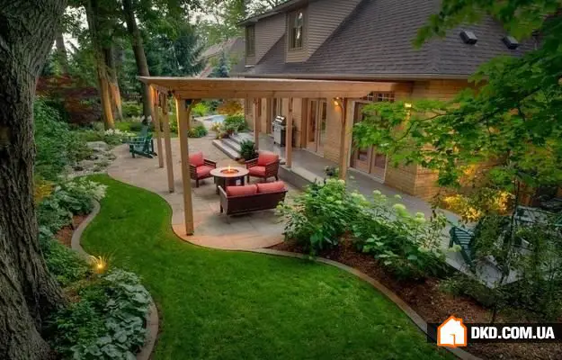 Preparing Your Garden Plot for the New Season: 7 Simple Steps
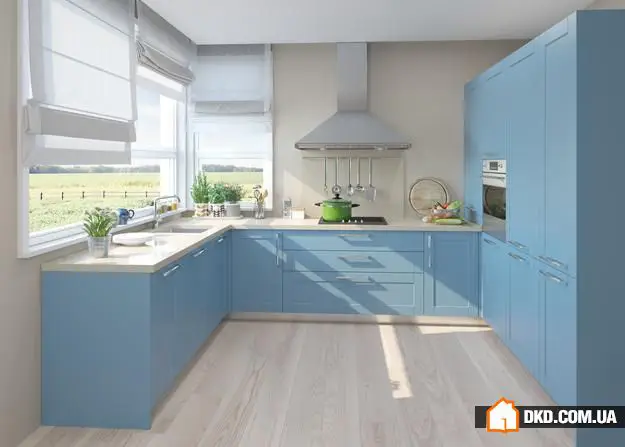 7 Signs of Coziness: Check Your Interior
 Should You Install a Multi-Level Ceiling in Your Apartment: Pros and Cons
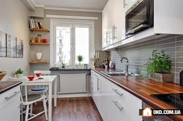 4 Layout Options for a Narrow Rectangular Kitchen
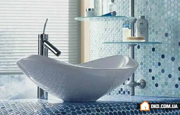 Choosing a Sink for the Bathroom: 7 Options from Different Materials
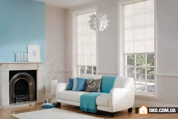 Without Curtains: 10 Original Ideas for Window Decoration
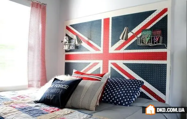 Ideal Bedroom Design: Tips from Professionals