Orange Tone Variations for Interior
Combining red and yellow gives you orange. By adjusting the proportions, you can create dozens of different shades to make your home shine! The original, energetic and warm orange color reveals the full palette of fire for vibrant decoration.
1. Orange
 Pinterest
This IS the TRUE orange shade by definition, the one that perfectly balances yellow and red amounts. It is also the warmest color in the palette, as it serves as a transition between two warm colors, while yellow transitions to green and red to blue, the two cool tones!
2. Apricot
 PinterestLet's be honest, it is often impossible to distinguish the difference between orange and apricot shades. Apricot is less vibrant with an additional note of red, so it's slightly sweeter. Either way, it is warm and dynamic for a sunny decoration!
3. Aurora Orange
 Pinterest
As a warning, aurora orange doesn't look like an orange but belongs to its shade family. It is an orange-yellow color that depending on intensity can sometimes be associated with pink or yellow tones and has no equal in creating a sunrise inside the room.
4. Coral Orange
 Pinterest
In the coral family there are red, pink and orange shades. Coral orange paint is vividly almost pink-orange, cheerful and light, which we love to combine with blue or sandy beige for a marine atmosphere.
5. Salmon Orange
 Pinterest
Soft and velvety, salmon shade is an orange color that's easy to accept, without electrifying the interior. It retains all the warmth of orange color, with a hint of pink and white. The result is a gentle, cozy and warm tone that never causes eye discomfort!
6. Cantaloupe Orange
 Pinterest
Expecting a bright orange color, and suddenly… Cantaloupe orange is more balanced in yellow, slightly shifted, almost closer to ginger yellow than orange! But since it's softer, it pairs beautifully with white and why not black.
7. Fired Orange
 Pinterest
Though also bronze, fired orange is lighter and brighter than russet but more restrained than classic orange. Loved in fashion and decor, it allows accepting the orange color in a softened version, to enjoy its warmth without overdoing it.
8. Sun-Kissed Orange
 Pinterest
Less vibrant than fired orange, less red than red and darker than copper, sun-kissed orange approaches the chestnut family with its warm and deep shade. It pairs well with the entire white palette but can also be used with other warm tones.
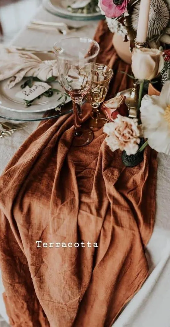
9. Maltese Orange
 Pinterest
Everything in the name, this orange shade gets its color from Maltese orange flesh, half-bloods. It is a polished orange shade close to terracotta, so it approaches terracotta and works perfectly in Mediterranean interiors.
Need a renovation specialist?
Find verified professionals for any repair or construction job. Post your request and get offers from local experts.
You may also like
More articles:
 Rustic Roman: Terracotta Bohemian Garlic Tabletop
 Rustic Wall Lamp to Add Charm to Your Home
 SAA House by aste arquitectura in Oliveira de Azemeis, Portugal
 Residential House Sabara by Padovani Arquitetos Associados in Campinas, Brazil
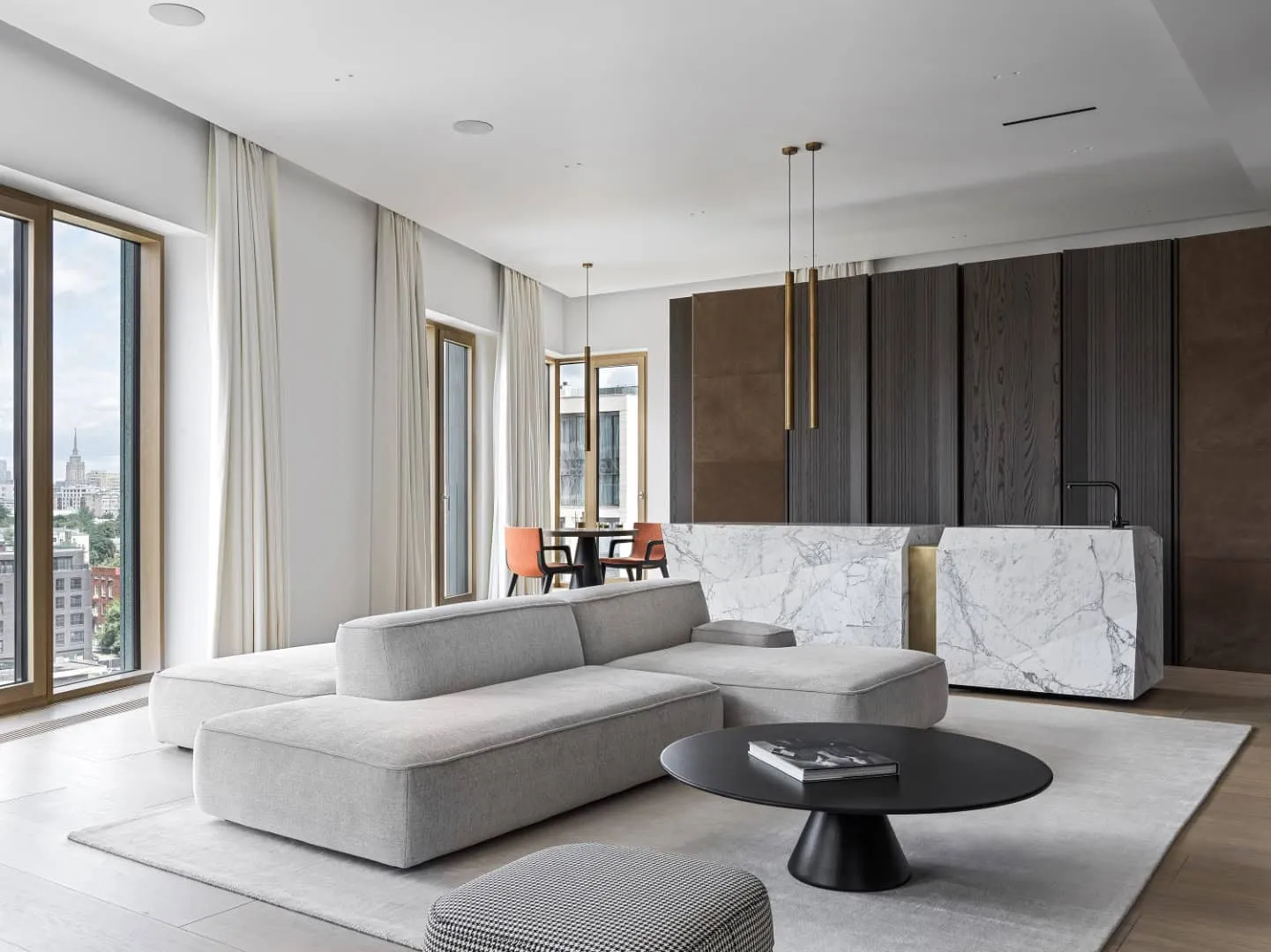 Garden District Apartments by Architects Babayants - Minimalist Luxury Apartment in Moscow
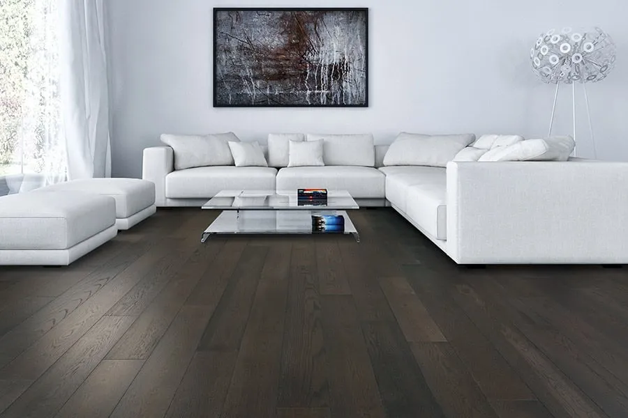 Protecting Your Wooden Floors: Practical Tips for Comprehensive Protection
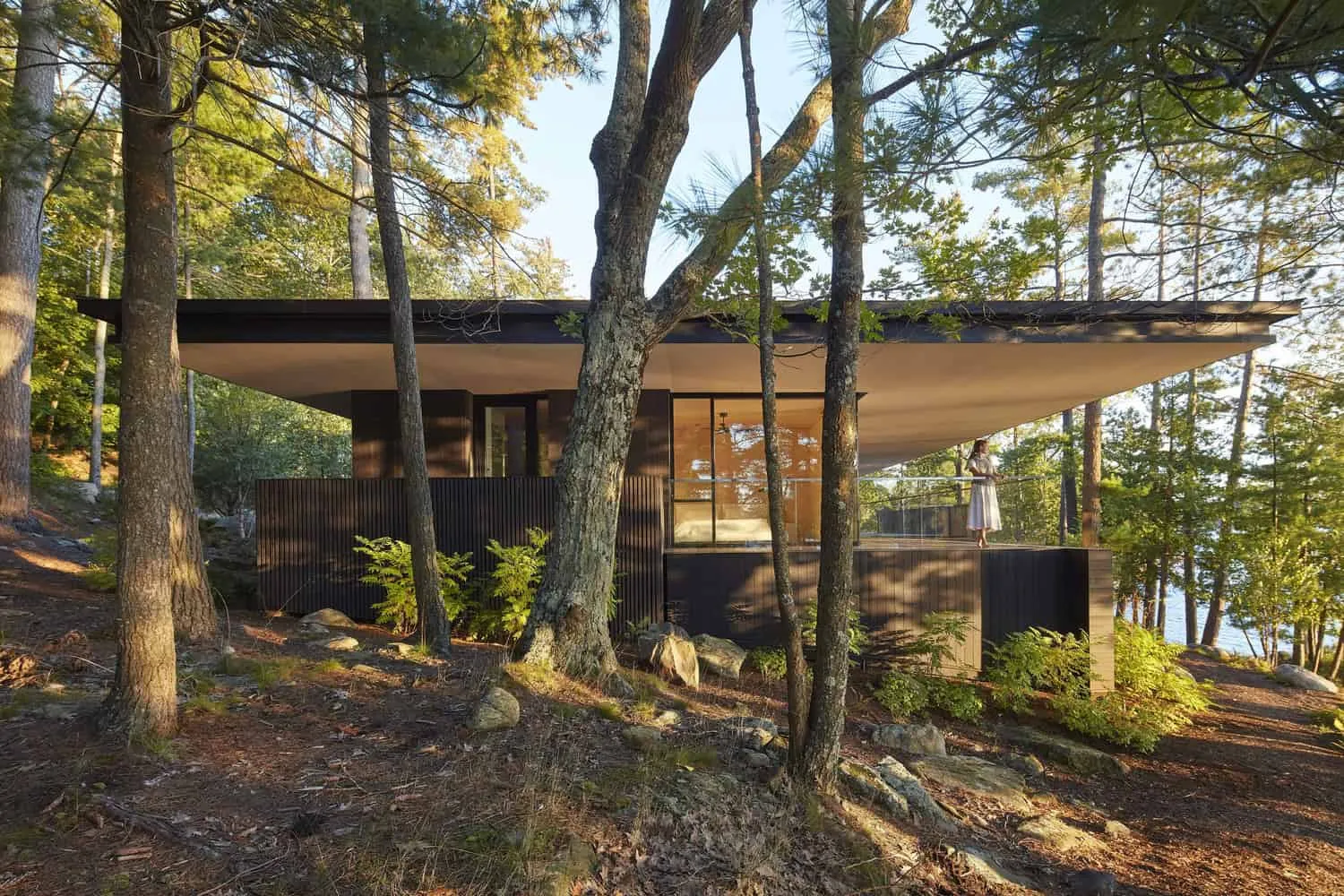 Sagamore North Cottage | Akb Architects | Mask, Canada
 Residential Project Saint-Denis by DREAM: A Model for Urban Renewal