How to Use Red Color in Interior Design with Complementary Tones
Not everyone likes it, but those who try will love it! Yes, decorating with red can be challenging, but with the right color palette, it's possible to create original and creative spaces with character.
 Pinterest
After all, red is everything and more. If you also like the idea of decorating with this color, keep reading us to see tips and ideas for combining colors with red.
Which Colors Go Well With Red
 Pinterest
Red, generally speaking, will always be the dominant color in an interior, even if it appears only in one element.
Neutral colors are the best choice for those who don't want to be too bold or afraid of making mistakes when putting together a decor. But there's no need to stop at them. There is an opportunity to play with other options, as you'll see below:
Red and White
Classic: the combination of red and white, despite being neutral, creates a strong contrast. White brings a sharp contrast to red, enhancing the intensity of the color. Red and white together evoke a sense of energy without overwhelming the space. The duo looks great when used in classic and modern styles.
Red and Gray
Here, the composition of red and gray reflects modernity, sophistication, and balance. Gray tones reduce the intensity of red, offering a softer and more elegant contrast compared to black or white. The two-color combination can be used in any room of the house — from bedroom to living room, through kitchen and bathrooms.
 Pinterest
Red and Beige
A palette of beige tones is also an excellent companion for red. Unlike white, beige creates a less intense contrast with red and even adds a more rural and cozy atmosphere to the space, because beige integrates earthy tones into the palette.
Red and Brown
Red and brown is another option for those who want something nature-inspired, adding a relaxing warm and cozy atmosphere. Brown can be added through natural wood finishes on furniture or elements such as floors or wall panels.
Red and Pink
Red and pink, in turn, form a composition with low contrast but warm, bright, and certainly more passionate and intense. This happens because both pink and red are symbols of love and passion. It's worth paying attention to this pair in bedrooms as well as social areas such as the living room and even outdoors.
One of the coolest ways to ensure red dominates in an interior is to make it a focal point. That means it will attract the eye.
For this tip: keep your surroundings in neutral tones and add red as one powerful element. This could be a sofa, chair, table or chairs in the dining room.
Need a renovation specialist?
Find verified professionals for any repair or construction job. Post your request and get offers from local experts.
You may also like
More articles:
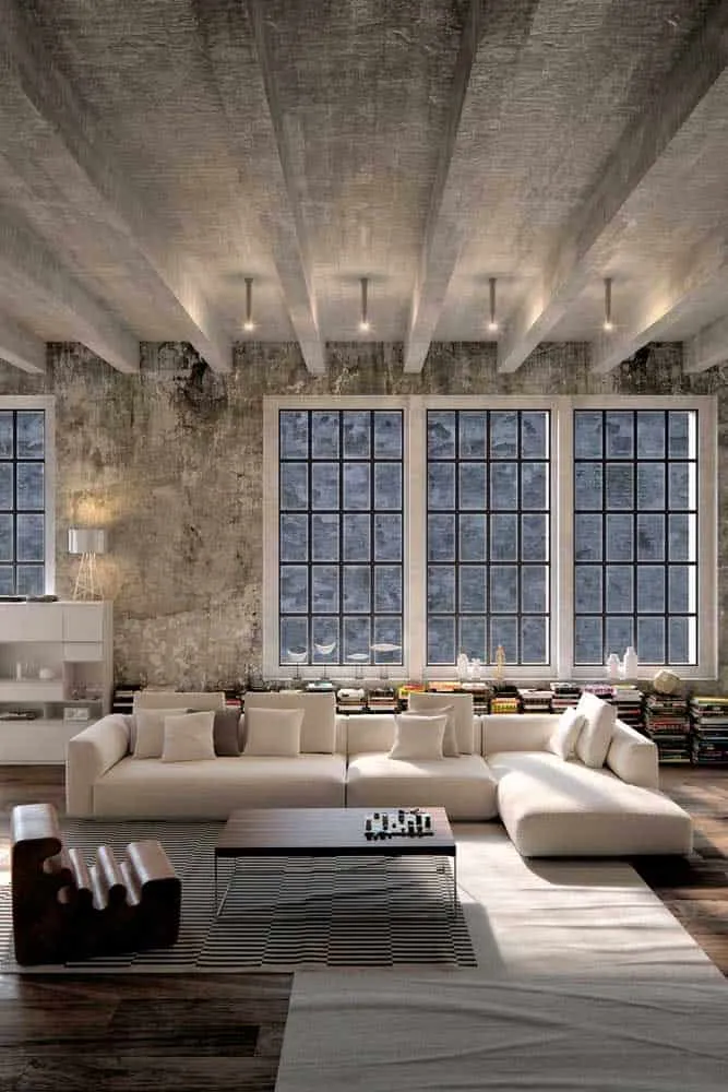 How to Perfectly Decorate an Industrial Loft
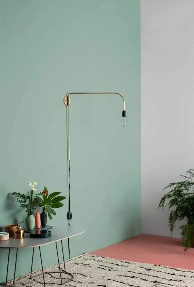 How to Properly Combine Mint Green Color in Interior Design
 How to Choose the Best Solar Generator for Home Use
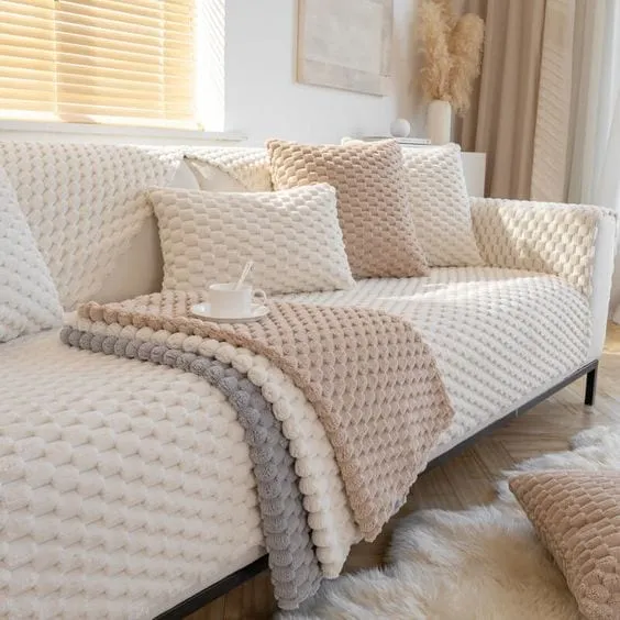 How to Choose the Perfect Sofa Cover
 How to Plan Solar Energy When Building a New House
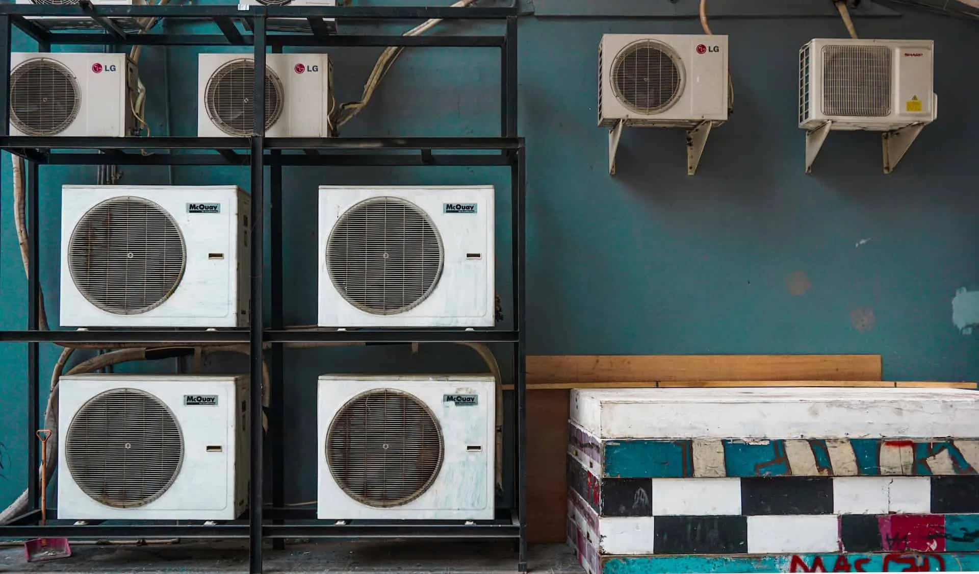 How to Plan the Installation of Heating and Cooling Systems in a New House: Guide
 How to Plan the Renovation of Commercial Office Space
 How to Set the Right Price for Unique Rental Property