A Brief Guide to Color and the Psychology of Spatial Perception for Interior Painters
Decorators and interior designers know well that color plays a vital role in how the mood of a room is perceived and can have a deep impact. Warm colors evoke feelings of alertness and stimulation, whereas cool tones are associated with calmness and relaxation.
But did you know that colors can also alter your perception of the distance between surfaces? In other words, you can make a room appear larger or smaller simply by choosing the right paint color. Home renovation and decoration have gained tremendous popularity, and along with it has come a fascination for using color as a way to "trick" the eye. There is a classic technique you may have heard of: painting the back wall of a long, narrow hallway in a darker color than the side walls. Why? To eliminate the feeling of an endless corridor and make the space more balanced. Smart, isn't it?
Architects agree that the brightness of surfaces in a room—walls defining space, as well as surrounding surfaces—influences how we perceive the size of that space. Simply put, lighter walls make a room feel bigger, and this effect is even stronger when there's a significant difference in brightness between the main walls and surrounding surfaces. The greater the contrast, the more noticeable the effect.

Light ceilings appear more open
As an interior painting expert on the Gold Coast, most of my work involves residential interior finishes and is typically done using white paint—currently 2025. However, my clients often choose the exact same shade of white for ceilings as they do for walls. Yet there are many different shades of white available on the market. Take, for example, Dulux's color palette:
Among cool whites, differences may seem minimal at first glance, but I always recommend clients use the brightest possible white ceiling to truly expand a room. But with one caveat: bright whites work well in modern interiors, but in more traditional homes I tend to choose a slightly warmer tone to avoid a clinical look.

Why does this happen?
It is believed that darker colors on certain walls can visually 'pull' them toward the viewer, reducing perceived distance and using contrasts—such as a brighter ceiling compared to walls. As a result, the eyes are drawn upward, expanding vertical space.
An excellent study on this topic
A significant study titled "The Role of Color in the Design of Residential Interior Spaces" primarily focuses on how color affects mood, but also found that: "using lighter colors on walls and ceilings creates an illusion of spaciousness, making small rooms feel more open".
So next time you're choosing paint, think not only about appearance: consider also the atmosphere and size of the room you want to create. If you're unsure, don't hesitate to seek professional advice—sometimes expert guidance can transform a narrow space into a cozy haven.
Need a renovation specialist?
Find verified professionals for any repair or construction job. Post your request and get offers from local experts.
You may also like
More articles:
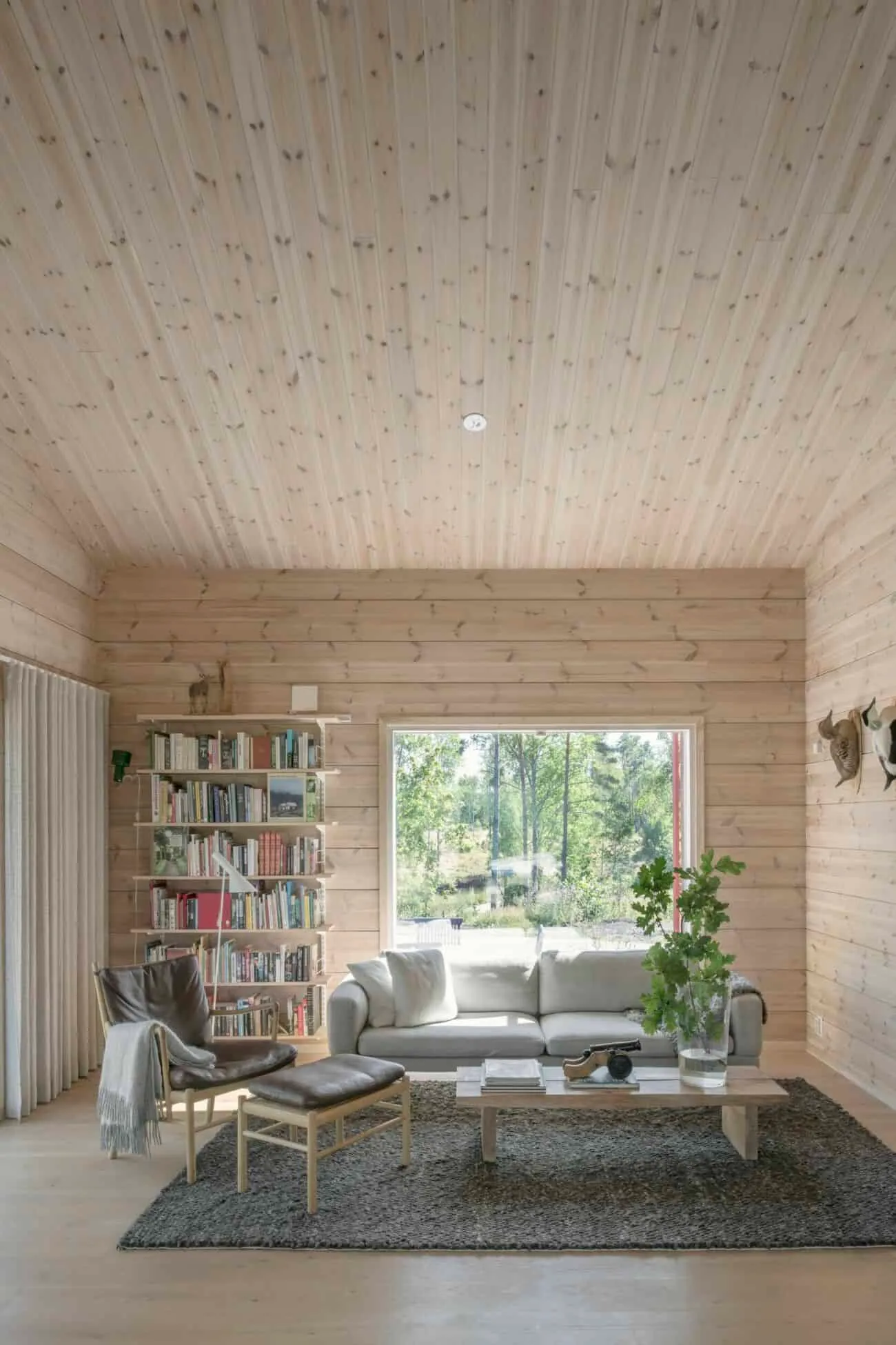 Finland Wooden Home Decoration in the Best Style
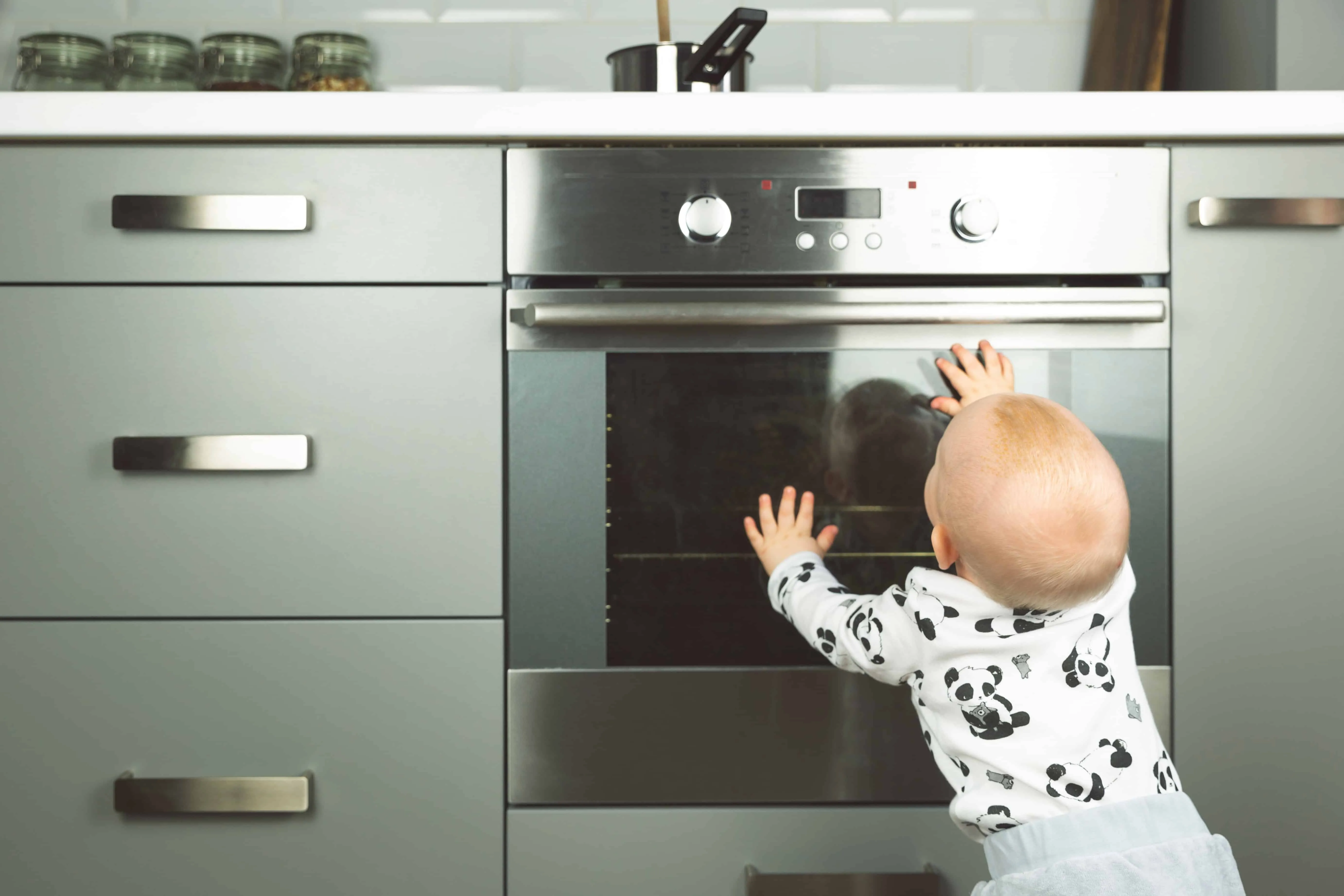 Parent's Guide to Home Safety for New Parents
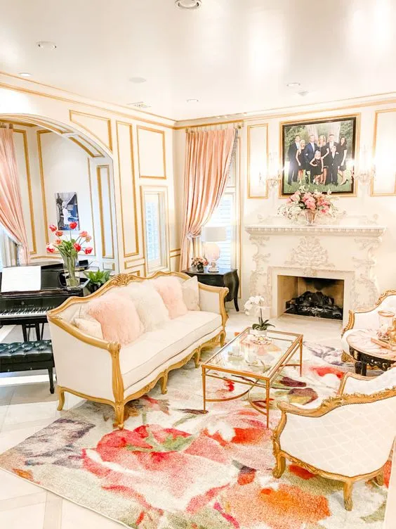 Floral Carpet in the House — A New Idea Worth Considering for Your Home
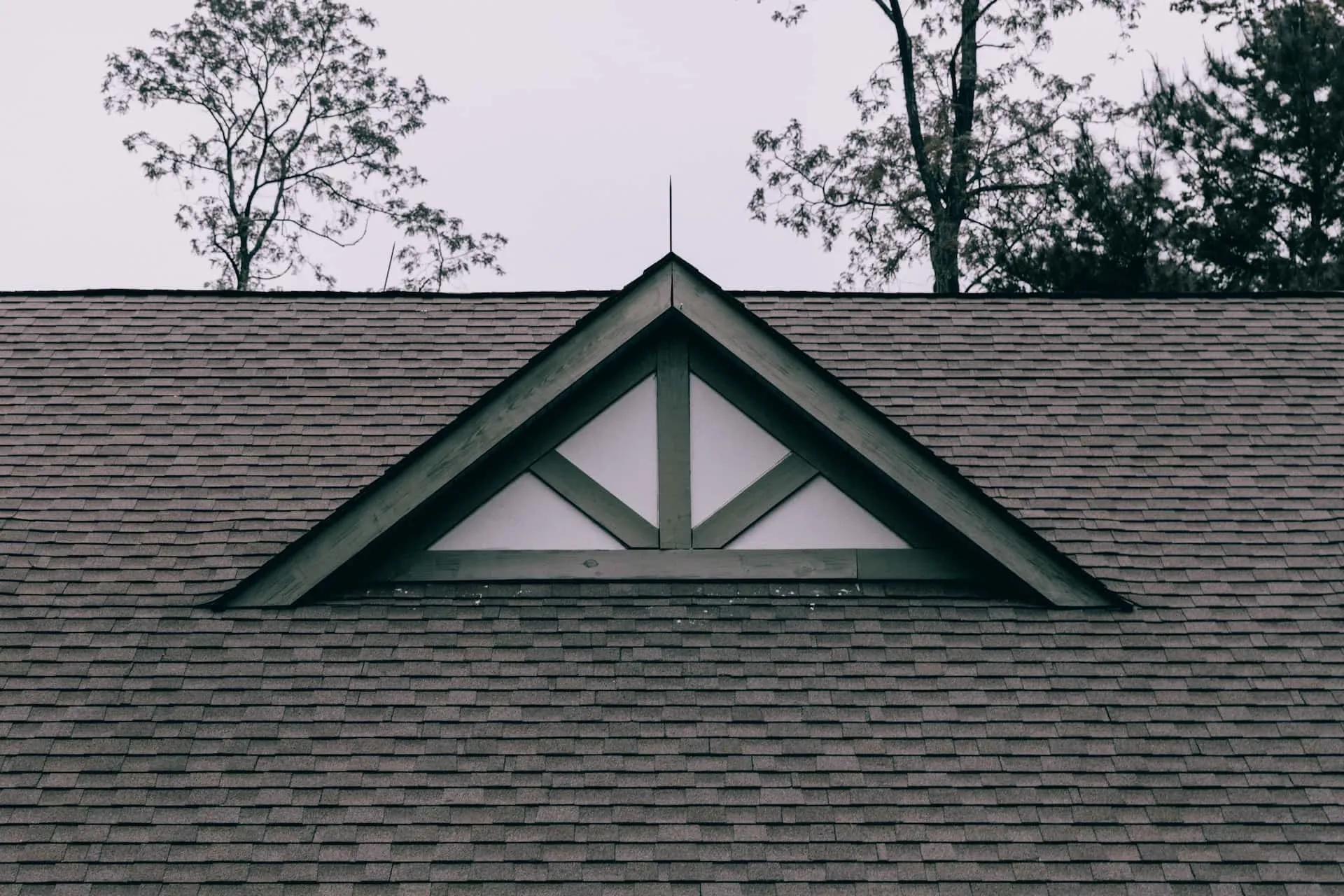 Complete Roof Inspection Checklist to Prevent Serious Problems
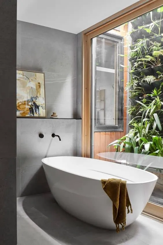 Glass Ceiling in Bathroom
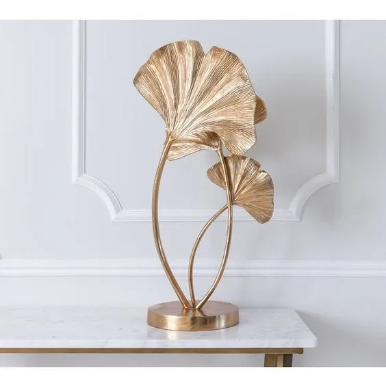 Golden Ginkgo Biloba Branch Brings Art Deco Chic to Your Living Space
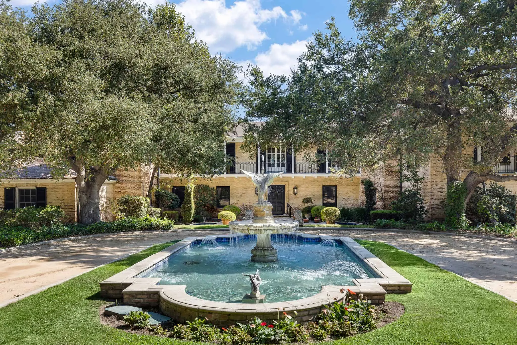 The Great Milestone: 60th Pasadena Home Design Showcase at Bauer Estate
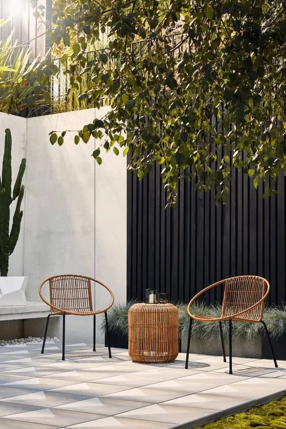 Guide to Choosing the Perfect Garden Furniture