Color in Interior Design: 8 Common Mistakes
What to pay attention to when choosing color? We share the formula for perfect color balance and show successful examples from design projects
In our article, we cover the most frequent mistakes made when selecting color combinations. It's not a big deal if you find some of these in your home — we'll help you fix the mistakes or avoid them.
Not accounting for natural light
Before choosing wall or fabric colors, take samples and look at them in different corners of the same room. Observe how the shades change throughout the day — color may become more saturated or fade, revealing unexpected undertones.
 Design: Marina Zhukova
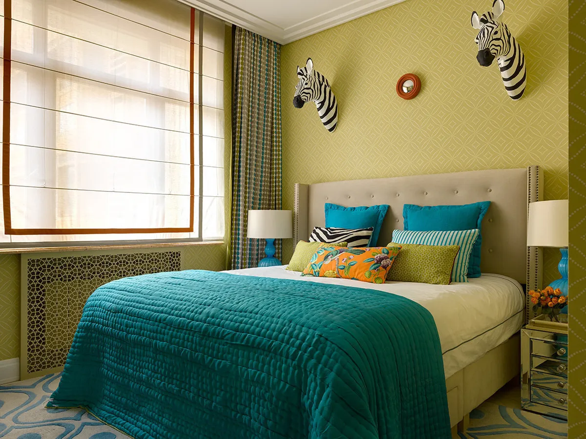
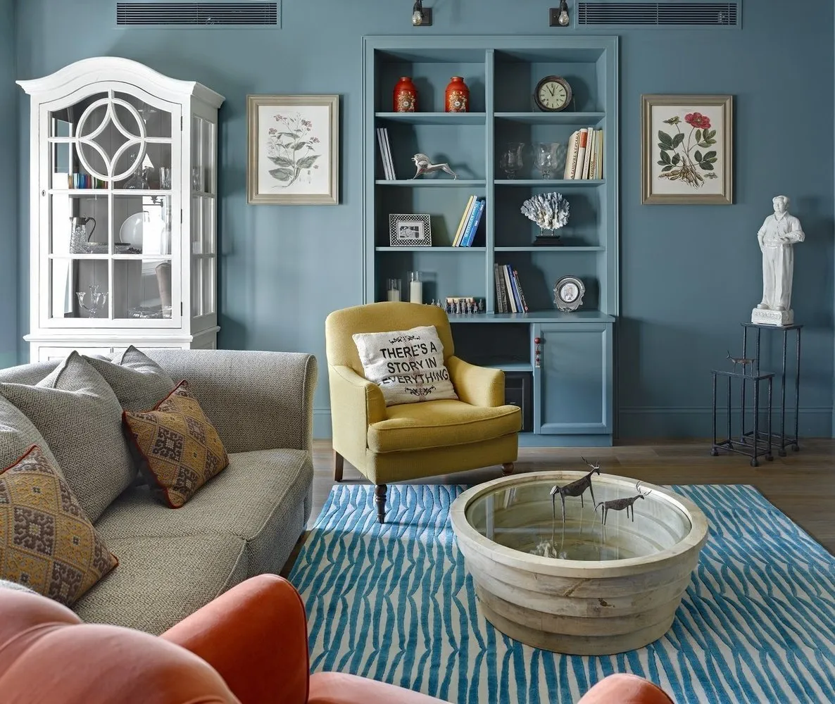
Disrupted balance
The formula that all designers know: 60% of the room should be base color, 30% additional color, and 10% can include accent color or bright accessories. Disrupt the balance, and your interior risks turning into an Eastern bazaar.
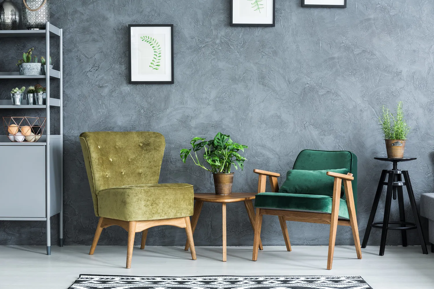
 Design: Galina Yurieva
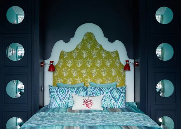
Excluded dark colors
They make the space feel smaller and evoke sadness — that's what most people think, and they're wrong. In fact, dark tones look noble, add coziness and depth to a space, even a small one. Overuse of decor and mixed color palettes can make the room feel cramped.
 Design: Anna Muravina
Mismatched colors for different rooms
Think of your apartment as a whole space and always keep that picture in mind.
Start simple: let each room match in color with adjacent rooms. That way, your home will look more harmonious. Ideally, use a single color palette throughout the entire space.
 Design: Daria Vasileva
Rejected contrasts
Don’t go to extremes: all rooms the same color is too much. A house or apartment should look organic, not monotonous.
 Design: Maria Piliipenko and Ekaterina Fedorova
Separated shades into warm and cool
Division into warm and cool colors is conditional. It's a bit more complex: different shades of the same color can be either warm or cool. Compare emerald and grass green.
 Design: Dots & Points
Overused white color
A completely white room doesn’t look elegant and refined but sterile. Although white adds light and air to a space, that’s not a reason to overuse it.
 Design: Dots & Points
Ignored floor and ceiling
Colors for these surfaces should be chosen in parallel with the overall palette, not afterward. Often, how the interior looks depends exactly on the floor and ceiling.
 Design: Irina Krascheninnikova
On the cover: design project by Daria Vasileva
Need a renovation specialist?
Find verified professionals for any repair or construction job. Post your request and get offers from local experts.
You may also like
More articles:
 Storage in Small Apartments: 10 Ideas from Western Projects
 Before and After: What You Can Do With a 'Killed' Kitchen
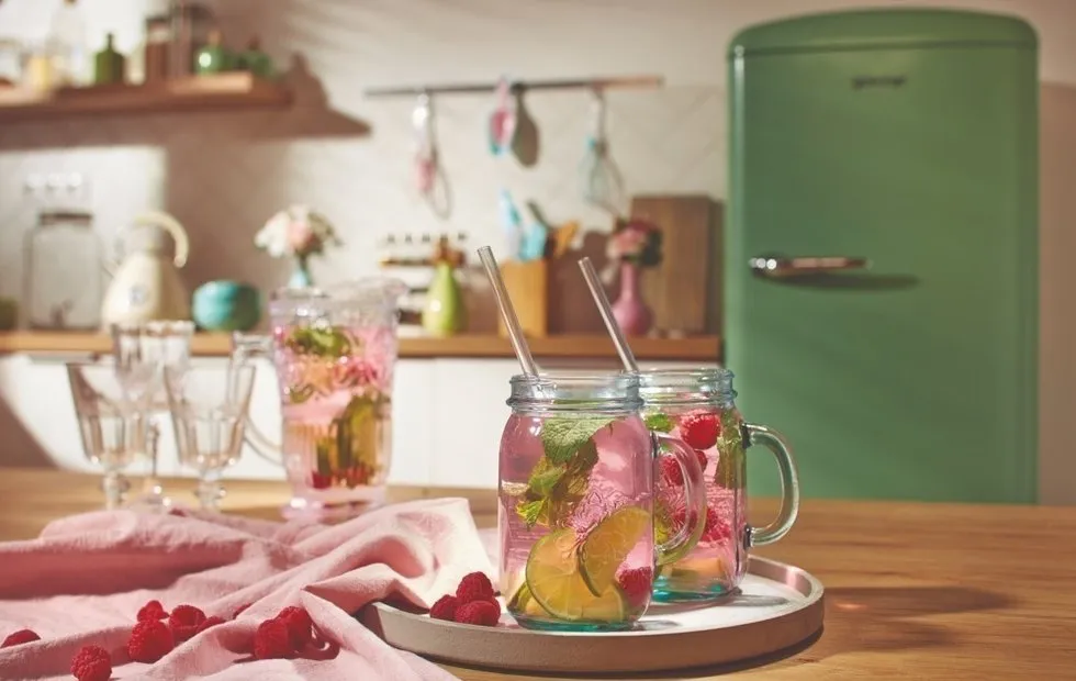 Kitchen Design Retrospective: The 1950s
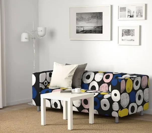 What You Need to Buy Before the End of IKEA Sale
 Architectural Biennale: Why You Should Buy Tickets to Venice Now
 Apartment with Mini-Kitchen and Loft Bedroom
 How to Beautifully and Budget-Friendly Decorate a Cottage: Real Example
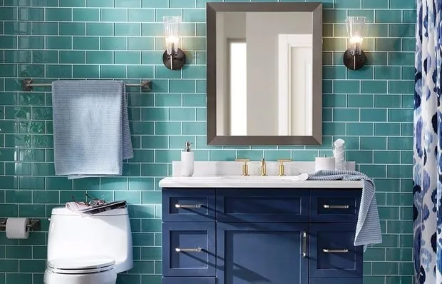 How to Pay Less for Water: Choosing the Right Plumbing Fixtures