Pink, sage, terracotta: how to decorate interior in the most fashionable colors
Let's move away from boring beige shades
The trend for these colors was forecasted as early as the end of last year. After the largest interior exhibition Salone del Mobile, it became clear that pink, sage and terracotta are among the most vibrant micro-trends of the year.
Together with the Design and Interior Center "Expobuild on Nakhimovskoy" we explain why you should pay attention to them.
Pink today is very versatile, and it can be used in various color variations. The most relevant shades are light, nude and cool, like the Cutie chandelier.
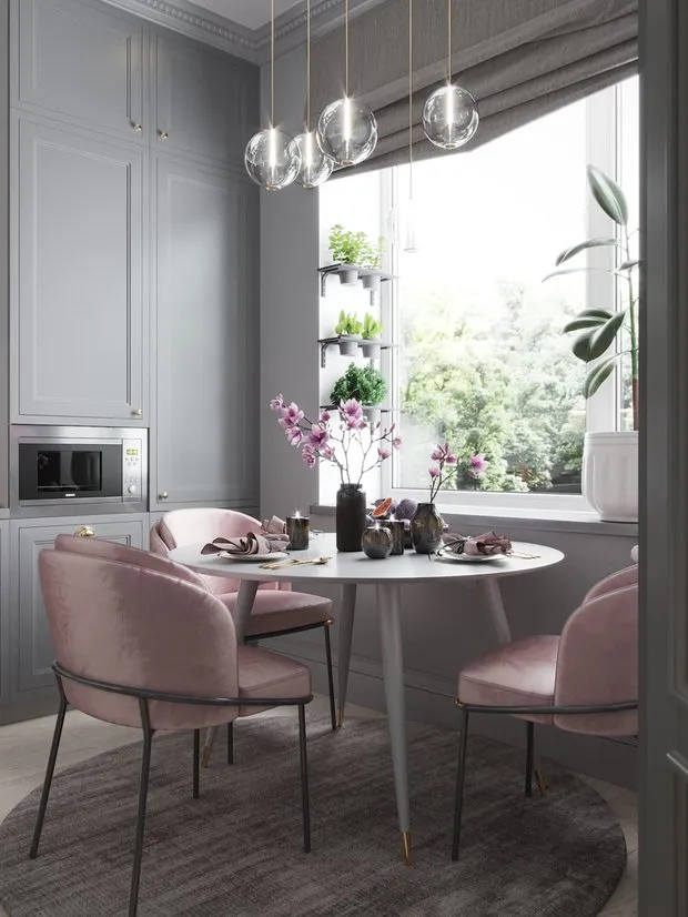 Design: Elena Ivanova
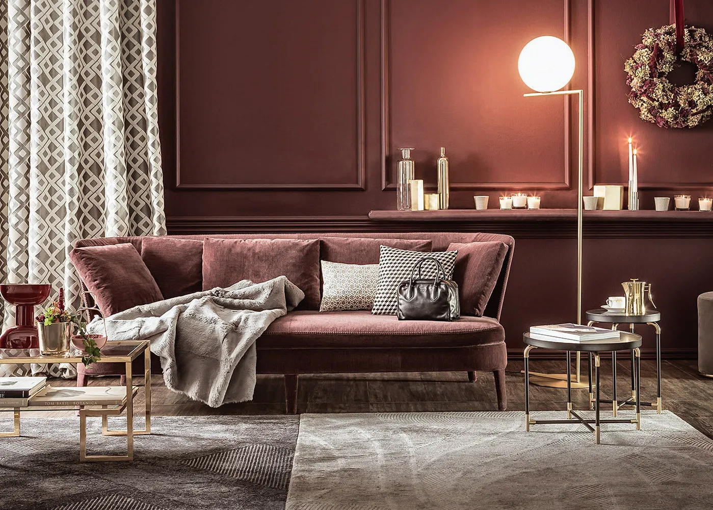
Choosing the right terracotta (this shade is also called rust-red or clay-fired color) is not difficult either: in trend are tones close to burgundy and copper, like the pendant light Lussole.
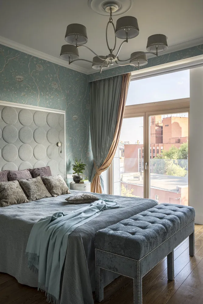
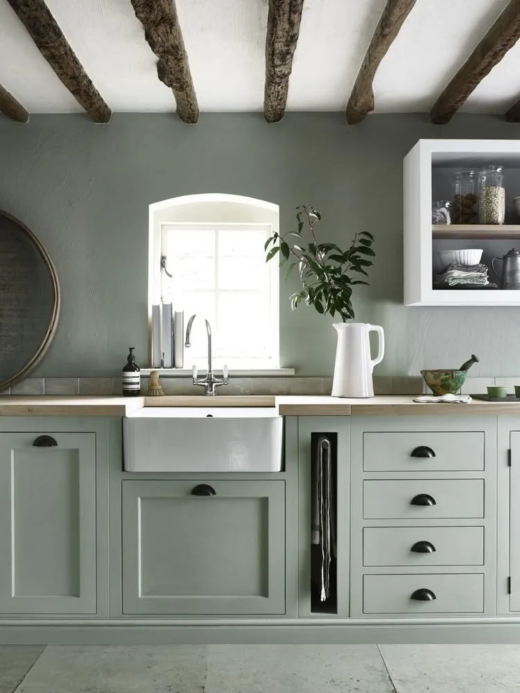
And one of the most popular colors of the year according to Pinterest is sage — a soft gray-green shade of lavender leaves. Such as on the Arte wallpaper and the JNL ELLIOT sofa upholstery.
Cover ValsChandelier CutieChair Cinderella light pink
Serving table on wheels Block
Wallpaper Arte
Sofa JNL Elliot
Wall tile Old Caravista Irregular
Pendant light Lussole
Parquet board "Sapele Natural"
Why are they great?
Pink, sage and terracotta are not just popular shades, but also an excellent basis for any interior. Neutral yet complex, these colors will make a great alternative to white and beige, and can be combined with many other shades.
 Design: Atmosphere@surfacesandobjects
What to combine with?
Blending all three colors together is safe. If it's too much for you, no worries: monochromatic looks and using several shades of the same color are also in trend.
Soften pink, sage and terracotta with warm metals and blue color — these combinations are currently at the peak of popularity.
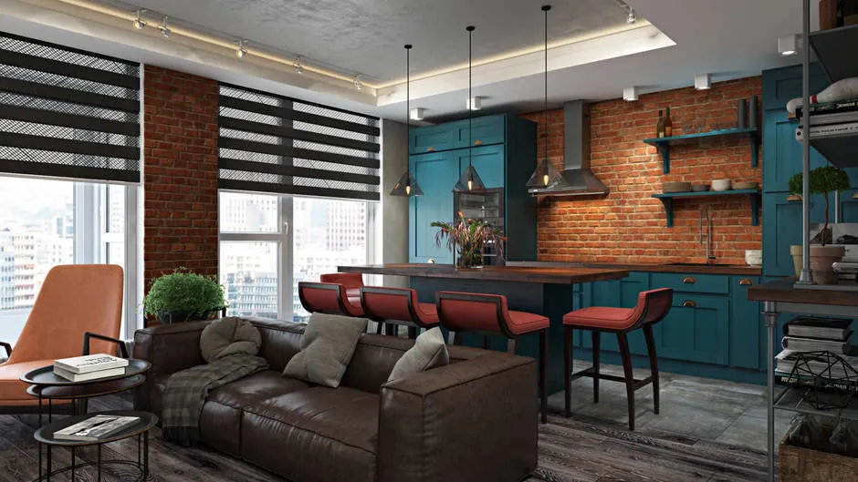 Design: FISHEYE Architecture & Design
How not to overdo it?
In this fashionable trio, sage is the most neutral and comfortable, so there shouldn't be any problems with it.
Pink is better used in accessories and furniture: for example, several Cinderella chairs will highlight the current style of the interior without making it look unprofessional.
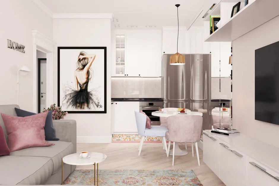 Design: KATYSHHHA Design Studio
As for terracotta, it’s better to be cautious, especially if this color is introduced into the interior through natural finishing materials or their imitation. They usually have an active, multi-layered texture — take a look at the Old Caravista Irregular tile or the "Sapele Natural" parquet board.
It’s best to complement such decoration with furniture and accessories in muted, dusty colors or something white, black or gray.
For which styles is it suitable?
Sage is considered the main color of cozy European and American country houses, as well as a perfect addition to Scandinavian decor. For example, the serving table Block would fit in both cases.
Terracotta recalls the 1970s and retro — one of the most important trends in modern interior fashion.
And the calming soft pink (remember, it was once typical of feminine colors?) now fits into any setting. A pink Vals carpet, for example, looks quite conservative and can easily be imagined in a modern classic living room or office.
9 more ideas on how to use pink, sage and terracotta in interior design
Pink velvet sofa in trend: here is both the current color and a fashionable material.
Combination of pink with gold — probably one of the most successful ones.
Just one piece of furniture in pink and the interior gains a soft glow effect.
Paint the vanity unit in the trendy sage and complement it with matching curtains — and a white bathroom will come alive with new colors.
Green shades soothe — what better reason to get bedding in trendy shades?
Living plants fit everywhere, and greenery next to sage tones will look more vivid and deep.
Deep terracotta shades look great on wallpapers with a suede texture.
Head off to the section for gardeners: plants in rust-colored clay pots will enhance any interior.
Worn surfaces won’t spoil the terracotta color, but rather highlight it beautifully. That’s why terracotta-toned ceramic tiles on the floor will only get better with time.
Need a renovation specialist?
Find verified professionals for any repair or construction job. Post your request and get offers from local experts.
You may also like
More articles:
 Personal Experience: How to Use Wood in Interior Design
 Tropical themes in interior design: a trend that never goes out of style
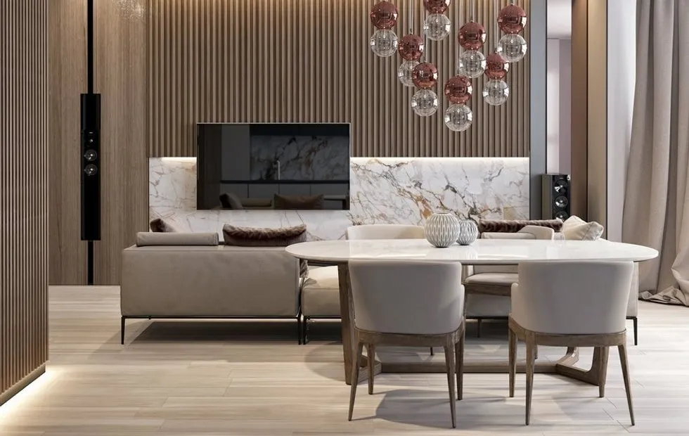 Marble, Onyx, Concrete in Interior Design: 15 Trendy Ideas
 How a Designer Decorated the Interior of an Old House in Finland
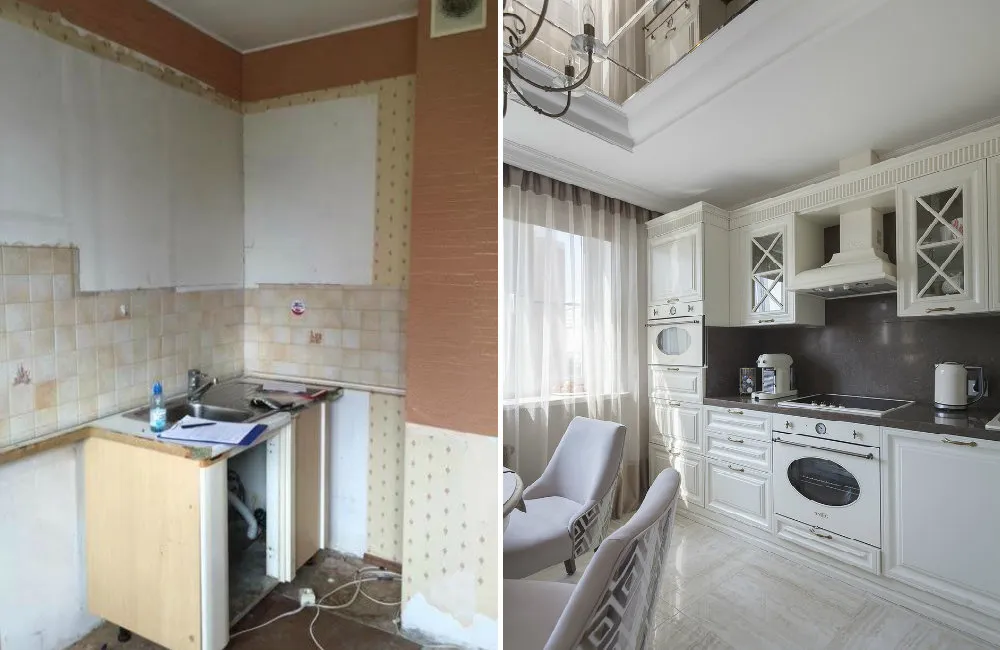 Before and After: How "Killed" Apartments Changed After Renovation
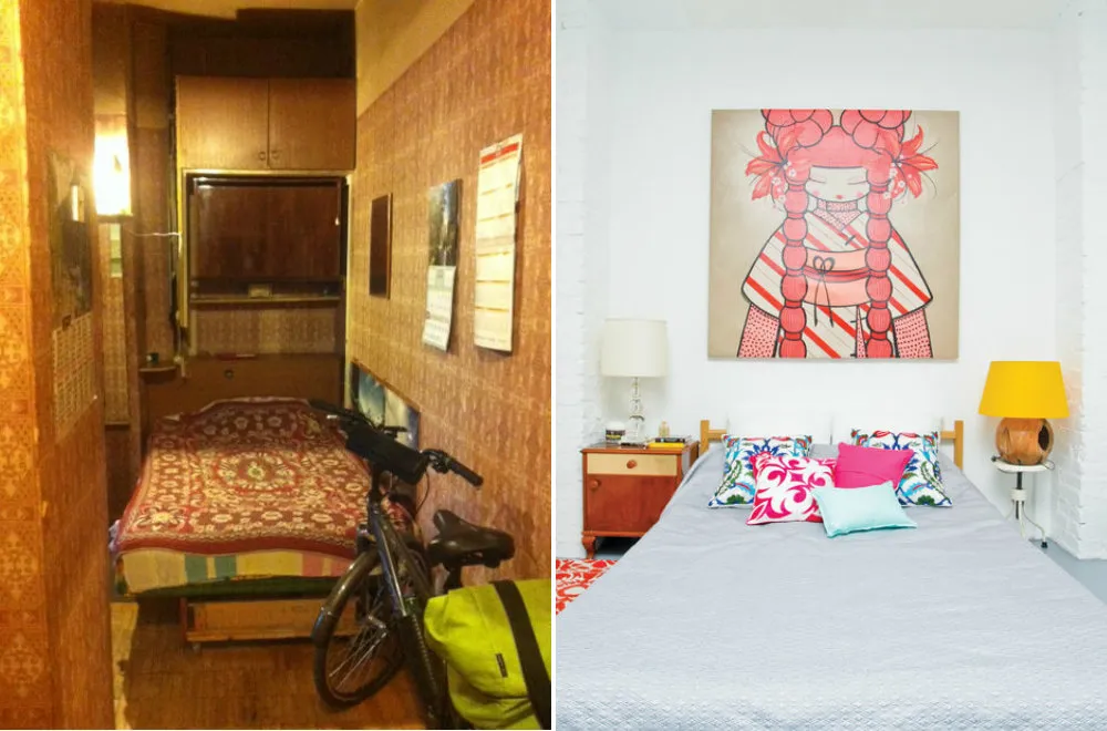 6 More Incredible Transformations of Old Apartments
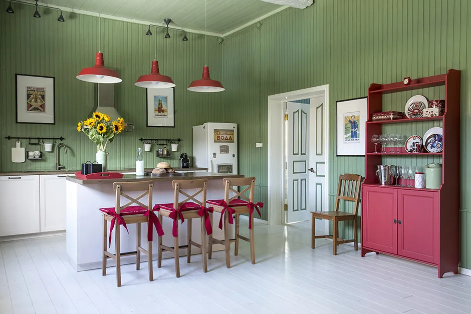 5 Unusual Ideas for Decorating a Country House
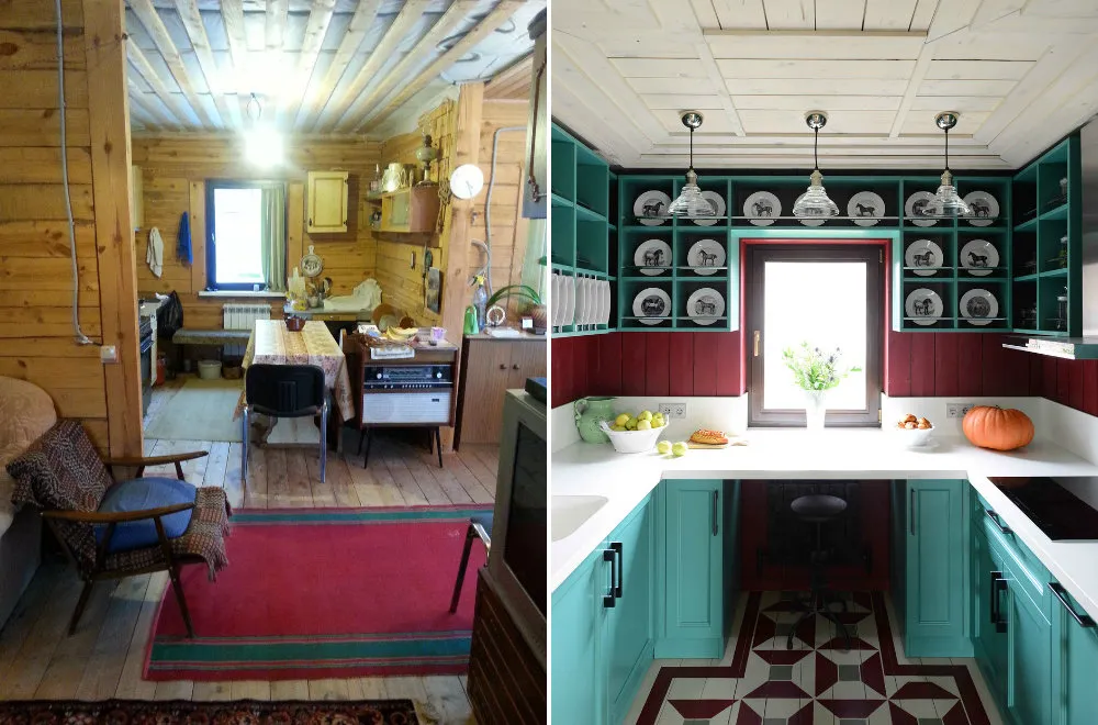 Before and After: How Designers Transformed Old Dachas