Monochrome Interior: 7 Mistakes People Make
Monochromatic solutions can be very successful if you work with color wisely
We want to encourage you right away: a monochrome interior is not primitive, but rather a quite stylish and classic solution. But before you start implementing this idea, take a look at the mistakes most people make when bringing their 'monochromatic' concept to life.
Using a too bold color as the base
It is commonly believed that to uplift your mood or boost energy, one should use invigorating colors in interior design. Those who live by Feng Shui even use them to attract money and love.
In reality, red, lemon, green, and other vivid shades are only good as accents. As a dominant color, they will tire and irritate you. Therefore, if you decide on a monochrome interior, choose a more neutral tone as the base.
Not checking how the color behaves during day and night
At different times of the day, the same color in an interior behaves differently — it's important to ensure that the color is equally pleasant to your eyes. Ideally, during the day, the dominant color in a room should be bright, vibrant, and lively, while at night under artificial lighting, it should be deep and calm, since that’s what your body needs to relax and prepare for sleep.
If you mostly spend time at home under artificial light, you can experiment with lighting scenarios to alter how the color is perceived — combine lamps of cool, warm, and neutral glow.
Not taking climate conditions into account
The same color plays differently in various parts of the world. For example, a cold Scandinavian interior in gray tones would look great in snow-covered Iceland, whereas on the hot coast of Cyprus it wouldn’t fit.
This principle also applies to sunny and shaded sides of a flat or house.
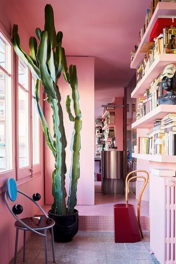
Not considering the size of the room
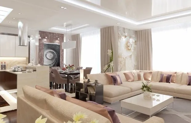
Perhaps you fell in love with a monochrome interior and want to implement it as soon as possible, but forgot that this effect won’t look as effective in a small apartment as it does in spacious apartments, like the one shown in the image. The mood of the color and its impact directly depend on the size of your living space.
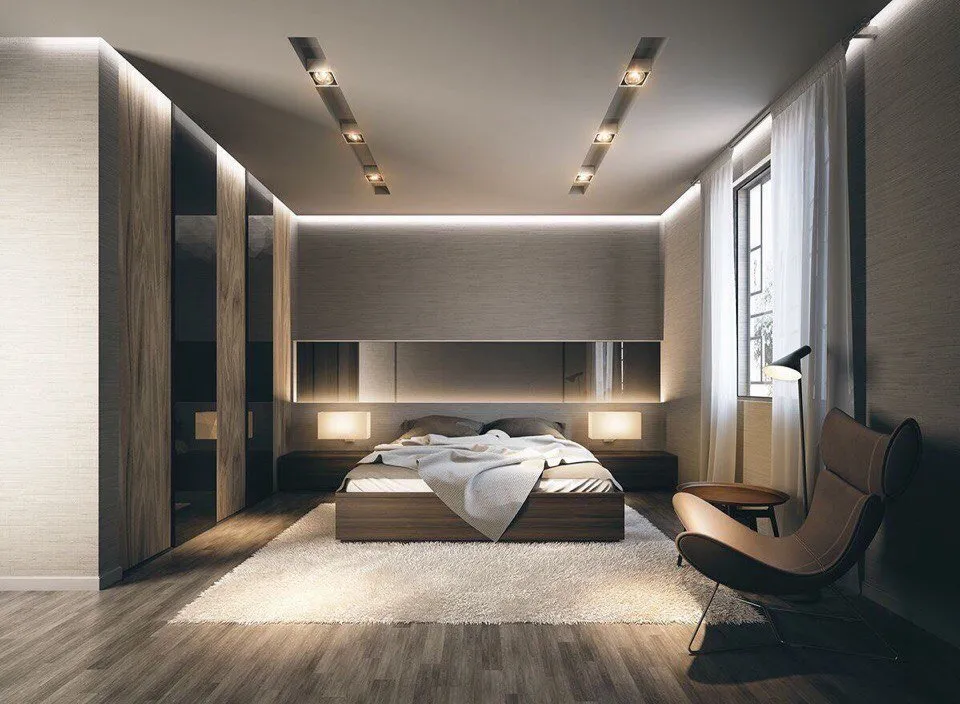
Not maintaining balance between color and architecture
Interior design cannot exist separately from the building's architecture, so choose a color that works well with it. For example, classic-style buildings do not tolerate loud tones, while modern-style homes can handle bright and life-affirming hues.
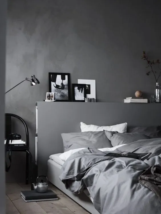
Ignoring the play of tints and monochrome interior rules
By choosing one color as the base and obsessively matching it with interior items, you risk turning your room into a flat surface without dynamics or character.
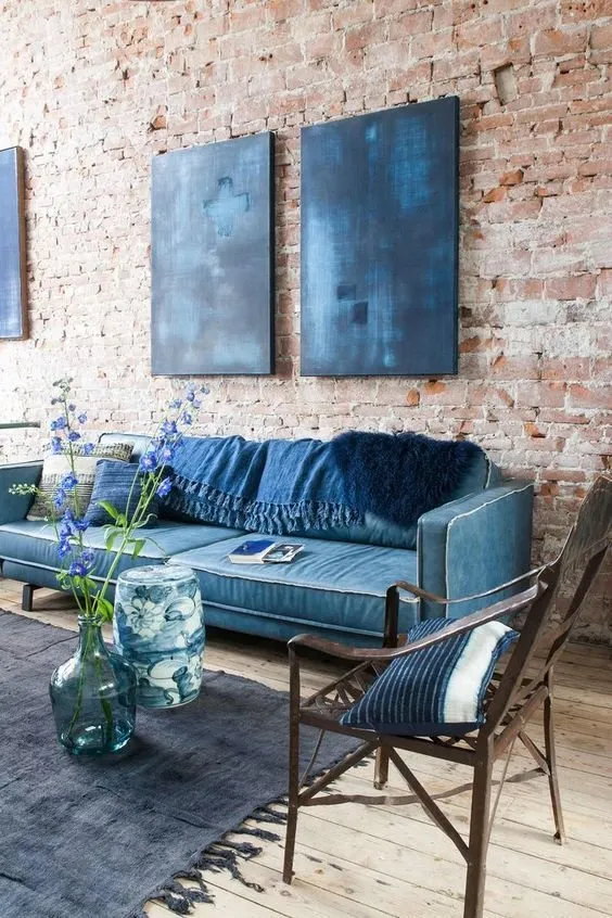
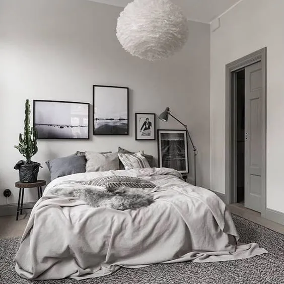
Each color has many tints. Combine them, and the interior will become more interesting, gaining depth and nuances. For example, blue can be complemented with sapphire, azure, and pansy shades, while gray can be supported by wet asphalt, white, and silver tones.
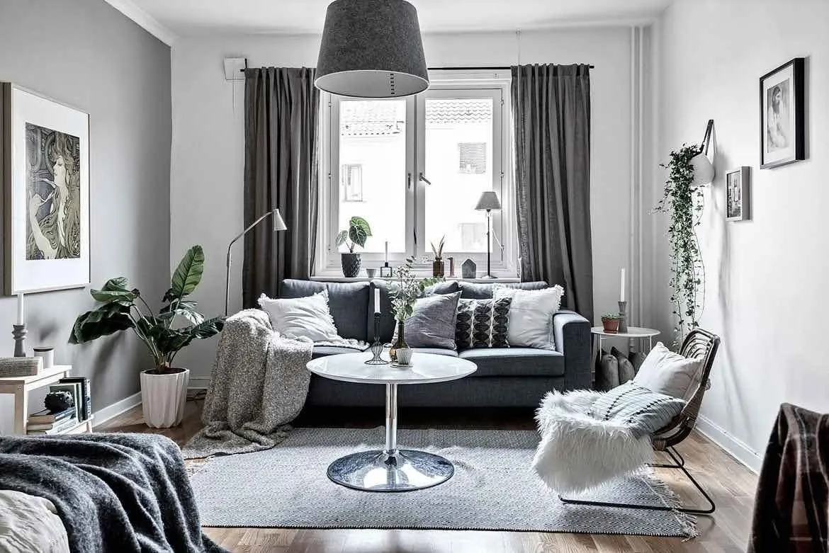
Using identical textures
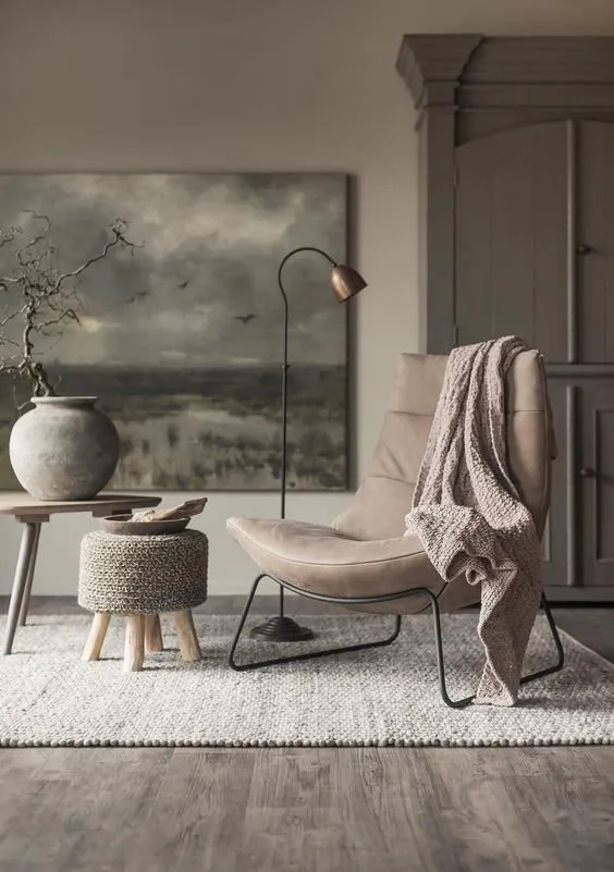
A monochrome interior, more than any other, offers many opportunities to use various textures. Here is where you can let your creativity shine: combine silk and velvet, ceramic and metal, large and small weaves, matte and glossy finishes — and you'll see how voluminous and resonant it will look.
Also read:
- Trendy pink color in a St. Petersburg apartment interior
- Interior in coffee tones: project in Kyiv
- How to incorporate UV light into an interior
Need a renovation specialist?
Find verified professionals for any repair or construction job. Post your request and get offers from local experts.
You may also like
More articles:
 Kitchen-Living Room Design 30 Square Meters with Photos
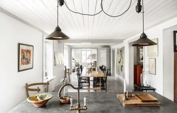 Natural tones and colorful kitchen: house in Sweden
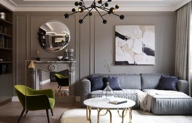 Wall Finishing Options in Apartment
 Design of a 36 Square Meter One-Room Apartment with Photos
 Beige Interior in Sweden with Loft Sleeping Area
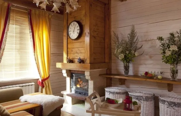 Living Room in Country Style: Interior Design
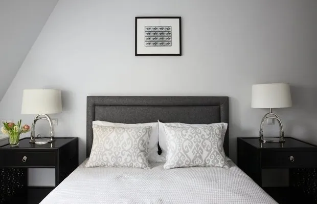 Black and White Bedroom Interior
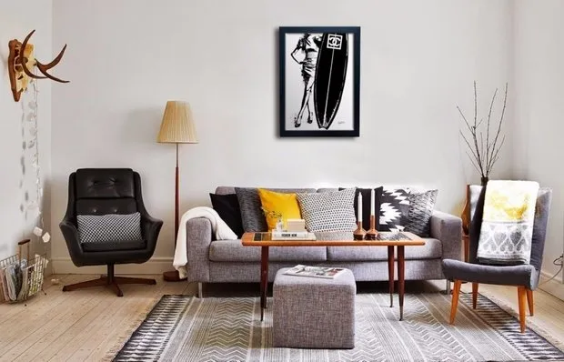 Decorating Interior on a Budget: Tips from Professionals