Small Apartment with Black Kitchen and Unusual Layout
The area of this stylish apartment in Stockholm is only 38 square meters. However, thanks to a fairly open layout, thoughtful zoning and decoration, the space visually appears significantly more spacious.
By the way, many details of this stylish interior can be successfully "borrowed" and applied in typical Russian small apartments.
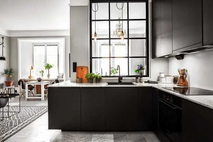
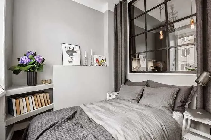
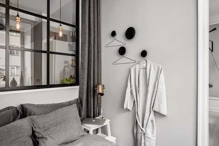
Notable attention deserves the glass window between the bedroom and kitchen area. Essentially, it acts as a kind of semi-partition that serves multiple functions. First, it visually makes the main part of the apartment look more spacious. Second, it provides sufficient natural lighting in the cooking area. Third, it helps to avoid the feeling of overly confined and enclosed space in the tiny bedroom.
In addition, such a window taking up half of the wall is quite an effective design solution. Note: from the bedroom side, there's an option to close the glass partition with a thick curtain and fully hide the bedroom from outsiders when needed.
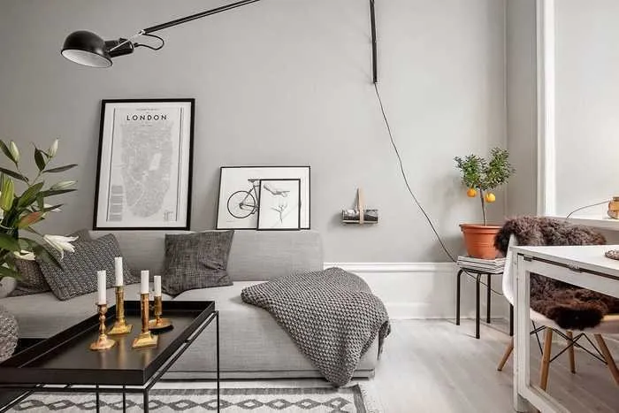
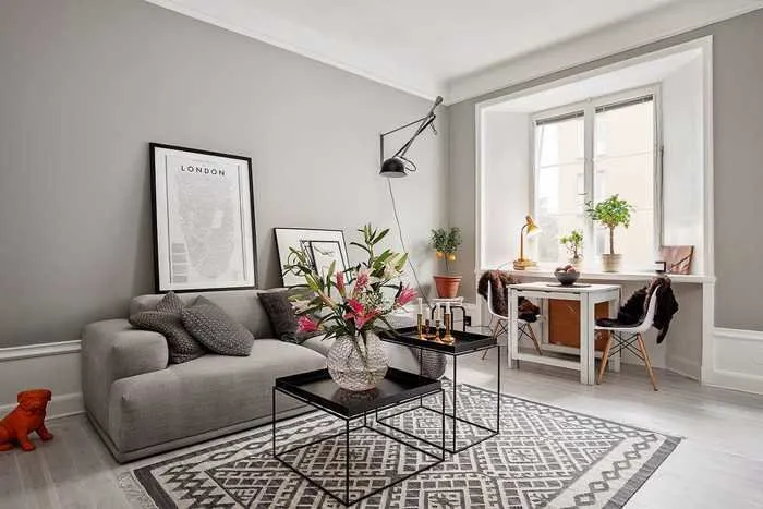
Another technique that visually makes the interior appear more spacious is elevated ceilings. The walls are painted in gray only up to a certain height: a wide strip painted in the ceiling color visually makes them look taller, and the room itself looks slightly larger.
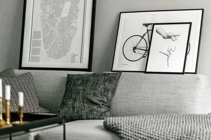
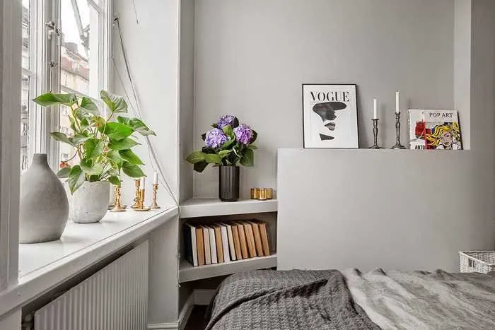
Wall decor placed low. Another element that works on "raising" the ceilings. Decorative posters and photos are placed below the usual level, below the middle of the wall. Thanks to this, it seems that the wall height is quite substantial.
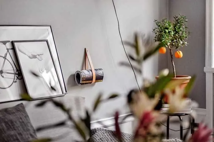
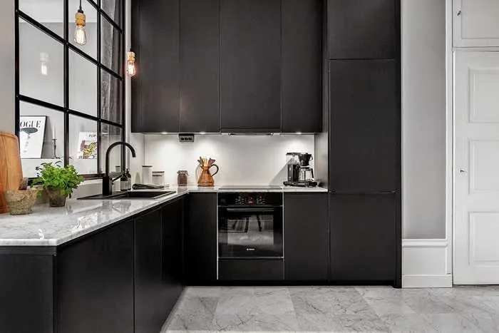
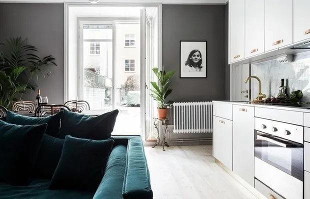
It's also interesting that the designers avoided bright accents in the interior. In a small space, colored accents often visually clutter the area. Instead, the project authors focused on shades, textures, patterns – and muted the palette with a black kitchen cabinet and neat dark details throughout the apartment.
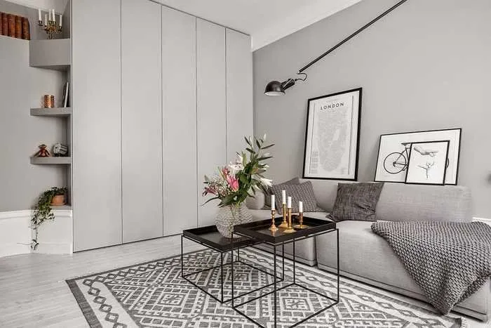
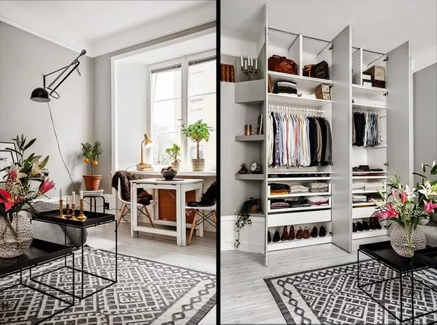
They also tried to minimize bulky furniture. This allowed creating a small wardrobe at the entrance and a spacious closet in the room (selected to match the wall color to visually blend with the space).
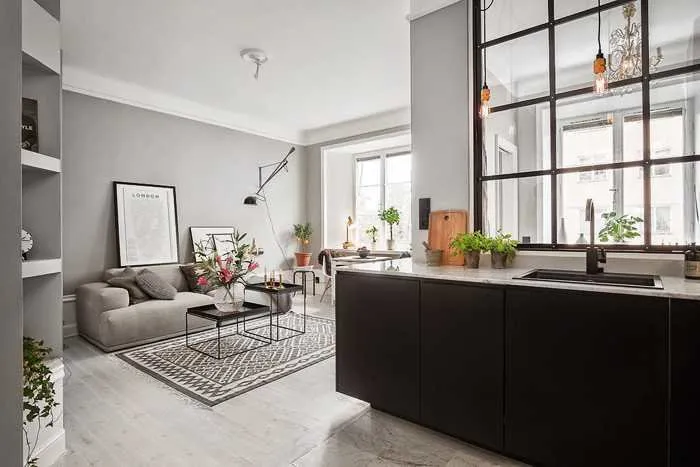
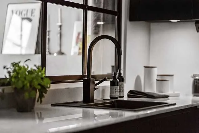
As for the kitchen cabinet, it was not visually hidden: on the contrary, it became a contrasting element that draws the eye and balances the overall light palette. Thanks to the window-divider and placement of upper cabinets along only one wall, the cabinet doesn't look overly bulky. Moreover, a black kitchen is incredibly trendy and stylish, isn't it?
 Layout
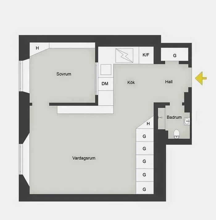 You May Also Like:
10 New IKEA Items for Small Apartments
Small Apartment with Proper Zoning
Small-Space of the Week: How to Decorate a 2-Bedroom Apartment for a Million
Need a renovation specialist?
Find verified professionals for any repair or construction job. Post your request and get offers from local experts.
You may also like
More articles:
 Scandinavian Interior Filled with Color and Living Plants
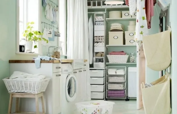 How to Arrange a Laundry Room in an Apartment: Designer Tips
 Doing Renovation in a "Panel" House with Professionals
 10 New IKEA Items for Small Apartments
 On What You Should Never Cut Corners During Renovation
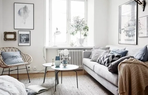 7 Ways to Make Life More Comfortable
 How to Place Appliances on a Small Kitchen: 6 Tips
 Tile in Interior Design: Favorite Techniques of Nadia Zотова