10 Common Mistakes When Working With Color
If honestly, there are many nuances and pitfalls in working with color that should be known in advance. Designer Nina Romanюk identified the main mistakes and explained how to fix them
The most obvious ways to add life to an interior are to paint the walls in a vibrant color or scatter bright cushions on the sofa. It seems so simple, right? However, even in this seemingly straightforward task, there are complications: the risk of overdoing it with color and making the interior look tacky is quite high.
Mistake #1: Not Considering the Impact of Lighting
Lighting can transform an interior and change the color beyond recognition – both for the better and worse. White color under certain light can look dirty, while a dull gray can turn into lavender.
That is why it's essential to consider the color you've chosen for your home both in bright daylight and under artificial lighting. Ask for a paint sample at the store, apply it to a small surface, and observe how the color looks in the morning, at noon, and in the evening. If you still like it, then you can go ahead and buy it.
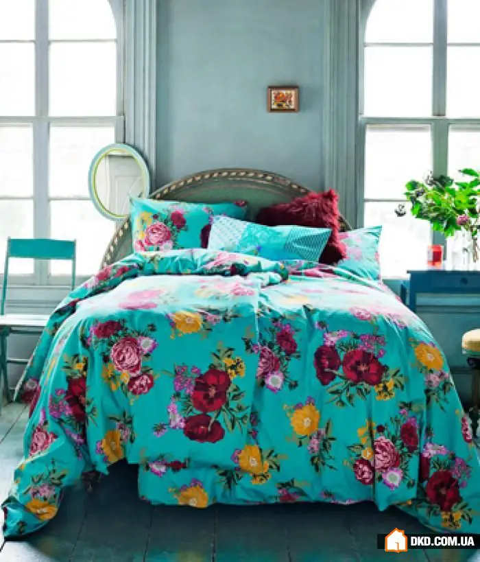
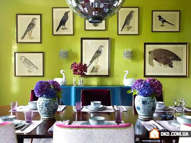
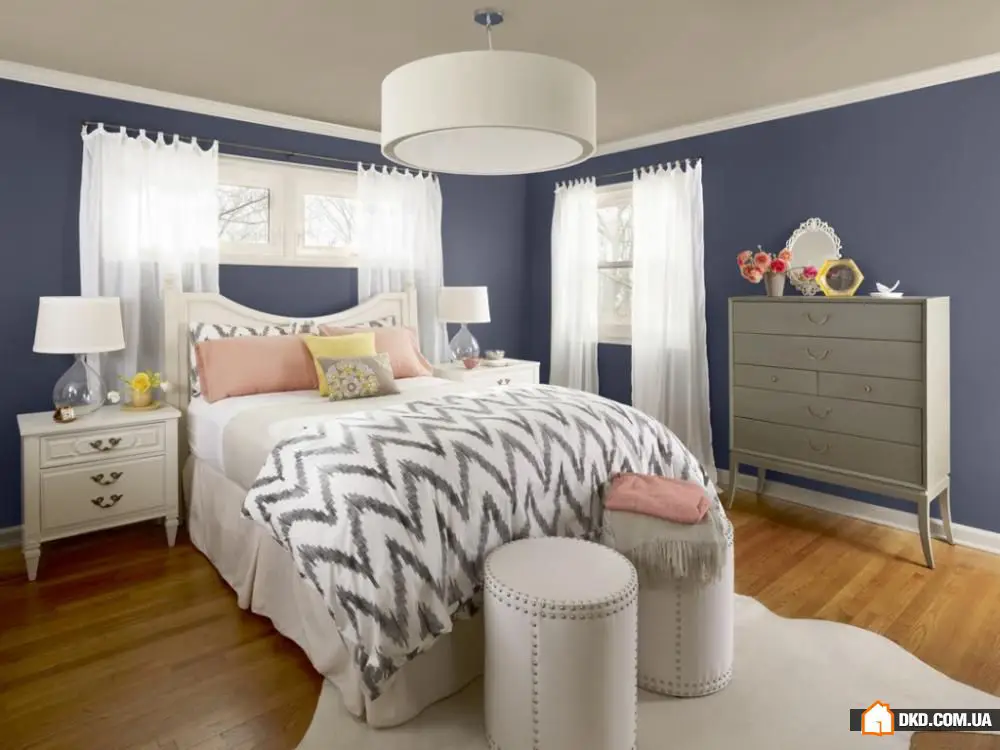
Mistake #2: Variety of Colors in One Interior
There is no specific number of acceptable shades within one interior. But the rule "more is better" doesn't always apply here. Want to know if you've gone too far with the number of colors in your room? Listen to your feelings. If it feels like chaos in the room and you've just cleaned recently, or if there's a feeling of suffocating space – you've probably gone overboard with colors. Start removing colors from the interior until balance is achieved. Or simply count the number of shades in the room. Usually, there should be a couple of main colors and two or three additional or accent colors.
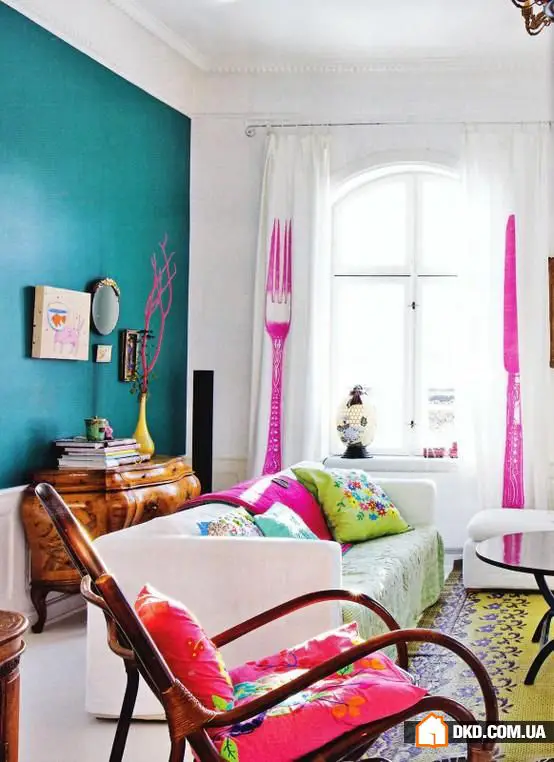
Mistake #3: Limited Color Palette
This is the opposite of the previous issue. The color palette should fully express the style and character of your home. If the entire interior is painted in just two or three colors, it becomes boring and predictable. The solution to this problem is simple: place a few vibrant color accents using decorative cushions, curtains, colored vases, and other accessories.
Mistake #4: Creating a Disconnected Interior
What exactly is meant by this? Sometimes homeowners choose their own color set for each room, and these colors don't match one another at all. Using all the colors of the rainbow in one apartment or house creates a sense of disorder and chaos. To transform scattered room interiors into a unified harmonious picture, use the rule of matching colors. When you use accessories in colors similar to those in another room’s interior, or make the accent color of one room the dominant color of the next.
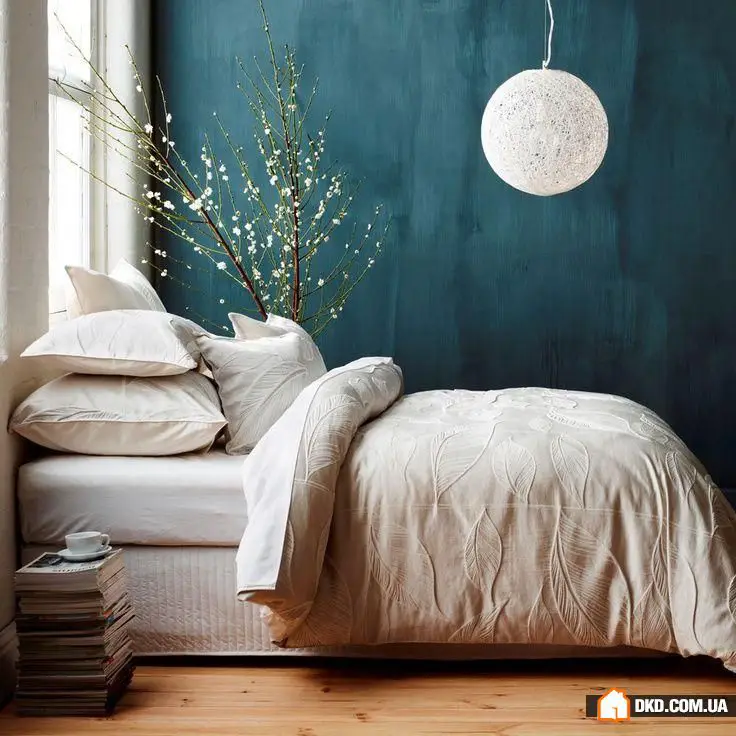
Mistake #5: Overloading the Interior with Color
To avoid overloading the interior, plan cozy corners where your eyes can rest from color variety. Choose large neutral items. For example, a carpet in pastel tones or a cream bedspread.
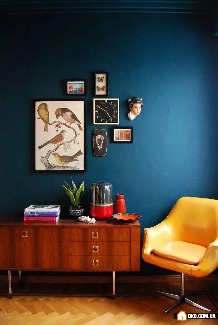
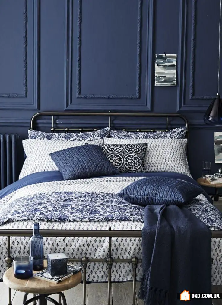
Mistake #6: Not Knowing How to Take Risks
Are you afraid to paint the walls in your favorite turquoise color? Or have you always dreamed of a blue sofa but bought gray instead because it's more practical? What about a red kitchen? You've probably dreamed of one but never dared to buy it... Sometimes this caution turns your interior into a gray mediocrity. It's better to make a few mistakes than live in a boring house.
Mistake #7: Wrong Finish Coating
Has it happened that the paint is of good quality and applied correctly, but the result looks different? Perhaps the issue lies in the finish coating. A matte effect or glossy shine might appear, which you didn’t want at all. The solution to this problem is simple: when choosing a finish coating, apply several samples on top of the paint and compare the results. Choose the one that best matches your expectations.
Mistake #8: Poor Painting Quality
Painting walls in neutral shades is quite simple, as the paint boundary is almost invisible. But it's a different matter with bright and saturated colors, especially at the junctions. Any imperfection or unevenness will be noticeable even from space. Therefore, if you want to achieve good quality with such paints, spend extra time on preparation and choose the right tools.
Mistake #9: Choosing Too Bright a Color
People who want to paint walls in saturated tones often encounter this issue. You carefully select the color, you really like it, and when you apply a sample, it turns out to be much too bright. Much brighter than you could imagine. This doesn't mean you should give up on your favorite shade – just ask for a paint sample that is a few shades lighter. Then it will look as you intended on the wall.
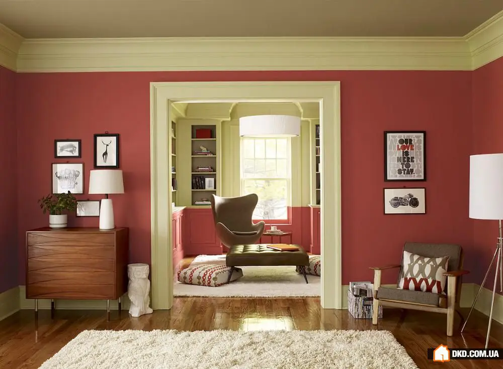
Mistake #10: Not Considering the Atmosphere of the Room
The appearance of a room largely influences its atmosphere. What you like in one color doesn't mean you have to surround yourself with that shade on all sides. For example, many people love a rich red color, but few would want to wake up or fall asleep in such a room. Therefore, when choosing an interior palette, think about the atmosphere you're creating. Planning quiet rest in your living room? Then baby pink or orange won’t suit you at all.
Need a renovation specialist?
Find verified professionals for any repair or construction job. Post your request and get offers from local experts.
You may also like
More articles:
 How to Decorate a Dormer: 4 Steps to Creating a Cozy Atmosphere
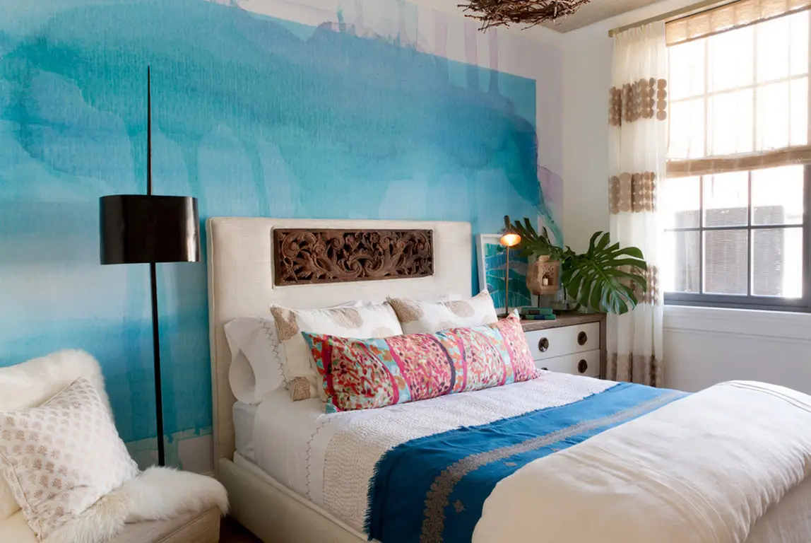 5 Tips to Make a Dark Room Brighter
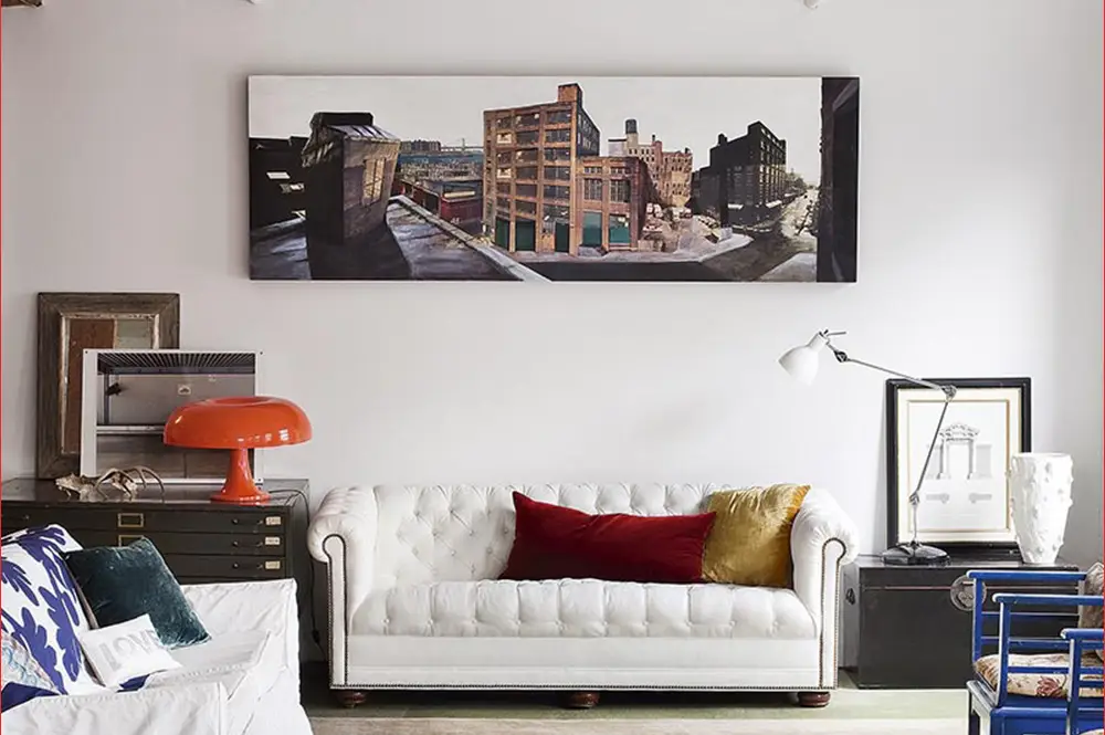 How to Create a Bold Interior: Real Example
 5 Useful Ideas for a Small Entryway in an Apartment
 Before and After: Stylish Kitchen on a Budget
 Take Height: 7 Ways to Visually "Lift" the Ceiling in a Khrushchyovka
 How to Refresh Your Workspace: 5 Best Ideas, 25 Bright Examples
 How to Decorate an Interior in Beige Tones: A Visual Example